by Kip Hansen, August 6, 2019 in WUWT
What we call a graph is more properly referred to as “a graphical representation of data.” One very common form of graphical representation is “a diagram showing the relation between variable quantities, typically of two variables, each measured along one of a pair of axes at right angles.”
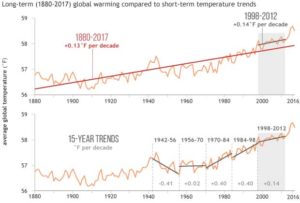
Here at WUWT we see a lot of graphs — all sorts of graphs of a lot of different data sets. Here is a commonly shown graph offered by NOAA taken from a piece at Climate.gov called “Did global warming stop in 1998?” by Rebecca Lindsey published on September 4, 2018.

I am not interested in the details of this graphic representation — the whole thing qualifies as “silliness”. The vertical scale is in degrees Fahrenheit and the entire range change over 140 years shown is on the scale 2.5 °F or about a degree and a half C. The interesting thing about the graph is the effort of drawing of “trend lines” on top of the data to convey to the reader something about the data that the author of the graphic representation wants to communicate. This “something” is an opinion — it is always an opinion — it is not part of the data.
The data is the data. Turning the data into a graphical representation (all right, I’ll just use “graph” from here on….), making the data into a graph has already injected opinion and personal judgement into the data through choice of start and end dates, vertical and horizontal scales and, in this case, the shading of a 15-year period at one end. Sometimes the decisions as to vertical and horizontal scale are made by software — not rational humans — causing even further confusion and sometimes gross misrepresentation.
Anyone who cannot see the data clearly in the top graph without the aid of the red trend lineshould find another field of study (or see their optometrist). The bottom graph has been turned into a propaganda statement by the addition of five opinions in the form of mini-trend lines.
…
