by P. Homewood, November 30, 2018 in NotaLotofPeopleKnowThat
…
I wholeheartedly agree with David’s comments, in particular the need to show graphs.
I am sometimes accused of cherry picking or coming to different conclusions to others. But what I always try to do is actually show the graph, so readers can form their own opinions.
While we are on the topic, I will put up that Woodfortrees graph, which I posted yesterday. According to Woodfortrees, the warming trend since 1950 has been 0.012C/yr, or 1.2C/C.
Yet the BBC report, referred to by Dr Whitehouse, actually states that:
If the trend continues, the WMO says temperatures may rise by 3-5C by 2100.
This claim clearly is not compatible with the historical data
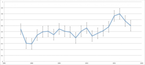
Fig 2 shows the same data with error bars from which it can be seen that 2018 is statistically equivalent to some years before the El Nino event.
…
See aslo here

