In the Great Climate Change Debate between Professor David Karoly and Professor Will Happer, Glenn Tamblyn was called upon to finish the consensus side of the debate after Karoly backed out. The details are described in my latest book. The debate contained an illuminating exchange of opinions on satellite versus surface temperature measurements. This is Glenn Tamblyn’s opinion:
“Stitching together raw data from multiple satellites is very complex. Thus, the satellite datasets are much less accurate than the surface temperature datasets.
Professor Happer’s stronger emphasis on satellite temperature measurements does not agree with the experts on the subject.”
Satellites measure microwave radiation emitted from oxygen atoms in the atmosphere to estimate the “brightness” temperature, which can then be converted to an actual atmospheric temperature. No correlation to any other measurements is required. The measured brightness is compared to the brightness temperature of deep space (-455°F) and a target of known temperature within the satellite to compute the actual temperature in the atmosphere.[1]
Due to interference and clouds, this technique does not work close to the surface, so satellite atmospheric temperatures cannot be directly compared to surface measurements. The satellite measurements are best for measuring air temperatures in the mid-troposphere and the lower stratosphere.
The Hadley Centre has estimated that their best current estimate of global monthly average SST accuracy(sea surface temperature average uncertainty from 2000 to 2021) is about ±0.033°C and David Karoly supplied an estimate of ±0.1°C. This is a bit less accurate than the accuracy Roy Spencer and John Christy estimate for their satellite measurements of ±0.011°C for a monthly average.[1]
There has been an unending stream of media reports about how the last few years have been the warmest on record.
They gloss over that they are only referring to the last 150 years, because temperatures have been higher than today on several occasions over the past 10,000 years, a period between glaciations know as the Holocene.
Recently, a presentation by Tony Heller caught my attention, in which he had facts, coupled with evidence, that shed light on the media’s hypocrisy.
What follows uses some of the materials from Mr. Heller’s presentation, coupled with additional information. (Relevant links are itemized below.)
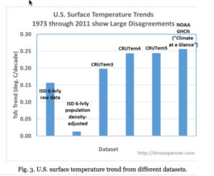
The first chart is Figure 3, from Dr. Roy Spencer’s evaluation of the heat island effect.
It shows that the urban heat island effect has skewed reported temperatures higher than where population density is low. Areas with low population density are representative of the vast majority of land surface areas.
…
Today’s temperatures are not the highest, or second highest, on record: Not for the past one-hundred-fifty years, or for the past 10,0000 years.
by P. Homewood, Feb 27, 2021 in NotaLotofPeopleKnwoThat
One of the most common arguments climate alarmists make is that rate of sea-level rise is “accelerating” or rising faster every year.
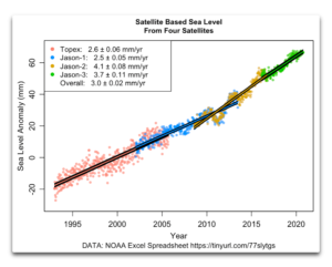
Sea-level data reported from satellites indicate seas are rising approximately of 3.3 mm/year (See Figure 1). By contrast, tidal stations have recorded a rise of approximately 1 to 2 mm annually, a rate which is little changed over the century or so for which we have adequate records. Indeed, as reported in Climate at a Glance: Sea Level Rise, the oldest tide gauge in the USA, in New York City, shows no acceleration at all going back to 1850.
Why the large difference?
The answer it turns out is simple. When NASA and NOAA launched new satellites, the data they produced wasn’t the same as the data recorded by earlier satellites.
…
Figure 2. NOAA sea level data, showing the trend of each of the full individual satellite records and the overall trend. SOURCE: NOAA Excel Spreadsheet
For more than a decade now, I’ve been wondering about a couple of questions.
First, why does the satellite-based sea-level data show that the sea level is rising so much faster than the rise measured at tidal stations on the coastlines around the world? Records from tidal stations show a rise on the order of a couple of mm per year, a rate which is little changed over the century or so for which we have adequate records. But the satellite record (Figure 1) shows a rise of 3.3 mm/year. Why the large difference?
Second, why does the satellite-based sea-level show such significant acceleration? As mentioned above, the sea-level records from tidal stations, which are much longer, show little or no acceleration. But the satellite record claims that the rate of sea-level rise is increasing by about a tenth of an mm per year. That amount of acceleration would double the rate of sea-level rise in about thirty years. Again, why the large difference?
To start with, here’s what the satellite data says, according to the University of Colorado Sea Level Research Group.
For centuries, humans have looked to space and the stars for answers. The fascination is more than philosophical—it’s coupled with the need to solve problems here on Earth.
Today, there are seemingly countless benefits and applications of space technology. Satellites, for instance, are becoming critical for everything from internet connectivity and precision agriculture, to border security and archaeological study.
Space is Open for Business
Right now, there are nearly 6,000 satellites circling our tiny planet. About 60% of those are defunct satellites—space junk—and roughly 40% are operational.
As highlighted in the chart above, The Union of Concerned Scientists (UCS), determined that 2,666 operational satellites circled the globe in April of 2020.
Over the coming decade, it’s estimated by Euroconsult that 990 satellites will be launched every year. This means that by 2028, there could be 15,000 satellites in orbit.
The Atlas provides a better understanding of the consequences climate change and human actions have for the planet’s surface water resources.
It is impossible to overstate the critical importance of water in our daily lives. Surface water bodies – including lakes, ponds and rivers – are particularly important as sources of water for domestic, industrial and agricultural use.
As the Earth’s surface water is intensely dynamic, our knowledge about where waterbodies can be found has not always been accurate. Waterbodies move, whole lakes dry up and new rivers and lakes form, which makes mapping these moving targets difficult.
Building on a project that combined thousands of years of computer time with millions of satellite images, the JRC’s Atlas of Global Surface Water Dynamics describes the important role that surface water plays for our planet’s climate and biodiversity, as well as virtually every aspect of our daily lives.
The Atlas documents the science behind a set of truly unique maps, which include time, and illustrates the changes in surface water resources over the past 35 years.
The scientists believe that the Atlas can improve our understanding of the consequences of climate change and human action on surface water resources, and that clearer understanding can help decision-makers to plan environmental actions and design effective policies aimed at the sustainable management of surface water resources.
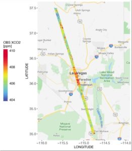
CO2 measurements from OCO-2 in parts per million over Las Vegas on Feb. 8, 2018. Credit: Dien Wu/University of Utah
A new NASA/university study of carbon dioxide emissions for 20 major cities around the world provides the first direct, satellite-based evidence that as a city’s population density increases, the carbon dioxide it emits per person declines, with some notable exceptions. The study also demonstrates how satellite measurements of this powerful greenhouse gas can give fast-growing cities new tools to track carbon dioxide emissions and assess the impact of policy changes and infrastructure improvements on their energy efficiency.
Cities account for more than 70% of global carbon dioxide emissions associated with energy production, and rapid, ongoing urbanization is increasing their number and size. But some densely populated cities emit more carbon dioxide per capita than others.
To better understand why, atmospheric scientists Dien Wu and John Lin of the University of Utah in Salt Lake City teamed with colleagues at NASA’s Goddard Space Flight Center in Greenbelt, Maryland and the University of Michigan in Ann Arbor. They calculated per capita carbon dioxide emissions for 20 urban areas on several continents using recently available carbon dioxide estimates from NASA’s Orbiting Carbon Observatory-2 (OCO-2) satellite, managed by the agency’s Jet Propulsion Laboratory in Pasadena, California. Cities spanning a range of population densities were selected based on the quality and quantity of OCO-2 data available for them. Cities with minimal vegetation were preferred because plants can absorb and emit carbon dioxide, complicating the interpretation of the measurements. Two U.S. cities were included–Las Vegas and Phoenix.
by Jean N., 3 janvier 2020 in ScienceClimatEnergie
…
…
3. Conclusions
• Depuis plus de 40 ans que des mesures de température sont effectuées par satellite, la basse et la moyenne troposphère se réchauffent bel et bien. Mais sans aucune accélération visible, et ce à des vitesses de l’ordre de +0.13°C/décade et +0.09°C/décade. La vitesse de réchauffement décroit donc avec l’altitude.
• La zone correspondant à la tropopause (vers 10 km d’altitude) ne se réchauffe pas, contrairement à ce que les modèles informatiques prédisent (pour plus de détails voir les articles de J. Christy). Peut-on alors continuer à utiliser ces modèles pour prédire la température de certaines couches atmosphériques dans le futur? Notons ici que les observations satellitaires sont confirmées par des observations réalisées in situ avec des ballons-sondes.
• La basse stratosphère se refroidit actuellement à la vitesse d’environ –0.29°C par décade, et l’analyse de corrélation menée par Varotsos et Efstathiou nous suggère que le comportement de la stratosphère n’est pas simplement lié à celui de la troposphère, les choses étant plus complexes.
• Les modèles climatiques actuels, basés sur l’hypothèse d’un l’effet de serre radiatif causé essentiellement par du CO2 atmosphérique, sont donc à revoir. Le CO2 (naturel ou d’origine anthropique) pourrait donc n’avoir qu’un rôle mineur et imperceptible sur la température de la troposphère.
En conclusion générale, nous devons toujours garder à l’esprit que le système climatique est très complexe car il est composé de cinq sous-systèmes (atmosphère, cryosphère, hydrosphère, biosphère et lithosphère) et que ces 5 sous-systèmes interagissent les uns avec les autres dans l’espace et le temps avec des processus principalement non linéaires (Lovejoy et Varotsos, 2016) et se comportent de manière chaotique (voir ici). Par conséquent, la modification d’un seul paramètre dans l’un des sous-systèmes (par exemple, la température de la basse troposphère) ne permet pas de prévoir un changement climatique à long terme, car tous les autres paramètres de l’atmosphère mais aussi ceux des autres sous-systèmes (connus et mesurables, ou non) ne sont pas nécessairement connus et stables. En plus de tout cela plusieurs facteurs externes, imparfaitement connus, peuvent influencer chacun des sous-systèmes, comme les rayonnements cosmiques ou les variations du champ magnétique solaire.
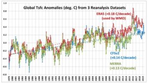
As a followup to my post about whether July 2019 was the warmest July on record (globally-averaged), I’ve been comparing reanalysis datasets since 1979. It appears that the ERA5 reanalysis upon which WMO record temperature pronouncements are made might have a problem, with spurious warmth in recent years.
Here’s a comparison of the global-average surface air temperature variations from three reanalysis datasets: ERA5 (ECMWF), CFSv2 (NOAA/NCEP), and MERRA (NASA/GSFC). Note that only CFSv2 covers the full period, January 1979 to July 2019:
ERA5 has a substantially warmer trend than the other two. By differencing ERA5 with the other datasets we can see that there are some systematic changes that occur in ERA5, especially around 2009-2010, as well as after 1998:
That’s an indication of the personal bias of co-author Schmidt, who in the past has repeatedly maligned the UAH dataset and its authors because their findings didn’t agree with his own GISTEMP dataset.
In fact, Schmidt’s bias was so strong that when invited to appear on national television to discuss warming trends, in a fit of spite, he refused to appear at the same time as the co-author of the UAH dataset, Dr. Roy Spencer.
A breakdown of several climate datasets, appearing below in degrees centigrade per decade, indicates there are significant discrepancies in estimated climate trends:
AIRS: +0.24 (from the 2019 Susskind et al. study)
GISTEMP: +0.22
ECMWF: +0.20
RSS LT: +0.20
Cowtan & Way: +0.19
UAH LT: +0.18
HadCRUT4: +0.17
Which climate dataset is the right one? Interestingly, the HadCRUT4 dataset, which is managed by a team in the United Kingdom, uses most of the same data GISTEMP uses from the National Oceanic and Atmospheric Administration’s Global Historical Climate Network.
Newly published data gathered by NASA’s AIRS satellite confirm the Earth is warming more slowly than has been forecast by climate activists and the United Nations Intergovernmental Panel on Climate Change (IPCC). Data gathered from 2003 through 2017 confirm temperatures remained essentially flat from 2003 through 2015, finally rising briefly as a strong El Nino formed in 2015 and lasted into 2016 (https://ggweather.com/enso/oni.htm). Even with El Nino adding an illusory warming spike at the end of the period, temperatures still rose just over 0.2 degrees during the 15-year period. That pace works out to less than 1.5 degrees of warming per century.
IPCC initial forecasts called for 0.3 degrees Celsius of warming per decade, while skeptic forecasts have tended to hover around 0.1 degrees. As temperatures warmed more slowly than IPCC predicted, IPCC reduced its forecasts to meet skeptics in the middle, moving to a predicted 0.2 degrees warming per decade. Even so, the newly published data indicate IPCC continues to forecast more warming than real-world data indicate.
This post has two related parts. The first has to do with the recently published study of AIRS satellite-based surface skin temperature trends. The second is our response to a rather nasty Twitter comment maligning our UAH global temperature dataset that was a response to that study.
…
Furthermore, that period (January 2003 through December 2017) shows significant warming even in our UAH lower tropospheric temperature (LT) data, with a trend 0.01 warmer than the “gold standard” HadCRUT4 surface temperature dataset (all deg. C/decade):
I’m pretty sure the Susskind et al. paper was meant to prop up Gavin Schmidt’s GISTEMP dataset, which generally shows greater warming trends than the HadCRUT4 dataset that the IPCC tends to favor more. It remains to be seen whether the AIRS skin temperature dataset, with its “clear sky bias”, will be accepted as a way to monitor global temperature trends into the future.
Ben Santer et al. have a new paper out in Nature Climate Change arguing that with 40 years of satellite data available they can detect the anthropogenic influence in the mid-troposphere at a 5-sigma level of confidence. This, they point out, is the “gold standard” of proof in particle physics, even invoking for comparison the Higgs boson discovery in their Supplementary information.
…
…
Conclusion
The fact that in my example the t-statistic on anthro falls to a low level does not “prove” that anthropogenic forcing has no effect on tropospheric temperatures. It does show that in the framework of my model the effects are not statistically significant. If you think the model is correctly-specified and the data set is appropriate you will have reason to accept the result, at least provisionally. If you have reason to doubt the correctness of the specification then you are not obliged to accept the result.
This is the nature of evidence from statistical modeling: it is contingent on the specification and assumptions. In my view the second regression is a more valid specification than the first one, so faced with a choice between the two, the second set of results is more valid. But there may be other, more valid specifications that yield different results.
In the same way, since I have reason to doubt the validity of the Santer et al. model I don’t accept their conclusions. They haven’t shown what they say they showed. In particular they have not identified a unique anthropogenic fingerprint, or provided a credible control for natural variability over the sample period. Nor have they justified the use of Gaussian p-values. Their claim to have attained a “gold standard” of proof are unwarranted, in part because statistical modeling can never do that, and in part because of the specific problems in their model.
by JC Maurin, 22 février 2019 in ScienceCimatEnergie
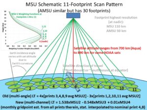
Afin d’élaborer les indicateurs de température, on utilise des radiomètres MSU, AMSU ou ATMS embarqués sur des satellites, puis on construit l’indicateur à partir des mesures et de diverses corrections. On obtient ainsi un indicateur qui concerne la quasi-totalité du globe, contrairement aux indicateurs terrestres basés essentiellement (avant 1980) sur quelques milliers de stations américaines et européennes. Au sujet des mesures par satellites, et sans être spécialiste dans ce domaine, un physicien peut néanmoins donner quelques éléments d’appréciation qu’ignore parfois un lecteur intéressé par la climatologie. Le but de la seconde partie de l’article sera atteint si ce lecteur a appris des éléments nouveaux, il pourra ensuite approfondir la question par lui-même.
by J.C. Maurin, 8 février 2019, in ScienceClimatEnergie
A partir des notions intuitives de chaleur et température, les physiciens (Carnot, Thomson, Clausius, Maxwell, Boltzmann) arrivèrent progressivement à la notion scientifique de température thermodynamique. La Conférence Générale des Poids et Mesures adopta en 1927 l’échelle thermodynamique proposée en 1911, puis l’unité kelvin en 1954.
La notion de température thermodynamique nécessite que l’équilibre thermique soit atteint, ce qui n’est pas le cas dans l’atmosphère de la Terre. Il n’existe pas une « température thermodynamique de l’atmosphère ». A défaut, on utilise une « moyenne des températures » mesurées en divers points de l’atmosphère. Mais la température thermodynamique étant une grandeur intensive, une moyenne, quelle que soit son élaboration, ne peut jouer qu’un rôle d’indicateur. L’usage est néanmoins d’utiliser le kelvin pour les indicateurs. On exprimera de préférence les variations des indicateurs sous forme relative. L’indicateur va être dépendant de l’échantillonnage (spatial et temporel) des mesures et surtout de son mode d’élaboration.
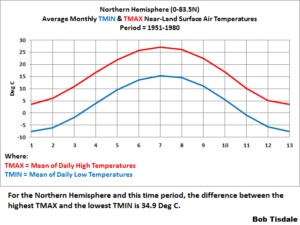
In this post, we’re going to present monthly TMIN and TMAX Near-Land Surface Air Temperature data for the Northern and Southern Hemispheres (not in anomaly form) in an effort to add a little perspective to global warming. And at the end of this post, I’m asking for your assistance in preparing a post especially for you, the visitors to this wonderful blog WattsUpWithThat.
INTRODUCTION FOR THE “GLOBAL WARMING IN PERSPECTIVE” SERIES
A small group of international unelected bureaucrats who serve the United Nations now wants to limit the rise of global land+ocean surface temperatures to no more 1.5 deg C from pre-industrial times…even though we’ve already seen about 1.0 deg C of global warming since then. So we’re going to put that 1.0 deg C change in global surface temperatures in perspective by examining the ranges of surface temperatures “we’ve been used to” on our lovely shared home Earth.
We have looked at quality, long term records from three different regions. Two of these are on opposite sides of the North Atlantic, one is in the South Pacific. The two regions bordered by the North Atlantic are similar, but not identical. The record from Australia is only similar in that temperature has varied over time and has warmed in the recent past.
In all three regions there is no evidence of any strong correlation to CO2. There is ample evidence to support a conjecture of little to no influence.
There is ample evidence, widely shown in other studies, of localized influence due to development and population growth. The CET record has a correlation of temperature to CO2 of 0.54, which is the highest correlation of any individual record in this study. This area is also the most highly developed. While this does not constitute proof, it does tend to support the supposition the weak CO2 signal is enhanced by a coincidence between rising CO2 and rising development and population.
The efficacy of combining US records with those records from Greenland, Iceland, and the UK may be subject to opinion. However, there is little doubt combining records from Australia would create an extremely misleading record. Like averaging a sine curve and a cosine curve.
It appears the GISS data set does a poor job of estimating the history of temperature in all three regions. It shows a near perfect correlation to CO2 levels which is simply not reflected in any of the individual or regional records. There are probably numerous reasons for this. I would conjecture the reasons would include the influence of short-term temperature record bias, development and population growth bias, and data estimation bias. However, a major source of error could be attributed to the simple mistake of averaging regions where the records simply are too dissimilar for an average to yield useful information.
The Intergovernmental Panel on Climate Change Assessment Report 5 (IPCC AR5, 2013) discussed bulk atmospheric temperatures as indicators of climate variability and change. We examine four satellite datasets producing bulk tropospheric temperatures, based on microwave sounding units (MSUs), all updated since IPCC AR5. All datasets produce high correlations of anomalies versus independent observations from radiosondes (balloons), but differ somewhat in the metric of most interest, the linear trend beginning in 1979. The trend is an indicator of the response of the climate system to rising greenhouse gas concentrations and other forcings, and so is critical to understanding the climate. The satellite results indicate a range of near-global (+0.07 to +0.13°C decade−1) and tropical (+0.08 to +0.17°C decade−1) trends (1979–2016), and suggestions are presented to account for these differences. We show evidence that MSUs on National Oceanic and Atmospheric Administration’s satellites (NOAA-12 and −14, 1990–2001+) contain spurious warming, especially noticeable in three of the four satellite datasets.
Comparisons with radiosonde datasets independently adjusted for inhomogeneities and Reanalyses suggest the actual tropical (20°S-20°N) trend is +0.10 ± 0.03°C decade−1. This tropical result is over a factor of two less than the trend projected from the average of the IPCC climate model simulations for this same period (+0.27°C decade−1).
This post is a coarse screening assessment of HadCRUT4 global temperature anomalies to determine the impact, if any, of data quality and data coverage. There has been much discussion on WUWT about the quality of the Hadley temperature anomaly dataset since McLean’s Audit of the HadCRUT4Global Temperature publication which is paywalled. I purchased a copy to see what all the hub-bub was about, and it is well worth the $8 in my view. Anthony Watts’ review of McLean’s findings and executive summary can be found here.
A key chart for critical study is McLean’s Figure 4.11 in his report. McLean suggests that HadCRUT4 data prior to 1950 is unreliable due to inadequate global coverage and high month-to-month temperature variability. For this post, I subdivided McLean’s findings into three groups shown with added shading: Good data which covers the years post-1950. During this period global data coverage is excellent at greater than 75% and month-to-month temperature variation is low. Questionable data occurs from 1880 to 1950. During this period global data coverage ranged from 40% to 70% with higher monthly temperature variations. Poor data is pre-1880 when global coverage ranged from 14 to 25% with extreme monthly temperature variations.
A new paper documents “remarkably different” land temperatures from one instrumental data set to another. In some regions there is as much as an 0.8°C conflict in recorded temperature anomalies for CRU, NASA, BEST, and NOAA. The relative temperature trend differences can reach 90% when comparing instrumental records. Consequently, the uncertainty in instrumental temperature trends — “0.097–0.305°C per decade for recent decades (i.e., 1981–2017)” — is as large or larger than the alleged overall warming trend itself for this period.
95% of the model runs predicted more warming than the RSS data since 1988… And this is the Mears-ized RSS data, the one in which the measurements were influenced to obtain key information (erase the pause and more closely match the surface data).
Their “small discrepancy” would be abject failure in the oil & gas industry.
The observed warming has been less than that expected in a strong mitigation scenario (RCP4.5).
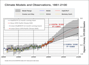
Output of 38 RCP4.5 models vs observations. The graph is originally from Carbon Brief. I updated it with HadCRUT4, shifted to 1970-2000 baseline, to demonstrate the post-El Niño divergence.
These results come from the SABER instrument onboard NASA’s TIMED satellite. SABER monitors infrared emissions from carbon dioxide (CO2) and nitric oxide (NO), two substances that play a key role in the energy balance of air 100 to 300 kilometers above our planet’s surface. By measuring the infrared glow of these molecules, SABER can assess the thermal state of gas at the very top of the atmosphere–a layer researchers call “the thermosphere.”
When the thermosphere cools, it shrinks, literally decreasing the radius of Earth’s atmosphere. This shrinkage decreases aerodynamic drag on satellites in low-Earth orbit, extending their lifetimes. That’s the good news. The bad news is, it also delays the natural decay of space junk, resulting in a more cluttered environment around Earth.
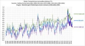
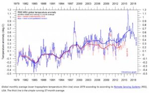
Temperatures can be measured from the ground and from satellites. Satellite data have two versions, UAH and RSS. The version of UAH (University of Alabama, Huntsville) makes a solid impression. The RSS version shows larger deviations and suggests a stronger warming.
How come?
Doping the data
Both datasets surely get their data from similar satellites. The explanation lies in a “post-processing” of the measured values by the RSS group. In the chart below you can see the old version in red.
Global temperature based on RSS satellite measurements. From Climate4You Newsletter June 2018.
Assuming that the uncertainty in GIA adjustments are ‘in the noise’ of global sea level rise may not be entirely justified. The adjustments to the satellite data that emerged in the discussion between Morner and Nerem do not inspire confidence in the estimate of sea level rise from satellite data, and the low level of stated uncertainty strains credulity.


