New research yields old result: Climate warming slow, steady. Observed value is half that of CMIP5 climate models.
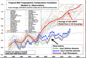
The rate at which Earth’s atmosphere is warming has not significantly accelerated over the past 23 years, according to research at The University of Alabama in Huntsville (UAH).
If you take away the transient cooling in 1983 and 1992 caused by two major volcanic eruptions in the preceding years, the remaining underlying warming trend in the bottom eight kilometers (almost five miles) of the atmosphere was 0.096 C (about 0.17° Fahrenheit) per decade between January 1979 and June 2017.
That was unexpectedly close to the 0.09 C warming trend found when similar research was published in 1994 with only 15 years of data, said Dr. John Christy, director of UAH’s Earth System Science Center.
by P. Homewood, November 28, 2017 in NotaLotofpeopleKnowThat
We are all too familiar with graphs showing how much global temperatures have risen since the 19thC.
The HADCRUT version above is typical, and also very precise, with fairly tight error bars even in the early part of the record.
One wonders where they got the data to work all this out, because it certainly could not have come from thermometers.
All of the major global temperature datasets rely heavily on the Global Historical Climatology Network (GHCN). Yet as the “Overview of the Global Historical Climatology Network-Daily Database”, published by Matthew Menne et al in 2012, rather inconveniently showed, most of the world had little or no temperature data in the 19thC, and even up to 1950.
The statistical association between temperature and greenhouse gases over glacial cycles is well documented, but causality behind this correlation remains difficult to extract directly from the data.
We show that such variable time lags are typical for complex nonlinear systems such as the climate, prohibiting straightforward use of correlation lags to infer causation.
Figure 1 shows one example of data derived from such proxy sources. The top panel of the figure shows a declining temperature trend over the 8,000-year period from the Holocene Climate Optimum to the modern warm period (left-hand scale). It also shows that this location experienced numerous cycles of warming and cooling that involved temperature changes of the order of two degrees Celsius.
by Steve Penn, November 22, 2017 in ClimateChangeDispatch
(…) It seemed obvious to me that there was a climate change problem. I heard about it—and read about it—every day in the news. Eventually, I started to study the issue, thinking that I needed to understand it better to write informed articles on the subject (…)
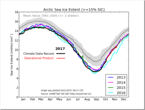
Rapid expansion of the Arctic sea ice cover is the norm for October as solar input dwindles and the remaining heat in the upper ocean is released upwards, warming the lower atmosphere and escaping to space. Because of late season growth, the seasonal Antarctic maximum we previously reported as occurring on September 15 was exceeded, with a new maximum set on October 11 and 12. This is the second-lowest and second-latest seasonal maximum extent in the satellite record.
(…) However, as so often, the supposed “hockey stick” appeared only after the data had been severely adjusted. The difference is shown at the figure at right. Unadjusted (raw) relative sea level (i.e. how sea level appears locally – the concern of state planners and policy-makers) in North Carolina increased steadily through the last two millennia, with somewhat of an upward inflection in the 19th century; it is only after heavy adjustment that a HS shape appears.
by Paul Homewood, November 25, 2017 in NotaLotofPeopleKnowThat
“Science” is not a set of facts but a process or method that sets out a way for us to discover information and which attempts to determine the level of confidence we might have in that information. In the method, a “claim” or “hypothesis” is stated such that rigorous tests might be employed to test the claim to determine its credibility. If the claim fails a test, the claim is rejected or modified then tested again.
Let’s face it, global surface temperature histories measured by thermometers are a mess. Recording stations come on-and offline seemingly at random. The time of day when the high and low temperatures for the previous 24 hours are recorded varies, often changing at the same station. Local conditions can bias temperatures. And the “urban heat island” can artificially warm readings with population levels as low as 2500. Neighboring reporting stations can diverge significantly from each other.
According to the most basic precepts of anthropogenic global warming (AGW), variations in CO2 concentrations exert significant control on sea surface temperatures, glaciers, sea levels, and generalized climate dynamics (i.e., precipitation patterns).
In particular, high CO2 concentrations, driven by human activity, are presumed to cause dangerously warming ocean waters, rapid glacier melt and sea level rise, and overall disruption to the Earth’s biosphere.
Newly published scientific papers wholly undermine this popularized conceptualization.
In fact, according to Bertrand et al. (2017), there has been a “marked cooling” of sea surface temperatures in the southernmost South America region during the last ~800 years — 3°C to 4°C colder than during the Medieval and Roman warm periods — that has continued unabated into “the most recent decades”.
by P. Homewood, November 21, 2017 in NotaLotofPeopleKnowThat
A year ago the media was full of fake Arctic heatwave news (…)
And a year later?
Arctic sea ice extent this October was the third highest since 2006, and continues to track recent years. Most of the Arctic basin is full of 2 meter+ thick ice, in stark contrast to 2008.
An international team of scientists, led by British Antarctic Survey (BAS), has produced a new map showing how much heat from the Earth’s interior is reaching the base of the Antarctic Ice Sheet. The map is part of a new paper accepted for publication in Geophysical Research Letters, a journal of the American Geophysical Union.
The team has produced the most up to date, accurate and high-resolution map of the so called ‘geothermal heat flux’ at the base of the Antarctic Ice Sheet. Of the basic information that shapes and controls ice flow, the most poorly known about is this heat
Stenni et al (2017), Antarctic climate variability on regional and continental scales over the last 2000 years, was published pdf this week by Climate of the Past. It includes (multiple variations) of a new Antarctic temperature reconstruction, in which 112 d18O and dD isotope series are combined into regional and continental reconstructions.
After a peak in 2012 the level went down by about 10 cm by mid 2017. It is very much related to natural variations, in sync with the El Ninos (low levels) and La Ninas (high levels).
So what remains of the climate change horror stories in connection to the Fiji Islands? (…)
(…) What does this all mean? Are models consistent with observations or not? Up to the recent very large El Nino, it seemed that even climate scientists were on the verge of conceding that models were running too hot, but the El Nino has given them a reprieve. After the very large 1998 El Nino, there was about 15 years of apparent “pause”. Will there be a similar pattern after the very large 2017 El Nino?
We are witnessing a holy alliance between Third World ecologists and big finance, orchestrated by the European Union, under the amused gaze of the American giant who has now taken leave of all this masquerade.
Sometimes you have to wonder which are the biggest fraud: Germany’s claim that its cars are clean, or its claim of being a leader in climate protection. Both, it turns out, are very fake and even downright frauds.
While German Chancellor Angela Merkel and German activists like going around and scolding Donald Trump for his “irresponsible” stance on “greenhouse” gas emissions, it is coming to light that Germany’s climate posturing is indeed a total swindle.
A new paper by renowned Swedish sea level expert Prof. Axel Mörmer published in the International Journal of Earth & Environmental Sciences dumps lots of cold water on the premise that today’s sea level rise is caused by man and is unusual.
Mörner’s paper looks back at the last 500 years of sea level rise and shows that natural variables are the major drivers, and not man-made CO2-driven global warming.
This is quite interesting. Remember the claim in on the front cover of Nature in 2009 by Steig and Mann that Antarctica was warming, thanks to that “special Mannian PCA math sauce” that was applied to air temperature data to smear surface temperature trends over the entire continent? It was dashed by climate skeptics who wrote a paper. It was accepted for publication and disproved (in my opinion) by a team of credible skeptics that wrote a counter-paper. But, there’s an interesting twist thanks to new and surprising data; Steig and Mann may have captured surface air temperature trends in the exact same areas that have been identified as geothermal hot spots.
While the effects of climate change on tree growth in forests have been extensively studied, there is little information available so far for urban trees”, said Professor Hans Pretzsch from the Chair for Forest Growth and Yield Science at TUM. The study supported by the Bavarian State Ministry for Environment and Consumer Protection as well as by the Audi Foundation for the Environment, which was published in the journal Scientific Reports, for the first time systematically examined the growth of urban trees worldwide for trends resulting from changing environmental conditions.
(…)The body of evidence however clearly shows that the climate sensitivity is on the low side, about 1 to 1.5 degree increase per CO2 doubling. People in the climate community are scratching their heads trying to understand the so called hiatus in the warming. Where is the heat hiding? While in reality it simply points to a low sensitivity.