
by Bob Tisdale, December 13, 2018 in WUWT
This post comes a couple of weeks after the post EXAMPLES OF HOW AND WHY THE USE OF A “CLIMATE MODEL MEAN” AND THE USE OF ANOMALIES CAN BE MISLEADING(The WattsUpWithThat cross post is here.)
INTRO
I was preparing a post using Berkeley Earth Near-Surface Land Air Temperature data that included the highest-annual TMAX temperatures (not anomalies) for China…you know, the country with the highest population here on our wonder-filled planet Earth. The graph was for the period of 1900 to 2012 (FYI, 2012 is the last full year of the local TMAX and TMIN data from Berkeley Earth). Berkeley Earth’s China data can be found here, with the China TMAX data here. For a more-detailed explanation, referring to Figure 1, I was extracting the highest peak values for every year of the TMAX Data for China, but I hadn’t yet plotted the graph in Figure 1, so I had no idea what I was about to see.
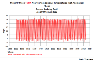
Figure 1 The results are presented in Figure 2, and they were a little surprising, to say the least.
…