by H.S. Burnett, Jul 1, 2022 in WUWT
…
Pielke notes five points of fact about hurricanes:
- The Intergovernmental Panel on Climate Change (IPCC) finds “no consensus” on the relative role of human influences on Atlantic hurricane activity, quoting the IPCC as follows: “there is still no consensus on the relative magnitude of human and natural influences on past changes in Atlantic hurricane activity, … and it remains uncertain whether past changes in Atlantic TC activity are outside the range of natural variability.”
- “The IPCC has concluded that since 1900 there is ‘no trend in the frequency of USA landfall events.’ This goes for all hurricanes and also for the strongest hurricanes, called major hurricanes.”
- “Since at least 1980, there are no clear trends in overall global hurricane and major hurricane activity.”
- “There are many characteristics of tropical cyclones that are under study and hypothesized to be potentially affected by human influences, … but at present there is not a unified community consensus on these hypotheses, as summarized by the World Meteorological Organization,” as to whether any of the factors are affected by human greenhouse gas emissions.
- “Hurricanes are common, incredibly destructive and will always be with us. Even so, we have learned a lot about how to prepare and recover.”
Pielke points out that some of the costliest hurricanes occurred in the early part of the twentieth century when average global temperatures were cooler than at present.
…
by Kip Hansen, August 6, 2019 in WUWT
What we call a graph is more properly referred to as “a graphical representation of data.” One very common form of graphical representation is “a diagram showing the relation between variable quantities, typically of two variables, each measured along one of a pair of axes at right angles.”
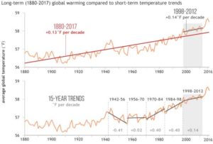
Here at WUWT we see a lot of graphs — all sorts of graphs of a lot of different data sets. Here is a commonly shown graph offered by NOAA taken from a piece at Climate.gov called “Did global warming stop in 1998?” by Rebecca Lindsey published on September 4, 2018.

I am not interested in the details of this graphic representation — the whole thing qualifies as “silliness”. The vertical scale is in degrees Fahrenheit and the entire range change over 140 years shown is on the scale 2.5 °F or about a degree and a half C. The interesting thing about the graph is the effort of drawing of “trend lines” on top of the data to convey to the reader something about the data that the author of the graphic representation wants to communicate. This “something” is an opinion — it is always an opinion — it is not part of the data.
The data is the data. Turning the data into a graphical representation (all right, I’ll just use “graph” from here on….), making the data into a graph has already injected opinion and personal judgement into the data through choice of start and end dates, vertical and horizontal scales and, in this case, the shading of a 15-year period at one end. Sometimes the decisions as to vertical and horizontal scale are made by software — not rational humans — causing even further confusion and sometimes gross misrepresentation.
Anyone who cannot see the data clearly in the top graph without the aid of the red trend lineshould find another field of study (or see their optometrist). The bottom graph has been turned into a propaganda statement by the addition of five opinions in the form of mini-trend lines.
…
La géologie, une science plus que passionnante … et diverse

