by Thongchai Thailand, June 27, 2019
THIS POST IS A CRITICAL EXAMINATION OF VARIOUS CLAIMS MADE BY CLIMATE SCIENCE ABOUT THE IMPACT OF CLIMATE CHANGE ON ANTARCTICA AND OF THE EVIDENCE FOR AGW CLAIMED TO BE FOUND IN DATA FROM ANTARCTICA.
IT IS BASED ON THE ANTARCTICA SECTION OF A LECTURE BY JAMES EDWARD KAMIS [LINK]
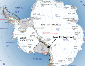
- Antarctica is broken into two pieces. On the west is West Antarctica that constitutes 20% of Antarctica. The upper portion of West Antarctica forms a thumb. It’s called the Antarctic Peninsula. The remaining 80% of Antarctica is called East Antarctica. The right image shows a NASA graph that reflects ice melting on the entire continent from 1995 to 2015. It is here shown as a proxy for ice melting denominated as millimeters of sea level rise due to meltwater. Note that West Antarctica, inclusive of the Antarctic Peninsula, the 20% portion of the continent, accounts for all of the continent’s ice loss. East Antarctica, the much larger 80%, is actually gaining ice. This melt graph was created in 2015 by Dr. H. Jay Zwally is Chief Cryospheric Scientist at NASA’s Goddard Space Flight Center and Project Scientist for the Ice Cloud and Land Elevation Satellite.
- The lopsided melt data raises this question: why is all the melt concentrated in 20% of the continent while the other 80% gains ice? The answer is found in the University of Washington 50-year average surface temperature map. It was generated in 2009 by Dr. Eric Steig – Earth and Space Sciences – University of Washington. It’s validity was hotly debated for many years. However, since that time, it has been proven correct by two more modern studies. NASA’s skin temperature map and British Antarctic Survey’s temperature map.
- The surface temperature map that Dr. Steig made represents the temperature of the upper few meters of ice and sediment and does not reflect the temperature of the atmosphere…
…
…