by Dr Roy Spencer, August 25, 2019 in GlobalWarming
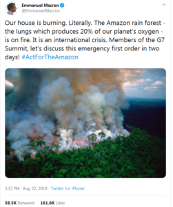
An old mantra of the news business is, “if it bleeds, it leads”. If someone was murdered, it is news. That virtually no one gets murdered is not news. That, by itself, should tell you that the mainstream media cannot be relied upon as an unbiased source of climate change information.
There are lots of self-proclaimed climate experts now. They don’t need a degree in physics or atmospheric science. For credentials, they only need to care and tell others they care. They believe the Earth is being murdered by humans and want the media to spread the word.
Most people do not have the time or educational background to understand the global warming debate, and so defer to the consensus of experts on the subject. The trouble is that no one ever says exactly what the experts agree upon.
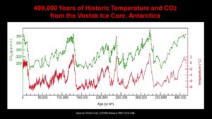
When you dig into the details, what the experts agree upon in their official pronouncements is rather unremarkable. The Earth has warmed a little since the 1950s, a date chosen because before that humans had not produced enough CO2 to really matter. Not enough warming for most people to actually feel, but enough for thermometers to pick up the signal buried in the noise of natural weather swings of many tens of degrees and spurious warming from urbanization effects. The UN consensus is that most of that warming is probably due to increasing atmospheric CO2 from fossil fuel use (but we really don’t know for sure).
For now, I tend to agree with this consensus.
And still I am widely considered a climate denier.
Why? Because I am not willing to exaggerate and make claims that cannot be supported by data.
…
…
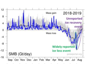
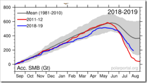
The widely reported Greenland surface melt event around 1 August 2019 (green oval) was then followed by a recovery to normal in the following weeks (purple oval), which was not reported by the media.
…