Melbourne: Australian scientists have developed an innovative method using cores drilled from coral to produce a world first 400-year long seasonal record of El Niño events, a record that many in the field had described as impossible to extract.
The record published today in Nature Geoscience detects different types of El Niño and shows the nature of El Niño events has changed in recent decades.
This understanding of El Niño events is vital because they produce extreme weather across the globe with particularly profound effects on precipitation and temperature extremes in Australia, South East Asia and the Americas.
The 400-year record revealed a clear change in El Niño types, with an increase of Central Pacific El Niño activity in the late 20th Century and suggested future changes to the strength of Eastern Pacific El Niños.
“We are seeing more El Niños forming in the central Pacific Ocean in recent decades, which is unusual across the past 400 years,” said lead author Dr Mandy Freund.
“There are even some early hints that the much stronger Eastern Pacific El Niños, like those that occurred in 1997/98 and 2015/16 may be growing in intensity.”
This extraordinary result was teased out of information about past climate from coral cores spanning the Pacific Ocean, as part of Dr Freund’s PhD research at the University of Melbourne and the Centre of Excellence for Climate Extremes. It was made possible because coral cores – like tree rings – have centuries-long growth patterns and contain isotopes that can tell us a lot about the climate of the past. However, until now, they had not been used to detect the different types of El Niño events.
If we speak of an average of the last 23 cycles in the months of the minimum, our only significant energy source at the center of the solar system was below average active last month as well.
The sunspot number (SSN) was 9.1, which was thus only 42% of the average of the cycles for month no. 125. Some cycles (No. 21, 18, 16, 15, 8 ) were already completed in month no. 125.
Fig. 1: The monthly sunspot activity of the current solar cycle (SC 24) since December 2008 (red) compared to the mean value of all previously systematically observed cycles since the beginning of SC 1 in March 1755 (blue) and the very similar SC 5 (black).
Figure 1 clearly shows that the latest cycle was quite below-normal, especially at the beginning and after the second peak which had an SSN of over 140 towards the end. Since February 2014 (the maximum of the entire cycle 24 with SSN = 146 in cycle month 63), it only reached 2/3 of the average activity.
What are the effects? The total radiation (TSI for total solar irradiance) is only moderately influenced:
UNITED NATIONS (AP) _ A senior U.N. environmental official says entire nations could be wiped off the face of the Earth by rising sea levels if the global warming trend is not reversed by the year 2000.
Coastal flooding and crop failures would create an exodus of ″eco- refugees,′ ′ threatening political chaos, said Noel Brown, director of the New York office of the U.N. Environment Program, or UNEP.
He said governments have a 10-year window of opportunity to solve the greenhouse effect before it goes beyond human control.
As the warming melts polar icecaps, ocean levels will rise by up to three feet, enough to cover the Maldives and other flat island nations, Brown told The Associated Press in an interview on Wednesday.
by P. Homewood, May 6, 2019 in NotaLotofPeopleKnowThat
This study aims to estimate the affect of urbanisation on daily maximum and minimum temperatures in the United Kingdom. Urban fractions were calculated for 10 km × 10 km areas surrounding meteorological weather stations. Using robust regression a linear relationship between urban fraction and temperature difference between station measurements and ERA‐Interim reanalysis temperatures was estimated. For an urban fraction of 1.0, the daily minimum 2‐m temperature was estimated to increase by 1.90 ± 0.88 K while the daily maximum temperature was not significantly affected by urbanisation. This result was then applied to the whole United Kingdom with a maximum T min urban heat island intensity (UHII) of about 1.7K in London and with many UK cities having T min UHIIs above one degree.
This paper finds through the method of observation minus reanalysis that urbanisation has significantly increased the daily minimum 2‐m temperature in the United Kingdom by up to 1.70 K.
As ever, the real issue with UHI is the change in the effect over time. Has, for instance, the effect of UHI increased in London and other cities increased over the last century, or was it just as great in 1919?
What we do know is that, generally speaking, towns and cities have both expanded over time, and seen increasing development in terms of roads, buildings, traffic and economic activity.
Indeed, these same tendencies also apply in small towns and what may appear to be relatively rural sites.
We also know that many of the sites used by the Met Office in their UK temperature series are urban and airport locations.
Mayor unveils plan aiming for 100% zero-emissions vehicles by 2050 amid sweeping climate package for the city
Los Angeles’ car-choked arteries will run clean within decades, according to a green reform package unveiled by mayor Eric Garcetti on Monday.
Speaking only a week after New York City mayor Bill de Blasio announced his own framework climate legislation, Garcetti presented plans to revolutionise local car culture and green the city’s buildings, which together account for three-quarters of LA’s emissions.
“Los Angeles needs to lead, but the whole world needs to act. This plan gives us a fighting chance,” Garcetti told the Los Angeles Times. “It’s sort of a ‘greenprint’ for every other city in the country and the world, hopefully.”
The legislation, which builds upon a previous 2015 sustainability plan, calls on the city to hike its percentage of zero emission vehicles from 1.4% in 2018 to 25% by 2025, 80% by 2035 and 100% by 2050. To do this, the City Town Hall intends to raise its number of publicly available electric-vehicle chargers from 2,100 to 28,000.
Climate alarmists often accuse skeptics, like myself and independent groups like the Committee For A Constructive Tomorrow and Heartland Institute, of being in the pay of Big Oil. This is completely false – the Big Lie repeated so often that people eventually believe it. We do not receive even a dime from Big Oil. It’s part of the green fairy tale that skepticism exists only because the oil companies are funding it.
For the record, none of us skeptics – climate realists – doubt or deny climate change. We all recognize that Earth’s climate is in nearly constant turmoil and fluctuation, locally, regionally or globally.
What we question is assertions that emissions from fossil fuel use have somehow replaced the sun and other powerful natural forces that have driven beneficial, benign, harmful or even hugely destructive climate changes throughout Earth and human history:
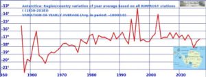
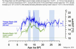
Changes such as at least five glacial periods that buried much of North America, Europe and Asia under mile-high rivers of ice, warm periods in between that melted those massive glaciers, Roman and Medieval Warm Periods, a Little Ice Age, the century-long Anasazi and Mayan droughts, the Dust Bowl, and countless other major and minor climate and weather changes.
The standard refrain is that ExxonMobil gave a cumulative few million dollars to various skeptical groups prior to 2007. But that was many years ago. They got scared off by alarmist pressure groups and haven’t given climate realists a dime since then. In fact, the situation today is completely the opposite.
Big Oil companies now give at least a billion dollars a year to climate alarmists, projects and lobbying, to drive the Manmade Climate Chaos narrative. Why would they do that? Two reasons come to mind.
Newly published data gathered by NASA’s AIRS satellite confirm the Earth is warming more slowly than has been forecast by climate activists and the United Nations Intergovernmental Panel on Climate Change (IPCC). Data gathered from 2003 through 2017 confirm temperatures remained essentially flat from 2003 through 2015, finally rising briefly as a strong El Nino formed in 2015 and lasted into 2016 (https://ggweather.com/enso/oni.htm). Even with El Nino adding an illusory warming spike at the end of the period, temperatures still rose just over 0.2 degrees during the 15-year period. That pace works out to less than 1.5 degrees of warming per century.
IPCC initial forecasts called for 0.3 degrees Celsius of warming per decade, while skeptic forecasts have tended to hover around 0.1 degrees. As temperatures warmed more slowly than IPCC predicted, IPCC reduced its forecasts to meet skeptics in the middle, moving to a predicted 0.2 degrees warming per decade. Even so, the newly published data indicate IPCC continues to forecast more warming than real-world data indicate.
I’ve been saying for years that surface temperature measurements (and long term trends) have been affected by encroachment of urbanization on the placement of weather stations used to measure surface air temperature, and track long term climate. In doing so we found some hilariously bad examples of climate science in action, such as the official USHCN climate monitoring station at the University of Arizona, Tucson:
USHCN weather station in a parking lot. University of Arizona, Tucson
I have published on the topic in the scientific literature, and found this to be true based on the science we’ve done of examining the USHCN and applying the siting methodology of Leroy 2010.
In Fall et al, 2011 we discovered that there was a change to the diurnal temperature range (DTR). It decreased where stations had been encroached upon, because of the heat sink effect of man-made materials (asphalt, concrete, bricks, etc.) that were near stations.
Tree-ring evidence reveals recent cooling and glacier thickening in Central Asia as well as flat temperatures throughout the last 432 years.
Tree rings were the proxy used by Dr. Michael Mann to invent the orignal hockey stick graph.
Twenty years later, yet another reconstruction (1580 to 2012 AD) indicates modern warmth in Central Asia is not unusual in the context of the last 432 years.
In fact, there was a recent cooling period, in line with natural variability, that was accompanied by regional glacier mass gains.
Dans une récente publication[1] de 2019, l’équipe russe de G.A. Zherebtsov présente un mécanisme permettant d’expliquer le réchauffement global. Ce mécanisme, basé sur une série d’observations, ne fait pas intervenir le taux de CO2 atmosphérique mais les rayons cosmiques solaires ainsi que le champ électromagnétique terrestre. Les chercheurs qui ont pensé à ce mécanisme (inconnu du GIEC) font tous partie de l’institut de Physique Terrestre et Solaire de la Branche Sibérienne de l’Académie Russe des Sciences (Irkutsk, Russie). Si le mécanisme de l’équipe de Zherebtsov est correct, on pourrait alors se passer de l’hypothèse de l’effet de serre radiatif qui, comme vous le savez peut-être, pose certains problèmes (voir ici, ici et ici). Le but du présent article est simplement de présenter ce mécanisme et de montrer par la même occasion que la science du climat est loin d’être dite.
1. Observations réalisées le 7 novembre 2004
Les chercheurs russes ont d’abord constaté qu’à certaines latitudes il y a un lien assez fort entre le flux de rayons cosmiques solaires (RCS) et la température de la troposphère. Ceci est par exemple bien visible dans un évènement qui a débuté le 7 novembre 2004 au niveau des hautes latitudes de l’hémisphère nord (55°N-65°N). Ce jour-là, le flux de RCS était particulièrement fort d’environ 3 ordres de grandeur plus élevé par rapport à la normale (Figure 1a). Une tempête géomagnétique s’est ensuite déclarée le jour suivant et a duré au moins 5 jours (il s’agit de fluctuations brusques et intenses du magnétisme terrestre qui proviennent d’une perturbation de l’ionosphère par l’activité solaire). Ceci est bien visible sur le tracé des indices géomagnétiques AE (Figure 1b) et Dst (voir aussi ici), indices obtenus par certaines stations de mesure placées au sol et réparties en divers endroits de la planète (Figure 1c). Il existe de nombreux indices géomagnétiques et il n’est pas nécessaire d’être un spécialiste pour comprendre la suite du présent article. Il faut simplement retenir que le champ magnétique terrestre est perturbé les jours suivant l’arrivée des RCS. Voyons maintenant si tout ceci peut avoir un effet sur la température de la basse troposphère.
…
Figure 4. Diagramme présentant le mécanisme de Zherebtsov. Source : Zherebtsov et al. (2019) J Atm Solar Terrestrial Physics 182:217–222 (traduit de l’anglais).
Réduire le réchauffement global sur Terre de 1,5° ? Dans un récent rapport, le Giec échafaude quatre scénarios pour y parvenir. Mais aucun d’eux ne tient la route.
es quatre scénarios mettent en œuvre à des degrés divers les techniques dites de Carbon Dioxide Removal (CDR), qui compensent les émissions humaines de CO2. Écoutons les experts « scientifiques » du GIEC — dont la plupart ne sont pas scientifiques. Lisons les experts du GIEC :
The recommendation of the Committee on Climate Change (CCC) for a Net Zero emissions target by 2050 is grounded in nothing stronger than irresponsible optimism and arbitrary assumptions about cost and technological feasibility. In point of fact, the technologies seen as necessary, including carbon capture and sequestration (CCS), further expansion of renewable generation, widespread adoption of hydrogen, and the very rapid electrification of the UK’s entire heating and transport systems, are either known failures or are unproven at these scales and would cost two to three times the amounts claimed by the CCC. Attempts to deliver these policies would ultimately fail, but in the attempt the UK would further harm its already declining productivity, and so erode the UK’s ability to compete internationally and thus deliver an acceptable standard of living for its people. This is not a sustainable low emissions strategy, and even if accepted by government is very likely to end only in humiliating and distressed policy correction. A wise government would reject this advice.
The Net Zero target and the recent history of emissions reductions in the UK
The consistent pattern of the IPCC reveals demonization and misrepresentations of CO2. Here are some basic facts about CO2 that illustrate the discrepancy between what the IPCC claim and what science knows.
Natural levels of Carbon dioxide (CO2) are less than 0.04% of the total atmosphere; it is far from being the most important or even only greenhouse gas as most of the public understands.
Water vapour which is 95 percent of the greenhouse gases by volume is by far the most abundant and important greenhouse gas.
The other natural greenhouse gas of relevance is methane (CH4), but it is only 0.000175 percent of atmospheric gases and 0,036 percent of all greenhouse gases.
In order to amplify the importance of CO2 they created a measure called “climate sensitivity”. This determines that CO2 is more “effective” as a greenhouse gas than water vapour
Here is a table from Wikipedia showing estimates of the effectiveness of the various GHGs. Notice the range of estimates, which effectively makes the measures meaningless, unless you have a political agenda. Wikipedia acknowledges “It is not possible to state that a certain gas causes an exact percentage of the greenhouse effect.”
I have previously addressed the NASA study that concluded the AIRS satellite temperatures “verified global warming trends“. The AIRS is an infrared temperature sounding instrument on the NASA Aqua satellite, providing data since late 2002 (over 16 years). All results in that study, and presented here, are based upon infrared measurements alone, with no microwave temperature sounder data being used in these products.
That reported study addressed only the surface “skin” temperature measurements, but the AIRS is also used to retrieve temperature profiles throughout the troposphere and stratosphere — that’s 99.9% of the total mass of the atmosphere.
Since AIRS data are also used to retrieve a 2 meter temperature (the traditional surface air temperature measurement height), I was curious why that wasn’t used instead of the surface skin temperature. Also, AIRS allows me to compare to our UAH tropospheric deep-layer temperature products.
So, I downloaded the entire archive of monthly average AIRS temperature retrievals on a 1 deg. lat/lon grid (85 GB of data). I’ve been analyzing those data over various regions (global, tropical, land, ocean). While there are a lot of interesting results I could show, today I’m going to focus just on the United States.
by P. Homewood, April 30, 2019 in NotaLotofPeopleKnowThat
China is building 300 new coal power stations around the world, according to NPR(National Public Radio), who I gather are the US equivalent of the BBC.
China, known as the world’s biggest polluter, has been taking dramatic steps to clean up and fight climate change.
So why is it also building hundreds of coal-fired power plants in other countries?
President Xi Jinping hosted the Belt and Road Forum in Beijing over the weekend, promoting his signature foreign policy of building massive infrastructure and trade links across several continents.
The forum, attended by leaders and delegates of nearly 40 countries, came amid growing criticism of China’s projects, including their effect on the environment.
Xi took the highly unusual step, for him, of meeting with international journalists, during which he repeated the slogan that he is committed to “open, clean and green development.”
For the past 30 years, there has been an orchestrated alarm over how much a trace of a trace gas, human-produced carbon dioxide (CO2), impacts earth’s climate.
The idea was presented as the ‘settled science’ and that there exists a ‘greenhouse effect’ in Earth’s atmosphere and that CO2 ‘traps heat’ or ‘delays cooling’.
Besides the ‘official scientists’ who have convinced the world that there really is a problem, there are what I call the pseudo-skeptics, a large group that is more widely known as ‘Lukewarmists’.
They include many professors who don’t disagree that the trace gas CO2 must be causing ‘some’ warming but think it is so small it isn’t worth worrying about.
This group also fully backs the greenhouse gas theory and claims CO2 warming is logarithmic (i.e., determined on a sliding scale of positive water vapor feedback – see this post from WUWT with reader comments and the subsequent confusion).
In May 2017, high tides engulfed parts of the iconic Waikiki beach, edging dangerously close to waterfront hotels. This kind of high-tide flooding, often called a king tide or sunny-day flood, occurs when ocean water surges to higher levels than coastal infrastructure was designed to accommodate. In that case, water levels rose 2.5 feet above average in Waikiki, drowning nearby roads and sidewalks.
According to a 2017 report (which was updated in September 2018), Hawaii’s state capital and Waikiki Beach – along with other coastal strips on Hawaii’s five islands – are expected to experience frequent flooding within 15 to 20 years.
“This flooding will threaten $5 billion of taxable real estate; flood nearly 30 miles of roadway; and impact pedestrians, commercial and recreation activities, tourism, transportation, and infrastructure,” Shellie Habel, lead author of the 2017 study, said in a release.
Now, Hawaii state lawmakers are taking steps to shore up the state’s beaches and coastal cities. A new bill that mandates a statewide shore protection program has passed both houses of Hawaii’s state legislature, and will soon makes its way to the governor’s desk for approval.
All well and good that they want to improve beach resilience. But, the claim that ” Hawaii’s iconic Waikiki Beach could be engulfed by the ocean in 20 years ” is totally bogus.
The world is drowning in articles about catastrophic sea level rise (SLR), reminding us that if the ice sheets melt, 260 feet of water will flood our coastal cities. We know that sea level today is 20-30 feet lower than it was at the end of the last interglacial period 120,000 years ago. We also know that sea level has risen 430 feet since the end of the last glacial maximum 22,000 years ago. Research shows this rise was not monotonic but oscillatory, and during periods over the past 10,000 years, sea level has been several meters higher than today. So, evidence supports the possibility of higher sea levels, but does the evidence support the possibility of catastrophic sea level rise from rapidly melting ice?
In this paper, basic science is used to show that catastrophic SLR from melting ice cannot happen naturally over a short period. Additionally, humankind does not possess the capability to melt a large amount of ice quickly even through our most advanced technology. This news should relieve the public, which is routinely deceived by reporting that misrepresents the facts. The public is susceptible to unnecessary alarmism when melt rates and ice-melt masses are presented without perspective and juxtaposed against claims that scientists are worried. This paper uses the same facts but places them in perspective to show that catastrophic risks do not exist.
This post has two related parts. The first has to do with the recently published study of AIRS satellite-based surface skin temperature trends. The second is our response to a rather nasty Twitter comment maligning our UAH global temperature dataset that was a response to that study.
…
Furthermore, that period (January 2003 through December 2017) shows significant warming even in our UAH lower tropospheric temperature (LT) data, with a trend 0.01 warmer than the “gold standard” HadCRUT4 surface temperature dataset (all deg. C/decade):
I’m pretty sure the Susskind et al. paper was meant to prop up Gavin Schmidt’s GISTEMP dataset, which generally shows greater warming trends than the HadCRUT4 dataset that the IPCC tends to favor more. It remains to be seen whether the AIRS skin temperature dataset, with its “clear sky bias”, will be accepted as a way to monitor global temperature trends into the future.
by P. Homewood, April 24, 2019 in NotaLotOfPeopleKnowThat
The DMI has just published its Greenland Climate Data Collection for last year, and it is worth looking at the temperature data:
There are six stations with long records, Upernavik, Nuuk, Ilulissat, Qaqortoq, Narsarsuaq and Tasilaq.
…
Throughout Greenland we find that temperatures in the last two decades are little different to the 1920s to 60s.
The only exceptions were 2010 on the west coast sites, which was an unusually warm year, and 2016 on the east coast at Tasilaq, another warm year there.
Noticeably, last year was actually colder than the 1981-2010 average at all of the west and south coast stations.
All diagrams in this report, along with any supplementary information, including links to data sources and previous issues of this newsletter, are freely available for download on www.climate4you.com
Yours sincerely,
Ole Humlum (Ole.Humlum@gmail.com)
Arctic Historical Evaluation and Research Organisation, Longyearbyen, Svalbard April 19, 2019.
I have maintained since 2015 that in the 2006-2007 season the Arctic underwent a cyclical phase shift, and the rapid sea-ice melting observed over the previous decades ended. A few scientists predicted or explained this shift based on their study of multi-decadal oscillations (see bibliography). They were ignored by mainstream climatology and the press because the “anthropogenic” melting of the Arctic is one of the main selling points of the climate scare. See for example:
…
Year after year the data supports my view over the desperate scaremongers like Tamino. With the passing of time it is more and more difficult to defend the idea that Arctic melting is continuing, so alarmists keep changing the metric. First it was September sea-ice extent (SIE), then September sea-ice volume, and now annual average SIE. However, the reference measurements are September minimum SIE and March maximum SIE.
This article is more than a biannual update on the Arctic ice situation, as I will focus specifically on showing evidence for the trend change that took place in 2007. As 12 years have passed since the shift, the best way is to compare the 2007-2019 period with the previous 1994-2006 period of equal length to display the striking differences between both periods.
Figure 1. Changes in September SIE for both periods as a percentage change over the first year of the period.
We discuss the issues of primary importance to understand the nature of climate changes in the 20th century and main physical processes responsible for these changes and present a physical model for the solar activity (SA) effect on climate characteristics. A key concept of this model is the heliogeophysical disturbance effect on the Earth climate system parameters driving the long-wave radiation flux moving away from the Earth out into space in high-latitude regions. We address the solar activity effect on the changes in the temperature of the atmosphere and of the World Ocean. The aa–index of the geomagnetic activity (GA) was used as an SA proxy index. We discuss the results of analyzing the regularities and peculiarities of the tropospheric and sea surface temperature (SST) responses to both separate heliogeophysical disturbances and long-term changes in solar and geomagnetic activity. The structure of the tropospheric and SST temperature responses was shown to feature a spatial time irregularity. We revealed the regions, where long-term SST changes are determined mainly by SA variations.
…
La géologie, une science plus que passionnante … et diverse