Cooked Up Consensus: Lynas et al “Should Rather Be Classified As Propaganda, Bad Science”…”Truly Brazen”

by P. Gosselin, Oct 26, 2021 in NoTricksZone


Martin Landvoigt writes on truth and consensus, climate models, the “fundamental and methodological difficulties” in climate science and how “hard, robust evidence is largely lacking” and so it’s “a matter of weakly substantiated opinions”.

Climate consensus and the climate

By Martin Landvoigt at Philosophieren für alle), Die kalte Sonne
(Text excerpt translated, subtitles added by P. Gosselin)

On this basis, the argument of the supposed consensus in climate science has been presented several times and repeatedly.

Numerous studies are supposed to prove this. In particular, the study: Quantifying the consensus on anthropogenic global warming in the scientific literature – John Cook, Dana Nuccitelli, Sarah A Green, Mark Richardson, Bärbel Winkler, Rob Painting, Robert Way, Peter Jacobs and Andrew Skuce – Published 15 May 2013.

Cook et al 2013 refuted

Arguably the most influential study used by U.S. presidents and other top-level decision makers as evidence for climate policy. Nevertheless, it can be considered refuted:

Dr Roger Pielke, Jr -What does IPCC AR6 say on Scenarios and Extreme Weather?

by C. Rotter, Oct 29, 2021 in WUWT


An ICSF & Clintel Zoom presentation held on 27th October, 2021

Roger Pielke, Jr. describes himself as an “undisciplined professor” of science, policy and politics. He holds degrees in mathematics, public policy and political science, all from the University of Colorado. In 2006, Roger received the Eduard Brückner Prize in Munich, Germany, for outstanding achievement in interdisciplinary climate research. Formerly a Scientist at the National Centre for Atmospheric Research, in 2012 Roger was awarded an honorary doctorate from Linköping University in Sweden and was also awarded the Public Service Award of the Geological Society of America. He is also author, co‐author or co‐editor of seven books, including The Honest Broker: Making Sense of Science in Policy and Politics, The Climate Fix: What Scientists and Politicians Won’t Tell you About Global Warming and The Rightful Place of Science: Disasters and Climate Change. His most recent book is The Edge: The War against Cheating and Corruption in the Cutthroat World of Elite Sports.

Abstract: In his lecture, Roger will give valuable insights on the recently‐released IPCC WG1 AR6 Report; describing it as a “code red for humanity” was not only wrong, it was irresponsible. Instead of apocalyptic warnings about “immediate risk” a top line message of this report should be: The Extreme Scenario that IPCC Saw as Most Likely in 2013 is Now Judged Low Likelihood, an incredible change in such a short time since the AR5 Report, which has not been highlighted by the media. Roger will also show that the IPCC has systematically and very helpfully gone through a large list of extreme‐weather phenomena in the detailed AR6 Report. Their results are quite surprising: floods, hurricanes, tropical cyclones, meteorological and hydrological droughts are not more frequent. Nor are tornadoes, hail, lightning or strong winds more frequent. However heatwaves are more frequent, as is extreme precipitation, and there are two other types of drought, namely agricultural and ecological drought, which have increased. It is very appealing, even seductive, for activists and the media to latch on to extreme events (as inaccurately summarized in the SPM), but at some point we have to say that objective science and its communication matters on this issue. This is a lecture and discussion of wide interest and is highly relevant in the lead‐up to COP26.

No signs of a climate emergency for W. Hudson Bay polar bears this year ahead of UN climate meeting

by  S. Crockford’s Polar Bear Science, Oct 17, 2021 in WUWT


Reposted from Dr. Susan Crockford’s Polar Bear Science

By Susan Crockford,

Posted on October 15, 2021 | Comments Offon No signs of a climate emergency for W. Hudson Bay polar bears this year ahead of UN climate meeting

I’ve been told that another complete aerial survey of the Western Hudson Bay polar bear subpopulation (from the Nunavut to Ontario boundaries) was conducted in August this year and that the bears have been hanging out further south than usual. It will be years before the results of the population count are published, of course (especially if it’s good news) but my contacts also say virtually all of the bears are in great condition again this year.

This is significant because W. Hudson Bay bears are one of the most southern subpopulations in the Arctic (only Southern HB bears live further south) and older data from this region is being used to predict the future for the entire global population based on implausible model projections (Molnar et al. 2020). And scary predictions of future polar bear survival are often taken to be proxies for future human disasters (see ‘Polar bears live on the edge of the climate change crisis‘), a point that some activists will no doubt make in the coming weeks, as the long-awaited UN climate change bash #26 (COP26) gets underway in Glasgow, Scotland on October 31.

September Mean Temps In Northern Europe See Little Change Over Past Decades…Snow, Frost Arrive

by P. Gosselin, Oct 17, 2021 in NoTricksZone


Today we look at September mean temperatures at the stations across northern Europe for which the Japan Meteorological Agency (JMA) have enough data. We find fall is not being pushed back as we should expect in a warming world.

The JMA has published the data for September and again we see a continuing warming hiatus.

First we look at the September trends from 6 stations in Ireland since 1991:


How good have climate models been at truly predicting the future?

by Gavin, Dec 4, 2019 in RealClimate


A new paper from Hausfather and colleagues (incl. me) has just been published with the most comprehensive assessment of climate model projections since the 1970s. Bottom line? Once you correct for small errors in the projected forcings, they did remarkably well.

Climate models are a core part of our understanding of our future climate. They also have been frequently attacked by those dismissive of climate change, who argue that since climate models are inevitably approximations they have no predictive power, or indeed, that they aren’t even scientific.

In an upcoming paper in Geophysical Research Letters, Zeke Hausfather, Henri Drake, Tristan Abbott and I took a look at how well climate models have actually been able to accurately project warming in the years after they were published. This is an extension of the comparisons we have been making on RealClimate for many years, but with a broader scope and a deeper analysis. We gathered all the climate models published between 1970 and the mid-2000s that gave projections of both future warming and future concentrations of CO2 and other climate forcings – from Manabe (1970) and Mitchell (1970) through to CMIP3 in IPCC 2007.

We found that climate models – even those published back in the 1970s – did remarkably well, with 14 out of the 17 projections statistically indistinguishable from what actually occurred.

We evaluated these models both on how well modeled warming compared with observed warming after models were published, and how well the relationship between warming and CO2 (and other climate forcings) in models compares to observations (the implied transient climate response) (see Figure). The second approach is important because even if an old model had gotten all the physics right, the future projected warming would be off if they assumed we would have 450 ppm CO2 in 2020 (which some did!). Future emissions depend on human societal behavior, not physical systems, and we can usefully distinguish evaluation of climate models physics from paths of future concentrations.

Figure 2 from Hausfather et al (2019) showing the comparisons between model predictions and observations for a) the temperature trends (above) and b) the implied Transient Climate Response (TCR) which is the trend divided by the forcing and scaled to an equivalent 2xCO2 forcing.

Urban areas more likely to have precipitation-triggered landslides, exposing growing populations to slide hazards

by American Geophysical Union, Oct 12, 2021 in ScienceDaily


Urban areas may be at greater risk for precipitation-triggered landslides than rural areas, according to a new study that could help improve landslide predictions and hazard and risk assessments.

Landslides cause thousands of deaths and billions of dollars of damage annually. With over half of the world’s population in urban areas, and both urbanization and precipitation extremes expected to increase in the future, understanding how urban landscapes are affected by precipitation-triggered landslides is a pressing need.

The new study used a large database of precipitation-triggered landslides across the Pacific coast of the U.S. and isolated the influence of precipitation changes using a specific type of computer model. When the researchers controlled for other factors, like slope steepness, rock type, and wildfire, they found that urban landslide hazard was up to 10 times more sensitive to variations in precipitation than in rural areas. That means that the same increase in rainfall in rural and urban areas could be 10 times more likely to cause a landslide in a city.

The new research is published in the AGU journal Geophysical Research Letters, which publishes high-impact, short-format reports with immediate implications spanning all Earth and space sciences.

Where Have All The Disasters Gone?

by W. Essenbach, Oct 14, 2021 in WUWT


I read today that the EU is using an estimate of US$68 per tonne of CO2 emissions for the purported cost of the damages done by CO2. This is known by a Newspeak term as the “Social Cost Of Carbon”.

It made me wonder—using this estimate, what is the overall total estimated damage done by humans from emitting CO2?

The answer is $97 TRILLION dollars since 1950.

YIKES! That’s about five times the 2020 US Gross Domestic Product (the value of everything produced in the US during that year).

So I thought I’d take a look at the various largest weather-related disasters. I got the big-disaster data from Wikipedia here and arranged it by type of disaster. All values are in 2020 dollars, that is to say, they’re adjusted for inflation. Here is the result.

Aussie Met Bureau – making up 13 years of missing temperature data

by D. Mason-Jones, Oct 15, 2021 in WUWT


Upon finding a 13-year gap in its data for an important weather station in Queensland, the Australian Bureau of Meteorology homogenised data from 10 other locations to fill-in the missing years. One of these places was more than 400km away and another almost 2.5 degrees of latitude further South.

Is the resulting data credible? No, is the conclusion reached in a research Report by Australian scientist, Dr. Bill Johnston.

When the US Army Air Force (USAAF) closed its heavy bomber transit base at Charleville at the end of the Second World War the aerodrome reverted to civilian status. The base had been a link in the ferry route delivering aircraft from factories in the US to the war zone.


4 More New Reconstructions Affirm The Medieval Warm Period Was ‘Warmer Than Today’

by K. Richard, Oct 14, 2021 in NoTricksZone


From Russia to the Indian Ocean to Antarctica, surface temperatures were much warmer than  they are today during Medieval times.

1. The Eastern Russia region was 1.5°C warmer than now during the Medieval Warm Period. The modern warm-up began centuries ago and temperatures have declined in the last few centuries. Relative sea levels were 1 m higher than now 1,000 years ago.

Nazarova et al., 2021

….


2. Scientists use coral fossil evidence to suggest mean sea surface temperatures (SST) during the Medieval Climate Anomaly were “warmer than today”. At the two Indian Ocean study sites, there has been no obvious SST warming since 1982.

Yudawati Cahyarini et al., 2021

3. The modern (1994-2004) surface temperatures in the South China Sea are colder now than any time in the last 6000 years. Except for a brief interval ~500 years ago, SSTs have been consistently 2-4°C warmer than today since the middle Holocene.

Zhou et al., 2021

….

4. Modern sea ice extent for Antarctica’s Ross Sea is more extensive today (and temperatures cooler) than nearly any time in 6000 years.  It was warmer with less sea ice 1.6 to 0.7k years ago. Penguin numbers decline with cooling/increased sea ice.

Xu et al., 2021

The crafty language of climate alarmism

by D. Wojick, Oct 4, 2021 in CFact


Disinformation word cloud concept. Vector illustration

I am constantly entertained by the artful ways alarmists bend language to their will. This often happens as science stories percolate through the media. Each step is a bit of a stretch, maybe not an obvious lie. But the sequence of stretches takes us so very far from the truth that we wind up in alarmville.

We just had a beauty kicked off by the great green Washington Post. What makes this especially funny is they are reporting their very own research, so there is no question of misunderstanding it. Just stretching it bit by bit, here and there.

The study itself is simple enough. When really bad, damaging weather hits it is normal to declare a federal disaster. This which allows Federal agencies to take certain actions, including loans and tax relief. This is done at the county scale. So WashPo looked at all of the disaster declarations in the last three months and determined the cumulative fraction of the US population that lived in those counties.

Since some disasters, especially from hurricanes, cover more than one entire state, it is no surprise that this added up to about a third of the national population. So far so good. This is science of a crude sort, basically adding stuff up.

The stretching begins when they report their study. First we get the headline, which is all that most people will read. Here is the main headline:

Nearly 1 in 3 Americans experienced a weather disaster this summer

“Climate Emergency” – Nothing But Politics And Propaganda Unsupported By Scientific Data

by  L. Hamlin, Oct 6, 2021 in WUWT


The “climate emergency” claim hyped by Scientific American and other political climate alarmist entities is based on the completely fallacious statement that “the planet is heating up way to fast” with that flawed claim representing nothing but politics and propaganda that is disproved by actually measured global temperature anomaly temperature measurements between 1988 and 2021 as well as being directly contradicted by the more than 5 year-long declining global temperature anomaly data presented by all 5 major global temperature anomaly measurement systems between 2016 and 2021.

SHARP UPTICK IN ARCTIC SEA ICE: EXTENT ON COURSE TO BE THE HIGHEST IN 15 YEARS

by Cap Allon, Aug 28, 2021 in Electroverse


Arctic Sea Ice Extent has been holding exceptionally well during the 2021 summer melt season.

Throughout August, higher volumes than usual have survived due to cold conditions and favorable wind patterns.

As a result, Arctic Sea Ice Extent is now the highest in 8 years, and, if this year’s trajectory continues for another week or two (which is expected), 2021 will achieve the ‘healthiest’ extent of the past 15 years (since 2006).

Only 2014, 2013, and 2009 remain in its way–though the gap is narrowing, fast:

Stalled: September Arctic Sea Remains Surprisingly Stable Over Past Decade, “Long Way From Predicted “Ice Free”

by P. Gosselin, Sept 10, 2021 in NoTricksZone


This year’s Arctic sea ice minimum reaches third highest level in a decade, latest data show.

Die kalte Sonne here presents its latest climate video. The first part looks at this year’s Arctic sea ice melt season. Now that it’s September, sea ice extent has just about reached its minimum for the year and soon the annual refreeze will begin.

We recall that years ago alarmist scientists and wacko activists, like al Gore, predicted an ice free Arctic by now. Today we look at the most recent data and we see that we are a very long way from that point.

Very slow August melt this year

What follows is the chart from the National Snow and Ice Data Center (NSIDC):

CET 30-Year Averages

by P. Homewood, Sept 7, 2021 in NotaLotofPeopleKnowThat


The World Meteorological Organisation is clear about defining climate average:

image

It is disappointing then that the Met Office still continues to use the 1981-2010 period as its base. By doing this, of course, it exaggerates temperature increases in the UK.

If we look at the Central England Temperature mean temperatures, for example, we see that both winter and spring this year were colder than average, whilst summer was only 0.3C warmer:


….

Countdown to COP26 on the road to failure

by D. Wojick, Sept 7, 2021 in Fact 


It is less than 60 days until COP26 convenes in Glasgow. We can expect a flood of climate horror stories (including flooding). But there will also be some discussion of the actual issues, so here is a brief breakdown of the big four.

Keep in mind that the alarmists have a bit of a civil war going on, between what I call the moderates and the radicals. The moderates have been at it for over 30 years and the radicals are fed up. The moderates now have a net zero target of 2050, while the radicals want 2030, so the difference is pretty stark. The last two COPs were partly paralyzed by this split, especially COP25. This fight will be a major factor in Glasgow.

The first two big issues are old business, money business to be precise. Of course it is all about money but these two are that by name — trading and finance.

Trading

The first big money issue is finalizing and launching the emissions trading scheme. This is part of the so-called Paris rule book, which was supposed to be settled well before now. The developed countries are depending on buying emission indulgences, which the developing countries dearly want to sell to them. This is the “net” in net zero.

Also some countries have indulgences left over from the now ended Kyoto trading. They want to bring these forward to be included in the new scheme. Some moderates oppose this.

The real problem is the radicals despise emission trading. They want every country to eliminate its own emissions, at home. Thus their target is actually more like gross zero, although some might allow domestic offsets. That issue has yet to really arise, but the trading fight froze COP25.

Finance

Change Climate in 15 Minutes

by J. Curry, Sept 3, 2021 in ClimateEtc


In a recent invited talk at the American Chemical Society annual meeting, I attempted to explain the climate debate in 15 minutes.

This talk was given in a session on sustainability. Other invited speakers included James Green (NASA Chief Scientist), Marilyn Brown (Georgia Tech) . Our talks were followed by a panel discussion. This was an extremely interesting session, but was not recorded owing to an ACS glitch (you can read the abstracts at the link above).

My presentation slides can be downloaded [here].

The New Pause lengthens yet again

by C. Monckton of Brenchley, Sept 2, 2021 in WUWT


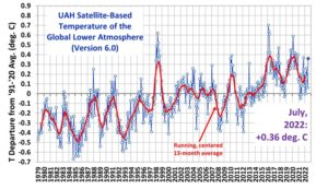
The New Pause has again lengthened by another two months. On the normative UAH lower-troposphere dataset there has been no global warming over the 6 years 8 months from January 2015 to August 2021. As always, the Pause is calculated as the longest period ending in the present that shows no warming trend, taken as the least-squares linear-regression trend on the UAH satellite monthly global mean surface temperature anomalies for the lower troposphere:

Lithium: How the Taliban will fight climate change?

by D.Middleton, Aug 24, 21, 2021 in WUWT


Afghanistan is the “the Saudi Arabia of lithium” –a metal that is essential for electric vehicle batteries and battery storage technologies. According to the International Energy Agency these technologies account for 30 percent of the current global demand for lithium. Demand for lithium is projected to increase 40-fold above 2020 levels by 2040, along with rare earth elements, copper, cobalt, and other minerals in which Afghanistan is also naturally rich.

China currently controls the supply chains for most of the production and/or processing of these minerals. Now China may have another source.

Six States Provide 55% of US Primary Energy… (And Federal Oil & Gas Leasing to Resume!)

by D. Middleton, Aug 31, 2021 in WUWT


AUGUST 31, 2021
Six U.S. states accounted for over half of the primary energy produced in 2019

In 2019, the top six primary energy-producing states—Texas, Pennsylvania, Wyoming, Oklahoma, West Virginia, and North Dakota—accounted for 55 quadrillion British thermal units (quads), or 55% of all of the primary energy produced in the United States. In 2000, these six states had accounted for 39% of the nation’s primary energy production, indicating that primary energy production has become more concentrated to the top producing states.

Primary energy production in the United States grew 40% from 2009 to 2019, driven largely by increased crude oil and natural gas production in Texas, Pennsylvania, Oklahoma, and North Dakota. During that period, advances in hydraulic fracturing and horizontal drilling made drilling for previously inaccessible crude oil and natural gas more economical in the United States. Between 2009 and 2019, production of primary energy more than doubled in Texas and Oklahoma, more than tripled in Pennsylvania, and more than quadrupled in North Dakota.

[…]

ANTARCTIC SEA ICE ‘REBOUND’ SURPRISES SCIENTISTS — MSM SILENT

by Cap Allon, Aug 25, 2021 in Electroverse


Just two years ago, many mainstream media outlets declared that sea ice at the South Pole was melting at an “astonishing” rate.

As recently pointed out by notrickszone.com, German national daily Süddeutsche Zeitung reported in June 2019 that Antarctic sea ice had “shrunk 1.8 million square kilometers”, writing: “the massive disappearance of ice is astonishing”.

And while the reporting was technically factual, it has proven to be yet more AGW-driving obfuscation and cherry-picking rather than well-founded indications of a concerning climatic trend.

And now, in 2021, as the ice sharply rebounds, these same MSM outlets have fallen silent–which is speaking volumes…


Sea ice at the South Pole has rebounded in 2020 and 2021, to the levels of some 3-decades ago.

Moreover, the trend of the past 40+ years (the satellite era) remains one of significant growth (of approx 1% per decade).

In 2021, Antarctic sea ice is actually tracking well-above the multidecadal average (shown below).

MASSIVE SEA ICE REBOUND GOES UNREPORTED

The climate-ambulance chasing MSM have stopped reporting on the state of the ice across the Southern Hemisphere.

CLASSIC DISINFORMATION TECHNIQUE

“Researchers are in agreement that the decline in Antarctic sea ice from 2016 to 2019 is due to natural causes,” writes Die kalte Sonne. “Obviously this is not a good topic for the Süddeutsche Zeitung, who prefer not to report on the ice recovery.”

Not informing the public about the most recent developments, but instead leaving them with a false impression based on carefully cherry-picked data from two years prior, is a classic disinformation technique that has long been perfected by the activist media.

For more on Antarctica, see:

Re-evaluating the role of solar variability on Northern Hemisphere temperature trends since the 19th century

by W. Soon et al., 2015 in EarthScienceReviews


Abstract

Debate over what influence (if any) solar variability has had on surface air temperature trends since the 19th century has been controversial. In this paper, we consider two factors which may have contributed to this controversy:

1.

Several different solar variability datasets exist. While each of these datasets is constructed on plausible grounds, they often imply contradictory estimates for the trends in solar activity since the 19th century.

2.

Although attempts have been made to account for non-climatic biases in previous estimates of surface air temperature trends, recent research by two of the authors has shown that current estimates are likely still affected by non-climatic biases, particularly urbanization bias.

With these points in mind, we first review the debate over solar variability. We summarise the points of general agreement between most groups and the aspects which still remain controversial. We discuss possible future research which may help resolve the controversy of these aspects. Then, in order to account for the problem of urbanization bias, we compile a new estimate of Northern Hemisphere surface air temperature trends since 1881, using records from predominantly rural stations in the monthly Global Historical Climatology Network dataset. Like previous weather station-based estimates, our new estimate suggests that surface air temperatures warmed during the 1880s–1940s and 1980s–2000s. However, this new estimate suggests these two warming periods were separated by a pronounced cooling period during the 1950s–1970s and that the relative warmth of the mid-20th century warm period was comparable to the recent warm period.

We then compare our weather station-based temperature trend estimate to several other independent estimates. This new record is found to be consistent with estimates of Northern Hemisphere Sea Surface Temperature (SST) trends, as well as temperature proxy-based estimates derived from glacier length records and from tree ring widths. However, the multi-model means of the recent Coupled Model Intercomparison Project Phase 5 (CMIP5) climate model hindcasts were unable to adequately reproduce the new estimate — although the modelling of certain volcanic eruptions did seem to be reasonably well reproduced.

Finally, we compare our new composite to one of the solar variability datasets not considered by the CMIP5 climate models, i.e., Scafetta and Willson, 2014’s update to the Hoyt and Schatten, 1993 dataset. A strong correlation is found between these two datasets, implying that solar variability has been the dominant influence on Northern Hemisphere temperature trends since at least 1881. We discuss the significance of this apparent correlation, and its implications for previous studies which have instead suggested that increasing atmospheric carbon dioxide has been the dominant influence.

100% consensus on the Anthropogenic Global Warming? A skeptical examination

by S. Point, Aug 27, 2021 in EuropeanScientist


The theory of Anthropogenic Global Warming is regularly presented as benefiting from a solid scientific consensus. What proves the solidity of this consensus? A scientific article, published in 2016  by Cook and colleagues, proposed a synthesis of the work: from the examination of  studies available at that time, the authors showed that the consensus on the reality of climate change was shared by 90%-100% of scientific climate experts. An estimate that we find widely relayed in the media today. In 2019, Powell said he found consensus to be 100%. In this article, we propose to analyze the potential biases in the work of Cook and colleagues, in order to understand how these biases could affect the claimed level of consensus. We also deal with Powell’s recent assert of 100% consensus and enlighten potential cognitive & methodological biases in his approach.

AN UNDENIABLE CONSENSUS?

New IPCC report resurrects the Hockey Stick

by Clintel,  26 Aug 2021


Every IPCC report is accompanied by this kind of ritual dance. The IPCC itself declares in somewhat woolly language (because the IPCC is officially policy neutral) that it is 2 minutes to 12 after which activists, politicians and the media go wild and declare that it is already 2 minutes past 12. This time it was no different.

Now that the media hype around the report has subsided somewhat, it is time to take a calm look at some of the claims in the new IPCC report and also at what the IPCC leaves unsaid or gives less attention to in its Summary for Policy Makers (SPM). I made a first attempt last week in an interview in the popular Studio BLCKBX: “Alarmist IPCC report offers hope” (in Dutch but with English subtitles).

Hockey stick
Back to the opening words in our national news program: “climate change is accelerating”. Most people will let these words pass almost without thinking and will assume “it must be true”. For insiders like me, however, this new conclusion in the IPCC report was downright surprising! The claim is based on a brand new hockey stick graph (the graph at the very top of this article). This graph was the opening graph in the Summary for Policy Makers. So it is a piece of evidence that the IPCC wanted to give a lot of attention. Coupled with yet another graph – with which the IPCC claims to ‘prove’ that the warming since 1850 is mainly due to greenhouse gases – the message was the following: “due to human influence (read: CO2 and other greenhouse gases), the earth has warmed at a rate unprecedented in the last 2000 years”.

Without exaggeration, I would not be writing this article now if, way back in 2004, when I worked at the popular science monthly Natuurwetenschap & Techniek, I had not been asked by my chief editor to write an article about “a hockey stick graph”. It became the beginning of a two-month quest that ended with a long article (English version here) in which the hockey stick graph in the third IPCC report in 2001 was smashed to smithereens by two Canadian researchers (Stephen McInytre and Ross McKitrick). This experience and especially the reactions to it from the field (the unwillingness to acknowledge the criticism of McIntyre and McKitrick) triggered me to start investigating more climate claims, which eventually led to the publication of my book (in Dutch) De Staat van het Klimaat.

The controversy surrounding the hockey stick, especially to be found on Stephen McIntyre’s blog climateaudit.org was a central theme in the climate debate for years. It was ultimately also the cause of climategate, an affair in which thousands of e-mails from prominent IPCC authors were hacked and put online. The emails were examined by various committees of enquiry but were ultimately dismissed as a storm in a teacup. But in my book, I show that several emails do shed a very questionable light on the integrity of the IPCC authors involved.

In any case, there is even a hefty book on this matter written by Andrew Montford and it would be going too far to go into it all again. After climategate, all those closely involved became fed up with the subject. And in the fourth (2007) and fifth (2013) IPCC reports, the IPCC did not publish a prominent hockey stick either. But lo and behold, in the sixth IPCC report the hockey stick is back in all its glory. Or as McInytre puts it: “the IPCC is addicted to hockey sticks”.

Where does this attraction to the hockey stick come from? A long time ago, in 1995, a climate researcher once wrote: we have to get rid of the Medieval Warm Period. There is much historical evidence that around the year 1000 it was also warm on Earth. The Vikings went to Greenland, called it Greenland (and not e.g. Iceland), farmed there and managed to survive for several centuries. This kind of information is unwelcome (for the IPCC) because this warm period suggests that even without CO2 emissions it was warm on Earth in the recent past. How warm exactly? Warmer than now? And if so, what caused the warming? There is no simple answer to these questions, but with the introduction of hockey sticks the IPCC suggests there is. Take a closer look.

PAGES2019: 30-60S

by S. McIntyre, Aug 26, 2021 in ClimateAudit


The 30-60N latitude band gets lots of attention in paleoclimate collections – probably more proxies than the rest of the world combined. The 30-60S latitude band is exactly the same size, but it is little studied. It is the world of the Roaring Forties and Furious Fifties, a world that is almost entirely ocean. The only land is New Zealand, Tasmania and the southern coast of Australia facing Antarctica, the tip of South Africa and the narrow part of South America: southern Chile and Argentina. But 96% or so is ocean.


Conclusion

Given that the 60-30S latband is almost entirely ocean, it seems logical that IPCC and PAGES2K should use data from ocean proxies to estimate past temperature in this latitude band. But this isn’t what they’ve done. Instead, they’ve purported to estimate past temperature from a few scattered tree ring chronologies, only one of which reaches earlier than AD1850; and an idiosyncratic singleton pigment series. Ironically, the only 30-60S proxy series in PAGES 2019 that reaches back into the first millennium – the Mount Read, Tasmania tree ring series – was used by Mann et al 1998-1999, Jones et al 1998 and numerous other supposedly “independent” multiproxy studies. Neither of the two series reaching back to the medieval period permit the conclusion that modern period is warmer than medieval period. Caveat: I’m not saying that it isn’t; only that this data doesn’t show it, let alone support the big-bladed HS cited by IPCC. High-resolution alkenone measurements from ocean cores offshore Chile show a consistent decrease in ocean temperatures over the past two millennia that is neither reported nor discussed by IPCC (or PAGES 2019).

To be clear, some of the technical articles on 30-60S ocean core proxies by specialist authors are truly excellent and far more magisterial than the IPCC mustered, in particular, several articles on offshore Chile. Here are a few:

Mohtadi et al, 2007. Cooling of the southern high latitudes during the Medieval Period
and its effect on ENSO link

Killian and Lamy 2012. A review of Glacial and Holocene paleoclimate records from southernmost Patagonia (49-55degS) link

Collins et al 2019. Centennial‐Scale SE Pacific Sea Surface Temperature Variability Over the Past 2,300 Years link

La géologie, une science plus que passionnante … et diverse