Archives de catégorie : to keep an eye on…

Northern Europe July Temperature Sees NO WARMING Over Past Decades. Global July Not A Record High!

by P. Gosselin, August 20, 2019 in NoTricksZone


Parts of Europe have seen a couple of brief but intense heat waves this summer, and so some of the public got brainwashed by the media into thinking the continent’s summer climate is rapidly getting hotter and that all this is the new normal.

Yet, when we examine the unaltered data from the Japan Meteorology Agency (JMA) for locations in northern Europe that have long-term datasets available, we see there has been no July warming trend over the past decades. Media reports suggesting otherwise are nonsense.

Ireland

Looking at 6 stations in Ireland, we have the following for July:


Data source: JMA.

Overall, Ireland’s mean July temperatures have been cooling off modestly over the past 3 decades and more, even though three stations are located at airports.

Sweden

Ten Causes of Warming: The Layperson’s Checklist

by Jim Steele, August 8, 2019 in WUWT


All temperatures are not created equally. Rising temperatures have many causes. Good science demands we explore alternative hypotheses before reaching any conclusions. Below is a list of common causes of warming trends and heat events that everyone should consider in addition to any possible increased greenhouse effect.

1. Heat trapping surfaces: Asphalt and cement not only heat up much faster than natural habitat during the day, those materials hold the heat longer, increasing temperatures at weather stations situated near buildings and near asphalt. More asphalt, more warming, more record temperatures.

2. Loss of Vegetation: During the summer the temperature of a dry dirt road can be 60°F higher at noon, than ground shaded by trees. That’s why our pets instinctively seek the shade. Plants also bring moisture from below the ground that cools the air by evaporative cooling. Increasing deforestation or lost vegetation due to landscape changes cause regional warming trends.

3. Transport of heat: Natural climate oscillations alter air and ocean circulation patterns that can drive more heat from the tropics towards the poles. Europe’s recent heat wave was largely caused by air heated over the baking Sahara Desert and then driven into Europe. Similarly, the latest research finds variations in Arctic sea ice has been dominated by transport of warm Atlantic water heated in the tropics and transported northward via the Gulf Stream.

4. Less cloud cover: Recent research suggests a trend of less cloud cover resulted in increased solar heating of land and oceans. The added solar energy normally reflected by clouds was 2 times greater than what’s believed to be added by increasing carbon dioxide. Two decades of declining cloud cover was similarly shown to cause Greenland’s rapid ice melt between 1995 and 2012.

5. Less Cooling: Windy conditions cool the oceans. The unusually warm ocean conditions that occurred in the northwestern Pacific Ocean, known as the Blob, were caused by decreased winds that reduced normal cooling.

6-10: ….

….

For Most Of The Last 10,000 Years, Greenland Ice Sheet and Glacier Volume Was Smaller Than Today

by K. Richard, August 5, 2019 in NoTricksZone


A new paper (Axford et al., 2019) reveals NW Greenland’s “outlet glaciers were smaller than today from ~9.4 to 0.2 ka BP” (9,400 to 200 years before 1950), and that “most of the land-based margin reached its maximum Holocene extent in the last millennium and likely the last few hundred years.”

The authors conclude:

“We infer based upon lake sediment organic and biogenic content that in response to declining temperatures, North Ice Cap reached its present-day size ~1850 AD, having been smaller than present through most of the preceding Holocene.”

Furthermore, the authors assert Greenland was 2.5°C to 3°C warmer than modern on average during the Holocene Thermal Maximum, and peak temperatures were 4°C to 7°C warmer.


Image Source: Mikkelson et al., 2018

Why You Shouldn’t Draw Trend Lines on Graphs

by Kip Hansen,  August 6, 2019 in WUWT


What we call a graph is more properly referred to as “a graphical representation of data.”  One very common form of graphical representation is “a diagram showing the relation between variable quantities, typically of two variables, each measured along one of a pair of axes at right angles.”

Here at WUWT we see a lot of graphs —  all sorts of graphs of a lot of different data sets.  Here is a commonly shown graph offered by NOAA taken from a piece at Climate.gov called “Did global warming stop in 1998?” by Rebecca Lindsey published on September 4, 2018.


I am not interested in the details of this graphic representation — the whole thing qualifies as “silliness”.  The vertical scale is in degrees Fahrenheit and the entire range change over 140 years shown is on the scale 2.5 °F or about a degree and a half C.   The interesting thing about the graph is the effort of drawing of “trend lines” on top of the data to convey to the reader something about the data that the author of the graphic representation wants to communicate.  This “something” is an opinion — it is always an opinion — it is not part of the data.

The data is the data.  Turning the data into a graphical representation (all right, I’ll just use “graph” from here on….), making the data into a graph has already  injected opinion and personal judgement into the data through choice of start and end dates, vertical and horizontal scales and, in this case, the shading of a 15-year period at one end.  Sometimes the decisions as to vertical and horizontal scale are made by software — not rational humans —  causing even further confusion and sometimes gross misrepresentation.

Anyone who cannot see the data clearly in the top graph without the aid of the red trend lineshould find another field of study (or see their optometrist).  The bottom graph has been turned into a propaganda statement by the addition of five opinions in the form of mini-trend lines.

Relation entre l’ activité sismique dans les océans et le réchauffement global (août 2019)

c/o Luc Trullemans,  août 2019 in PublicMétéo


Introduction

Une forte relation à été observée ces dernières années entre de l’activité sismique dans les océans et le récent réchauffement climatique  (CSARGW ,Correlation of Seismic Activity and Recent Global Warming) .

Cette corrélation entre de l’activité sismique océanique et le réchauffement climatique avait déjà été remarquée de 1979 à 2016 (CSARGW16) et vient d’être confirmée jusqu’en 2018.

Dans cette note, on démontre que  l’activité sismique dans les océans ( =>tremblements de terre de magnitude 4-6) provoque des flux géothermiques sous-marins et ont une relation importante avec les fluctuations de la température globale des océans (SST) et de la température globale de l’air (GT).

Ceci avance une nouvelle l’hypothèse selon laquelle l’activité sismique océanique pourrait être  un des paramètres  les plus importants dans la variation de la température globale.


Hockey Stick Groundhog Day

by P. Homewood, August, 1, 2019 in NotaLotofPeopleKnowThat


Some ancient history

Fifteen to twenty years ago, Michael Mann and colleagues wrote a few papers claiming that current warming was unprecedented over the last 600 to 2000 years.  Other climate scientists described Mann’s work variously as crap, pathetic, sloppy, and crap.  These papers caught the interest of Stephen McIntyre and this led to the creation of his Climate Audit blog and the publication of paperspointing out the flaws in these hockey stick reconstructions. In particular, Mcintyre and his co-author Ross McKitrick showed that the method used by Mann and colleagues shifted the data in such a way that any data sets that showed an upward trend in the 20th century would receive a stronger weighting in the final reconstruction.  With this method, generation of a hockey-stick shape in the temperature reconstruction was virtually guaranteed, which M&M demonstrated by feeding in random numbers to the method.

Former Award-Winning NOAA scientist Dr. Rex Fleming declares his climate dissent

by Marc Morano, July 30, 2019 in Climate Depot,


Former NOAA Award-Winning Atmospheric Scientist Dr. Rex Fleming joins many former UN IPCC and U.S. government scientists publicly dissenting on man-made climate change. Fleming declares that “CO2 has no impact on climate change.”

“Past climates have been warm and cold and warm and cold with no changes in carbon dioxide. How can that be a cause when there’s no correlation.”

Fleming 8:10 on AMS, AGU, AAAS: “all 3 of those organizations will not support a “denier”..I could not get published in any of those organizations..as a denier..I had to go to Europe to publish a paper..it was peer-reviewed in Europe, it got thru, & it has been very successful”
Quote Tweet

Fleming’s work here: The Rise and Fall of the Carbon Dioxide Theory of Climate Change (2019)


Anti science L. A. Times hypes propaganda denying global wide Medieval Warm Period and Little Ice Age

by Larry Hamlin, July 28, 2019 in WUWT


The Los Angeles Times is at it again hyping anti science climate alarmist propaganda trying to conceal the global wide Medieval Warm Period and the Little Ice Age that are supported and justified by hundreds of scientific studies.

This climate alarmist propaganda Times article cites a new “study” that ridiculously attempts to deny these clearly established warm and cool periods in our past.

This alarmist hyped new “study” is addressed in a superb article at the JoNova website demonstrating the complete lack of scientific veracity of this studies claims.

There is nothing I can add to show how politically contrived and inane the claims are from this new “study” beyond the excellent presentation in the JoNova article.

Provided below are excerpts from this excellent article which demonstrate the lack of scientific credibility of the new “study” as well as the politically driven anti science climate alarmism bias of the Times.


1970s: Earth Warmed 0.6°C From 1880-1940 And Cooled -0.3°C From 1940-1970. Now It’s 0.1°C And -0.05°C.

by K. Richard, July 25, 2019 in NoTricksZone


About 45 years ago, the “consensus” in climate science (as summarized by Williamson, 1975) was quite different than today’s version.

1. The Medieval Warm Period was about 1°C warmer than present overall while the “largely ice-free” Arctic was 4°C warmer, allowing the Vikings to navigate through open waters because there was “no or very little ice” at that time.
2. The island of Spitsbergen, 1237 km from the North Pole and home to over 2000 people, “benefited” because it warmed by 8°C between 1900 and 1940, resulting in 7 months of sea-ice free regional waters. This was up from just 3 months in the 1800s.
3. Central England temperatures dropped -0.5°C between the 1930s to the 1950s.
4. Pack-ice off northern and eastern iceland returned to its 1880s extent between 1958 and 1975.
5. In the 1960s, polar bears were able to walk across the sea (ice) from Greenland to Iceland for the first time since the early 1900s. (They had somehow survived the 7 months per year of sea-ice-free waters during the 1920s-1940s).


Image Source: National Academy of Sciences,  Understanding Climatic Change

12 New Papers Provide Robust Evidence The Earth Was Warmer During Medieval Times

by K. Richard, July 29, 2019 in NoTricksZone


Claims that modern temperatures are globally warmer than they were during Medieval times (~800 to 1250 A.D.) have been contradicted by a flurry of new (2019) scientific papers.

Southern Ocean/SE Pacific (SSTs)

The Medieval Warm Period (1100 years BP) was 1.5°C warmer than today (14°C vs. 12.5°C) in the SE Pacific or Southern Ocean.


See also here

Strong storms also play big role in Antarctic ice shelf collapse

by Oregon State University, July 18, 2019 in ScienceDaily


Warming temperatures and changes in ocean circulation and salinity are driving the breakup of ice sheets in Antarctica, but a new study suggests that intense storms may help push the system over the edge.

A research team led by U.S. and Korean scientists deployed three moorings with hydrophones attached seaward of the Nansen Ice Shelf in Antarctica’s Ross Sea in December of 2015, and were able to record hundreds of short-duration, broadband signals indicating the fracturing of the ice shelf.

The “icequakes” primarily took place between January and March of 2016, with the front of the ice sheet calving into two giant icebergs on April 7. The day the icebergs drifted away from the shelf coincided with the largest low-pressure storm system the region had recorded in the previous seven months, the researchers say.

Results of the study are being published this week in Frontiers in Earth Science.

Journal Reference:

  1. R. P. Dziak, W. S. Lee, J. H. Haxel, H. Matsumoto, G. Tepp, T.-K. Lau, L. Roche, S. Yun, C.-K. Lee, J. Lee, S.-T. Yoon. Hydroacoustic, Meteorologic and Seismic Observations of the 2016 Nansen Ice Shelf Calving Event and Iceberg Formation. Frontiers in Earth Science, 2019; 7 DOI: 10.3389/feart.2019.00183

NO EXPERIMENTAL EVIDENCE FOR THE SIGNIFICANT ANTHROPOGENIC CLIMATE CHANGE

by J. Kauppinen and P. Malmi, July 13, 2019 in Physics.gen-ph


Abstract. In this paper we wil lprove that GCM-models used inI IPCC report AR5 fail to calculate the influences of the low cloud cover changes on the global temperature. That is why those models give a very small natural temperature change leaving a very large change for the contribution of the green house gases in the observed temperature. This is the reason why IPCC has to use a very large sensitivity to compensate a too small natural component. Further they have to leave out the strong negative feedback due to the clouds in order to magnify the sensitivity. In addition, this paper proves that the changes in the low cloud cover fraction practically control the global temperature.

1. Introduction

The climate sensitivity has an extremely large uncertainty in the scientific lit- erature. The smallest values estimated are very close to zero while the highest ones are even 9 degrees Celsius for a doubling of CO2. The majority of the papers are using theoretical general circulation models (GCM) for the estimation. These models give very big sensitivities with a very large uncertainty range. Typically sensitivity values are between 2–5 degrees. IPCC uses these papers to estimate the global temperature anomalies and the climate sensitivity. However, there are a lot of papers, where sensitivities lower than one degree are estimated without using GCM. The basic problem is still a missing experimental evidence of the cli- mate sensitivity. One of the authors (JK) worked as an expert reviewer of IPCC AR5 report. One of his comments concerned the missing experimental evidence for the very large sensitivity presented in the report [1]. As a response to the com- ment IPCC claims that an observational evidence exists for example in Technical Summary of the report. In this paper we will study the case carefully.

2. Low cloud cover controls practically the global temperature

Antarctica was warmer one thousand years ago — and life was OK

JoNova, July 11, 2019


Remember when polar amplification was the rage? So much for that theory

Antarctica is twice the size of the US or Australia. Buried 2 km deep under domes of snow, it holds 58 meters of global sea level to ransom. The IPCC have been predicting its demise-by-climate-change for a decade or two.

A new paper looks at 60 sites across Antarctica, considering everything from ice, lake and marine cores to peat and seal skins. They were particularly interested in the Medieval Warm Period, and researched back to 600AD.  During medieval times (1000-1200 AD) they estimate Antarctica as a whole was hotter than it is today.  Antarctica was even warmer still  — during the dark ages circa 700AD.

Credit to the paper authors: Sebastian Lüning, Mariusz Gałka, and Fritz Vahrenholt

Feast your eyes on the decidedly not unprecedented modern tiny spike:

The little jaggy down after 2000 AD is real. While there was rapid warming across Antarctica from 1950-2000, in the last twenty years, that warming has stalled. Just another 14 million square kilometers that the models didn’t predict.

We already knew the Medieval Warm Period was a global phenomenon, thanks to hundreds of proxies, and 6,000 boreholes. But this new paper is a great addition.

With an awesome dedication to detail, the team put all the big oceanic and other factors into one big graph. It is nice to see them side by side so we can see the connections between them.

Scientists: Humans Perform As Well Or Better When Exposed To High (5000-15000 ppm) vs. Low CO2 Concentrations

by K. Richard, July 8, 2019 in NoTricksZone


A new paper finds the performance of test-taking (cognitive, decision-making) “astronaut-like” subjects exposed to 5000 ppm CO2 was “similar to or exceeded” the performance of those exposed to baseline (600 ppm). This study follows up on a 2018 paper that determined submariners exposed to 15000 ppm CO2 performed just as well as subjects exposed to 600 ppm.

Those of us who own CO2 monitors know that indoor (bedroom) CO2 concentrations typically vary between about 600 ppm during the day and 1000 ppm overnight – the latter earning a frowny face air quality rating.


CO2 is a cognitively-impairing toxin?

In recent years there has been a push to create the impression carbon dioxide is a pollutant, or toxin. Consequently, there have been a few studies suggesting exposure to higher CO2 concentrations (~1500 to 2500 ppm) severely impair human cognitive and decision-making performance (Satish et al., 2012, Allen et al., 2016).

If true, this would be rather problematic for elementary school children, as they are routinely exposed to CO2 concentrations ranging between about 1500 and 3000 ppm in their classrooms (Corsi et al., 2002).

Driving alone in one’s vehicle could mean exposure to “3700 ppm … above outdoor [CO2] concentrations” (Satish et al, 2012), or about 4100 ppm.

This elevated-CO2-is-toxic-to-brain-functioning paradigm suggests the world’s highways are teeming with cognitively-impaired drivers.

PUTTING CLIMATE CHANGE CLAIMS TO THE TEST

by John Christy, June 18, 2019 in GWPF


This is a full transcript of a talk given by Dr John Christy to the GWPF on Wednesday 8th May.

When I grew up in the world of science, science was understood as a method of finding information. You would make a claim or a hypothesis, and then test that claim against independent data. If it failed, you rejected your claim and you went back and started over again. What I’ve found today is that if someone makes a claim about the climate, and someone like me falsifies that claim, rather than rejecting it, that person tends to just yell louder that their claim is right. They don’t look at what the contrary information might say.

OK, so what are we talking about? We’re talking about how the climate responds to the emission of additional greenhouse gases caused by our combustion of fossil fuels. In terms of scale, and this is important, we want to know what the impact is on the climate, of an extra half a unit of forcing amongst total forcings that sum to over 100 units. So we’re trying to figure out what that signal is of an extra 0.5 of a unit.

Here is the most complicated chart I have tonight, and I hope it makes sense:


Medieval Climate Anomaly Now Confirmed In Southern Hemisphere On All Four Continents

by Lüning et al., July  6, 2019 in NoTricksZone


For a long time it has been said that the Medieval Warm Period was a purely North Atlantic phenomenon. This has proved to be wrong.

On 29 June 2019, a paper by Lüning et al. 2019 on the Medieval Warm Period in Antarctica appeared in the trade journal Palaeogeography, Palaeoclimatology, Palaeoecology. Here is the abstract:

With the publication of this paper, the Medieval Climate Anomaly (MCA) has now been confirmed on all four continents of the southern hemisphere.

While the largest part of the southern hemisphere apparently experienced a warm phase during the MCA, there were also isolated areas that cooled down. To the latter regions belong, for example, coasts, where cold water from the depth rose increasingly. In other areas so-called climate seesaws or dipoles were active, as we know them from today’s climate. One end of the “seesaw” heats up, the other end cools down.

Another result of the studies is that the medieval climate history of huge areas in the southern hemisphere is simply unknown. A task force urgently needs to be set up to fill in this climatic “empty space” with information on pre-industrial temperature development. This information is urgently needed to calibrate the climate models on the basis of which far-reaching socio-political planning is currently taking place.

What follows are publications on the Medieval Period climate of the southern hemisphere as an overview:

Lüning, S., M. Gałka, F. Vahrenholt (2019): The Medieval Climate Anomaly in Antarctica. Palaeogeogr., Palaeoclimatol., Palaeoecol., doi: 10.1016/j.palaeo.2019.109251

Antarctic sea ice is declining dramatically

by Claire L. Parkinson, July 5, 2019 in WUWT


PNAS first published July 1, 2019 https://doi.org/10.1073/pnas.1906556116

Contributed by Claire L. Parkinson, May 24, 2019 (sent for review April 16, 2019; reviewed by Will Hobbs and Douglas G. Martinson)

Significance

A newly completed 40-y record of satellite observations is used to quantify changes in Antarctic sea ice coverage since the late 1970s. Sea ice spreads over vast areas and has major impacts on the rest of the climate system, reflecting solar radiation and restricting ocean/atmosphere exchanges. The satellite record reveals that a gradual, decades-long overall increase in Antarctic sea ice extents reversed in 2014, with subsequent rates of decrease in 2014–2017 far exceeding the more widely publicized decay rates experienced in the Arctic. The rapid decreases reduced the Antarctic sea ice extents to their lowest values in the 40-y record, both on a yearly average basis (record low in 2017) and on a monthly basis (record low in February 2017).

Abstract

Following over 3 decades of gradual but uneven increases in sea ice coverage, the yearly average Antarctic sea ice extents reached a record high of 12.8 × 10⁶ km2 in 2014, followed by a decline so precipitous that they reached their lowest value in the 40-y 1979–2018 satellite multichannel passive-microwave record, 10.7 × 10⁶ km2, in 2017. In contrast, it took the Arctic sea ice cover a full 3 decades to register a loss that great in yearly average ice extents. Still, when considering the 40-y record as a whole, the Antarctic sea ice continues to have a positive overall trend in yearly average ice extents, although at 11,300 ± 5,300 km2⋅y−1, this trend is only 50% of the trend for 1979–2014, before the precipitous decline. Four of the 5 sectors into which the Antarctic sea ice cover is divided all also have 40-y positive trends that are well reduced from their 2014–2017 values. The one anomalous sector in this regard, the Bellingshausen/Amundsen Seas, has a 40-y negative trend, with the yearly average ice extents decreasing overall in the first 3 decades, reaching a minimum in 2007, and exhibiting an overall upward trend since 2007 (i.e., reflecting a reversal in the opposite direction from the other 4 sectors and the Antarctic sea ice cover as a whole).

Fig. 1. Identification of the 5 sectors used in the regional analyses. These are identical to the sectors used in previous studies (7, 8).

A Critique of the Fourth National Climate Assessment

by Robert W. Endlich, December 18, 2018 in CAtmSciForum


In describing the errors in the Fourth National Climate Assessment, ‘NCA4’, I’ll use the words from the Executive Summary which purport to link climate changes in the USA to global climate change.

The first claim, “The last few years have also seen record-breaking, climate-related weather extremes,“ is shown to be false, simply by examining climate records, some from the National Climate Data Center.

Tornadoes have been decreasing over the past six decades as temperatures moderate from the significant cooling of the 1940s to 1970s.  As a basic knowledge of meteorology teaches, it is the pole to equator temperature difference that drives the intensity of cold season storms and especially the spring-season storms which bring the extremely strong tornado outbreaks.

Figure 1.  Annual count of strong to violent tornadoes from 1954-2014, showing a significant decrease of tornado activity the past 60 years, based on data from NOAAs Storm Prediction Center. [Note: This graphic replaces the original graphic that showed all tornadoes EF1 and stronger. Correction made 1/25/2019].

New Paper: Mammals Thrived and Diversified With ~2000-4000 ppm CO2, 20°C Warmer Oceans Than Today

by K. Richard, July 1, 2019 in NoTricksZone


Marine species evolved, thrived, and diversified in 35 to 40°C ocean temperatures and CO2 concentrations “5-10x higher than present-day values” (Voosen, 2019 and Henkes et al., 2018).

Image Source: Voosen, 2019

I. The insignificance of modern “global warming”

Today’s ocean temperatures average about 16°C. CO2 levels hover around 400 parts per million (0.04%).

The oceans have warmed at a rate of just 0.015°C per decade since 1971 in the 0-700 m layer according to the IPCC (2013). This warming rate isn’t detectable when considering overall long-term changes in this layer (Rosenthal et al., 2017) during the Holocene.

Record High Temperatures in France: 3 Facts the Media Don’t Tell You

by Roy Spencer, July 2, 2019 in GlobalWarming


News reporting of the recent heat wave in France and other European countries was accompanied with the usual blame on humans for causing the event. For example, here’s the CBS News headline: Record-breaking heat is scorching France. Experts say climate change is to blame.

While it is possible that the human component of recent warming might have made the heat wave slightly worse, there are three facts the media routinely ignore when reporting on such “record hot” events. If these facts were to be mentioned, few people with the ability to think for themselves would conclude that our greenhouse gas emissions had much of an impact.

1. Record High Temperatures Occur Even Without Global Warming

Adjusted “Unadjusted” Data: NASA Uses The “Magic Wand Of Fudging”, Produces Warming Where There Never Was

by P. Gosselin, June 25, 2019 in NoTricksZone


By Kirye
and Pierre Gosselin

It’s been long known that NASA GISS has been going through its historical temperature data archives and erasing old temperature measurements and replacing them with new, made up figures without any real legitimate reason.

This practice has led to the formation of new datasets called “adjusted” data, with the old datasets being called “V3 unadjusted”. The problem for global warming activists, however, was that when anyone looks at the old “V3 unadjusted” – i.e. untampered data – they often found a downward linear temperature trend. Such negative trends of course are an embarrassment for global warming alarmists, who have been claiming the planet is warming up rapidly.

The adjusted “unadjusted” data

So what to do? Well, it seems that NASA has decided to adjust its “V3 unadjusted datasets” and rename them as “V4 unadjusted”. That’s right, the adjusted data has become the new V4 “unadjusted” data.

And what kind of trend does the new “V4 unadjusted” data show?

You guessed it. The new V4 unadjusted data are now yielding warmed up trends, even at places where a cooling trend once existed.

This is how NASA uses its magic wand of fudging to turn past cooling into (fake) warming.

6 examples of scandalous mischief by NASA

What follows are 6 examples, scattered across the globe and going back decades, which demonstrate this scandalous mischief taking place at NASA.
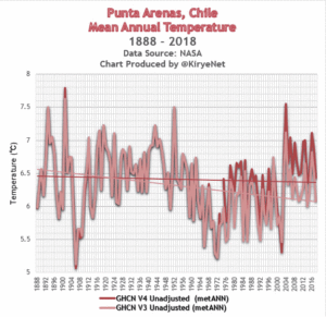
No. 1

Punta Arenas, Chile. Here we see how a clear cooling trend has been warmed up by NASA to produce a slight cooling trend:


giss.nasa.gov/cgi-bin/gistemp/stdata_show_v3

giss.nasa.gov/cgi-bin/gistemp/stdata_show_v4

Antarctic marine life recovery following the dinosaurs’ extinction

by British Antarctic Survey, June 19, 2019 in ScienceDaily


The K-Pg extinction wiped out around 60% of the marine species around Antarctica, and 75% of species around the world. Victims of the extinction included the dinosaurs and the ammonites. It was caused by the impact of a 10 km asteroid on the Yucatán Peninsula, Mexico, and occurred during a time period when the Earth was experiencing environmental instability from a major volcanic episode. Rapid climate change, global darkness, and the collapse of food chains affected life all over the globe.

The K-Pg extinction fundamentally changed the evolutionary history of life on Earth. Most groups of animals that dominate modern ecosystems today, such as mammals, can trace the roots of their current success back to the aftermath of this extinction event.

A team of scientists from British Antarctic Survey, the University of New Mexico and the Geological Survey of Denmark & Greenland show that in Antarctica, for over 320,000 years after the extinction, only burrowing clams and snails dominated the Antarctic sea floor environment. It then took up to one million years for the number of species to recover to pre-extinction levels.

A Second Look At Radiation Versus Temperature

by Willis Eschenbach, June 14, 2019 in WUWT


I kept going back and looking at the graphic from my previous post on radiation and temperature. It kept niggling at me. It shows the change in surface temperature compared to the contemporaneous change in how much energy the surface is absorbing. Here’s that graphic again:


Figure 1. From my previous post. It is a scatterplot showing the dependence of temperature on the total downwelling radiation (longwave plus shortwave) absorbed by the surface.

What I found botheracious were the outliers at the top of the diagram. I knew what they were from, which was the El Nino/La Nina of 2015-2016.

After thinking about that, I realized I’d left one factor out of the calculations above. What the El Nino phenomenon does is to periodically pump billions of cubic meters of the warmest Pacific equatorial water towards the poles. And I’d left that advected energy transfer out of the equation in Figure 1. (Horizontal transfer of energy from one place on earth to another is called “advection”).

And it’s not just advection of energy caused by El Nino. In general, heat is advected from the tropics towards the poles by the action of the ocean and the atmosphere. Figure 2 shows the average amount of energy exported (plus) or imported (minus) around the globe.

Central Europe temperature constrained by speleothem fluid inclusion water isotopes over the past 14,000 years

by Affolter et al., June 5, 2019 in ScienceAdvance


Abstract

The reasons for the early Holocene temperature discrepancy between northern hemispheric model simulations and paleoclimate reconstructions—known as the Holocene temperature conundrum—remain unclear. Using hydrogen isotopes of fluid inclusion water extracted from stalagmites from the Milandre Cave in Switzerland, we established a mid-latitude European mean annual temperature reconstruction for the past 14,000 years. Our Milandre Cave fluid inclusion temperature record (MC-FIT) resembles Greenland and Mediterranean sea surface temperature trends but differs from recent reconstructions obtained from biogenic proxies and climate models. The water isotopes are further synchronized with tropical precipitation records, stressing the Northern Hemisphere signature. Our results support the existence of a European Holocene Thermal Maximum and data-model temperature discrepancies. Moreover, data-data comparison reveals a significant latitudinal temperature gradient within Europe. Last, the MC-FIT record suggests that seasonal biases in the proxies are not the primary cause of the Holocene temperature conundrum.

New Proxy Data Show Northern Europe Weather Variability In Sync With Natural Factors: Solar Activity, Oceanic Cycles

by J. Goslin in P. Gosselin, June 1, 2019 in NoTricksZone


Another new paper, which of course will be ignored by the government-funded IPCC because it contradicts claims CO2 drives climate, shows that natural factors dominated the earth’s climate variability.

A team of scientists led by Jerome Goslin have published a paper titled Decadal variability of north-eastern Atlantic storminess at the mid-Holocene: New inferences from a record of wind-blown sand, western Denmark in the journal Global and Planetary Change, suggesting climate variability is driven naturally.

Image: NASA, public domain

Climate change driven by solar and oceanic cycles

Not surprisingly, as evidenced by hundreds of other publications (which are entirely ignored by the IPCC), climate variability is indeed tied to solar activity and “internal atmospheric and oceanic modes”.