Latest Mean Annual Temperature Data Show Tokyo Has Been Cooling For Decades!

by P. Gosselin, Jan 25, 2023 in NoTricksZone


TOKYO HAS COOLED OVER THE PAST 30 YEARS.
Hachijō-jima island hasn’t seen any climate change in decades!

Charts by Kirye

The mean temperature data for December, 2022, for the city of Tokyo, Japan and its Hachijō-jima island in the Pacific are now available from the Japan Meteorological Agency (JMA).

These data now allow us to look at the newest annual mean temperature trends for the two locations.

First we look at latest annual mean temperature plots for Tokyo since 1994:

Data: JMA.

According to the alarmists, the increase in CO2 is supposed to be heating up the entire planet. Strangely, using data from the JMA, Tokyo has in fact cooled modestly since 1994 – despite the urban heat sink effect from all the concrete, asphalt, steel and waste heat.


Why Is Antarctica’s Climate Considered ‘Global’ But Arctic Siberia’s Is Not?

by K. Richard, Jan 26, 2023 in NoTricksZone


Independent analyses from multiple independent sources indicate Arctic Siberia was 3 to 5°C warmer than today during the peak of the last glacial, or when CO2 levels were below 200 ppm.

Measurements from Antarctica’s ice sheet are almost invariably used to characterize both the global-scale atmospheric CO2 levels and climate for the last 10s to 100s of thousands of years.

But it is rather odd that Antarctica’s climate is considered globally representative (i.e., “global warming”) since there has been no warming here for the last seven decades.

Further, ice samples from Antarctica have CO2 values that range between 900 and 2900 ppm (Matsuo and Miyake, 1966) for the modern period (i.e., the 1960s). These values are far outside the range of the accepted modern global atmospheric values (~300 to 400 ppm).

Abrupt episode of mid-Cretaceous ocean acidification triggered by massive volcanism

by Jones et al., Jan 2023 in NatureGeoscience


Abtsract

Large-igneous-province volcanic activity during the mid-Cretaceous triggered a global-scale episode of reduced marine oxygen levels known as Oceanic Anoxic Event 2 approximately 94.5 million years ago. It has been hypothesized that this geologically rapid degassing of volcanic carbon dioxide altered seawater carbonate chemistry, affecting marine ecosystems, geochemical cycles and sedimentation. Here we report on two sites drilled by the International Ocean Discovery Program offshore of southwest Australia that exhibit clear evidence for suppressed pelagic carbonate sedimentation in the form of a stratigraphic interval barren of carbonate minerals, recording ocean acidification during the event. We then use the osmium isotopic composition of bulk sediments to directly link this protracted ~600 kyr shoaling of the marine calcite compensation depth to the onset of volcanic activity. This decrease in marine pH was prolonged by biogeochemical feedbacks in highly productive regions where elevated heterotrophic respiration added carbon dioxide to the water column. A compilation of mid-Cretaceous marine stratigraphic records reveals a contemporaneous decrease of sedimentary carbonate content at continental slope sites globally. Thus, we contend that changes in marine carbonate chemistry are a primary ecological stress and important consequence of rapid emission of carbon dioxide during many large-igneous-province eruptions in the geologic past.

In Search Of A (Near) Perfect CO2 Global Warming Analogy

by R. Barmby, Jan 23; 2023 in ClimateChangeDispatch


Most people have a firm opinion on whether human emissions of carbon dioxide (CO2) are causing unnatural global warming, and hold that opinion without understanding how the molecule physically absorbs and then releases heat energy.

Understanding that mechanism reveals why today’s significant global CO2 emissions are insignificant to future global warming.

Analogies are a great way to explain science, and I’m going to share the worst and best analogies for how carbon dioxide acts as a greenhouse gas. I will also share why the warming effect of CO2 is limited.

Why Today’s Carbon Dioxide Emissions Are Insignificant To Global Warming

As more CO2 molecules are added as potential absorbers for the fixed amount of the specific band of infrared radiation, there is less chance that any CO2 molecule will be hit. If the additional CO2 molecules do not absorb infrared radiation, they cannot contribute to global warming.

The ever-reducing CO2 contribution to global warming looks like this graph, which, ironically, is based on the IPCC’s formula (from Inconvenient Facts by Gregory Wrightstone):

On the graph above, consider that the pre-industrial (circa 1875) atmospheric CO2 level was about 280 parts per million (ppm), and today it is about 420 ppm—an increase of 140 ppm.

As a rough approximation, the three bars labeled 350, 400, and 450 ppm represent this past increase in CO2, and the sum of the global warming temperature increases associated with those three bars is about 0.7°C.

The next four bars (500, 550, 600, and 650 ppm) represent a future CO2 increase of 200 ppm, which at today’s rate of 2.5 ppm increase each year would take from now to about 2100.

The global warming associated with those four bars is only 0.65°C. The graph shows it keeps taking more CO2 to achieve a smaller amount of global warming.

I chose bars 350 through 650 ppm to highlight that the IPCC’s formula predicts that global warming from current CO2 emissions held flat (1.35°C) would still beat the IPCC’s target of 1.5°C of human-caused global warming from preindustrial times to the year 2100.

The above graph suggests global warming from increasing CO2 never stops, but we know from ancient climates that even 12 times today’s CO2 concentrations did not cause runaway global warming.

Drs. Happer, Koonin, and Lindzen submitted to the U.S. (Northern California) District Court in 2021 that minor changes in cloud cover and convection currents can have a bigger effect on the Earth’s surface temperature than major increases in CO2.

Warmth Limits For Tree Growth Affirm Austria Was 4-7°C Warmer Than Today 2000 Years Ago

by K. Richard, Jan 23, 2023 in NoTricksZone


Robust evidence from bison remains recovered from the Austrian Alps in 2020 and 2021 invalidate claims modern Alpine temperatures are unusually warm.

new study suggests that from about 6000 to 1200 years ago European bison fed on deciduous tree/vegetation that grew at Alpine altitudes reaching around 800 m higher than they do today.

Known beech and oak tree growth warmth thresholds – the required number of days per year above a minimum temperature limit – thus affirm Austria needed to be 4-7°C warmer than now during this period (~2000 years ago).

“[T]he beech limit but also the forest line during the »wisent time« (6,000 to 1,200 years before today) was much higher and the average summer temperature had to be at least 3 to 6 °C higher than today. Remarkable is a palynological record (Ressl, 1980) from the shaft cave Stainzerkogelschaft near Lunz am See. Remains of wisent were found in the shaft (1,463 m, see Tab. 3). The clay with a skull fragment with horncores inside was examined palynologically. The dominating pollen were from alder (Alnus), oak (Quercus) and linden tree (Tilia). The oak boundary (boundary between colline and montane vegetation stages) today lies between 400 and 800 metres in the Northern Alpine Alps (Grabherr et al., 2004). Oaks (Quercus) at an altitude of 1,450 metres around 2,000 years ago also indicate a climate approximately 4 to 7 °C warmer than today.”

Mauna Loa Observatory

by Climate Auditor, January 2023


Atmospheric CO2 concentration

Here in Figure 1 is the monthly atmospheric CO2 concentration measured at the Mauna Loa Observatory, Hawaii, Latitude19.5̊ N, Longitude 155̊ W, elevation 3397m, for the 64 year period from March 1958 to May 2022.

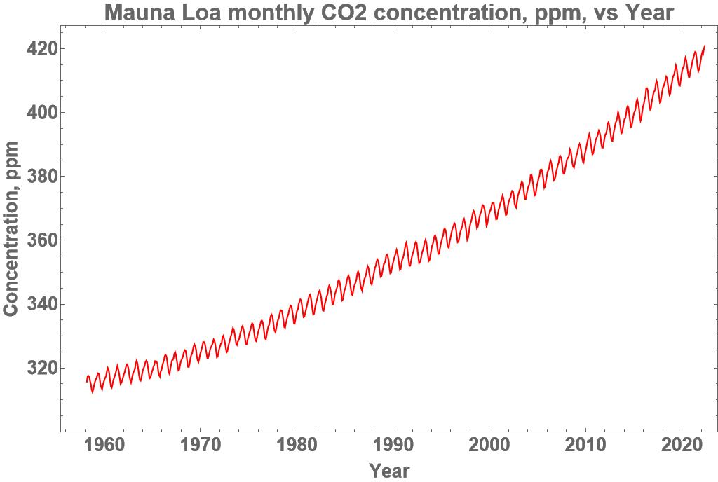
Figure 1. Monthly atmospheric CO2 concentration, Mauna Loa Observatory, Source:[ Ref. 2]

The source file, Ref. 2, lists the data in 10 columns. The columns used here were columns 3 and 4, the date in Excel and decimal format, column 9 being the measured CO2 concentration with missing values in-filled from a smoothed fit to the data and column 10 being the seasonally adjusted measurements again with missing values in-filled.

The monthly CO2 concentration had an average rate of increase over the 64 year period from March 1958 to May 2022 of 1.60 ppm pa. For the 5 year period March 1958 to March 1963 the rate was 0.68 ppm pa and for the 5 year period May 2017 to May 2022 the rate was 2.50 ppm pa, that is, the rate of increase has steadily accelerated over time to be 3.7 times greater than it was 59 years earlier. The range was from a minimum of 312.43 ppm to a maximum of 420.78 ppm.

The amplitude of the seasonal variation was estimated to range from 5.25 ppm to 8.03 ppm, increasing in amplitude over time, in an irregular fashion. The maxima occurred, on average, in early May, which is the beginning of Summer, and the minima in late September, at the end of Summer. The greatest seasonal variation took place between September 2015 and April 2016. This means that the CO2 concentration rose during the cool of Winter and fell during the heat of Summer, which is out of phase with the UN IPCC claim that increased CO2 concentration causes an increase in temperature. Nor does the UN IPCC hypothesis provide an explanation for the steady increase in the rate of increase of the CO2 concentration.

Temperature and CO2 concentration

Here is 522 months of empirical data, showing a distinct lack of a relationship between the Tropics satellite lower troposphere temperature [ Ref.1] and the seasonally adjusted atmospheric CO2 concentration at the Mauna Loa Observatory.


Figure 2. Mauna Loa Observatory, Source: [ Ref. 1] and [ Ref. 2]

Figure 2 shows the monthly satellite lower troposphere temperature for the Tropics zone, 20̊ South to 20̊ North, in blue, and the relevant monthly CO2 concentration in red after removal of the seasonal variation so as to match the residual temperature series. The range for the monthly CO2 concentration is from 335.77 ppm to 418.2 ppm. The range for the Tropics temperature is from -0.99̊ Celsius to +1.15̊ Celsius with respect to a 30 year average base value. The clear and obvious difference between the two raises the possibility that there may be no common causal factor whereby the CO2 concentration drives the temperature as claimed by the UN IPCC.

Calculation of the Ordinary Linear Regression between the two time series gave a Pearson correlation coefficient of 0.462 from the 522 monthly data pairs. This is a measure of the relationship between the background linear trend of each of the time series as shown by an almost identical correlation of 0.463 between the temperature and the time. The correlation between the CO2 concentration and the time was 0.995, that is, the seasonal adjusted CO2 concentration time series was practically a linear trend with respect to time. Any pair of linear trends, no matter what their source, will have a high correlation coefficient of about 1.0 which is necessarily of no causal significance as a background linear trend with respect to time can be calculated for any time series.

Antarctica’s Missing Warming: Japanese Syowa Station Shows Cooling Since 1977 By P Gosselin on 20. January 202

by Heller, Jan 20, 2023 in NoTricksZone


Despite all the claims of a “rapidly warming planet”, we know Antarctic sea ice extent has seen a rather impressive upward trend over the past 40 years, which tells us cooling is more likely at play.

Here’s southern hemisphere sea ice extent chart (up to 2017):

Antarctic sea ice has gained steadily over the past 40 years. Chart: Comiso et al, 2017

It’s not what you’d expect from a CO2-induced warming planet.

On the Annual and Semi-Annual Components of Variations in Extent of Arctic and Antarctic Sea-Ice

by Lopes F, Courtillot, V. et al., 2023  in MDPIGeosciences


Abstract

In this paper, the 1978–2022 series of northern (NHSI) and southern (SHSI) hemisphere sea ice extent are submitted to singular spectral analysis (SSA). The trends are quasi-linear, decreasing for NHSI (by 58,300 km2/yr) and increasing for SHSI (by 15,400 km2/yr). The amplitude of annual variation in the Antarctic is double that in the Arctic. The semi-annual components are in quadrature. The first three oscillatory components of both NHSI and SHSI, at 1, 1/2, and 1/3 yr, account for more than 95% of the signal variance. The trends are respectively 21 (Antarctic) and 4 times (Arctic) less than the amplitudes of the annual components. We next analyze variations in pole position (PM for polar motion, coordinates m1, m2) and length of day (lod). Whereas the SSA of the lod is dominated by the same first three components as sea ice, the SSA of the PM contains only the 1-yr forced annual oscillation and the Chandler 1.2-yr component. The 1-yr component of NHSI is in phase with that of the lod and in phase opposition with m1, while the reverse holds for the 1-yr component of SHSI. The semi-annual component appears in the lod and not in m1. The annual and semi-annual components of NHSI and SHSI are much larger than the trends, leading us to hypothesize that a geophysical or astronomical forcing might be preferable to the generally accepted forcing factors. The lack of modulation of the largest (SHSI) forced component does suggest an alternate mechanism. In Laplace’s theory of gravitation, the torques exerted by the Moon, Sun, and planets play the leading role as the source of forcing (modulation), leading to changes in the inclination of the Earth’s rotation axis and transferring stresses to the Earth’s envelopes. Laplace assumes that all masses on and in the Earth are set in motion by astronomical forces; more than variations in eccentricity, it is variations in the inclination of the rotation axis that lead to the large annual components of melting and re-freezing of sea-ice.

2022 updates to the temperature records

by Gavin, Jan 13, 2023 in RealClimate


Another January, another annual data point.

As in years past, the annual rollout of the GISTEMP, NOAA, HadCRUT and Berkeley Earth analyses of the surface temperature record have brought forth many stories about the long term trends and specific events of 2022 – mostly focused on the impacts of the (ongoing) La Niña event and the litany of weather extremes (UK and elsewhere having record years, intense rainfall and flooding, Hurricane Ian, etc. etc.).

But there are a few things that don’t get covered much in the mainstream stories, and so we can dig into them a bit here.

What influence does ENSO really have?

It’s well known (among readers here, I assume), that ENSO influences the interannual variability of the climate system and the annual mean temperatures. El Niño events enhance global warming (as in 1998, 2010, 2016 etc.) and La Niña events (2011, 2018, 2021, 2022 etc.) impart a slight cooling.

GISTEMP anomalies (w.r.t. late 19th C) coded for ENSO state in the early spring.

Consequently, a line drawn from an El Niño year to a subsequent La Niña year will almost always show a cooling – a fact well known to the climate disinformers (though they are not so quick to show the uncertainties in such cherry picks!). For instance, the trends from 2016 to 2022 are -0.12±0.37ºC/dec but with such large uncertainties, the calculation is meaningless. Far more predictive are the long term trends which are consistently (now) above 0.2ºC/dec (and with much smaller uncertainties ±0.02ºC/dec for the last 40 years).

It’s worth exploring quantitatively what the impact is, and this is something I’ve been looking at for a while. It’s easy enough correlate the detrended annual anomalies with the ENSO index (maximum correlation is for the early spring values), and then use that regression to estimate the specific impact for any year, and to estimate an ENSO-corrected time series.

Paul Ehrlich And The Madness Of Climate Alarmists

by J.  Woudhuysen, Jan 12, 2023 in ClimateChangeDispatch


All forecasters make mistakes. But few forecasters have been as consistently wrong as biologist Paul Ehrlich.

So it was quite surprising to see, on January 1, the once venerable CBS series, 60 Minutes, inviting Ehrlich on the show to give his take on the state of the planet.

Focussing on ‘the vanishing wild’, the interview was essentially a forecast of doom, with Ehrlich warning that Earth is in the midst of a ‘sixth mass extinction’ and that its wildlife is ‘running out of places to live’. [emphasis, links added]

Ehrlich, a Stanford University entomologist, is most infamous for his 1968 doom-mongering tome, The Population Bomb.

In the tradition of Thomas Malthus, the prologue begins with the following warning:

‘The battle to feed all of humanity is over. In the 1970s and 1980s, hundreds of millions of people will starve to death in spite of any crash programs embarked upon now. At this late date, nothing can prevent a substantial increase in the world death rate.’

In reality, since The Population Bomb was published, rates of starvation have fallen off a cliff, while the world’s population has doubled.

Ronald Bailey, the science correspondent at Reason magazine, notes that the global crude death rate (deaths per 1,000 people) fell ‘from 12.5 in 1968 to seven in 2019, before ticking up to eight in the pandemic year of 2020’.

Ehrlich has been prolific in promoting mistaken forecasts. With Richard L Harriman, he also wrote How To Be a Survivor: A Plan to Save Spaceship Earth (1971).

Then, with his wife Anne, he issued more lurid warnings in books including Extinction: The Causes and Consequences of the Disappearance of Species (1981) and The Population Explosion (1991).

HadCRUT Data Manipulation Makes 2000-2014 Warming Pause Vanish


by K. Richard, Jan 12, 2023 in PrincipiaScientifIntern


The Met Office and the Climate Research Unit are at it again, making adjustments to the temperature records to increase the claimed rate of warming.

From 2009 to 2019, there were 90 peer-reviewed scientific papers published on the global warming “pause” or “hiatus” observed over the first 15 years of the 21st century.

The HadCRUT3 global temperature trend was recorded as 0.03°C per decade during the global warming hiatusyears of 2000-2014 (Scafetta, 2022).

This was increased to 0.08°C per decade by version 4, as the overseers of the HadCRUT data conveniently added 0.1°C to 0.2°C to the more recent anomalies.

Today, in HadCRUT5, the 2000-2014 temperature trend has been adjusted up to 0.14°C per decade when using the computer model-infilling method.

So, within the last decade, a 15-year temperature trend has been changed from static to strong warming.

See more here notrickszone.com

It’s temperature prediction time again!

by Net Zero, Jan 13, 2023  NetZeroWatch


  1. Each year, we invite Net Zero Watch readers to enter our annual Global Temperature Prediction Competition, in which we try to outdo the Met Office for the accuracy of our soothsaying.

  2. For 2022, the Met Office predicted an average of between 0.97 and 1.21°C (midpoint 1.09°C) above pre-industrial temperatures for the HadCRUT5 index. However, Net Zero Watch readers, as is their wont, went slightly lower, with the median prediction coming in at 1.00°C, and the mode at 1.03°C. This is all shown in the graph below, alongside the correct value, just announced by the Met Office, of 1.16°C.

As you can see, none of our competition entrants got the right answer. There were three people just above, and three more just below. We’ll put all six names into a hat to pick a winner. We’ll be in contact shortly.

If you’d like to enter the 2023 competition, now is your chance!

As always, the prize is a bottle of hooch of your choice, and a book from the GWPF or Net Zero Watch publication lists.

The Met Office reckons on a relatively sharp warming, suggesting HadCRUT5 will come in at between 1.08 and 1.32°C above pre-industrial (with a central estimate of 1.20°C). That’s 0.04°C above last year’s outturn, which doesn’t seem unreasonable, assuming we come out of the La Nina conditions that prevailed in 2022.

To enter, click here (opens a new site). Good luck!

German Renewable Energies Expert : Global Warming is Going To Pause As North Atlantic Cools

by Prof. F. Vahrenholt, Jean 11, 2023 in Clintel


The unusually mild weather at the turn of the year in Central Europe has strengthened the belief of many in Germany that CO2-induced global warming is in full swing. Globally – and this is the only thing that matters – temperatures are developing in a different direction.

If we take the average of the last years, the global temperature has been constant for 8 years and 4 months.

In December, the deviation of the global temperature from the 30-year average of the satellite-based measurements of the University of Alabama (UAH) dropped again, to 0.05 degrees Celsius. To be sure, there is a long-term temperature increase through 2015. But it has averaged only 0.13 degrees Celsius per decade since 1979.

Weakening North Atlantic Oscillation

But it gets even better: the latest scientific studies show for Europe that it will first go slightly downhill for 15-20 years.

Chart by Dr. Roy Spencer.

Some climate science heavyweights recently caused a stir in the Nature journal “Climate and Atmospheric Science.” Katja Matthes, director of the GEOMAR Helmholtz Centre for Ocean Research in Kiel, Johann Jungclaus of the Max Planck Institute for Meteorology in Hamburg and Nour-Eddine Omrani of the Norwegian Bjerknes Centre for climate research published a study showing that we are facing a weakening of the North Atlantic Oscillation, a cooling of the North Atlantic and a related global temperature development as between 1950 and 1970 (the authors say in their summary).

The graph shows the decline in North Atlantic temperatures by 2040, but because of the global warming trend, temperatures are not falling back to 1950-1970 levels, explains one of the authors, Eddine Omrani. The expected pause in warming gives us time, Omrani says, to work out technical, political and economic solutions before the next warming phase, which will take over again from about 2050.

Why is the coming cooling in Europe not being reported ?

Good 2022 Climate News the MSM didn’t tell you

by J. Vinos, Jan 8, 2023 in WUWT


No minimally informed person denies that climate changes. The climate has always changed. Since 1860 the predominant climate change has been warming, which is fortunate because if we had a winter like those of 1800-1850, we would be in for a shock. No one has been able to prove that global warming is primarily a consequence of our emissions. It is reasonable to assume that increased CO2 has contributed to warming since the mid-20th century when our CO2 emissions increased significantly, but no one knows how much they have contributed, no matter how much the Intergovernmental Panel on Climate Change (IPCC) insists that “humans are the dominant cause of observed global warming over recent decades.”(IPCC AR6, page 515).

There is no evidence for this statement. I know this because I have read thousands of scientific papers looking for it. And no, computer models are not evidence of anything but the programming skills of their authors. Models and their predictions are constantly changing and when our knowledge of climate changes, they must be redone.

The absolute lack of evidence contrasts sharply with the decision to cut our CO2 emissions to zero by completely changing our fossil fuel-based energy system and calling CO2 a pollutant—when it is as essential to life as oxygen. All this while most of the world doesn’t give a damn about emissions and many are only on board for the promised money.

….

UAH Global Temperature Update: 2022 was the 7th Warmest of 44-Year Satellite Record

by R. Spencer, Jan 3, 2023 in GlobalWarming

December of 2022 finished the year with a global tropospheric temperature anomaly of +0.05 deg. C above the 1991-2020 average, which was down from the November value of +0.17 deg. C.

The average anomaly for the year was +0.174 deg. C, making 2022 the 7th warmest year of the 44+ year global satellite record, which started in late 1978. Continuing La Nina conditions in the Pacific Ocean have helped to reduce global-average temperatures for the last two years. The 10 warmest years were:

  • #1 2016 +0.389
  • #2 2020 +0.358
  • #3 1998 +0.347
  • #4 2019 +0.304
  • #5 2017 +0.267
  • #6 2010 +0.193
  • #7 2022 +0.174
  • #8 2021 +0.138
  • #9 2015 +0.138
  • #10 2018 +0.090

The linear warming trend since January, 1979 continues at +0.13 C/decade (+0.12 C/decade over the global-averaged oceans, and +0.18 C/decade over global-averaged land).

2022, Seventh Warmest Year: Warming Slows Down

by Andy May,  Jan 7, 2023 in Petrophysicist


No minimally informed person denies that climate changes. The climate has always changed. Since 1860 the predominant climate change has been warming, which is fortunate because if we had a winter like those of 1800-1850, we would be in for a shock. No one has been able to prove that global warming is primarily a consequence of our emissions. It is reasonable to assume that increased CO2 has contributed to warming since the mid-20thcentury when our CO2 emissions increased significantly, but no one knows how much they have contributed, no matter how much the Intergovernmental Panel on Climate Change (IPCC) insists that “humans are the dominant cause of observed global warming over recent decades.” (IPCC AR6, page 515).

There is no evidence for this statement. I know this because I have read thousands of scientific papers looking for it. And no, computer models are not evidence of anything but the programming skills of their authors. Models and their predictions are constantly changing and when our knowledge of climate changes, they must be redone.

The absolute lack of evidence contrasts sharply with the decision to cut our CO2 emissions to zero by completely changing our fossil fuel-based energy system and calling CO2 a pollutant—when it is as essential to life as oxygen. All this while most of the world doesn’t give a damn about emissions and many are only on board for the promised money.

To get to the good news about global warming we need to look at variations in the rate of global warming, i.e., the speed of warming. Today we are going to use satellite-calculated global temperature data from the University of Alabama in Huntsville, UAH 6.0. They are plotted in Figure 1.

Figure 1. UAH satellite global temperature anomaly data in °C relative to the mean from 1991 to 2020. In green is the linear trend of the series (+0.13 ºC/decade) and in blue is the linear trend since 2016. Data: UAH 6.0Graph: Woodfortrees.

As we can see, the temperature trend decreases since 2016, so 2022 is the seventh warmest year. For 7 years the planet has been cooling. Does that mean that warming is over? No, periods of 7 years of cooling are frequent in the record, there being 8 of them since 1979, and the warming continues. But there is only one period of more than 15 years of cooling, from 1998 to 2014, that appears in the record for the last 45 years. It is known as the “Pause.”

To analyze the evolution of the warming rate, we subtract from each monthly data the previous one to calculate the monthly increase. We then deseasonalize the monthly increase by finding the 12-month moving average to remove a lot of the noise. Finally, we calculate the 15-year average warming rate in °C/decade by calculating the 180-month moving average and multiplying the resulting data by 120.

Figure 2. Evolution of the warming rate for 15-year periods between 1979 and 2022 in °C/decade and its linear trend, from monthly UAH 6.0 satellite temperature data.