
by P. Homewood, Nov 15, 2021 in NotaLot ofPeopleKnowThat
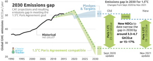
For the last few weeks, the BBC has been regularly publishing the above graph from Climate Action Tracker, showing the extra emission reductions resulting from the new NDCs, National Plans, submitted for COP26.
Essentially they estimate a figure of 3.3 to 4.7 GtCO2e for all GHGs. Significantly this means that they will still be much higher than 2010 in 2030. According to the science, they need to be cut by 45% from 2010 levels to stay on track for 1.5C
Curiously however in the last few days, the BBC has dropped the above graph, and replaced with an ostensibly fake one, which claims that the new COP26 pledges will cut emissions by 10.5 GtCO2e, more than double the Climate Tracker numbers, bringing 2030 levels down to 90% of 2010 ones.
…