Archives par mot-clé : Global Temperature

Climate: about which temperature are we talking about?

by S. Furfari and H. Masson, July 26, 2019 in ScienceClimateEnergie


Is it the increase of temperature during the period 1980-2000 that has triggered the strong interest for the climate change issue? But actually, about which temperatures are we talking, and how reliable are the corresponding data?

1/ Measurement errors

Temperatures have been recorded with thermometers for a maximum of about 250 years, and by electronic sensors or satellites, since a few decades. For older data, one relies on “proxies” (tree rings, stomata, or other geological evidence requiring time and amplitude calibration, historical chronicles, almanacs, etc.). Each method has some experimental error, 0.1°C for a thermometer, much more for proxies. Switching from one method to another (for example from thermometer to electronic sensor or from electronic sensor to satellite data) requires some calibration and adjustment of the data, not always perfectly documented in the records. Also, as shown further in this paper, the length of the measurement window is of paramount importance for drawing conclusions on a possible trend observed in climate data. Some compromise is required between the accuracy of the data and their representativity.

2/ Time averaging errors

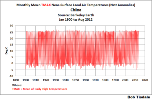
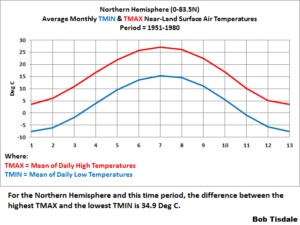
If one considers only “reliable” measurements made using thermometers, one needs to define daily, weekly, monthly, annually averaged temperatures. But before using electronic sensors, allowing quite continuous recording of the data, these measurements were made punctually, by hand, a few times a day. The daily averaging algorithm used changes from country to country and over time, in a way not perfectly documented in the data; which induces some errors (Limburg, 2014) . Also, the temperature follows seasonal cycles, linked to the solar activity and the local exposition to it (angle of incidence of the solar radiations) which means that when averaging monthly data, one compares temperatures (from the beginning and the end of the month) corresponding to different points on the seasonal cycle. Finally, as any experimental gardener knows, the cycles of the Moon have also some detectable effect on the temperature (a 14 days cycle is apparent in local temperature data, corresponding to the harmonic 2 of the Moon month, Frank, 2010); there are circa 13 moon cycle of 28 days in one solar year of 365 days, but the solar year is divided in 12 months, which induces some biases and fake trends (Masson, 2018).

3/ Spatial averaging

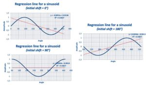
Figs. 12, 13 and 14 : Linear regression line over a single period of a sinusoid.


Conclusions


  1. IPCC projections result from mathematical models which need to be calibrated by making use of data from the past. The accuracy of the calibration data is of paramount importance, as the climate system is highly non-linear, and this is also the case for the (Navier-Stokes) equations and (Runge-Kutta integration) algorithms used in the IPCC computer models. Consequently, the system and also the way IPCC represent it, are highly sensitive to tiny changes in the value of parameters or initial conditions (the calibration data in the present case), that must be known with high accuracy. This is not the case, putting serious doubt on whatever conclusion that could be drawn from model projections.

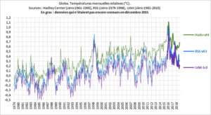
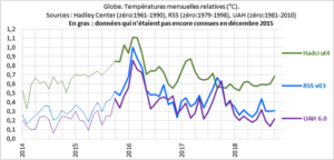
  2. Most of the mainstream climate related data used by IPCC are indeed generated from meteo data collected at land meteo stations. This has two consequences:(i) The spatial coverage of the data is highly questionable, as the temperature over the oceans, representing 70% of the Earth surface, is mostly neglected or “guestimated” by interpolation;(ii) The number and location of theses land meteo stations has considerably changed over time, inducing biases and fake trends.

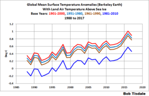
  3. The key indicator used by IPCC is the global temperature anomaly, obtained by spatially averaging, as well as possible, local anomalies. Local anomalies are the comparison of present local temperature to the averaged local temperature calculated over a previous fixed reference period of 30 years, changing each 30 years (1930-1960, 1960-1990, etc.). The concept of local anomaly is highly questionable, due to the presence of poly-cyclic components in the temperature data, inducing considerable biases and false trends when the “measurement window” is shorter than at least 6 times the longest period detectable in the data; which is unfortunately the case with temperature data

  4. Linear trend lines applied to (poly-)cyclic data of period similar to the length of the time window considered, open the door to any kind of fake conclusions, if not manipulations aimed to push one political agenda or another.

  5. Consequently, it is highly recommended to abandon the concept of global temperature anomaly and to focus on unbiased local meteo data to detect an eventual change in the local climate, which is a physically meaningful concept, and which is after all what is really of importance for local people, agriculture, industry, services, business, health and welfare in general.

Latest Global Temp. Anomaly (May ’19: +0.32°C) A Simple “No Greenhouse Effect” Model of Day/Night Temperatures at Different Latitudes

by Dr. Roy Spencer, June 7, 2019 in WUWT


Abstract: A simple time-dependent model of Earth surface temperatures over the 24 hr day/night cycle at different latitudes is presented. The model reaches energy equilibrium after 1.5 months no matter what temperature it is initialized at. It is shown that even with 1,370 W/m2 of solar flux (reduced by an assumed albedo of 0.3), temperatures at all latitudes remain very cold, even in the afternoon and in the deep tropics. Variation of the model input parameters over reasonable ranges do not change this fact. This demonstrates the importance of the atmospheric “greenhouse” effect, which increases surface temperatures well above what can be achieved with only solar heating and surface infrared loss to outer space.

Does NASA’s Latest Figures Confirm Global Warming?

by Anthony Watts, May 9, 2019 in ClimateChangeDispatch


That’s an indication of the personal bias of co-author Schmidt, who in the past has repeatedly maligned the UAH dataset and its authors because their findings didn’t agree with his own GISTEMP dataset.

In fact, Schmidt’s bias was so strong that when invited to appear on national television to discuss warming trends, in a fit of spite, he refused to appear at the same time as the co-author of the UAH dataset, Dr. Roy Spencer.

A breakdown of several climate datasets, appearing below in degrees centigrade per decade, indicates there are significant discrepancies in estimated climate trends:

  • AIRS: +0.24 (from the 2019 Susskind et al. study)
  • GISTEMP: +0.22
  • ECMWF: +0.20
  • RSS LT: +0.20
  • Cowtan & Way: +0.19
  • UAH LT: +0.18
  • HadCRUT4: +0.17

Which climate dataset is the right one? Interestingly, the HadCRUT4 dataset, which is managed by a team in the United Kingdom, uses most of the same data GISTEMP uses from the National Oceanic and Atmospheric Administration’s Global Historical Climate Network.

New satellite data confirm real world temperature cooler than climate models

by CFACT, May 2nd, 2019


Newly published data gathered by NASA’s AIRS satellite confirm the Earth is warming more slowly than has been forecast by climate activists and the United Nations Intergovernmental Panel on Climate Change (IPCC). Data gathered from 2003 through 2017 confirm temperatures remained essentially flat from 2003 through 2015, finally rising briefly as a strong El Nino formed in 2015 and lasted into 2016 (https://ggweather.com/enso/oni.htm). Even with El Nino adding an illusory warming spike at the end of the period, temperatures still rose just over 0.2 degrees during the 15-year period. That pace works out to less than 1.5 degrees of warming per century.

IPCC initial forecasts called for 0.3 degrees Celsius of warming per decade, while skeptic forecasts have tended to hover around 0.1 degrees. As temperatures warmed more slowly than IPCC predicted, IPCC reduced its forecasts to meet skeptics in the middle, moving to a predicted 0.2 degrees warming per decade. Even so, the newly published data indicate IPCC continues to forecast more warming than real-world data indicate.

2019 GLOBAL TEMPS PREDICTION: THE ENTRIES ARE IN

by GWPF, March 6, 2019


The Met Office says it’s going to get warmer this year. GWPF readers reckon not.

Back in early February, we invited readers to submit their entries for our 2019 global temperature prediction competition. The GWPF posse had soundly beaten the Met Office in last year’s competition, and you certainly seemed encouraged by your success, as there were 250 entries this time round, more than double last year’s entry.

For 2019, the Met Office have once again pushed the boat out on their predictions, suggesting that we might see a temperature rise of 0.19°C by the year end.

As you can see from the graph below, GWPF readers are a lot more cautious. The graph is a histogram of the entries, so the height of each blue bar is the number of readers making a particular prediction, the temperatures being given in terms of anomalies from the 1961-1990 average. The most common prediction was therefore for a slight decline in temperature over the course of the year, down to to 0.55°C from last year’s 0.6°C. The Met Office prediction is the grey band – they have given a single value this time round, rather than the range given in previous years.

Aerosol-driven droplet concentrations dominate coverage and water of oceanic low-level clouds

by  D. Rosenfeld et al., February 8, 2019 in Science

Reflections on cloud effects

How much impact does the abundance of cloud condensation nuclei (CCN) aerosols above the oceans have on global temperatures? Rosenfeld et al.analyzed how CCN affect the properties of marine stratocumulus clouds, which reflect much of the solar radiation received by Earth back to space (see the Perspective by Sato and Suzuki). The CCN abundance explained most of the variability in the radiative cooling. Thus, the magnitude of radiative forcing provided by these clouds is much more sensitive to the presence of CCN than current models indicate, which suggests the existence of other compensating warming effects.

WORLD COOLING – BUT RAPID WARMING FORECAST

by David Whitehouse, February 7, 2019 in GWPF


Average global temperature has been falling for the last 3 years, despite rising atmospheric CO2 levels.


2018 was the fourth warmest year of the instrumental period (started 1850) having a temperature anomaly of 0.91 +/- 0.1 °C – cooler than 2017 and closer to the fifth warmest year than the third. But of course there are those that don’t like to say the global surface temperature has declined.

Here we go again! Media hypes alleged ‘Hottest year’ declarations as 2018 cools, slips to 4th ‘warmest’ – Book excerpt

by Marc Morano ,February 6, 2019 in ClimatDepot


Another year, another claim of “hottest” or “warmest years.” So-called “Hottest year” claims are purely political statements designed to persuade the public that the government needs to take action on man-made climate change. Once again, the media and others are hyping temperature changes year-to-year so small as to be within the margin of error.

Such temperature claims are based on year-to-year temperature data that differs by only a few hundredths of a degree to up to a few tenths of a degree—differences that were within the margin of error in the surface data.

Here are the AP’s and NASA’s claims out today: (A full debunking of these “hottest year”claims follows below.)

IPCC’s Special Report Slammed By Eminent Climate Scientist

by P. Homewood, December 20, 2018 via GWPF


The significance of this new GWPF report by Prof Ray Bates of the Meteorology and Climate Centre at University College Dublin cannot really be overstated:

GWPF Briefing 36

This is the press release:

London, 20 December: One of Europe’s most eminent climate scientists has documented the main scientific reasons why the recent UN climate summit failed to welcome the IPCC’s report on global warming of 1.5°C.
In a paper published today by the Global Warming Policy Foundation Professor Ray Bates of University College Dublin explains the main reasons for the significant controversy about the latest IPCC report within the international community.
The IPCC’s Special Report on a Global Warming of 1.5°C (SR1.5) was released by the Intergovernmental Panel on Climate Change (IPCC) in advance of the recent COP24 meeting in Katowice, Poland, but was not adopted by the meeting due to objections by a number of governments.

Examples of How the Use of Temperature ANOMALY Data Instead of Temperature Data Can Result in WRONG Answers

by Bob Tisdale, December 13, 2018 in WUWT


This post comes a couple of weeks after the post EXAMPLES OF HOW AND WHY THE USE OF A “CLIMATE MODEL MEAN” AND THE USE OF ANOMALIES CAN BE MISLEADING(The WattsUpWithThat cross post is here.)

INTRO

I was preparing a post using Berkeley Earth Near-Surface Land Air Temperature data that included the highest-annual TMAX temperatures (not anomalies) for China…you know, the country with the highest population here on our wonder-filled planet Earth. The graph was for the period of 1900 to 2012 (FYI, 2012 is the last full year of the local TMAX and TMIN data from Berkeley Earth). Berkeley Earth’s China data can be found here, with the China TMAX data here. For a more-detailed explanation, referring to Figure 1, I was extracting the highest peak values for every year of the TMAX Data for China, but I hadn’t yet plotted the graph in Figure 1, so I had no idea what I was about to see.

Figure 1 The results are presented in Figure 2, and they were a little surprising, to say the least.

“…it is the change in temperature compared to what we’ve been used to that matters.” – Part 1

by Bob Tisdale, December 8, 2018 in WUWT


In this post, we’re going to present monthly TMIN and TMAX Near-Land Surface Air Temperature data for the Northern and Southern Hemispheres (not in anomaly form) in an effort to add a little perspective to global warming. And at the end of this post, I’m asking for your assistance in preparing a post especially for you, the visitors to this wonderful blog WattsUpWithThat.

INTRODUCTION FOR THE “GLOBAL WARMING IN PERSPECTIVE” SERIES

A small group of international unelected bureaucrats who serve the United Nations now wants to limit the rise of global land+ocean surface temperatures to no more 1.5 deg C from pre-industrial times…even though we’ve already seen about 1.0 deg C of global warming since then. So we’re going to put that 1.0 deg C change in global surface temperatures in perspective by examining the ranges of surface temperatures “we’ve been used to” on our lovely shared home Earth.

The source of the quote in the title of this post is Gavin Schmidt, who is the Director of the NASA GISS (Goddard Institute of Space Studies). It is from a 2014 post at the blog RealClimate, and, specifically, that quote comes from the post Absolute temperatures and relative anomalies (Archived here.). The topic of discussion for that post at RealClimate was the wide span of absolute global mean temperatures [GMT, in the following quote] found in climate models. Gavin wrote (my boldface):

WMO Reasoning behind Two Sets of “Normals” a.k.a. Two Periods of Base Years for Anomalies

by Bob Tisdale, December 3, 2018 in WUWT


Most of us are familiar with the World Meteorological Organization (WMO)-recommended 30-year period for “normals”, which are also used as base years against which anomalies are calculated. Most, but not all, climate-related data are referenced to 30-year periods. Presently the “climatological standard normals” period is 1981-2010. These “climatological standard normals” are updated every ten years after we pass another year ending in a zero. That is, the next period for “climatological standard normals” will be 1991-2020, so the shift to new “climatological standard normals” will take place in a few years.

But were you aware that the WMO also has another recommended 30-year period for “normals”, against which anomalies are calculated? It’s used for the “reference standard normals” or “reference normals”. The WMO-recommended period for “reference normals” is 1961-1990. And as many of you know, of the primary suppliers of global mean surface temperature data, the base years of 1961-1990 are only used by the UKMO.

Long Term Temperature Records Contradict GISS Temperature Record

by Mark Fife, November 30, 2018 in WUWT


Conclusions:

We have looked at quality, long term records from three different regions. Two of these are on opposite sides of the North Atlantic, one is in the South Pacific. The two regions bordered by the North Atlantic are similar, but not identical. The record from Australia is only similar in that temperature has varied over time and has warmed in the recent past.

In all three regions there is no evidence of any strong correlation to CO2. There is ample evidence to support a conjecture of little to no influence.

There is ample evidence, widely shown in other studies, of localized influence due to development and population growth. The CET record has a correlation of temperature to CO2 of 0.54, which is the highest correlation of any individual record in this study. This area is also the most highly developed. While this does not constitute proof, it does tend to support the supposition the weak CO2 signal is enhanced by a coincidence between rising CO2 and rising development and population.

The efficacy of combining US records with those records from Greenland, Iceland, and the UK may be subject to opinion. However, there is little doubt combining records from Australia would create an extremely misleading record. Like averaging a sine curve and a cosine curve.

It appears the GISS data set does a poor job of estimating the history of temperature in all three regions. It shows a near perfect correlation to CO2 levels which is simply not reflected in any of the individual or regional records. There are probably numerous reasons for this. I would conjecture the reasons would include the influence of short-term temperature record bias, development and population growth bias, and data estimation bias. However, a major source of error could be attributed to the simple mistake of averaging regions where the records simply are too dissimilar for an average to yield useful information.

Calculating global temperature anomaly

by Nick Stokes, November 14, 2018 in WUWT


There is much criticism here of the estimates of global surface temperature anomaly provided by the majors – GISS, NOAA and HADCRUT. I try to answer these specifically, but also point out that the source data is readily available, and it is not too difficult to do your own calculation. I point out that I do this monthly, and have done for about eight years. My latest, for October, is here (it got warmer).

Last time CharlesTM was kind enough to suggest that I submit a post, I described how Australian data made its way, visible at all stages, from the 30-minute readings (reported with about 5 min delay) to the collection point as a CLIMAT form, from where it goes unchanged into GHCN unadjusted (qcu). You can see the world’s CLIMAT forms here; countries vary as to how they report the intermediate steps, but almost all the data comes from AWS, and is reported at the time soon after recording. So GHCN unadjusted, which is one of the data sources I use, can be verified. The other, ERSST v5, is not so easy, but there is a lot of its provenance available.

My calculation is based on GHCN unadjusted. That isn’t because I think the adjustments are unjustified, but rather because I find adjustment makes little difference, and I think it is useful to show that.

I’ll describe the methods and results, but firstly I should address that much-argued question of why use anomalies.

The phase relation between atmospheric carbon dioxide and global temperature

by O. Humlum et al., 2013 in Global&PlanetaryChange


Highlights

► Changes in global atmospheric CO2 are lagging 11–12 months behind changes in global sea surface temperature. ► Changes in global atmospheric CO2 are lagging 9.5–10 months behind changes in global air surface temperature. ► Changes in global atmospheric CO2 are lagging about 9 months behind changes in global lower troposphere temperature. ► Changes in ocean temperatures explain a substantial part of the observed changes in atmospheric CO2 since January 1980. ► Changes in atmospheric CO2 are not tracking changes in human emissions.

Also this graph

Examination of space-based bulk atmospheric temperatures used in climate research

by J.R. Christy et al., March 8, 2018 in InternJournRemoteSensing


The Intergovernmental Panel on Climate Change Assessment Report 5 (IPCC AR5, 2013) discussed bulk atmospheric temperatures as indicators of climate variability and change. We examine four satellite datasets producing bulk tropospheric temperatures, based on microwave sounding units (MSUs), all updated since IPCC AR5. All datasets produce high correlations of anomalies versus independent observations from radiosondes (balloons), but differ somewhat in the metric of most interest, the linear trend beginning in 1979. The trend is an indicator of the response of the climate system to rising greenhouse gas concentrations and other forcings, and so is critical to understanding the climate. The satellite results indicate a range of near-global (+0.07 to +0.13°C decade−1) and tropical (+0.08 to +0.17°C decade−1) trends (1979–2016), and suggestions are presented to account for these differences. We show evidence that MSUs on National Oceanic and Atmospheric Administration’s satellites (NOAA-12 and −14, 1990–2001+) contain spurious warming, especially noticeable in three of the four satellite datasets.

Comparisons with radiosonde datasets independently adjusted for inhomogeneities and Reanalyses suggest the actual tropical (20°S-20°N) trend is +0.10 ± 0.03°C decade−1. This tropical result is over a factor of two less than the trend projected from the average of the IPCC climate model simulations for this same period (+0.27°C decade−1).

UAH global temperature – little change in October

by Anthony Watts, November 3, 2018 in WUWT


UAH Global Temperature Update for October, 2018: +0.22 deg. C

The Version 6.0 global average lower tropospheric temperature (LT) anomaly for October, 2018 was +0.22 deg. C, up a little from +0.14 deg. C in September. The linear temperature trend of the global average lower tropospheric temperature anomalies from January 1979 through October 2018 remains at +0.13 C/decade.