Archives par mot-clé : Global Temperature

Study: Global Warming Hiatus (aka “The Pause”) Was Real

by A. Watts, Sep 28, 2020 in WUWT


From the GWPF and the better late than never department: (the paper was published in late 2019 but seems pretty solid, using Oxygen18 isotope analysis) – Anthony

A new analysis of global air temperature by researchers from Tongji University in Shanghai has cast light on the much debated recent hiatus in global temperature.

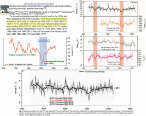
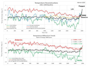
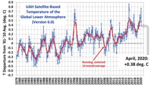
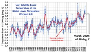
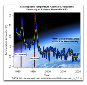
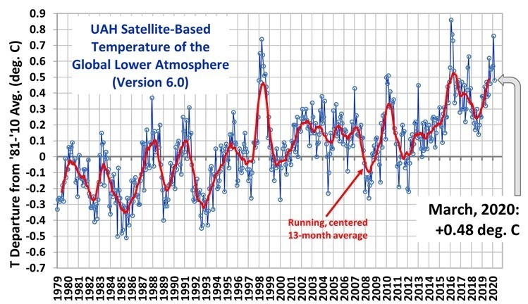
Writing in the Journal of Earth Science the Chinese scientists say there was a rapid rise in global mean surface air temperature after the late 1970s but that this stalled and there was a relative stagnation and even slight cooling that lasted for about 15 years (1998–2012). They add that even though the slowdown was acknowledged by the Intergovernmental Panel on Climate Change Fifth Assessment Report (IPCC AR5) and termed as a hiatus (IPCC, 2013) there was a debate in the scientific community about whether there was a hiatus in global warming or not.

The researchers believe that the debate about the global warming hiatus poses a substantial challenge to our understanding of the global climate response to anthropogenic greenhouse gas emissions and natural variability. They say that the disagreements about the recent global warming hiatus mainly arise from different sources, among which differences across observational SAT datasets may be a key contributor to the contradictory conclusions. So they use an alternative set of data.

They use the ratio of two oxygen isotopes in precipitation, oxygen 16 and 18, which is a proxy for the temperature of precipitation and surface temperature. They are particularly interested in what they term a “robust correlation” between precipitation oxygen ratios and surface temperature over mid- and high-latitude regions. Twelve stations were selected of which ten are located in Europe, and the remaining two in Antarctica and North America, respectively. Using the data they constructed a composite isotope index spanning 1970–2016 by combining twelve precipitation oxygen isotope records collected over mid and high-latitude continents. With it they evaluate the recent global warming hiatus.

Continuer la lecture de Study: Global Warming Hiatus (aka “The Pause”) Was Real

Determined Scientists Add Phantom ‘Unprecedented’ Warmth To New Temperature Reconstructions

by K. Richard, Sep 21, 2020 in NoTricksZone


Paleoclimate reconstructions that find no unusual modern warming are nonetheless characterized as showing sharp temperature increases in recent decades anyway.

A new (Li et al., 2020) 1818-2012  temperature reconstruction determined 1955 (6.33 °C) and 2001 (7.17 °C) were the 1st and 5th coldest years in northeastern China in the last 200 years. The two warmest years were 1832 (9.63 °C) and 1900 (9.57 °C).

Further, the highest “continuous high decadal temperatures” recorded were in 1818–1844 and 1856–1873. The post-1950s temperatures were colder than nearly all of the first 100 years of the temperature record.

And yet in spite of the warmer 19th-century temperatures, the authors chracterize the slight temperature rise since the 1950s as heralding  in “unprecedented” warming. They make this claim (of “unprecedented” recent warmth) in both the paper’s textual and graphical abstracts.


Image Source: Li et al., 2020


Forbes et al. (2020) use thermometer data from an Alaskan airport for the last ~90 years of their temperature record. The instrumentals show surface temperatures cooled -0.7°C in winter (January) and warmed 0.8°C in summer (July) from the 1950s-’80s decades to the 1990s to 2010s.

For the summer temperature record (shown in red below), nearly all the warming occurred during a step-change from the mid-1970s to mid-1980s. Since about 1985, summer temperatures seem to have been stable to slightly declining.

A lack of net overall warming in the last 50 or 60 years does not advance the anthropogenic global warming (AGW) cause, of course.

When will Temperatures start to fall? Part1

by Tony Brown, August 28, 2020 in WUWT


“If Europeans truly mobilize around the delivery of the 2050 goal, every business decision, lifestyle choice, political swing, every hallmark of European culture — from annual ski trips, to Champions League Football matches, to French cheese — will need to be tested against its contribution to climate change.” European Commission ‘Green Deal’ March 2020

This is an article with a simple proposition.  Science tells us that rapidly rising Co2 in turn causes rising temperatures, which has become a very serious problem for humanity.

The three questions I ask, in the expectation that the answer can be provided from main stream published science is;

“Assuming we reach zero carbon emissions by 2030-Extinction Rebellion (XR) requirement,  or 2050 -the aim of most governments under the Paris Accord- 1) how long would it take for Co2 levels to naturally fall below the’ safe upper limits’ of 350ppm espoused by such as James Hansen; 2) for it to fall further to 280ppm -the previous pre industrial level -AND 3) when will temperatures start to fall in turn, to achieve pre industrial levels, said to be 1 to 2 degrees Centigrade below present, according to the IPCC.”

There are all sorts of caveats of course, with methane, water vapour, clouds, feedbacks, ocean response, natural variations etc but having scoured various ‘official’ web sites I can find no definitive estimate. An examination of the Extinction Rebellion web site demonstrates they are anarchists, rather than a serious green organisation. A couple of more reasoned attempts to track the consequences of zero carbon emissions are given in Note 3below the graphic-Figure 1 together with a variety of other useful background information.

Whether the reader personally believes excess Co2 to be a problem is not a matter this article is concerned with.  Let’s take science at face value –our respective Governments  have overwhelmingly agreed that humanity has added some 140ppm of Co2 to the pre industrial 280ppm and that, as a result, temperatures have risen substantially and are at a dangerous level and causing extremes of weather.

Extensively-Referenced Study Of Past Scientists’ Global Temperature Estimates Suggests ‘No Change’ In 100 Years

by K. Richard, August 13, 2020 in NoTricksZone


In the early 1900s, the globally-averaged distribution of calculated surface temperature estimates ranged between 14 and 15°C. For 1991-2018, HadCRUT, Berkeley, and NASA GISS also estimate today’s global temperature is about 14.5°C.

Scientists estimating Earth’s surface temperature has been an ongoing pursuit since the early 19th century.

A new study (Kramm et al., 2020) suggests the generally agreed-upon global temperature from 1877 to 1913 from dozens of calculated results was about 14.4°C.

Problematically, HadCRUT, Berkley, and NASA GISS also indicate the 1991-2018 had a global surface temperature of about 14.5°C.

This would suggest there has been “no change in the globally averaged near-surface temperature over the past 100 years”.

Le 20ème siècle a été anormalement chaud mais le 21ème siècle revient à la normale (1/2)

by Jean Van Vliet, 14 août 2020, in ScienceClimatEnergie


Introduction

Suite à la prise de conscience à la fin du 20ème siècle d’une hausse inhabituelle des températures terrestres, des chercheurs américains ont développé une théorie du réchauffement global basé sur l’effet de serre dû au CO2 [1], en soulignant la responsabilité possible de l’homme dans le réchauffement observé: la poursuite des émissions de CO2 conduirait à une éventuelle catastrophe planétaire. Ces  chercheurs ont présenté leur théorie au Congrès américain [2] et aux médias. Le monde politique international a réagi rapidement à cet alarmisme [3] en permettant à Assemblée Générale de l’ONU de décembre 1988 d’approuver la mise en place du GIEC [4].

Depuis plus de trente ans et malgré le manque persistant de preuve formelle, la peur du réchauffement global anthropique causé par le CO2 est propagée sans relâche par l’ONU et ses satellites PNUE, GIEC et OMM relayés par les ONG environnementales et les médias, suivis plus récemment par une fraction du monde académique occidental. Une puissante industrie des énergies renouvelables a été créée via des subsides et des certificats verts quitte à doubler ou tripler le prix de l’électricité. Cette industrie est prête à exploiter les nouvelles aubaines financières annoncées par l’Accord de Paris et le Green Deal de l’UE. Dans un tel contexte, le but avoué est que l’humanité change radicalement son comportement, fût-ce au prix d’une dictature environnementale: l’alarmisme médiatique est maximal, et même les enfants sont embrigadés dans le débat pour soi-disant “sauver la planète”.

Cette tentative rampante de prise du pouvoir a cependant buté contre un obstacle imprévu depuis le début de 2020, à savoir la pandémie du Coronavirus: le lockdown sanitaire a montré que la société pouvait changer son comportement de manière spectaculaire, mais au prix de conséquences économiques et sociales majeures. A la première attaque de la pandémie succède aujourd’hui une deuxième vague et il semble impossible de prévoir quand nous serons délivrés du virus.

Les ressources des Etats n’étant pas infinies, la question brûlante se pose aujourd’hui  de l’affectation des moyens humains et financiers disponibles en fonction nos priorités: devons-nous avoir davantage peur d’une pandémie et de ses conséquences sociales et économiques incontestables ou devons-nous supputer une explosion incontrôlable de la crise climatique amorcée au 20ème siècle et modifiant de manière drastique et irréversible notre environnement ?

Le but du présent article est d’apporter des éléments de réponse à cette question en examinant, dans une perspective scientifique large et basée sur les observations plutôt que sur les modèles, la “crise climatique” démarrée durant la seconde moitié du 20ème siècle en essayant de tirer des conclusions applicables au 21èmesiècle.

1/ La crise ‘climatique du 20ème siècle

Il existe de nombreuses sources fournissant des historiques de température, mais il existe peu de séries chronologiques comparables à celle de l’Observatoire d’Armagh en Irlande du Nord pour la période 1796-2002 [5]; cette série est disponible sur le site web du Met Office britannique pour la période allant de 2002 à aujourd’hui [6].

Figure 1 : Evolution des températures moyennes annuelles de 1796 à 2019 (courbe bleue) ainsi qu’une courbe lissée correspondant à la moyenne glissante rétrospective sur une période de 11 ans (courbe rouge).

Modern Ancient Temperatures

by W. Eschenbach, July 24, 2020 in WUWT


OK, no need to torture me, I confess it—I’m a data junkie.

And when I see a new (to me at least) high-resolution dataset, my knees get weak. Case in point? The temperature dataset of the Colle Gnifetti ice core. It has a two-year resolution thanks to some new techniques. Better, it stretches clear back to the year 800. And best, it extends up to near the present, 2006. This lets us compare it to modern datasets. The analysis of the ice core dataset is described in Temperature and mineral dust variability recorded in two low-accumulation Alpine ice cores over the last millennium by Pascal Bohleber et al.

Let me start with where Colle Gnifetti is located. Unusual among ice core records, it’s from Europe, specifically in the Alps on the border of Switzerland and Italy.

Figure 1. Location of the ice cores in the study.

This is good because some of the longest thermometer-based temperature records are in Europe.

One interesting thing about the site is that usually, ice core drilling occurs at the literal ends of the earth, in Antarctica and Greenland and the like. But this site is not far from the foot of the Margherita Hut, which is at over 4500 metres elevation.


Further Reading: It’s instructive to compare the listed temperatures with the data in A Chronological Listing of Early Weather Events.

Decadal Climate Prediction? Might As Well Throw A Dice!

by P. Homewood, July 12, 2020 in NotaLotofPeopleKnowThat


https://hadleyserver.metoffice.gov.uk/wmolc/

The WMO has collated global temperature projections from twelve different organisations, covering this year and the next five years. They were produced in 2019.

It is totally clear that there is very little agreement between any of them, other than a warm Arctic.

An unkind person might call them a waste of space!

Sunny May–But Only The 48th Warmest

by P. Homewood, June 3, 2020 in NotaLotofPeopleKnowThat


While we’re on with Harrabin’s hysterics about May’s sunny weather being due to climate change, it is appropriate to point out to him that last month was far from being the hottest on record in England:

https://www.metoffice.gov.uk/hadobs/hadcet/data/download.html


In fact there have been 47 hotter Mays since 1659. The hottest was 1833, and the five hottest were all pre 1850.

See also:  UAH Global Temperature Update for May 2020: +0.54 deg. C

New Study: Arctic Waters Were 4°C Warmer Than Today And Nearly Sea-Ice Free Year-Round ~4100 Years Ago

by Brice et al., May 28, 2020 in NoTricksZone


Today, the region north of Svalbard is encrusted with sea ice for all but a few weeks per year and summer sea surface temperatures (SSTs) hover near 0°C.  Scientists (Brice et al., 2020) have determined this same region had sea ice-free conditions last about 10 months per year while SSTs reached 4°C just ~4100 years ago.

In early September, 2019, Arctic explorers once again needed to be rescued from the “disappearing” sea ice that had captured their ship in central Svalbard. This region is presently free of sea ice for only a few weeks per year (late August).

Image Source: electroverse.net

Tendencies, variability and persistence of sea surface temperature anomalies

by Bulgin et al., May 14, 2020 in Nature OPEN ACCESS


Abstract

Quantifying global trends and variability in sea surface temperature (SST) is of fundamental importance to understanding changes in the Earth’s climate. One approach to observing SST is via remote sensing. Here we use a 37-year gap-filled, daily-mean analysis of satellite SSTs to quantify SST trends, variability and persistence between 1981–2018. The global mean warming trend is 0.09 K per decade globally, with 95% of local trends being between −0.1 K and + 0.35 K. Excluding perennial sea-ice regions, the mean warming trend is 0.11 K per decade. After removing the long-term trend we calculate the SST power spectra over different time periods. The maximum variance in the SST power spectra in the equatorial Pacific is 1.9 K2 on 1–5 year timescales, dominated by ENSO processes. In western boundary currents characterised by an intense mesoscale activity, SST power on sub-annual timescales dominates, with a maximum variance of 4.9 K2. Persistence timescales tend to be shorter in the summer hemisphere due to the shallower mixed layer. The median short-term persistence length is 11–14 days, found over 71–79% of the global ocean area, with seasonal variations. The mean global correlation between monthly SST anomalies with a three-month time-lag is 0.35, with statistically significant correlations over 54.0% of the global oceans, and notably in the northern and equatorial Pacific, and the sub-polar gyre south of Greenland. At six months, the mean global SST anomaly correlation falls to 0.18. The satellite data record enables the detailed characterisation of temporal changes in SST over almost four decades.

 …

Earth’s Mean Temperature Falling, Planetary Alignment Suspected As Driver Of The 11-Year Solar Cycle

by F. Vahrenholt, May 9, 2020 in NoTricksZone


The global mean temperature in April 2020 was again significantly lower than in February and March, at 0.38°C above the average from 1981 to 2010. The average temperature increase on the globe from 1981 to February 2020 was 0.14°C per decade. The further development promises to be interesting, especially since a number of research institutes expect a higher probability of a cooling La Nina in the Pacific towards the end of the year. March’s solar activity was very low with a sunspot number of 1.5.  Activity in April rose slightly to 5.4. The first sunspots of the new cycle are showing.

What causes the sun to have an 11-year cycle?

Since the Dessau pharmacist Heinrich Samuel Schwabe discovered in 1843 that the sunspots of the sun increase and decrease in an 11-year cycle, science has been puzzling over the reason why this cycle lasts 11 years and why the solar magnetic field also changes its polarity in this rhythm: the north pole becomes the south pole and vice versa.

In July last year, scientists at the Helmholtz Centre in Dresden Rossendorf made a little-noticed but exciting discovery. Every 11.07 years, the planets Venus, Earth and Jupiter are aligned quite precisely. At this point in time, their gravitational force acts jointly in one direction on the Sun.

Image: NASA Earth Observatory. Public Domain

NOAA Satellite records second largest 2-month temperature drop in history

by Anthony Watts, May 1, 2020 in WUWT


UPDATE: Changed emphasis from Northern Hemisphere extratropics to entire Northern Hemisphere (h/t John Christy)

In April, 2020, the Northern Hemisphere experienced its 2nd largest 2-month drop in temperature in the 497-month satellite record.

The Version 6.0 global average lower tropospheric temperature (LT) anomaly for April, 2020 was +0.38 deg. C, down from the March, 2020 value of +0.48 deg. C.

The Northern Hemisphere temperature anomaly fell from +0.96 deg. C to 0.43 deg. C from February to April, a 0.53 deg. C drop which is the 2nd largest 2-month drop in the 497-month satellite record. The largest 2-month drop was -0.69 deg. C from December 1987 to February 1988.

The linear warming trend since January, 1979 has now increased to +0.14 C/decade (but remains statistically unchanged at +0.12 C/decade over the global-averaged oceans, and +0.18 C/decade over global-averaged land).

Global Mean Temperature Flattens the Past

by Andy May, May3, 2020 in WUWT


Introduction

There have been recent discussions about ‘flattening the curve’ and some curves are easier to flatten than others. The Pages 2K Consortium calculates global mean temperature in a manner that flattens the long-term trend and makes present day temperatures appear warmer relative to past temperatures. Across the globe, temperature reconstructions show cooling millennial temperature trends with one exception, the Pages 2K global mean.

Millennial Temperature Trends Show Global Cooling

Global mean surface temperature anomalies were recently calculated by the Pages 2K Consortium led by Nuekom, 2019. Their statistical means are a conglomeration of seven different averaging methods for 7000 proxy records over the past 2000 years. The median across all global mean methods is plotted as a dashed line in Figure 1 and compared to Pages 2K’s published regional reconstructions. All means demonstrate similar trends as the median and will be simply be referred to as the global mean(s).

Regional temperature reconstructions are chosen that utilize similar proxy datasets used in the global mean calculation. The Arctic reconstruction by McKay incorporates a balance of proxy records consisting of ice cores, tree rings, lake and marine sediments north of 60 deg N. The Northern Hemisphere (NH) European reconstruction by Luterbacher is tree ring proxy based. And Stenni’s Antarctic reconstruction uses predominantly ice core isotopes.

The Pages 2K global mean appears to be reasonable compared to regional reconstructions from Present through the Little Ice Age (LIA) until about 1250 AD. Although it is difficult to see how the mean compares to regional reconstructions during the Present when using a 1961-1990 baseline as all reconstructions converge creating the “hockey stick” effect. Pre-1250 AD, the global mean appears to parallel NH Europe temperatures largely ignoring the Antarctic.


Figure 1: Top graph are surface temperature reconstructions with a 50-year loess filter plotted with Pages 2K global mean of the 7000-member ensemble across all methods. Bottom graph shows linear trends over the past 2000 years.

GLOBAL TEMPERATURES SUFFER SECOND LARGEST TWO MONTH DROP IN RECORDED HISTORY

by Cap Allon, May 6, 2020 in Electroverse


The Temperature of the Global Lower Atmosphere plunged 0.38C through March and April, halving its February above baseline high of 0.76C to 0.38C — the second-largest two-month drop in the UAH temperature dataset.

The largest two month drop remains the 0.69C observed back in 1987. And note how the global average temperature back in 1987 –before both the drop AND the inception of the global warming scare is EXACTLY the same as it is now:


A continuation of this sharp downward plunge (seen in March and April, 2020) is highly probable over the coming months (with the odd bump on the way), and we can now consider a reading below baseline by the end of the year “likely”.

For a more in-depth look at the data check out this video from the Oppenheimer Ranch Project:


EARTH’S TEMPERATURE PLUNGED IN MARCH — GLOBAL COOLING FROM HERE ON OUT

by Cap Allon, April 2, 2020 in Electroverse


The Global Lower Atmosphere plunged 0.28C in March to 0.48C, from its (expected early-year) high of 0.76C in February. Looking at the Sun, the cycles, the past, and the graphs, it is reasonable to assume there’s only one trend from here on out, and that’s down…

Take the previous anomalous “warming spikes” on the UAH Satellite-Based Temperature of the Global Lower Atmosphere chart (below) — they generally occur at the beginning of a year, and then are quickly followed by a sharp downward plunge:

www.drroyspencer.com/

The UAH Global Temperature Dataset at 30 Years: A Look Back at the Early Days

by Dr. Roy Spencer, March 31, 2020 in GlobalWarming


Today (Monday, March 30) is the 30th anniversary of our publication in Science describing the first satellite-based dataset for climate monitoring.

While much has happened in the last 30 years, I thought it might be interesting for people to know what led up to the dataset’s development, and some of the politics and behind-the-scenes happenings in the early days. What follows is in approximate chronological order, and is admittedly from my own perspective. John Christy might have somewhat different recollections of these events.

Some of what follows might surprise you, some of it is humorous, and I also wanted to give credit to some of the other players. Without their help, influence, and foresight, the satellite temperature dataset might never have been developed.


Continuer la lecture de The UAH Global Temperature Dataset at 30 Years: A Look Back at the Early Days

More On Earth’s Meaningless Global Temperature, Now And Before

by J. Moseley, March 9, 2020 in ClimateChangeDispatch


Is planet Earth warming, cooling, or staying the same? I often challenge advocates for climate alarmism: what is the temperature of the planet today?

Or we can use any specific day in recent years for which data are available. We cannot know the temperature of the planet thousands or millions of years ago if we cannot even measure it today.

Yes, the question is one single temperature of the entire planet. Not the temperature in Nome, Alaska, or Dallas, Texas, or Sydney, Australia, or in your hometown.

One single temperature reading for the entire globe. To put it that way immediately sounds strange.

But if we don’t have a single temperature reading for the entire planet for today, how can we say if the planet is getting warmer or cooler or not changing at all?

We cannot talk about the temperature in, say, Geneva or London or New York City only. The question is whether the entire planet is getting warmer, not isolated cities.

Some of us have forgotten basic statistics. Some avoided it in school. But most of us are vaguely familiar with the random sampling process used in public opinion surveys.

NASA satellite offers urban carbon dioxide insights

by University of Utah, March 8, 2020 in WUWT


CO2 measurements from OCO-2 in parts per million over Las Vegas on Feb. 8, 2018. Credit: Dien Wu/University of Utah

A new NASA/university study of carbon dioxide emissions for 20 major cities around the world provides the first direct, satellite-based evidence that as a city’s population density increases, the carbon dioxide it emits per person declines, with some notable exceptions. The study also demonstrates how satellite measurements of this powerful greenhouse gas can give fast-growing cities new tools to track carbon dioxide emissions and assess the impact of policy changes and infrastructure improvements on their energy efficiency.

Cities account for more than 70% of global carbon dioxide emissions associated with energy production, and rapid, ongoing urbanization is increasing their number and size. But some densely populated cities emit more carbon dioxide per capita than others.

To better understand why, atmospheric scientists Dien Wu and John Lin of the University of Utah in Salt Lake City teamed with colleagues at NASA’s Goddard Space Flight Center in Greenbelt, Maryland and the University of Michigan in Ann Arbor. They calculated per capita carbon dioxide emissions for 20 urban areas on several continents using recently available carbon dioxide estimates from NASA’s Orbiting Carbon Observatory-2 (OCO-2) satellite, managed by the agency’s Jet Propulsion Laboratory in Pasadena, California. Cities spanning a range of population densities were selected based on the quality and quantity of OCO-2 data available for them. Cities with minimal vegetation were preferred because plants can absorb and emit carbon dioxide, complicating the interpretation of the measurements. Two U.S. cities were included–Las Vegas and Phoenix.

Continuer la lecture de NASA satellite offers urban carbon dioxide insights

A Skeptic’s Guide To Global Temperatures

by Clive Best, August 30, 2019 in ClimateChangeDispatch


Climate change may well turn out to be a benign problem rather than the severe problem or “emergency” it is claimed to be.

This will eventually depend on just how much the Earth’s climate is warming due to our transient but relatively large increase in atmospheric CO2 levels.

This is why it is so important to accurately and impartially measure the Earth’s average temperature rise since 1850. It turns out that such a measurement is neither straightforward, independent, nor easy.

For some climate scientists, there sometimes appears to be a slight temptation to exaggerate recent warming,  perhaps because their careers and status improve the higher temperatures rise.

They are human like the rest of us. Similarly, the green energy lobby welcomes each scarier temperature increase to push ever more funding for their unproven solutions, without ever really explaining how they could possibly work better than a rapid expansion in nuclear energy instead.

Despite over 30 years of strident warnings and the fairly successful efforts of G7 countries to actually reduce emissions, CO2 levels in the atmosphere are still stubbornly accelerating upwards.

This is because simultaneously the developing world has strived to raise the wellbeing and living standards of their large populations through the use of ever more coal and oil, exactly as we did.

This is our current dilemma. Should they somehow be stopped from burning fossil fuels, or maybe compensated financially to ‘transition’ to so-called renewable energy instead?

All this again depends on the speed of climate change, which simply translates to the slope of the temperature record.

There’s No Such Thing As The Earth’s Ideal Temperature

By Jerry Powlas, March 2, 2020 in ClimateChangeDispatch


“The temperature of the Earth” is an ambiguous term that cannot mean anything.

At any given time, it is possible to measure the temperature of some very small part of the Earth, such as, perhaps, a shot glass of water.

At that same moment, other temperatures of the Earth that could be measured will show a variation from the temperature of molten rock (1,300 to 2,200°F) to polar ice (32 to -76°F).

Daily variation of the same place on Earth can be 50 to 60°F. Seasonal variation can be well over 100°F in high latitudes.

Conceptually, we could imagine, but not actually measure, every possible place and thing, at every possible time through all the seasons, and then average these data.

To detect “global warming,” we would have to modify these data to include the specific heat of everything measured, as well as the latent heat of all the things that change phase such as water, which appears as a liquid, vapor, and ice.

Conceptually, yes; actually, no. Not possible.

Atmospheric science is presumably the scientific study of the atmosphere. (I am proudly not an atmospheric scientist.) If you use the scientific method to study something, you might presume to call yourself a scientist.

Calling yourself a scientist does not give you the privilege of using bad data to reach fuzzy conclusions and then scare people with the latter.

These folks are looking for about a 1°C change in “the temperature of the Earth” over the course of 100 years.


Continuer la lecture de There’s No Such Thing As The Earth’s Ideal Temperature

Longest-Ever S. Hemisphere Tree-Ring Reconstruction Finds The 1700s-1800s Were Warmer Than Today

by  K. Richard, February 3, 2020  in NoTricksZone


A new 5680-year tree-ring temperature reconstruction for southern South America (Lara et al., 2020) reveals (a) no clear warming trend in recent decades, and (b) the 18th and 19th centuries (and many centennial-scale periods from the last 5680 years) had much warmer temperatures than today.

In addition to finding modern temperature changes in southern South America fall well within the range of natural variability in the context of the last 5680 years, Lara et al. (2020) assess solar forcing to have contributed to climate variations for this region of the Southern Hemisphere.

2019 Science Refutes Climate Alarm On Every Front… Shrinking Deserts, Growing Islands, Crumbling Consensus, Weaker Storms, Cooler Arctic Etc. Etc. Etc.

by P. Gosselin, December 31, 2019 in NoTricksZone


2019 science: Absolutely no climate alarm 

No alarm on every aspect: stable polar ice, normal sea level rise, no consensus, growing snow cover, less tropical storms, tornadoes, shrinking deserts, global greening, predictions wrong, models flawed, climate driven by sun, ocean cycles, biodiversity, warmer 1000 years ago…etc…


2019 saw a great amount of new science emerge showing that there’s nothing alarming or catastrophic about our climate. 

Some 2019 scientific findings

Need to make a presentation showing there is no climate alarm? The following findings we reported on in 2019 will put many concerns to rest.

Hundreds of peer-reviewed papers ignored by media

What follows are some selected top science-based posts we published here at NoTricksZone in 2019. These new findings show there is absolutely no climate alarm.

Hundreds of new peer-reviewed papers, charts, findings, etc – which the IPCC, activists and media ignore and even conceal. No wonder they’ve gotten so shrill.


Gavin’s Falsifiable Science

by Willis Eschenbach, January 18, 2020 in WUWT


Folks are interested in why the temperature of the planet changes over time. That’s at the center of modern climate science. My theory, on the other hand, arose from my being interested in a totally different question about climate—why is the temperature so stable? For example, over the 20th Century, the temperature only varied by ± 0.3°C. In the giant heat engine that is the climate, which is constantly using solar energy to circulate the oceans and the atmosphere, this is a variation of 0.1% … as someone who has dealt with a variety of heat engines, I can tell you that this is amazing stability. The system is ruled by nothing more solid than waves, wind, and water. So my question wasn’t why the climate changes as it does.

My question was, why is the climate so stable?

And my answer is, there are a host of what are called “emergent phenomena” that arise when local temperatures go above some local threshold. They include the timing and strength of the daily emergence of the cumulus cloud field in the tropics; the development of thunderstorms; the emergence of dust devils when temperatures get hot; the action of the El Nino/La Nina pump moving warm water to the poles; and various “oscillations” like the Pacific Decadal Oscillation.

These emergent phenomena arise out of nowhere, last for some length of time, and then disappear completely. And acting together, they all work to prevent both the overcooling and the overheating of the planet. And as mentioned above, I say that these phenomena acted to reduce the length and the depth of the effect of the Pinatubo volcano. See my post called “When Eruptions Don’t” for another look at how the climate system responds to a decrease in incoming solar energy due to volcanic eruptions.


I originally published this theory in the journal Energy and Environment. I followed that up with a posting of the same ideas here at Watts Up With That in a post called The Thermostat Hypothesis.

Figure 2. Global stratospheric temperatures measured from space.

While NOAA/NASA claims 2019 as the “second warmest year ever”, other data shows 2019 cooler than 2005 for USA.

by Anthony Watts, January 15, 2020 in WUWT


Today, at the big 100 year anniversary shindig of the American Meteorological Society (AMS) there was a press release session that featured NOAA and NASA GISS talking about how their climate data says that the world in 2019 was the second warmest ever.

Here is their slideshow presentation, released today: https://www.ncdc.noaa.gov/sotc/briefings/20200115.pdf

In my opinion, the NOAA/NASA press release (and slideshow) is inconsistently presented. For example, they can’t even agree on a common base period for comparisons. Some graphs use 1951-1980 while others compare to 1981-2010 averages to create anomaly plots. NOAA and NASA owe it to the public to present climate data with a consistent climate period for comparison, otherwise it’s just sloppy science. NASA GISS has consistently resisted updating the 1951-1980 NASA GISS baseline period to the one NOAA and other datasets use, which is 1981-2010. GISS stubbornly refuses to change even though they have been repeatedly excoriated for keeping it.

That 1951-1980 period just so happens to be the coolest period in the 20th century, so by using that as a baseline, the peak amount of warming anomaly is magnified in NASA GISS plots. Most laymen will never spot this. A simple comparison of the two maps show the difference in the peak values: