Archives par mot-clé : NASA

NEW NASA STUDY: SATELLITES SEE COOLING IN THE UPPER ATMOSPHERE

Cap Allon, July 1, 2021 in Electroverse


NASA satellites have revealed that the mesosphere –the layer of the atmosphere some 30-50 miles above our heads– is COOLING and contracting.

Using decades of data and a number of satallites, a team at NASA have identified a cooling mesosphere.

“We had to put together three satellites’ worth of data,” said Scott Bailey, atmospheric scientist at Virginia Tech in Blacksburg, head of the new research, published in the Journal of Atmospheric and Solar-Terrestrial Physics.

“You need several decades to get a handle on these trends and isolate what’s happening,” continued Bailey, who goes on to blame the usual “greenhouse gas emissions” for the observed changes –well how else would they have obtained funding– however, Bailey also mentions “solar cycle changes, and other effects”.

Together, the satellites provided about 30 years of observations, indicating that the summer mesosphere over Earth’s poles is cooling four to five degrees Fahrenheit and contracting 500 to 650 feet per decade.

California’s Creek Fire Creates Its Own Pyrocumulonimbus Cloud

by NASA, September 9, 2020 in WUWT


On Friday September 4, 2020 at about 6:44 PM PDT the Creek Fire began in the Big Creek drainage area between Shaver Lake, Big Creek and Huntington Lake, Calif. NASA’s Suomi NPP satellite captured these images of the fire on Sep. 05 through Sep. 07, 2020. From the series of images the spread of the fire can be seen in the outward movement of the red hot spots, although the huge cloud on the 6th obscures all readings due to its size.

The huge, dense cloud created on Sep. 05 and seen in the Suomi NPP image was a pyrocumulonimbus cloud (pyroCb) and the resulting smoke plume that grew upward was spotted and confirmed on Sep. 06, 2020. A pyrocumulonimbus cloud is also called a cumulonimbus flammagenitus. The origins of the latter word are from the Latin meaning “flame” and “created from.” This perfectly describes a cloud that is caused by a natural source of heat such as a wildfire or volcano. Rising warm air from the fire can carry water vapor up into the atmosphere causing clouds. Any type of convective cloud can be created. In this case, the cumulonimbus, or thunderhead cloud, was created. Precipitation and lightning can also occur with these types of clouds creating a risk that the fire will expand due to increased wind from precipitation downdraft or by creating new fires due to lightning strikes. These are all things that fire managers must keep in mind while continuing to try to fight the fire.

HIGHEST U.S. TEMPERATURES ON RECORD BY STATE

by Cap Allon, July 12, 2020 in Electroverse


Historical documentation destroys the man-made global warming theory.

While those in control of the temperature graphs are all too happy to fraudulently increase the running average, what they haven’t (yet) had the balls to do is rewrite the history books.

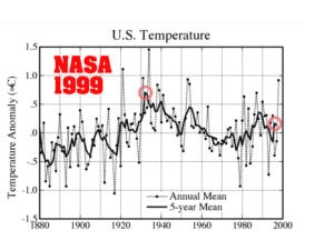
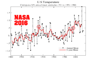
As Tony Heller uncovers on his site realclimatescience, NASA routinely cools the past and heats the present, so to give the illusion of a greater warming trend — and comparisons between old and new graphs instantly reveals this fraud:

In 1999, NASA’s James Hansen reported 0.5C US cooling since the 1930’s:

By 2016, the same NASA graph has eliminated that 1930-1999 cooling:

Rural Northern US Stations Showed No Warming – Before NASA Rewrote The Data

by P. Gosselin, May 03, 2020 in NoTricksZone


The northern hemisphere surface temperature was expected to drop substantiallyaccording to NCEP, but this of course will not keep global warming alarmists from sounding the warming alarms.

But a look at the unadjusted data from some rural US stations tells us that there has been no warming.

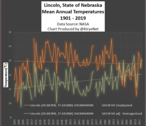
Today we look at temperature data from NASA of some stations along the northern US with a Brightness Index (BI) of 0, meaning rural locations with no urban heat island effects. We want to see the trend over the past 100 or so years.

Plotted are the USHCN Version 4 versus Version 4 adjusted.

The first plots are the data from Lincoln, Nebraska going back to 1901:

Modest cooling changed to warming. Data: NASA

Note how a modest cooling trend was changed to a warming trend. Very ealy temperatures were cooled by 2°C!

Next we move to the Livingston, Montana station, where here as well a modest cooling trend was transformed into warming by massively adjusting past temperatures downward also by more than 2°C:

NASA Fights To Keep Debunked 97% Climate-Consensus Claim On Website

by V. Richardson, April 15, 2020 in ClimateChangeDispatch


Nothing sends climate skeptics into orbit faster than seeing NASA repeat the 97% climate-consensus claim, but the effort to have the Obama-era declaration removed from the government website is suffering from a failure to launch.

NASA officials rejected the Competitive Enterprise Institute’s July 9 request for correction under the Information Quality Act, concluding that “changes to the Web site are not needed at this time,” prompting the free-market group to file an appeal Tuesday.

On its Global Climate Change page, NASA states: “Multiple studies published in peer-reviewed scientific journals show that 97 percent or more of actively publishing climate scientists agree: Climate-warming trends over the past century are extremely likely due to human activities.”

CEI attorney Devin Watkins, who called the statement “inaccurate, unreliable, and biased,” said that NASA has refused to budge even though President Trump has expressed reservations about the consensus argument on anthropogenic global warming.

In 2017, for example, Mr. Trump told The Associated that “you have scientists on both sides of the picture.”

“It’s really weird when the President of the United States seems to say the 97% figure is incorrect, but an agency he is responsible for overseeing continues to say on their website that the President is wrong,” Mr. Watkins said in an email.

In her reply to the CEI, NASA chief information officer Renee P. Wynn said that the Global Climate Change website “presents the state of scientific knowledge about climate change and honors the role that NASA has played and plays in researching and communicating climate science.”

Is Greenland Warming, Melting? Hell No! NASA Data Show No Warming In Nearly 100 Years!

by Kirye & Gosselin, April 3, 2020 in NoTricksZone


But then NASA adjusted the V3 data and called it GHCN V4 “unadjusted”. The chart shown above in my tweet toggles between the prior V3 chart and the “unadjusted” V4. See the difference?

Note how the lack of warming has been removed and now the V4 data show modest warming. The missing heat was found – in the statistics! So in a sense, global warming has been “man-made” – done through statistical fudging and not human activity.

NASA satellite offers urban carbon dioxide insights

by University of Utah, March 8, 2020 in WUWT


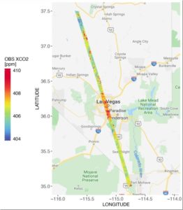
CO2 measurements from OCO-2 in parts per million over Las Vegas on Feb. 8, 2018. Credit: Dien Wu/University of Utah

A new NASA/university study of carbon dioxide emissions for 20 major cities around the world provides the first direct, satellite-based evidence that as a city’s population density increases, the carbon dioxide it emits per person declines, with some notable exceptions. The study also demonstrates how satellite measurements of this powerful greenhouse gas can give fast-growing cities new tools to track carbon dioxide emissions and assess the impact of policy changes and infrastructure improvements on their energy efficiency.

Cities account for more than 70% of global carbon dioxide emissions associated with energy production, and rapid, ongoing urbanization is increasing their number and size. But some densely populated cities emit more carbon dioxide per capita than others.

To better understand why, atmospheric scientists Dien Wu and John Lin of the University of Utah in Salt Lake City teamed with colleagues at NASA’s Goddard Space Flight Center in Greenbelt, Maryland and the University of Michigan in Ann Arbor. They calculated per capita carbon dioxide emissions for 20 urban areas on several continents using recently available carbon dioxide estimates from NASA’s Orbiting Carbon Observatory-2 (OCO-2) satellite, managed by the agency’s Jet Propulsion Laboratory in Pasadena, California. Cities spanning a range of population densities were selected based on the quality and quantity of OCO-2 data available for them. Cities with minimal vegetation were preferred because plants can absorb and emit carbon dioxide, complicating the interpretation of the measurements. Two U.S. cities were included–Las Vegas and Phoenix.

Continuer la lecture de NASA satellite offers urban carbon dioxide insights

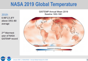
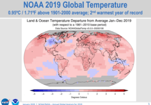
While NOAA/NASA claims 2019 as the “second warmest year ever”, other data shows 2019 cooler than 2005 for USA.

by Anthony Watts, January 15, 2020 in WUWT


Today, at the big 100 year anniversary shindig of the American Meteorological Society (AMS) there was a press release session that featured NOAA and NASA GISS talking about how their climate data says that the world in 2019 was the second warmest ever.

Here is their slideshow presentation, released today: https://www.ncdc.noaa.gov/sotc/briefings/20200115.pdf

In my opinion, the NOAA/NASA press release (and slideshow) is inconsistently presented. For example, they can’t even agree on a common base period for comparisons. Some graphs use 1951-1980 while others compare to 1981-2010 averages to create anomaly plots. NOAA and NASA owe it to the public to present climate data with a consistent climate period for comparison, otherwise it’s just sloppy science. NASA GISS has consistently resisted updating the 1951-1980 NASA GISS baseline period to the one NOAA and other datasets use, which is 1981-2010. GISS stubbornly refuses to change even though they have been repeatedly excoriated for keeping it.

That 1951-1980 period just so happens to be the coolest period in the 20th century, so by using that as a baseline, the peak amount of warming anomaly is magnified in NASA GISS plots. Most laymen will never spot this. A simple comparison of the two maps show the difference in the peak values:


Doomsday awaits? NASA predicts the odds of two asteroids that are now headed toward earth

by Nirmal Narayanan, November 30, 2019 in InternationalBusinessTimes


Several space experts believe that earth will face an extinction event following a dreaded asteroid hits

It was on last July that NASA discovered a giant asteroid named 2019 ND7. This doomsday rock is more than 200 meters wide, and a potential hit on the planet could wipe out a city within a fraction of a second. Experts believe that a potential collision with 2019 ND7 will unleash energy equivalent to more than 1,000 atomic bombs exploded in Hiroshima during World War II, and millions of people will lose life instantly.

However, the chances of asteroid 2019 ND7 hitting the earth are very small. The United States space agency has calculated the risk at 1 in 310,000, which means there is a 99.99968 chance that this dangerous space rock will miss the earth. 2019 WG2 is a small asteroid when compared to 2019 ND7.

The asteroid is 35 meters wide, and NASA has calculated the risk at 1 in 4,000. As per NASA, 2019 ND7 may crash into the earth between 2097-2117 on 20 different occasions. On the other hand, 2019 WG2 may hit between 2098 and 2119 on 56 different occasions.

Scientists: Climate Records ‘Correlate Well’ With Solar Modulation…A Grand Solar Minimum Expected By 2030

by K. Richard, November 11, 2019 in NoTricksZone


International and NASA solar scientists find their Total Solar Irradiance reconstruction extending to 1700 can “correlate well” with Earth’s global temperature records, including a positive net TSI trend during 1986-2008. A new Grand Solar Minimum is expected to commence during the 2030s.

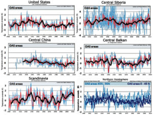
Surface climate records that have been uncorrupted by coastal (ocean-air)/urbanization biases suggest there has been a long-term oscillation in temperature since 1900, with peaks during the 1920s-1940s and again during recent decades (Lansner and Pepke Pedersen, 2018).

Adjusted “Unadjusted” Data: NASA Uses The “Magic Wand Of Fudging”, Produces Warming Where There Never Was

by P. Gosselin, June 25, 2019 in NoTricksZone


By Kirye
and Pierre Gosselin

It’s been long known that NASA GISS has been going through its historical temperature data archives and erasing old temperature measurements and replacing them with new, made up figures without any real legitimate reason.

This practice has led to the formation of new datasets called “adjusted” data, with the old datasets being called “V3 unadjusted”. The problem for global warming activists, however, was that when anyone looks at the old “V3 unadjusted” – i.e. untampered data – they often found a downward linear temperature trend. Such negative trends of course are an embarrassment for global warming alarmists, who have been claiming the planet is warming up rapidly.

The adjusted “unadjusted” data

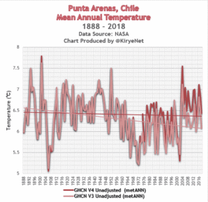
So what to do? Well, it seems that NASA has decided to adjust its “V3 unadjusted datasets” and rename them as “V4 unadjusted”. That’s right, the adjusted data has become the new V4 “unadjusted” data.

And what kind of trend does the new “V4 unadjusted” data show?

You guessed it. The new V4 unadjusted data are now yielding warmed up trends, even at places where a cooling trend once existed.

This is how NASA uses its magic wand of fudging to turn past cooling into (fake) warming.

6 examples of scandalous mischief by NASA

What follows are 6 examples, scattered across the globe and going back decades, which demonstrate this scandalous mischief taking place at NASA.

No. 1

Punta Arenas, Chile. Here we see how a clear cooling trend has been warmed up by NASA to produce a slight cooling trend:


giss.nasa.gov/cgi-bin/gistemp/stdata_show_v3

giss.nasa.gov/cgi-bin/gistemp/stdata_show_v4

If “Greenland is catastrophically melting”, how do alarmists explain NASA’s growing Greenland glacier?

by A. Watts, June19, 2019 in WUWT


It turned out to be a weather event, unrelated to “climate change”. The next year, there was no “insta-melt“.

In fact. we’d not even know about the melting in Greenland before satellites came on the scene. So how many times in the history of the Earth has Greenland has a quick melt spike? I’m guessing hundreds of thousands of times.

Jakobshavn Glacier in western Greenland is notorious for being the world’s fastest-moving glacier. It is also one of the most active, discharging a tremendous amount of ice from the Greenland Ice Sheet into Ilulissat Icefjord and adjacent Disko Bay—with implications for sea level rise. The image above, acquired on June 6, 2019, by the Operational Land Imager (OLI) on Landsat 8, shows a natural-color view of the glacier.

Jakobshavn has spent decades in retreat—that is, until scientists observed an unexpected advance between 2016 and 2017. In addition to growing toward the ocean, the glacier was found to be slowing and thickening. New data collected in March 2019 confirm that the glacier has grown for the third year in a row, and scientists attribute the change to cool ocean waters.

June 6th, 2019 Jakobshavn Glacier in western Greenland . Image acquired on June 6, 2019, by the Operational Land Imager (OLI) on Landsat 8, shows a natural-color view of the glacier.

Multiple NASA Studies Confirm Bedrock Heat Flow Behind Melting Polar Ice, Not Global Warming

by James E. Kamis, August 7, 2018 in ClimateChangeDispatch

In what amounts to dissension from National Aeronautics and Space Administration (NASA) climate change policy, a series of just-released studies by working-level scientists prove that geological and not atmospheric forces are responsible for melting of Earth’s polar ice sheets.


NASA Greenland Study August 1, 2018

The results of this research study illustrated in Figure 2 confirm the very high geothermal bedrock heat-flow from Greenland’s massive subglacial Mantle Plume, which was originally documented in four previous research studies (see herehere, here, and here).

A geothermal heat-flow cause for the melting of Greenland’s ice sheet has been the focus of numerous Climate Change Dispatch articles (see here, here, here, and here).


The Little Ice Age: What Happened Around the World

by Marcia Wendorf, May 15, 2019 in InterestingEngineering


Between 1300 and 1850, the Earth experienced a Little Ice Age whose cause to this day is not known.

During the period 950 CE to 1250 CE, the earth experienced an unusually warm period, which became known as the Medieval Warm Period (MWP) or the Medieval Climatic Anomaly. At their height, temperatures during that period were similar to those experienced during earth’s mid-20th-century warming period.

Following the Medieval Warm Period came a period of intense cold, which has become known as the Little Ice Age (LIA). The term “Little Ice Age” was coined by Dutch-born American geologist F.E. Matthes in 1939. The LIA began around 1300 CE and lasted until about 1850 CE.

Within that stretch, NASA’s Earth Observatory has described three particularly cold periods: one around 1650, a second around 1770, and the third around 1850.

Fabricating A Warming: NASA Now Altering ‘Unadjusted” Data To Create New, Warmer ‘Unadjusted’ Data

by P. Gosselin, March 31, 2019 in NoTricksZone


By Kirye

and Pierre Gosselin

One fellow climate blogger recently wrote on how he’s been been looking at GHCN ‘unadjusted’ data and noticed that scientists at NASA appear to have been altering them: “This is a fairly disturbing development,” he wrote.

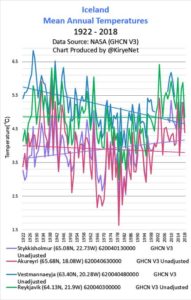
Heating up Reykjavik and Nuuk

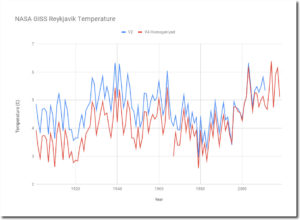
Cited as an example is Reykyavik, Iceland. According to Tony Heller here, “The current version V4 has massively cooled the past, to make it look like Iceland is warming.”

Heller then posted a chart showing the difference between v2 unadjusted and the new v4 ‘unadjusted’ for the Reykjavik station.


Spreadsheet

Heller also found here that the same appears to be the case for Nuuk, Greenland as well.

NASA hides page saying the Sun was the primary climate driver, and clouds and particles are more important than greenhouse gases

by P. Homewood, February 18, 2019 i


Here’s the text from the original page (my bolding).

NASA 2010: What are the primary forcings of the Earth system?

The Sun is the primary forcing of Earth’s climate system. Sunlight warms our world. Sunlight drives atmospheric and oceanic circulation patterns. Sunlight powers the process of photosynthesis that plants need to grow. Sunlight causes convection which carries warmth and water vapor up into the sky where clouds form and bring rain. In short, the Sun drives almost every aspect of our world’s climate system and makes possible life as we know it.

Earth’s orbit around and orientation toward the Sun change over spans of many thousands of years. In turn, these changing “orbital mechanics” force climate to change because they change where and how much sunlight reaches Earth. (Please see for more details.) Thus, changing Earth’s exposure to sunlight forces climate to change. According to scientists’ models of Earth’s orbit and orientation toward the Sun indicate that our world should be just beginning to enter a new period of cooling — perhaps the next ice age.

Repost from JoNova

Antarctic Losing Tiny Amounts Of Ice (Or Maybe It’s Gaining Ice, NASA Is Not Sure!)

by P. Homewood, January 15, 2019 in NotaLotofPeopleKnowThat


Antarctica is shedding ice at a staggering rate.

Scientists have discovered global warming has caused the melting of the ice on the continent to increase sixfold since 1979.

This phenomenal rate of melting has seen global sea levels rise by more than half an inch – and experts predict it will get worse. 

Scientists have predicted a ‘multi-meter sea level rise from Antarctica in the coming centuries’ as a result of the vast loss of ice.

Researchers discovered that, between 1970 and 1990, the continent was shedding an average of 40 gigatons of ice mass annually.

This jumped to an average of 252 gigatons a year between 2009 and 2017.

https://www.dailymail.co.uk/sciencetech/article-6590841/Antarctica-losing-SIX-TIMES-ice-year-1970s.html#newcomment


You may of course recall that it was only three years ago that the same NASA, who are behind this latest scare story, were telling us that the ice cap was actually growing in Antarctica. But more of that in a minute.

There are several aspects to this latest story that need closer examination.

NASA: Global Warming Promotes Arctic Sea Ice Growth

by Eric Worrall, December 11, 2018 in WUWT


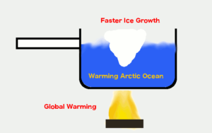
According to NASA, the increased rate of thickening of sea ice in the Arctic is due to Global Warming.

Read more: https://www.nasa.gov/feature/goddard/2018/wintertime-arctic-sea-ice-growth-slows-long-term-decline-nasa

The abstract of the study:

Read more: https://agupubs.onlinelibrary.wiley.com/doi/10.1029/2018GL079223

I guess we should count ourselves lucky the world isn’t currently in a cooling phase, otherwise we might lose the Arctic icepack altogether.


La baisse de l’activité solaire conduit la NASA à annoncer un refroidissement climatique

by Anne Dolhein, 2 october 2018 in Reinformation.TV


La NASA – peu suspecte de climato-scepticisme – s’appuie sur de nouveaux résultats d’observations de température aux confins de l’atmosphère terrestre pour annoncer un refroidissement notable dans ces zones, lié à l’un des minima solaires les plus importants de l’ère spatiale. Il s’agit très clairement d’un refroidissement climatique entraîné par la baisse de l’activité solaire, confirmant le rôle important sinon prépondérant du soleil sur les variations de température de la planète.

« Nous constatons une tendance au refroidissement », vient ainsi de déclarer Martin Mlynczak, chercheur principal associé du centre de recherches Langley de la NASA. « Très loin de la surface de la terre, près du bord de l’espace, notre atmosphère perd de l’énergie calorifique. Si les tendances actuelles se poursuivent, on pourrait bientôt atteindre un record de froid pour notre ère spatiale », a-t-il affirmé.

NASA: The chill of solar minimum is being felt in our atmosphere – cooling trend seen

by Anthony Watts, September 28, 2018 in WUWT


These results come from the SABER instrument onboard NASA’s TIMED satellite. SABER monitors infrared emissions from carbon dioxide (CO2) and nitric oxide (NO), two substances that play a key role in the energy balance of air 100 to 300 kilometers above our planet’s surface. By measuring the infrared glow of these molecules, SABER can assess the thermal state of gas at the very top of the atmosphere–a layer researchers call “the thermosphere.”

When the thermosphere cools, it shrinks, literally decreasing the radius of Earth’s atmosphere. This shrinkage decreases aerodynamic drag on satellites in low-Earth orbit, extending their lifetimes. That’s the good news. The bad news is, it also delays the natural decay of space junk, resulting in a more cluttered environment around Earth.

NASA alarmism headline: ‘A World On Fire’

by Anthony Watts, August 23, 2018 in WUWT


The world is on fire. Or so it appears in this image from NASA’s Worldview. The red points overlaid on the image designate those areas that by using thermal bands detect actively burning fires. Africa seems to have the most concentrated fires. This could be due to the fact that these are most likely agricultural fires. The location, widespread nature, and number of fires suggest that these fires were deliberately set to manage land. Farmers often use fire to return nutrients to the soil and to clear the ground of unwanted plants. While fire helps enhance crops and grasses for pasture, the fires also produce smoke that degrades air quality.

Multiple NASA Studies Confirm Bedrock Heat Flow Behind Melting Polar Ice, Not Global Warming

by James E. Kamis, August 7, 2018 in ClimateChangeDisatch


In what amounts to dissension from National Aeronautics and Space Administration (NASA) climate change policy, a series of just-released studies by working-level scientists prove that geological and not atmospheric forces are responsible for melting of Earth’s polar ice sheets.

Claim: U.N. data reflects greening of the Earth, not carbon dioxide

by A. Watts, May 15, 2018 in WUWT


NASA says the greening of the planet is due to increased CO2, these guys are arguing against that, saying increased forest growth “correlates strongly to the UN Development Programme’s Human Development Index”. Riiiighht. They say that “Europe’s early turnaround and expansion of forest resources obviously can’t be attributed to the rapid rise of atmospheric carbon dioxide that began decades later”. By the same token, the U.N. didn’t exist until decades later, and they sure as hell haven’t had any impact on the greening of the Eastern United States as shown in their map below (…)