Sooner or later, fearmongering becomes noise. Reality crashes against predictions.
Public schools, institutions of higher learning, governments, international organizations, the whole culture, and scientific institutions have spent billions and untold hours trying to normalize the idea that modernity and capitalistic gluttony have driven temperatures to dangerous extremes.
When I was growing up, it was cooling. Now, it’s warming. And with each surge of alarmism, the message depreciates.
A recent article at Al Jazeera, titled “Wildfire risks as climate change fuels extreme heatwave in Southern Europe,” claims that recent heatwaves in parts of southern Europe are due to climate change, which the publication says is making them more intense, and will inevitably cause more deaths. This is false. Recent heatwaves are not outside of historic norms, and though Al Jazeera correctly identifies the urban heat island effect as a major contributor, they downplay its role in recent trends and the evidence concerning temperature related deaths.
Al Jazeera reports that authorities across several southern European countries have issued heat warnings and fire warnings, “as Southern Europe experiences the summer’s first severe heatwave and as experts link the rising frequency and intensity of soaring temperatures to climate change.”
Countries impacted are: Spain; Portugal, where Al Jazeera says Lisbon is “expected” to see temperatures around 107°F; the Italian island of Sicily, which saw some wildfires over the weekend; and Greece.
Much of the article presents a reasonable discussion of the dangers heatwaves can pose, like increases in the likelihood of wildfire outbreaks and heat stroke. Unfortunately, the author of the post proceeds to make unfounded claims regarding the cause of the summer heat, like that “extreme weather events are becoming increasingly common across Europe’s southern region due to global warming.”
This is false; extreme weather is not becoming more severe or frequent. For example, Lisbon’s predicted high is not unprecedented, in part because the city is prone to being impacted by what is called the “Saharan air layer.” This is the same phenomenon that carries dust all the way across the Atlantic, as well as hot dry air with boosts temperatures. In 2018, Lisbon recorded a high of 111°F, and the all time high for Portugal was 117°F in 2003.
The narrative that says relative sea level changes are driven by variations in atmospheric CO2 concentrations has taken another hit.
Before relative sea level (RSL) declined to its present position over the last millennium, Africa’s Atlantic coast RSL ranged anywhere from 0.8 to 4 meters higher than today between 5000 and 1700 years ago (Vacchi et al., 2025).
This Mid- to Late-Holocene RSL highstand was “mainly controlled by the deglaciation history” − meltwater contributions from Earth’s ice sheets and glaciers. Because the climate was so much warmer than today at that time, there was significantly less water locked up on land as ice.
The Antarctic Thermal Optimum “simulated melt of the western Antarctic ice sheet until 2.0 ka BP.” Consequently, sea levels were still ≥ 1 meter higher than present during the Roman Warm Period
“Between -15°N and -0°…data indicate RSL reached its maximal elevation above the present sea level in the late Holocene (~2.0 to ~1.7 ka BP).”
The Met Office were given a right of reply to this GB News story. Instead of actually responding to the specific points raised, they merely regurgitated their Press Release:
However, according to the Met Office, the UK has warmed by 0.25C per decade since the 1980s, with the past three years among the five warmest on record.
Last year saw the warmest spring, the warmest May, and the wettest winter half-year in over 250 years, the report says.
It also states that days with temperatures 10°C above average have quadrupled since the 1960s, and months of double-average rainfall have risen by 50 per cent.
They could, of course, added that the wettest year was in 1872!
Their waffle about higher temperatures is meaningless without the corresponding data on extreme cold days.
Worst of all is the fact that they still make claims of extreme rainfall against a baseline of 1961-90. This is what the Press Release stated:
“the number of months where counties are recording monthly rainfall totals of at least twice the 1991-2020 monthly average has increased by over 50% compared to the number in 1961-1990”
They know full well that 1961-90 was a much drier interlude compared with both what preceded it and also what followed it.
They have all the data back into the 19thC, so why don’t they show the long term trends? Is it because it would not tell the story they want to tell?
The long term monthly data for the England & Wales Precipitation Series, for example, shows absolutely no evidence to support the Met Office’s claims:
KNMI Climate Explorer
The KNMI chart only runs to 2021, but since then the wettest month was 177.5mm in October 2023. Nothing, in other words, that alters the trends shown.
Holocene (11,700 to 8,200 years ago) Arctic (Svalbard) temperatures “were up to 9°C higher than today” according to the authors of a newNature journal study. At that time CO2 was thought to only hover around 260 ppm.
Svalbard then cooled as CO2 rose for the next 8,000 years – a negative correlation that wholly contradicts the rising-CO2-drives-Arctic-warmth narrative.
Nonetheless, climate models are predicated on the assumption rising human CO2 emissions (RCP 8.5) will lead to a warming of ~8°C by 2100.
ery so often, the climate media machine spits out a headline so breathless you’d think the laws of physics had just been accidentally repealed by a badly-worded executive order. Case in point: bne IntelliNews in Germany recently told us that a “major ocean current in the Southern Hemisphere has reversed direction for the first time in recorded history,” and that climatologists are calling it a“catastrophic” tipping point. It also quotes a climatologist as saying “The stunning reversal of ocean circulation in the Southern Hemisphere confirms the global climate system has entered a catastrophic phase.”
The implication: pack your bags, the climate apocalypse is here, and don’t forget your floaties.
But as is so often the case, the devil isn’t just in the details—it’s in the words they didn’t mention. The article, like a magician with something up both sleeves, never links to the actual scientific study.
And when I got to the study, what do you know? The study doesn’t mention “tipping point,” “collapse,” “current reversal,” “Southern Ocean current” or even “overturning circulation.” The only “reversal” in the paper refers to satellites detecting a reversal in surface salinity trends from decreasing to increasing, not a reversal in the the direction of the Southern ocean’s most complex circulation shown above.
So what did the study actually say? Here’s the paper’s abstract:
“For decades, the surface of the polar Southern Ocean (south of 50°S) has been freshening—an expected response to a warming climate. This freshening enhanced upper-ocean stratification, reducing the upward transport of subsurface heat and possibly contributing to sea ice expansion. It also limited the formation of open-ocean polynyas. Using satellite observations, we reveal a marked increase in surface salinity across the circumpolar Southern Ocean since 2015. This shift has weakened upper-ocean stratification, coinciding with a dramatic decline in Antarctic sea ice coverage. Additionally, rising salinity facilitated the reemergence of the Maud Rise polynya in the Weddell Sea, a phenomenon last observed in the mid-1970s. Crucially, we demonstrate that satellites can now monitor these changes in real time, providing essential evidence of the Southern Ocean’s potential transition toward persistently reduced sea ice coverage.”
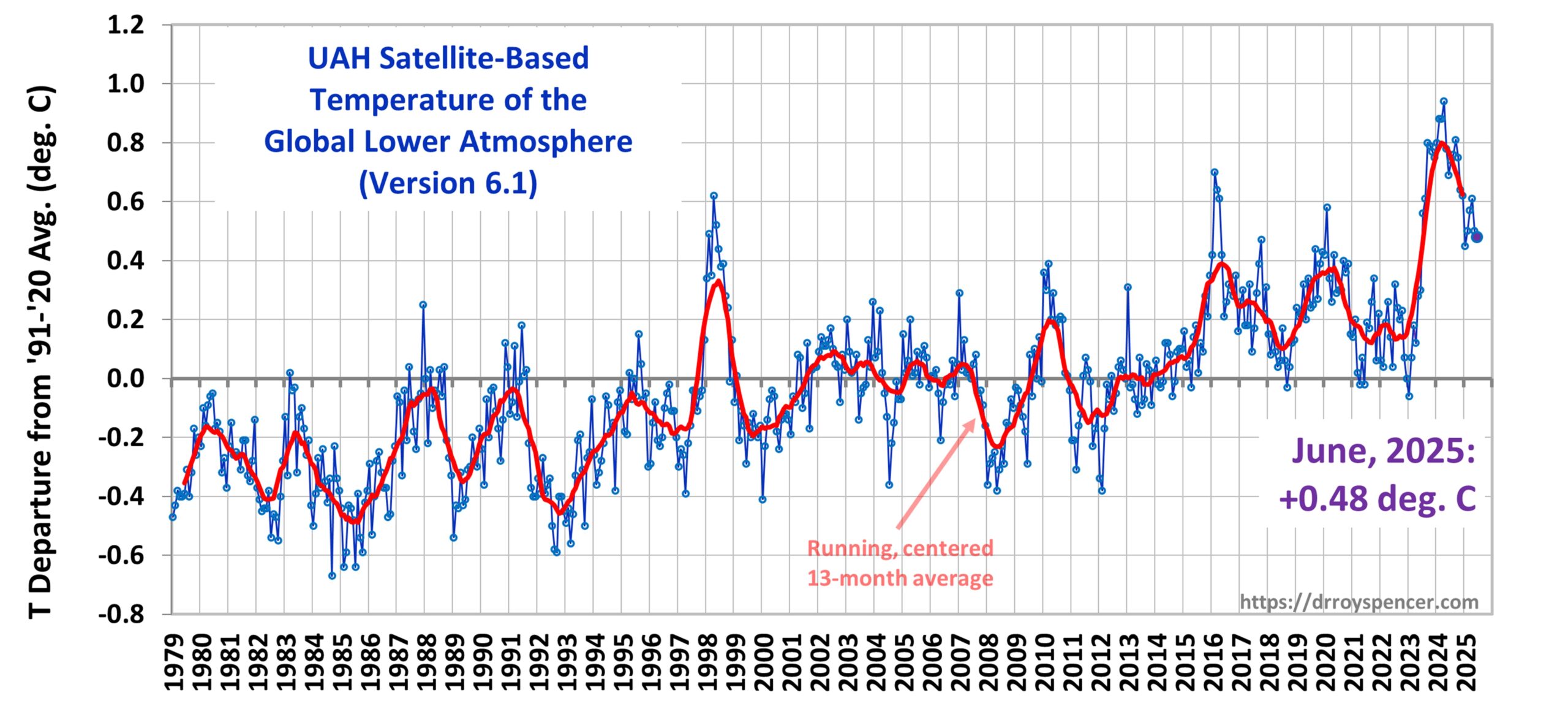
The Version 6.1 global average lower tropospheric temperature (LT) anomaly for June, 2025 was +0.48 deg. C departure from the 1991-2020 mean, down slightly from the May, 2025 anomaly of +0.50 deg. C.
The Version 6.1 global area-averaged linear temperature trend (January 1979 through June 2025) now stands at +0.16 deg/ C/decade (+0.22 C/decade over land, +0.13 C/decade over oceans).
The following table lists various regional Version 6.1 LT departures from the 30-year (1991-2020) average for the last 18 months (record highs are in red).
YEAR
MO
GLOBE
NHEM.
SHEM.
TROPIC
USA48
ARCTIC
AUST
2024
Jan
+0.80
+1.02
+0.58
+1.20
-0.19
+0.40
+1.12
2024
Feb
+0.88
+0.95
+0.81
+1.17
+1.31
+0.86
+1.16
2024
Mar
+0.88
+0.96
+0.80
+1.26
+0.22
+1.05
+1.34
2024
Apr
+0.94
+1.12
+0.76
+1.15
+0.86
+0.88
+0.54
2024
May
+0.78
+0.77
+0.78
+1.20
+0.05
+0.20
+0.53
2024
June
+0.69
+0.78
+0.60
+0.85
+1.37
+0.64
+0.91
2024
July
+0.74
+0.86
+0.61
+0.97
+0.44
+0.56
-0.07
2024
Aug
+0.76
+0.82
+0.69
+0.74
+0.40
+0.88
+1.75
2024
Sep
+0.81
+1.04
+0.58
+0.82
+1.31
+1.48
+0.98
2024
Oct
+0.75
+0.89
+0.60
+0.63
+1.90
+0.81
+1.09
2024
Nov
+0.64
+0.87
+0.41
+0.53
+1.12
+0.79
+1.00
2024
Dec
+0.62
+0.76
+0.48
+0.52
+1.42
+1.12
+1.54
2025
Jan
+0.45
+0.70
+0.21
+0.24
-1.06
+0.74
+0.48
2025
Feb
+0.50
+0.55
+0.45
+0.26
+1.04
+2.10
+0.87
2025
Mar
+0.57
+0.74
+0.41
+0.40
+1.24
+1.23
+1.20
2025
Apr
+0.61
+0.77
+0.46
+0.37
+0.82
+0.85
+1.21
2025
May
+0.50
+0.45
+0.55
+0.30
+0.15
+0.75
+0.99
2025
June
+0.48
+0.48
+0.47
+0.30
+0.81
+0.05
+0.39
The full UAH Global Temperature Report, along with the LT global gridpoint anomaly image for June, 2025, and a more detailed analysis by John Christy, should be available within the next several days here.
The monthly anomalies for various regions for the four deep layers we monitor from satellites will be available in the next several days at the following locations:
The U.K.’s The Guardian ran an article claiming that the world’s oceans have surpassed a critical tipping point in acidity threatening sea life. This is false. The pH content of the world’s oceans varies by time and place throughout the day, rising and falling modestly, but the average pH content remains far from acidic and there is no evidence crustaceans or other types of shellfish are being threatened by the sea water becoming acidic.
The world’s oceans are in worse health than realized, scientists have said today, as they warn that a key measurement shows we are “running out of time” to protect marine ecosystems.
Ocean acidification, often called the “evil twin” of the climate crisis, is caused when carbon dioxide is rapidly absorbed by the ocean, where it reacts with water molecules leading to a fall in the pH level of the seawater. It damages coral reefs and other ocean habitats and, in extreme cases, can dissolve the shells of marine creatures.
Bachelor’s story is based upon a study which claims that ocean acidity has breached a “planetary boundary,” the seventh of nine such milestones or boundaries to be breached, threatening to cause permanent damage to the planet’s health.
The study looked at ice core records and studies of marine life, run through algorithms of complex computer models to assess the past 150 years, concluding the ocean acidification boundary had been breached, with the world facing a “ticking timebomb,” of sea life destruction.
This study’s findings are driven by woefully flawed computer models,a limited time horizon and understanding of long-term history, and lack a basis in real world data. As such it and The Guardian’s dire warnings based on it, are unjustified.
Model outputs are only as good as the assumptions, data, and our understandings of the feedbacks and systems built into them. Even as our knowledge improves, our understanding of the oceans and the interactions of its various currents, systems, inputs, and outputs remain limited, thus the assumptions built into the models are weak and uncertain. As discussed at Climate Realism, here, here, and here, for example, the climate model outputs fail to match reality.
One of my favorite statistics about climate change
…is that apparently, 60% of Americans reckon that climate change has become like a religion, quote, “used to control people.”
…
…
Climate change elephant — You’ll be surprised to know that climate change is a significant threat to elephants.
Climate change kangaroo — Climate change is impacting kangaroos in various ways, including changing their habitat, food availability, and overall health. They didn’t mention whether the kangaroo’s mental health is affected, but I’m pretty sure it is.
Climate change giraffe — Raid your house in Kenya for extinction because of poaching and climate change.
Climate change albatross — Climate crisis pushes albatross divorce rates higher. Albatrosses form monogamous relationships. But apparently… and this is in the Royal Society for goodness’ sake. You know—Isaac Newton.
I can barely believe this. Right?
Apparently, albatrosses are splitting up more often.
Climate change gorilla — Yep. Climate change is making endangered mountain gorillas more thirsty.
Researchers have studied things like pebble layers, shell fragments, and coral rubble in Fiji to find out what has happened there in the past. Yanan Li and others drilled cores to find debris pushed 120m into the mangroves by the worst of the worst tropical cyclones. Handily, they also had two bad storms recorded in the last century to calibrate what they found. Awkwardly, the big storms were more common in the Little Ice Age.
According to a new study, abrupt (±1-2°C per century) shifts in North Atlantic sea surface temperature (SST) have occurred routinely over the last 9000 years. These decadal- to centennial-scale climate changes were “induced by Holocene summer insolation and atmosphere-ocean internal variability.”
The average SST throughout the 8.2 ka fluctuation was 10.0°C. The average 4.2 ka SST was 8.1°C. And during the Little Ice Age (LIA, 1600-1900 CE) the North Atlantic SSTs averaged 7.5°C.
Since 1900, SSTs have been stable to declining, suggesting the modern period is the coldest of the Holocene.
by I. Slav, June 26, 2025 in ClimateChangeDispatch
The United States is the largest oil and gas producer in the world. It is also experiencing a slowdown in its oil production for a number of reasons, including natural depletion. [emphasis, links added]
The U.S. Geological Survey, however, has just published a study stating that there are almost 30 billion new barrels of untapped oil—under federal lands, no less.
Oil and gas drilling was a contentious topic during the Biden administration. The administration decidedly did not like it and put a serious effort into curbing this drilling as much as the law allowed.
Now, the U.S. Geological Survey has thrown its weight behind the American energy dominance idea, reportingan estimated undiscovered oil reserves of 29.4 billion barrels across the country, with the leader being Alaska, with 14.46 billion barrels of untapped oil under federal lands.
New Mexico is next, with 8.925 billion barrels of undiscovered oil, followed by Nevada, with 1.4 billion barrels. Untapped gas reserves on federal lands were estimated at over 391.55 trillion cu ft.
Now, the only question is when these hitherto untapped resources will be tapped.
USGS reports 29.4 billion barrels of untapped oil under U.S. federal lands. Map: USGS
The number of drilling rigs in the U.S. oil patch has been on a steady decline recently, reflecting an extended weakness in international prices. This has now changed, of course, after Israel attacked Iran on June 13, but the industry is in no rush to reverse course for the time being.
The industry is playing it safe, not least because cheap drilling sites are running out—or maybe not, if the USGS assessment of untapped resources is correct.
For years now, the biggest production growth driver of U.S. oil has been the Permian Basin, spanning Texas and New Mexico. The Permian has single-handedly offset declines in several other shale plays and has largely uneventful day-to-day business in conventional fields.
Yahoo News recently posted an article from the environmental website The Cool Down claiming that the native residents of the very small Panamanian island, Gardí Sugdub (also known as Cartí Sugdupu), are being forced to flee due to fast rising sea levels swamping the land as a result of climate change. This is false. Sea levels at Gardi Sugdub aren’t rising unusually fast, and the best evidence is that most of the island’s residents are voluntarily abandoning it with government help due to overcrowding and insufficient services and infrastructure on the small island.
Rising sea levels are splitting communities apart in Gardí Sugdub and leaving people behind, possibly in danger.
. . .
One year ago, around 1,200 Indigenous Guna people were transported to the mainland by the Panama government for their safety as ocean waters encroached upon their community.
Climate Realismdebunked an earlier article from the BBC making the same claims in February of this year; nothing has changed in the four months since then.
A few days ago I published another analysis of mine, called pHony Alarmism. Take a moment to read that if you haven’t, because this is a sequel. Both are about a new study in Science Magazine yclept “A 485-million-year history of Earth’s surface temperature”, paywalled, of course.
A short digression. One of the ways I truly benefit from publishing the results of my scientific investigations on the web and interacting with the commenters is that my mistakes don’t last long. When I go off the rails, and notice I didn’t say “if” I go, my mistakes rarely last more than a day before they’re pointed out and I can consider and correct them.
But that’s only one of the ways that it’s beneficial to write for the web and then stick around. Perhaps more importantly, it lets people ask me interesting questions and point out overlooked avenues to investigate.
Here’s an example. In a reply to my post yesterday, I got this …
Jeff Alberts, June 25, 2025 4:26 pm
No graph with the co2 and pH together?
To which I answered …
They’re sampled at different times. I could interpolate both ways. Thought about it, then decided that was enough for one post. Hang on … we know pH is proportional in some sense to the log of the CO2. Give me a minute …
In a bit I came back to say:
…well, of course it takes more than a minute but most interesting.
Looks like that will be the subject of my next post. Stay tuned.
w.
This is that next post. End of digression.
One of the reasons that I didn’t look at graphing pH versus CO2 was that I was given to understand that the procedure for calculating the pH was very complex. The paper says (or at least the Supplementary Information (PDF) says, the paper is paywalled:
4.3 Estimating the temporal variability of pHsw [pH of saltwater]
Possibly one of the dumbest and most scientifically illiterate climate scare stories ever written has been published by the fast-fading UK Sky News. Climate reporter Victoria Seabrook notes that the sea ice on the Arctic “continent” is melting at 12% every decade but she backs it up by publishing a graph clearly showing it has been stable since 2007. She goes on to claim that the Arctic melt will push up sea levels around Britain and fuel worse coastal flooding, seemingly unaware that melting ice in liquid does not raise its level (suggested educational tip, check out ice in a gin and tonic glass). Just for good measure, her silly story throws in the wobbling jet stream and a “shocking” prediction that global temperature could rise by nearly 1°C in just five years.
This story is a classic of its kind – late climate psychosis folderol to back up the collapsing Net Zero fantasy. After decades of relentless mainstream gaslighting, mass audiences are still vaguely concerned that the climate is in some kind of ‘emergency’. Net Zero is retreating around the world, partly because it is increasingly understood that human civilisation cannot abolish the use of hydrocarbons without returning to the dark ages, and partly because nobody is prepared to pay for it when given a choice. But the great climate science con that is the foundation of the collectivist Net Zero lunacy continues, and, if Seabrook’s latest work is an example, it is getting more desperate by the day.
So she publishes the graph below with the misleading 12% decline every decade heading.
by P. Gosselin, June 03, 2025 in ClimateChangeDispatch
The German blog site lokalgeschichte examines the German summer of 1911, which was exceptionally hot, dry, and sunny. It disproves the previously widespread idea that Central Europe’s heat waves are something new and caused by more CO2 in the atmosphere. [emphasis, links added]
Although temperatures in the summer of 1911 were very high in places (up to 40°C [104°F] in Chemnitz), no new records were broken. The year 1892 had similar or even higher values (41.5°C [106.7°F] in Reichenhall).
The most remarkable feature of the summer of 1911 was not the absolute maximum temperature, but the duration of the hot spell and the persistent tendency towards dry and warm high-pressure weather, which lasted from spring until well into September.
In 1911, Germany saw extreme drought, particularly in western and central Germany. In Berlin, for example, only about half of the normal precipitation fell between April and July, and only a seventh in August.
by K. Richard, May 28, 2025 in ClimateChangeDispatch
A new evidence-based study provides compelling evidence that for decades, the IPCC has been engaged in “advocacy research,” or the “antiscientific practice of undertaking research designed to support a given hypothesis.” [emphasis, links added]
[It is] so fraught with errors that even a stripped-down benchmark model that merely projects future temperatures will not deviate from the historical average, overwhelmingly outperforming the IPCC’s modeling.
“The IPCC’s models of anthropogenic climate change lack predictive validity. The IPCC models’ forecast errors were greater for most estimation samples – often many times greater – than those from a benchmark model that simply predicts that future years’ temperatures will be the same as the historical median.”
The IPCC’s Anthro models, which hypothesize that (primarily) CO2 will foment dangerous global warming over the coming decades, woefully overestimated the warming from 1970-2019 by anywhere from 1.8°C [3.2°F] to 2.5°C [4.5°F].
“The errors of forecasts from the anthropogenic models for the era of concern over man-made global warming, starting in 1970, were 1.8°C (AVL), 1.7°C (AVSL), 2.3°C (AVR), and 2.5°C (AVSR) warmer than the measured temperatures.”
Over the 2000 to 2019 period, the Anthro models’ forecast errors were a staggering 16 times greater than the simple benchmark model’s errors.
“…forecasts for the years 2000 to 2019 from models estimated with 50 observations of historical data (1850 to 1899) have MdAEs [median absolute errors] of around 17°C or 1,600 percent greater than the 1°C MdAE of forecasts from the naïve benchmark model.”
China accounts for 26% of all global emissions, while the U.S. is responsible for another 11.5%.
This was equivalent to 12.7 billion tons of carbon dioxide for China and 5.6 billion tCO2e for the U.S. in 2022.
Most of the top 10 emitters are also the world’s most populous countries, barring Iran, Saudi Arabia, and Canada.
Developing Countries Are Driving Emissions Growth
There’s a pattern as to why middle-income countries are seeing emissions growth.
They are prioritizing economic development and have larger populations, driving an overall increase in energy consumption.
Most emissions-heavy industries have moved from high-income countries to middle- and low-income ones.
Thus, high-income countries are able to sustain their consumption levels while the emissions from producing the goods they consume are accounted for elsewhere.
Climate scientists say the Arctic is warming four times faster than anywhere else. This impacts ecosystems, wildlife and local populations
In reality temperatures in the Arctic have been stable for the last two decade. The Arctic is not “warming” at all.
Looking further back, temperatures were at similar levels to now in the 1930s and 40s. In between that era and now, there was a plunge in temperatures, followed by a recovery:
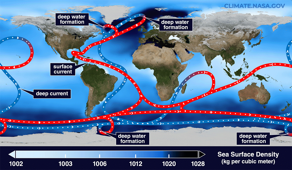
A recent CNN article by Laura Paddison, titled “A crucial system of ocean currents is slowing. It’s already supercharging sea level rise in the US,” references new research on the Atlantic Meridional Overturning Circulation (AMOC) to claim the current is slowing down leading to rising seas and costly, deadly coastal flooding. This false claim is based solely on a single, as yet unpublished and unverified, study which used a single climate model’s projections. Evidence, such as other studies and historical reporting on AMOC trends demonstrate that there is no consensus on the status of the AMOC. Rather, scientists’ predictions and the media’s reporting on the AMOC have been flip-flopping for nearly two decades—unable to decide whether AMOC is speeding up, slowing down, or staying steady.
Figure1. A simplified illustration of the global “conveyor belt” of ocean currents that transport heat around Earth. Red shows surface currents, and blue shows deep currents. Deep water forms where the sea surface is the densest. The background color shows sea-surface density. The AMOC is the currents in the Atlantic Ocean off the east coast of the US. Source: NASA/Goddard Space Flight Center Scientific Visualization Studio.…
AfricaNews (AN), in collaboration with the Associated Press, recently posted an article claiming that recent drought in Nigeria is due to climate change. This is unlikely to be the full story. Although data is sparse for the region, human activities are just as likely to be contributing to desertification as cycles of drought are.
The article, “Nigerian farmers struggle as climate change dries up water sources,” claims that climate change is the cause of recent drought in Nigeria, leading to crop declines. Surface water is becoming scarce during the dry seasons, so some farmers are forced to dig wells to irrigate their crops. AN writes that “[r]iverbeds have started to run dry,” and so the blame “is pointed firmly at climate change, with conservationists warning that food could become scarce if measures are not urgently put in place to help the farmers irrigate their land.”
While it is true that Nigeria has been suffering from extended drought, particularly in the northern part of the country, it is not clear that this is all or even mostly because of any human-caused climate change due to changing temperatures. Natural drought, combined with human error in land and water management, seems to be the more likely culprit.
According to the article, over 80 percent of Nigeria’s farmers are smallholder farmers, and they make up 90 percent of the nation’s crop production. The article points at maize (corn) as a sample crop that is suffering due to the water shortage, it “saw a decline in cultivated land from 6.2 million hectares in 2021 to 5.8 million hectares in 2022.”
Crop production data from the United Nations Food and Agriculture Organization (FAO) show that Nigeria’s corn production has been increasing over time. It actually shot upwards the most in recent decades, after remaining relatively flat through the 1980s. Between just 1990 and 2023, Nigerian corn production increased 91 percent, while yields increased 71 percent. (See figure below)
A new study from the University of Alabama in Huntsville addresses the question of how much the Urban Heat Island (UHI) effect is responsible for the higher temperatures at weather stations across the world. Dr. Roy Spencer and Dr. John Christy have spent several years developing a novel method that quantifies, for the first time, the average UHI warming effects related to population density. Their finding: no less than 65% of “runaway global warming” is not caused by our emissions of carbon dioxide, but by the urbanization of the world.
Dr. Spencer will join us to go over his findings. We’ll also cover the Crazy Climate News of the Week, including an absurd new bit of unscientific propaganda from the U.S. Climate Reference Network at NOAA, wonder if the sun is setting on wide-scale solar energy, and discuss how alarmists refuse to see that we live in a climactic “golden age”—and more.
Join Heartland’s Anthony Watts, Linnea Lueken, H. Sterling Burnett, Jim Lakely, and Dr. Roy Spencer LIVE at 1 p.m. ET for Episode #157 of The Climate Realism Show. We’ll be answering questions in the chat for us, and for Dr. Spencer, on the show.
by N. Chatterjee, May 12, 2025 in ClimateChangeDispatch
American energy sector is on the cusp of a tectonic transformation.
This week, members of the House Committee on Natural Resources heard testimony on the vast potential of geothermal energy as “a new era of American energy — built with American innovation, American technology and American workers,” as one witness put it. [emphasis, links added]
Chris Wright, President Donald Trump’s new energy secretary, has fervently endorsed geothermal as a way to “energize our country,” and a March study found that geothermal could meet roughly two-thirds of the voracious energy demands of AI datacenters by the early 2030s.
Geothermal has the potential to be the Holy Grail of energy: unlimited and right under our feet.
But there’s a problem. Geothermal is expensive because it’s difficult to access … until now.
Today, American innovators are supercharging the geothermal energy revolution with directional drilling and hydraulic fracturing, the same technologies that delivered the miracle of American shale.
One would think that James Hansen—once lionized as the father of modern climate alarmism—might bask in the limelight after a fresh round of histrionics about Earth hurtling toward a “point of no return.” Instead, we find him on the pages of his latest blog-style polemic, “Large Cloud Feedback Confirms High Climate Sensitivity”, complaining that he’s being ostracized by the very media and institutions he helped train to bark on command every time the CO2 concentration ticks up another ppm.
“A strange phenomenon occurred… almost uniformly, these reports dismissed our conclusions as a fringe opinion… Are there important repercussions for the public… indeed, for the future of all people? The answer… is ‘yes.’”
One might suggest that after decades of theatrics, people have simply stopped buying tickets to the same show.
But let’s not be hasty. His newest round of publications deserves scrutiny, not for its recycled gloom, but for the increasingly acrobatic logic and interpretive liberties embedded within.
The ‘Big FXcking Deal’ and the Cloud Feedback Feedback
At the heart of Hansen’s thesis is the observed decrease in Earth’s albedo—the fraction of sunlight reflected back into space. Hansen pegs this decline at 0.5% over the last two decades, translating to a 1.7 W/m² increase in absorbed solar radiation. This, he insists, proves that cloud feedback must be large and positive, confirming an equilibrium climate sensitivity of 4.5°C ± 0.5°C for doubled CO2.
“Earth’s albedo… has decreased about 0.5%… we described this change as a BFD… because it has staggering implications.”
by K&K Media, May 14 2025 in ClimateChangeDispatch
These days, stories of extreme weather are everywhere you look. But a crucial detail often goes overlooked: We’re safer from the consequences of that weather than ever before. [emphasis, links added]
In the last 85 years, however, there have only been three such events that took over 1,000 lives: Hurricane Katrina, Hurricane Maria, and a 1980 heatwave.
…
There’s a reason for that.
The most important factor in determining a natural disaster’s destructiveness isn’t its intensity, but how well people in its path are protected. And on that front, things have improved … a lot.
Better building codes have prevented about $1.6 billion in damage a year since 2000. Advances in hurricane forecasts and early-warning systems have given people more time to prepare.