Bacterial origin of the red pigmentation of Phanerozoic carbonate rocks: an integrated study of geology-biology-chemistry

by A. Préat et  al., December 2018 in GeologicaBelgica (with .pdf)


Abstract

Explaining the color of rocks is still a complex problem. This question was raised long ago in the community of geologists, particularly for the pigmentation of the ‘red marbles’ of the Frasnian of Belgium at the beginning of the last century, with many unsatisfactory hypotheses. Our recent analysis of different red carbonate rocks in Europe and North Africa (Morocco) may provide an alternative explanation for the color of these rocks. For this it was necessary to bring together diverse and complementary skills involving geologists, microbiologists and chemists. We present here a synthesis of these works. It is suggested that the red pigmentation of our studied Phanerozoic carbonate rocks, encompassing a time range from Pragian to Oxfordian, may be related to the activity of iron bacteria living in microaerophilic environments. A major conclusion is that this red color is only related to particular microenvironments and has no paleogeographic or climatic significance. All red carbonates have not necessarily acquired their pigmentation through the process established in this review. Each geological series must be analyzed in the light of a possible contribution of iron bacteria and Fungi.

Greenland Is Way Cool

by Willis Eschenbach, January 8, 2019


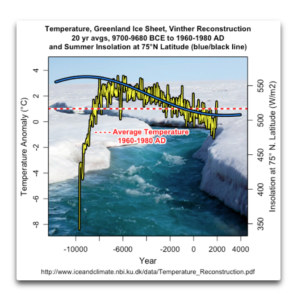
As a result of a tweet by Steve McIntyre, I was made aware of an interesting dataset. This is a look by Vinther et al. at the last ~12,000 years of temperatures on the Greenland ice cap. The dataset is available here.

Figure 1 shows the full length of the data, along with the change in summer insolation at 75°N, the general location of the ice cores used to create the temperature dataset.

Figure 1. Temperature anomalies of the Greenland ice sheet (left scale, yellow/black line), and the summer insolation in watts per square metre at 75°N (right scale, blue/black line). The red horizontal dashed line shows the average ice sheet temperature 1960-1980.

I’ll only say a few things about each of the graphs in this post. Regarding Figure 1, the insolation swing shown above is about fifty watts per square metre. Over the period in question, the temperature dropped about two and a half degrees from the peak in about 5800 BCE. That would mean the change is on the order of 0.05°C for each watt per square metre change in insolation …

Is the forecasted El Niño for this year fading away? It sure looks that way.

by Anthony Watts, January 8, 2019 in WUWT


In late 2018, there were some predictions that there would be a significant El Niño event in 2019. There were strong hints of an El Niño event in both SST data and forecasts. In an April 6th 2018 essay, Bob Tisdale suggested  “Looks like one may be forming right now.”

But if we look at the animation provided by NOAA’s Climate prediction center, it sure looks like it has been fading: