Archives par mot-clé : Fun?/Discussion

The Picasso Problem

by Willis Eschenbach, November 17, 2018 in WUWT


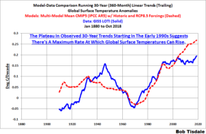
Let me start explaining the link from Picasso to climate science by looking at what Dr. Nir Shaviv called “the most boring graph I have ever plotted in my life”.

This is the graph of the changes in the best estimate of the range of what is called “climate sensitivity” over the last forty years or so.

What is climate sensitivity when it’s at home? To explain that, I’ll have to take a slight detour. First, downwelling radiation.

“Downwelling” in climate science means headed down towards the planetary surface. Downwelling radiation is the total radiation going downwards towards the surface. It is composed of sunshine (shortwave) plus thermal radiation from the atmosphere (longwave). In climate science, this quantity, total downwelling radiation, is called “forcing”, abbreviated “F”

The central paradigm of modern climate science is that if you change the amount of downwelling radiation (forcing), that the surface temperature perforce will change. The claim is that everything else averages out, and if the forcing increases, then surface temperature needs to change to maintain the global energy balance. It has to change. It must.

In short, the central paradigm of modern climate science is the following:

In the long run, global temperature change is proportional to global forcing change.

The putatively constant proportion between the two, which is the temperature change divided by forcing change, is called the “climate sensitivity”.

See also here

L’astuce de la NOAA pour « réchauffer » la planète

by Les Blogs, 17 novembre 2018


D’abord cette info surprenante. Une étude récente sur le réchauffement des océans a dû être modifiée après publication dans Nature. L’étude, très alarmiste, avait pourtant été révisée puis validée par un comité de lecture et publiée dans la plus prestigieuse revue scientifique au monde. Or la méthodologie et les conclusions  de cette recherche étaient erronées.

La faille a été découverte par Nic Lewis, un chercheur climato-critique très populaire en Grande-Bretagne. Il affirme, et les faits lui donnent raison: « Je suis légèrement surpris que ni les pairs examinateurs ni le rédacteur en chef n’aient repéré ce qui me semblait être une alarme rouge à la page 1. »

October 2018 Global Surface (Land+Ocean) and Lower Troposphere Temperature Anomaly Update Bob Tisdale

by Bob Tisdale, November 15, 2018 in WUWT


As you’ll soon see, there was an eye-catching uptick (+0.25 deg C) in the GISS global Land-Ocean Temperature Index (LOTI) data from September to October 2018. We’ll have to wait for next month’s update to see if it also appears in the NOAA and Met Office datasets.

Figure 8

There are numerous things to note in the trend comparison. First, there is a growing divergence between models and data starting in the early 2000s. The continued rise in the model trends indicates global surface warming is supposed to be accelerating, but the data indicate little to no acceleration since then. Second, the plateau in the data warming rates begins in the early 1990s, indicating that there has been very little acceleration of global warming for more than 2 decades. This suggests that there MAY BE a maximum rate at which surface temperatures can warm. Third, note that the observed 30-year trend ending in the mid-1940s is comparable to the recent 30-year trends. (That, of course, is a function of the new NOAA ERSST.v5 data used by GISS.) Fourth, yet that high 30-year warming ending about 1945 occurred without being caused by the forcings that drive the climate models. That is, the climate models indicate that global surface temperatures should have warmed at about a third that fast if global surface temperatures were dictated by the forcings used to drive the models. In other words, if the models can’t explain the observed 30-year warming ending around 1945, then the warming must have occurred naturally. And that, in turns, generates the question: how much of the current warming occurred naturally? Fifth, the agreement between model and data trends for the 30-year periods ending in the 1960s to about 2000 suggests the models were tuned to that period or at least part of it. Sixth, going back further in time, the models can’t explain the cooling seen during the 30-year periods before the 1920s, which is why they fail to properly simulate the warming in the early 20thCentury.

One last note, the monumental difference in modeled and observed warming rates at about 1945 confirms my earlier statement that the models can’t simulate the warming that occurred during the early warming period of the 20th Century.

Climate Alarmism Dies In 2018 As Modern Ice Melt, Sea Level Rise Has No Net Impact On World’s Coasts

by Kenneth Richard, November 15, 2018 in NoTricksZone


The year 2018 could mark the beginning of the end of climate change alarmist reporting.  Projections of catastrophic melting of the ice sheets and sea level rise swallowing up the Earth’s coasts are increasingly undermined by observation.

Despite the hackneyed practice of reporting “staggering” ice sheet melt for both Greenland and Antarctica in recent decades, the two polar ice sheets combined to add just 1.5 centimeters to sea level rise between 1958 and 2014 (graphfrom Frederikse et al., 2018) as global sea levels only rose by “1.5 ± 0.2 mm yr−1 over 1958–2014 (1σ)” or “1.3 ± 0.1 mm yr−1 for the sum of contributors”.

That’s about 7.8 centimeters (3.1 inches) of global sea level change in 56 years.

MATH ERROR: Scientists Admit ‘Mistakes’ Led To Alarming Results In Major Global Warming Study

by M. Bastasch, November 14, 2018 in WUWT/DailyCaller


  • Scientists behind a headline-grabbing climate study admitted they “really muffed” their paper.

  • Their study claimed to find 60 percent more warming in the oceans, but that was based on math errors.

  • The errors were initially spotted by scientist Nic Lewis, who called them “serious (but surely inadvertent) errors.”

The scientists behind a headline-grabbing global warming study did something that seems all too rare these days — they admitted to making mistakes and thanked the researcher, a global warming skeptic, who pointed them out.

“When we were confronted with his insight it became immediately clear there was an issue there,” study co-author Ralph Keeling told The San Diego Union-Tribune on Tuesday.

Their study, published in October, used a new method of measuring ocean heat uptake and found the oceans had absorbed 60 more heat than previously thought. Many news outlets relayed the findings, but independent scientist Nic Lewis quickly found problems with the study.

Keeling, a scientist at the Scripps Institution of Oceanography, owned up to the mistake and thanked Lewis for finding it. Keeling and his co-authors submitted a correction to the journal Nature. (RELATED: Headline-Grabbing Global Warming Study Suffers From A Major Math Error)

Shale Reservoirs, do they work, will they spread?

by Andy May, November 13, 2018 in WUWT


Popular accounts of shale oil and gas reservoirs are often riddled with errors and, even when technically correct, often misleading. As a shale petrophysicist, retired from Devon Energy, I thought I would try and explain, in a non-technical way, how these reservoirs work and why they have been so successful.

Figure 1. Major shale oil and gas plays in the United States. Source EIA.

Antarctic temperatures recently plunged close to the theoretically coldest achievable on Earth! David Middleton

by David Middleton, November 13, 2018 in WUWT


This story was previously discussed here at WUWT… But, why wasn’t this headline news in the Washington Post, New York Times, etc.?  Yes… That was a rhetorical question.

Comparisons with nearby automated weather stations suggest that air temperatures during these events are near −94 ± 4 °C or about −138 F. Ultracold conditions (below −90 °C) occur more frequently when the Antarctic polar vortex is strong. This temperature appears to be about as low as it is possible to reach, even under clear skies and very dry conditions, because heat radiating from the cold clear air is nearly equal to the heat radiating from the bitterly cold snow surface.

Forest Fires in the Golden State

by Willis Eschenbach, November 12, 2018 in WUWT


Our charmingly incompetent California Governor, Jerry “Moonbeam” Brown, has announced that all climate-change deniers are “definitely contributing” to the wildfires in the northern and southern parts of the state over the past few days, as well as blazes “in the coming years.” So look out, you dang “deniers”, it’s all your fault!

So … did scientists actually “predict” that past temperatures have gone up by one degree? Can scientists actually predict the past? And can we really expect half a degree of warming in the next decade? To get some perspective on these questions, I thought I’d take a look at the records. I found an interesting site, the Western Regional Climate Center (WRCC), which has a variety of weather-related data state by state. So with no further ado, here is the average temperature in California from January of 1895 to the present, October 2018.

Interview exclusive: Henri Masson, Université d’Anvers, déclare les modèles du GIEC « aberration statistique »

by Henri Masson, 10 mars 2012, in Contrepoints


Des modèles, cela fait 40 ans que j’en fais », précise d’emblée Henri Masson. Ingénieur chimiste de formation (Université Libre de Bruxelles), docteur en sciences appliquées, professeur émérite à l’Université d’Anvers, expert globe-trotter (notamment pour la Banque Mondiale et l’ONU), l’homme est, de surcroît, doté d’un sérieux sens de la vulgarisation. Lorsque Contrepoints lui propose d’analyser les modèles prédictifs du GIEC, le Belge est catégorique : « Si mes étudiants me présentaient de tels modèles, je n’hésiterais pas à les recaler ! »

Contrepoints : Quelle confiance peut-on accorder aux modèles du GIEC, qui prévoient, parmi d’autres choses, un réchauffement planétaire dû aux émissions humaines de CO2 ?

Role of atmospheric carbon dioxide in climate change

by M. Hertzberg & H. Scheruder, 2016 in EnergyEnvironment


Abstract

The authors evaluate the United Nations Intergovernmental Panel on Climate Change (IPCC) consensus that the increase of carbon dioxide in the Earth’s atmosphere is of anthropogenic origin and is causing dangerous global warming, climate change and climate disruption. The totality of the data available on which that theory is based is evaluated. The data include: (a) Vostok ice-core measurements; (b) accumulation of CO2 in the atmosphere; (c) studies of temperature changes that precede CO2 changes; (d) global temperature trends; (e) current ratio of carbon isotopes in the atmosphere; (f) satellite data for the geographic distribution of atmospheric CO2; (g) effect of solar activity on cosmic rays and cloud cover. Nothing in the data supports the supposition that atmospheric CO2 is a driver of weather or climate, or that human emissions control atmos- pheric CO2.

Do Doomsters Know How Much Global Surface Temperatures Cycle Annually

by Bob Tisdale, November 5, 2018 in WUWT


Alternate Title: The Annual Cycle in Global Land+Ocean Surface Temperature IS Far Greater Than 1.5 Deg C, AND Much-Much-MUCH Greater Than 1.5 Deg C Annually for Global Land Air Surface Temperatures

We all were taught early in school that the Earth orbits the Sun…that its path is elliptical…that because of the tilt in Earth’s axis of rotation, we have seasons as the Earth orbits our star annually. Because of the elliptical orbit, and because the ratios of land to ocean are different between the Northern and Southern Hemispheres, we might expect that global average surface temperatures would vary over the course of a year.

Later in life we’ve been brow beaten with alarmism about human-induced global warming and climate change…that the Earth will become a literal—not figurative—hell if global surface temperatures rise—formerly 2-deg C—now 1.5 deg C above pre-industrial levels. But does the average person know much global surface temperatures vary annually as it orbits the Sun? It’s unlikely, because I’ve never before seen graphs that are similar to what’s presented in this post or seen it discussed in any of the global warming literature. Am I expecting most persons to find this information to be of any interest? Nope. I simply find it noteworthy that, as I mentioned before, I’ve never seen it presented anywhere. In fact, I just Googled, in quotes, “How Much Do Global Surface Temperatures Cycle Annually?” and Google replied (their boldface), “No results found for “How Much Do Global Surface Temperatures Cycle Annually?”.

Remarkable, is it not, in these times of global warming interest?

Enough with the preamble and on to the meat of the post:

Hothouse claims from ‘Trajectories of the Earth System in the Anthropocene’ are in a virtual world, not the real world

by Albert Parker, November 2, 2018 in WUWT


A recent paper Trajectories of the Earth System in the Anthropocene (Ref. [1] below) claims that even if the CO2 emission reductions called for in the Paris Agreement are met, our Earth may still enter what they call “Hothouse Earth” conditions, a long-term stabilization at temperature 4-5 °C-higher than pre-industrial temperatures, and sea-level 10-60 m-higher than today. They conclude calling for an accelerated transition towards a CO2 emission-free-world-economy. There is, however, very little evidence that the apocalyptic prediction is scientific grounded. Where really measured, the temperatures haven’t increased dramatically, and similarly, the sea-levels haven’t risen dramatically. More importantly, any acceleration of the temperature warming, or any acceleration of the rate of rise of the sea-level, are hard to detect.

Figure 1 –sample long-term-trend thermometer results (Alice Spring, NT, Australia). The temperatures were recorded in the Post Office / City and Airport locations. Data downloaded from www.bom.gov.au/climate/data/.


REBUTTAL: IPCC SR15 Climate Change Report is Based on Faulty Premises

by Anthony Watts, October 31, 2018 in WUWT


Friends of Science Society is critical of the IPCC SR15 report, pointing out the following:

  1. We are in the Meghalayan, not the Anthropocene. The IPCC SR15 report claims to view climate change through “the lens of the Anthropocene.” This term is popularly used to describe a modern geological period wherein humans are assumed to have a larger impact on the world than nature. On July 13, 2018, the International Union of Geological Sciences (IUGS) issued a statement that the earth is now in the Meghalayan, a period that began 4,200 years ago.  In response to questions as to why the term “Anthropocene” had not been included, at least for the past 50 years of presumed human influence, the IUGS responded that the term “Anthropocene” has not even been submitted for consideration and that the term has only sociological, not scientific relevance.  The IPCC should not use this ‘lens.’

  2. All climate models (simulations) used by the IPCC run ‘too hot’ versus observations. The computer simulations project future warming (thus being the rationale for global warming climate policies) show significantly higher temperatures than what is being observed. Only the Russian climate model and satellite/weather balloon data closely match present temperatures in the lower troposphere. This suggests that most climate models ascribe too great an effect of warming (climate sensitivity) to carbon dioxide.

    This means the climate models should not be used to set public policy.

  3. No temperature can be accurately measured to a precision of less than ±0.1°C. global temperature data is a metric of averaged and adjusted data from many sources, suggesting that a 0.5°C difference in temperature is moot and an arbitrary figure. It does not reference an actual measurement of earth’s temperature; people are being misled.

How Bad is HadCRUT4 Data?

by Renee Hannon, October 29, 2018 in WUWT

Introduction

This post is a coarse screening assessment of HadCRUT4 global temperature anomalies to determine the impact, if any, of data quality and data coverage. There has been much discussion on WUWT about the quality of the Hadley temperature anomaly dataset since McLean’s Audit of the HadCRUT4Global Temperature publication which is paywalled. I purchased a copy to see what all the hub-bub was about, and it is well worth the $8 in my view. Anthony Watts’ review of McLean’s findings and executive summary can be found here.

A key chart for critical study is McLean’s Figure 4.11 in his report. McLean suggests that HadCRUT4 data prior to 1950 is unreliable due to inadequate global coverage and high month-to-month temperature variability. For this post, I subdivided McLean’s findings into three groups shown with added shading: Good data which covers the years post-1950. During this period global data coverage is excellent at greater than 75% and month-to-month temperature variation is low. Questionable data occurs from 1880 to 1950. During this period global data coverage ranged from 40% to 70% with higher monthly temperature variations. Poor data is pre-1880 when global coverage ranged from 14 to 25% with extreme monthly temperature variations.


MOVING THE GOALPOSTS, IPCC SECRETLY REDEFINES ‘CLIMATE’

by David Whitehouse, October 29, 2018 in GWPF


The IPCC appears to have secretly changed the definition of what constitutes ‘climate’ by mixing existing and non-existing data

The definition of ‘climate’ adopted by the World Meteorological Organisation is the average of a particular weather parameter over 30 years. It was introduced at the 1934 Wiesbaden conference of the International Meteorological Organisation (WMO’s precursor) because data sets were only held to be reliable after 1900, so 1901 – 1930 was used as an initial basis for assessing climate. It has a certain arbitrariness, it could have been 25 years.

For its recent 1.5°C report the IPCC has changed the definition of climate to what has been loosely called “the climate we are in.” It still uses 30 years for its estimate of global warming and hence climate – but now it is the 30 years centred on the present.

View From German Scientists On The U Of Arizona’s Coming Release Of The Hockey Stick Chart E-Mails

by P. Gosselin, October 26, 2018 in NoTricksZone


A Piece Of Climate Science History: Hockey Stick Emails Soon To Be Published

By Dr. Sebastian Lüning and Prof. Fritz Vahrenholt
(Text translated by P Gosselin)

The hockey stick controversy over a temperature reconstruction of the past 2000 years represents an important stage in the climate debate. At around the turn of the millennium, the authors of the “hockey stick chart” suggested that the pre-industrial climate was monotonous and uneventful. The Medieval Warm Period and Little Ice Age described in many parts of the world climatically must have been very similar. But that’s hard to understand if you look at the wide variety of case studies.

Cover-up absurdity, then forced to correct

Later, the authors improved and presented a corrected version, which again showed stronger climatic fluctuations. Quite a science story. You can read about it here.

In addition to this scientific rush job, the debate about the hockey stick also showed that climate data really must be made publicly available. This is all the more important if the science is used for far-reaching policies. Data and results obtained thereof must be verifiable. At the time no one wanted the data to be released. Today in retrospect that was quite an absurdity — similar to smoking in a large open office.

Some Failed Climate Predictions

by Andy May, October 30, 2018 in WUWT


Here, for the first time in public, is Javier’s entire collection of massive, “consensus” climate science prediction failures. This collection is carefully selected from only academics or high-ranking officials, as reported in the press or scientific journals. Rather than being exhaustive, this is a list of fully referenced arguments that shows that consensus climate science usually gets things wrong, and thus their predictions cannot be trusted.

To qualify for this list, the prediction must have failed. Alternatively, it is also considered a failure when so much of the allowed time has passed that a drastic and improbable change in the rate of change is required for it to be true. Also, we include a prediction when observations are going in the opposite way. Finally, it also qualifies when one thing and the opposite are both predicted.

A novelty is that I also add a part B that includes obvious predictions that consensus climate science did not make. In science you are also wrong if you fail to predict the obvious.

A. Failed predictions

PAGES2K: North American Tree Ring Proxies

by Steve McIntyre, October 24, 2018 in ClimatAudit


The PAGES (2017) North American network consists entirely of tree rings. Climate Audit readers will recall the unique role of North American stripbark bristlecone chronologies in Mann et al 1998 and Mann et al 2008 (and in the majority of IPCC multiproxy reconstructions).  In today’s post, I’ll parse the PAGES2K North American tree ring networks in both PAGES (2013) and PAGES (2017) from two aspects:

Conclusions

  • ex post screening based on recent proxy trends necessarily biases the resulting data towards a Hockey Stick shape – a criticism made over and over here and at other “ske;ptic” blogs, but not understood by Michael (“I am not a statistician”) Mann and the IPCC paleoclimate “community”;

  • the PAGES 2017 North American tree ring network has been severely screened ex post from a much larger candidate population: over the years, approximately 983 different North American tree ring chronologies have been used in MBH98, Mann et al 2008, PAGES 2013 or PAGES 2017. I.e. only ~15% of the underlying population was selected ex post – a procedure which, even with random data, would impart Hockey Stick-ness to any resulting composite

  • despite this severe ex post screening (in both PAGES 2013 and PAGES 2017), the composite of all data other than stripbark bristlecones had no noticeable Hockey Stick-ness and does not resemble a temperature proxy.

Climate Book By Japanese Physics Professor: “The Globe Isn’t Warming Anymore”…IPCC “Scientifically Immoral”

by Kirye, October 23, 2048 in NoTricksZone


Dr. Fukai also points out that global vegetation coverage increased by 11% in 29 years, from 1982 to 2010, as increasing CO2 has helped the greening of the Sahel and Sahara Desert. He contradicts the often heard media claims that drought is spreading globally, writing: “The media spread the word that desertification is progressing globally, but practically the desert is greening through CO2.” […] “Everyone should be aware that increasing CO2 concentrations in atmosphere is not in itself harmful, but it’s a good thing.”

No correlation

Dr. Fukai also shows that the earth’s temperature change is not simple and does not correlate at all with CO2. He shows graphs from D. M. Etheridge et al., Mauna Loa Observatory and the temperature data from Moberg et al. (2005).

Chart: ftp://ftp.ncdc.noaa.gov/pub/data/paleo/contributions_by_author/moberg2005/nhtemp-moberg2005.txt 

The retired Japanese professor writes that at around 1000 A.D. — the Medieval Warm Period — there were no signs showing CO2 concentration was higher. A temperature graph using data from Moberg et al. (2005) shows the Medieval Warm Period appears clearly and that CO2 was in fact around 280 ppm at that time.

DEFRA VERSUS MET OFFICE Fact-checking the state of the UK climate

by Paul Homewood, October 2018, in GWPF


This paper (.pdf 17 pages) reports the results of a detailed analysis carried out using published UK Met Office data up to 2017. These show:

  • UK temperatures rose during the 1990s and early 2000s. This rise is associated with a similar increase in near-coastal sea surface temperatures. There has been no rise in the last decade.
  • Seasonal temperatures have followed a similar pattern: a rise during the 1990s, but a levelling off since.
  • This sudden rise in UK land temperature is not unprecedented, with the Central Eng- land Temperature series (CET) showing a similar occurrence in the early 18th century.
  • Analysis of CET shows that despite the rise in average summer temperatures, there has been no increase in the highest daily temperatures, or the frequency of extreme high temperatures, in recent years. In fact the opposite is true. Heatwaves were far more intense in 1975 and 1976, when there were thirteen days over 30◦C. By contrast, between 2007 and 2017 there have only been two such days. (Note that there was also only been one day over 30◦C in the summer of 2018). The highest daily temperature on CET was 33.2◦C, set in 1976 and equalled in 1990.

Le réchauffement climatique pour les deux cultures

by Richard Lindzen, 21 octobre 2018, Conférence GWPF, in Skyfall


Traduction par Volauvent.

Il y a plus d’un demi-siècle, C.P. Snow (romancier et physicien anglais qui a également occupé plusieurs postes importants dans la fonction publique britannique et brièvement au sein du gouvernement britannique) a examiné de manière célèbre les implications de « deux cultures » :

Bien des fois, j’ai assisté à des rassemblements de personnes qui, selon les normes de la culture traditionnelle, sont considérées comme très éduquées et qui ont exprimé leur incrédulité face à l’analphabétisme des scientifiques. Une ou deux fois, j’ai été provoqué et j’ai demandé à la compagnie combien d’entre eux pourraient décrire la deuxième loi de la thermodynamique. Ils répondaient froidement : c’était aussi toujours négatif. Pourtant, je demandais quelque chose qui était l’équivalent scientifique de : avez-vous lu un ouvrage de Shakespeare ?

Je crois maintenant que si j’avais posé une question encore plus simple – telle que : que voulez-vous dire par masse ou accélération, qui est l’équivalent scientifique de : pouvez-vous lire ? – pas plus d’un diplômé sur dix aurait eu l’impression que je parlais la même langue que lui. Ainsi, le grand édifice de la physique moderne se construit, et la majorité des personnes les plus intelligentes du monde occidental en ont à peu près le même aperçu que leurs ancêtres néolithiques en auraient eu.

Je crains que peu de choses n’aient changé depuis l’évaluation de Snow, il y a 60 ans. Certains pourraient soutenir que l’ignorance de la physique n’a pas d’incidence sur la capacité politique, mais elle a très certainement une incidence sur la capacité des politiciens non scientifiques à traiter des problèmes théoriquement fondés sur la science. Le manque de compréhension est également une invitation à l’exploitation malveillante. Compte tenu de la nécessité démocratique pour les non-scientifiques de prendre position sur des problèmes scientifiques, la croyance et la foi remplacent inévitablement la compréhension, même si des récits simplifiés à outrance de façon triviale rassurent les non-scientifiques sur le fait qu’ils ne sont pas totalement dénués de « compréhension scientifique ». Le sujet du « réchauffement global » offre de nombreux exemples de tout cela.

Je voudrais commencer cette conférence par une tentative visant à forcer les scientifiques du public à se familiariser avec la nature réelle du système climatique et à aider les non-scientifiques motivés de ce public susceptibles de faire partie du groupe « Un sur dix » de Snow à aller au-delà des simplifications excessivement triviales.

Trump s’interroge sur les causes du changement climatique

by Tom Harris & Jay Lehr, 20 octobre 2018 in Contrepoints


Le 14 octobre dernier, durant une interview sur la chaine de télévision CBS, le président américain a exprimé à juste titre son scepticisme concernant le rôle de l’homme sur le changement climatique.

Contrairement à l’affirmation d’Al Gore daté du 12 octobre selon laquelle seuls « quelques rares marginaux » dans la communauté scientifique ne partageraient pas l’avis du GIEC, de nombreux chercheurs sont en désaccord avec les conclusions faites par l’agence internationale.

En effet, c’était un euphémisme pour le président américain de déclarer durant l’interview « qu’il y a des scientifiques qui réfutent cela », en parlant d’un lien entre la fonte de glace au Groenlandet du changement climatique anthropique.

Le 8 octobre dernier, durant sa conférence devant la Global Warming Policy Foundation (GWPF) située à Londres, le professeur Richard Lindzen a mentionné « la découverte faite conjointement par la NOAA (la National Oceanic and Atmospheric Administration) et l’Institut Météorologique Danois, à savoir que la masse de glace du Groenland a effectivement augmenté ».

Reliable? CRU, NASA, BEST, NOAA Land Temp Data Conflict By Up To 90% (0.8°C), Spawning ‘Large Uncertainty’

by K. Richard, October 8, 2018 in NoTricksZone


A new paper documents “remarkably different” land temperatures from one instrumental data set to another. In some regions there is as much as an 0.8°C conflict in recorded temperature anomalies for CRU, NASA, BEST, and NOAA. The relative temperature trend differences can reach 90% when comparing instrumental records. Consequently, the uncertainty in instrumental temperature trends — “0.097–0.305°C per decade for recent decades (i.e., 1981–2017)” —  is as large or larger than the alleged overall warming trend itself for this period.

McIntyre: ‘a reductio ad absurdum of tree ring chronologies as useful temperature proxies’

by A. Watts, October 11, 2018 in WUWT


Steve McIntyre has a look at the “revised” PAGES2K temperature proxy dataset that includes tree rings and river sediments. He finds the usual ridiculous problems from the past, such as upside down data and river sediment accumulations that have more to do with building a dam than climate.

See also here

Richard Lindzen Lecture at GWPF: ‘Global Warming for the Two Cultures’

by R. Lindzen, Ocotber2, 2018 in A. Watts, WUWT


The climate system

The following description of the climate system contains nothing that is in the least controversial, and I expect that anyone with a scientific background will readily follow the description. I will also try, despite Snow’s observations, to make the description intelligible to the non-scientist.

Conclusion

So there you have it. An implausible conjecture backed by false evidence and repeated incessantly has become politically correct ‘knowledge,’ and is used to promote the overturn of industrial civilization. What we will be leaving our grandchildren is not a planet damaged by industrial progress, but a record of unfathomable silliness as well as a landscape degraded by rusting wind farms and decaying solar panel arrays. False claims about 97% agreement will not spare us, but the willingness of scientists to keep mum is likely to much reduce trust in and support for science. Perhaps this won’t be such a bad thing after all – certainly as concerns ‘official’ science.

There is at least one positive aspect to the present situation. None of the proposed policies will have much impact on greenhouse gases. Thus we will continue to benefit from the one thing that can be clearly attributed to elevated carbon dioxide: namely, its effective role as a plant fertilizer, and reducer of the drought vulnerability of plants. Meanwhile, the IPCC is claiming that we need to prevent another 0.5◦C of warming, although the 1◦C that has occurred so far has been accompanied by the greatest increase in human welfare in history. As we used to say in my childhood home of the Bronx: ‘Go figure’.