by K. Richard, August 5, 2019 in NoTricksZone
A new paper (Axford et al., 2019) reveals NW Greenland’s “outlet glaciers were smaller than today from ~9.4 to 0.2 ka BP” (9,400 to 200 years before 1950), and that “most of the land-based margin reached its maximum Holocene extent in the last millennium and likely the last few hundred years.”
The authors conclude:
“We infer based upon lake sediment organic and biogenic content that in response to declining temperatures, North Ice Cap reached its present-day size ~1850 AD, having been smaller than present through most of the preceding Holocene.”
Furthermore, the authors assert Greenland was 2.5°C to 3°C warmer than modern on average during the Holocene Thermal Maximum, and peak temperatures were 4°C to 7°C warmer.
…
…
by Christopher Monckton of Brenchley, August 5, 2019 in WUWT
Yet again, the hard-Left Washington Post has libeled Dr Willie Soon, whom many of us know to be one of the most dedicated scientists in single-minded pursuit of the objective truth about global warming. If you agree with the following Letter to the Editor, please write your own letter and send it in to the Washpot.
Sir,
The Post’s inaccurate and malicious personal attack on Dr. Willie Soon
…
….
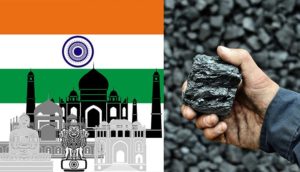
by GWPF, August 5,2019 in EnergyLiveNews
India expects coal-fired power capacity to grow by 22% in three years.
That’s according to the Chief Engineer at the country’s Federal Power Ministry, Ghanshyam Prasad, who Reuters reported as stating coal capacity is likely to reach 238GW by 2022.
India’s Coal Minister, Pralhad Joshi previously said annual coal demand rose by 9.1% during the year ending March 2019, noting the figure hit 991.35 million tonnes, driven primarily by utilities, which accounted for three-quarters of total demand.
The anticipated growth is likely to affect efforts to cut emissions and could risk worsening already poor air quality.
India’s electricity demand rose by 36% in the seven years up to April 2019, while coal-fired generation capacity during the period rose by three-quarters to 194.44GW.
Pralhad Joshi said despite the growth rate in thermal capacity outpacing electricity consumption in the last few years, more coal-fired plants will still be needed in the future to meet growth.
He added: “If we have to meet demand and address the intermittencies we have with solar and wind, we have no choice but to keep depending on coal-based generation in the near future.”
by Kip Hansen, August 6, 2019 in WUWT
What we call a graph is more properly referred to as “a graphical representation of data.” One very common form of graphical representation is “a diagram showing the relation between variable quantities, typically of two variables, each measured along one of a pair of axes at right angles.”
Here at WUWT we see a lot of graphs — all sorts of graphs of a lot of different data sets. Here is a commonly shown graph offered by NOAA taken from a piece at Climate.gov called “Did global warming stop in 1998?” by Rebecca Lindsey published on September 4, 2018.
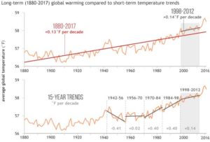
I am not interested in the details of this graphic representation — the whole thing qualifies as “silliness”. The vertical scale is in degrees Fahrenheit and the entire range change over 140 years shown is on the scale 2.5 °F or about a degree and a half C. The interesting thing about the graph is the effort of drawing of “trend lines” on top of the data to convey to the reader something about the data that the author of the graphic representation wants to communicate. This “something” is an opinion — it is always an opinion — it is not part of the data.
The data is the data. Turning the data into a graphical representation (all right, I’ll just use “graph” from here on….), making the data into a graph has already injected opinion and personal judgement into the data through choice of start and end dates, vertical and horizontal scales and, in this case, the shading of a 15-year period at one end. Sometimes the decisions as to vertical and horizontal scale are made by software — not rational humans — causing even further confusion and sometimes gross misrepresentation.
Anyone who cannot see the data clearly in the top graph without the aid of the red trend lineshould find another field of study (or see their optometrist). The bottom graph has been turned into a propaganda statement by the addition of five opinions in the form of mini-trend lines.
…
La géologie, une science plus que passionnante … et diverse
