Archives par mot-clé : Antarctic

La péninsule Antarctique se porte bien

by P. Berth, 28 février 2020 in ScienceClimatEnergie


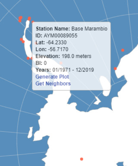
Selon un récent article du Guardian, des scientifiques ont mesuré pour la première fois la température de 20,75°C le 9 février 2020 sur l’île Seymour, une île située au large de la péninsule Antarctique. Cette île comporte la station de mesure Marambio où les relevés ont été réalisés. Bien entendu, cette nouvelle a été reprise par les médias, Greta Thunberg en tête. Cependant, en analysant objectivement la situation vous pourrez constater qu’il n’y a pas lieu de s’alarmer.

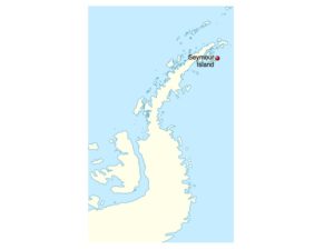
1. Localisation de l’île Seymour et température moyenne annuelle

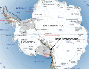
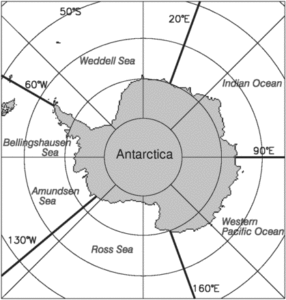
L’île Seymour est située au large de la péninsule Antarctique (Figure 1), la région la plus au nord du continent Antarctique et, quasiment, la seule partie d’Antarctique s’étendant au-delà du cercle polaire.

3. Conclusions

– Pour comprendre ce qu’il se passe dans un jeu de données de température il ne faut pas considérer une seule mesure comme le fait l’article du Guardian; il ne faut pas non plus considérer une seule station de mesure.

– Si l’on désire faire passer des droites parmi les données de température, les plus longues séries disponibles sont celles de la station Orcadas (depuis 1902), qui est quand même assez éloignée de la péninsule Antarctique. On constate alors un réchauffement d’environ + 2°C en 110 ans (la courbe de tendance coupe –5°C en 1900 et –3°C en 2010). Cependant, en considérant des courbes polynomiales dont le coefficient de détermination est meilleur on constate que les températures moyennes chutent depuis les années 2000, comme dans toutes les stations de la péninsule Antarctique présentées dans cet article.

– Les phénomènes naturels suivent rarement des droites. Ils sont généralement cycliques, avec des périodes et amplitudes très variables. Il est donc permis de conclure que la péninsule Antarctique ne se réchauffe pas depuis 25 ans. Ceci est confirmé par d’autres analyses (voir ici et ici) et il est dommage qu’une fois de plus les médias ne fassent pas plus preuve de rigueur et se permettent des raccourcis donnant une information inexacte à 100%. En sont-ils seulement conscients ?

Unexpected ice

by N. Vizcarra, February 2020 in EarthData/NASA


Paul Holland, a climate modeler with the British Antarctic Survey, has spent the last ten years studying Antarctica’s sea ice and the Southern Ocean. Lately, he has been scrutinizing the seasons of Antarctica and how fast the ice comes and goes. Holland thinks these seasons may be a key to a conundrum: If Earth’s temperatures are getting warmer and sea ice in the Arctic has been shrinking fast, why then is sea ice in the Antarctic slowly increasing?

Spring surprise

Holland used data from NASA’s National Snow and Ice Data Center Distributed Active Archive Center (NSIDC DAAC) to calculate the ice concentration rate of growth for each single day, which he called intensification; and the total ice area rate of growth, which he called expansion. “I did that for all thirty years of data and plotted the trends,” he said. Holland’s plots showed that the different regions in the Southern Ocean contributed to the overall increase, but they had very diverse trends in sea ice growth. This suggested that geography and different wind patterns played a role. So to gain more insight Holland looked at seasonal wind trends for the different regions.

Holland found that winds were spreading sea ice out in some regions and compressing or keeping it intact in others and that these effects began in the spring. It contradicted a previous study in which, using ice drift data, Holland and Ron Kwok from the NASA’s Jet Propulsion Laboratory (JPL) found that increasing northward winds during the autumn caused the variations.

“I always thought, and as far as I can tell everyone else thought, that the biggest changes must be in autumn,” Holland said. “But the big result for me now is we need to look at spring. The trend is bigger in the autumn, but it seems to be created in spring.”

“Paul has created two more sea ice metrics that we can use to assess how Antarctic sea ice is responding,” said researcher Sharon Stammerjohn, referring to the measures of intensification and expansion. The new metrics help assess how the system is responding as opposed to simply monitoring the state of the system. “Say your temperature is at 99.2 degrees Fahrenheit,” Stammerjohn said. “You don’t have any insight to that temperature unless you take it again an hour later and you see that it changed to 101 degrees. Then you can say, okay, my system is responding to something.”

Is “All-Time Antarctic 20.75C Record High Temperature” Just A Sensational Hoax? Station Data Show Only 16C

by P. Gosselin, February 17, 2020 in NoTricksZone


In Germany there have been rumors that the alleged Antarctic Seymour Island “all-time Antarctic record high” of 20.75°C set on February 9th is a hoax – originating by the AFP news agency and then spread by The Guardian.

The alleged 20.75°C was supposedly logged by Brazilian scientists and was supposedly almost a full degree higher than the previous record of 19.8C, taken on Signy Island in January 1982, The Guardian blared with much alarm, citing its own rush job chart.

Currently the WMO is seeking to obtain the actual temperature data for Seymour Island, part of a chain of islands off the Antarctic peninsula.

WMO cites media as source!

The WMO website itself is citing the media as its source, writing: “Media reports say that researchers logged a temperature of 20.75°C. Mr Cerveny cautioned that it is premature to say that Antarctica has exceeded 20°C for the first time.”

Thermometer data show only 16°C!

According to German Facebook site Klima.Wissen here and its readers, the “all-time record high reading” of 20.75°C appears to have its origins from the AFP news agency. It was then picked up by the always climate sensational The Guardian. But now the whole story is beginning to appear as just big sensational hoax.

First, WetterOnline.de here shows that the high temperature on February 9th at the Seymour Island station (Base Murambio) was merely 16°C!

Greta’s, The Guardian’s Latest Panic Attack Over Antarctica Record Ignores Cooling Trends Of Recent Decades

by P. Gosselin, February 15, 2020 in NoTricksZone


In her latest panic attack, teenage Swedish climate activist Greta Thunberg – citing the Guardian –  once again appeared to be proclaiming the end of the world was a step closer when she tweeted Antarctica has set a new record high temperature:


Two new warm records

According to the Guardian, “The 20.75C logged by Brazilian scientists at Seymour Island on 9 February was almost a full degree higher than the previous record of 19.8C, taken on Signy Island in January 1982.”

That reading, the Guardian reports, follows the February 6 record of 18.3C recorded at the Argentinian research station, Esperanza measured.

As is the case with most alarmists, every warm single datapoint anomaly gets uncritically accepted with open arms as solid evidence of man-made global warming while cold trends get dismissed or downgraded as “natural variability”.

Seymour Island has been cooling for over a quarter century

So we have two recent warm records set at and near the Antarctic peninsula over the past week or so and that means the region there is heating up, alarmists like Greta and the Guardian want us to believe. But what are the real TRENDS there? Do the 2 recent warm records mean the region is heating up.

Looking at official data from NASA, it turns out that warming isn’t true. And because climate is always changing, the temperature in the region in question has also not remained completely steady. The only possibility left? COOLING.

Also here

OFFICIAL DATA REVEALS JANUARY 2020’S ANTARCTIC SEA ICE EXTENT TRACKED 1979-1990 AVERAGE

by Cap Allon, February 10, 2020 in Electroverse


According to official government data from the National Snow & Ice Data Center (NSIDC), Antarctic Sea Ice Extent is currently tracking the 1979-1990 average:

In addition, Jan 2020’s extent exceeded that of 2019, 2018, 2017, 2016, 2011, 2007, 2006, 2005, 2000, 1997, 1993, 1992, 1988, 1985, 1984, 1981, and 1980.


NO CORRELATION BETWEEN CO2 AND SEA ICE EXTENT

Since 1979 — the year sea ice satellite measurements began — CO2 readings taken at the Mauna Loa Observatory in Hawaii have been on an unnaturally linear rise. While, during the same period, Antarctic Sea Ice Extent has been “extremely variable” with “the yearly minimum hitting both record highs and lows” — NOAA (climate.gov)

Media’s Horribly Dishonest Antarctica Propaganda

by Jim Steele, February 9, 2020 in WUWT


The current context for the Antarctica Peninsula is that for over a decade it has experienced cooling temperatures driven by natural variability. In fact, glaciers in Esperanza’s region have also expanded. Esperanza’s record temperature simply happened due to foehn winds despite a cooling trend. Unfortunately, the media would rather scare the public to promote a climate crisis, than honestly educate them about the causes of natural climate variability.

Bloomberg It’s T-Shirt Weather in Antarctica as Temperature Breaks Record

by L.M. Lombrana, February 8, 2020
in NotaLotofPeopleKnowThat/Bloomberg


When one day’s weather is climate!
Paul Homewood

(Bloomberg) — The temperature at one research base in Antarctica reached a record-breaking 18.3 degrees Celsius (65 Fahrenheit) on Thursday, almost a full degree above the previous high set five years ago.

Argentine scientists on the Esperanza base who confirmed the reading said that wasn’t the only record broken this week. The nation’s Marambio site registered the highest temperature for the month of February since 1971. Thermometers there hit 14.1 Celsius, above the previous February 2013 reading of 13.8 Celsius.

The reports are shocking, but not surprising, said Frida Bengtsson, who is leading a expedition to the Antarctic for the environmental group Greenpeace.

Thwaites Glacier: Why Did The BBC Fail To Mention The Volcanoes Underneath?

by D. Whitehouse, January 29, 2020 in GWPF


Scientists have known for years that subglacial volcanoes and other geothermal “hotspots” are contributing to the melting of the Thwaites Glacier. Why did the BBC fail to mention these facts in its recent report?


The International Thwaites Glacier Collaboration is performing some magnificent science, conducting the most ambitious fieldwork ever undertaken at the tip of what is one of the most significant glaciers on Earth. Its melting already contributes 4% of global sea level rise and there are fears that it could become unstable and contribute many metres to global sea level.

The reason for its vulnerability lies in its geology. While most of the glacier is on ground and making its way into the West Antarctic seas, Thwaites lip floats on water allowing warm water to weaken and melt it from beneath. Being one of the most difficult places in the world to reach the scientific collaboration planned for years to transport many tonnes of equipment to the glaciers front. Two weeks ago they announced they had carried out the first warm water borehole through the ice at the point where it lifts off the land and starts to be suspended by the ocean. Image courtesy British Antarctic Survey.

Patterns of thinning of Antarctica’s biggest glacier are opposite to previously observed

by University of Bristol, January 27, 2020 in ScienceDaily


Using the latest satellite technology from the European Space Agency (ESA), scientists from the University of Bristol have been tracking patterns of mass loss from Pine Island — Antarctica’s largest glacier.

They found that the pattern of thinning is evolving in complex ways both in space and time with thinning rates now highest along the slow-flow margins of the glacier, while rates in the fast-flowing central trunk have decreased by about a factor of five since 2007. This is the opposite of what was observed prior to 2010.

Pine Island has contributed more to sea level rise over the past four decades than any other glacier in Antarctica, and as a consequence has become one of its most intensively and extensively investigated ice stream systems.

However, different model projections of future mass loss give conflicting results; some suggesting mass loss could dramatically increase over the next few decades, resulting in a rapidly growing contribution to sea level, while others indicate a more moderate response.

Identifying which is the more likely behaviour is important for understanding future sea level rise and how this vulnerable part of Antarctica is going to evolve over the coming decades.

The results of the new study, published in the journal Nature Geoscience, suggest that rapid migration of the grounding line, the place where the grounded ice first meets the ocean, is unlikely over that timescale, without a major change in ocean forcing. Instead, the results support model simulations that imply that the glacier will continue to lose mass but not at much greater rates than present.

Lead author Professor Jonathan Bamber from the University of Bristol’s School of Geographical Sciences, said: “This could seem like a ‘good news story’ but it’s important to remember that we still expect this glacier to continue to lose mass in the future and for that trend to increase over time, just not quite as fast as some model simulations suggested.

“It’s really important to understand why the models are producing different behaviour in the future and to get a better handle on how the glacier will evolve with the benefit of these new observations.

“In our study, we didn’t make projections but with the aid of these new data we can improve model projections for this part of Antarctica.”

Comprehensive Data, Recent Studies In Top Journals: Antarctica Stable, Temps Falling, Ice Mass Growing!

by P. Gosselin, January 14, 2020 in NoTricksZone


The ice in Antarctica, how is it doing? Is it melting, is it growing? In the following we wishto present the latest literature on the subject. There is a lot to report.

Fasten your seat belt, there’s a lot to cover.

Let’s start with the temperature development because along with snowfall, this is the most important control factor for Antarctic inland ice.

At NoTricksZone, Kirye shows ten coastal stations of Antarctica. None have been warming over the past 10 years. An example follows:


And here’s the temperature development of the entire Antarctic according to UAH and RSS satellite measurements (from Climate4You, via NoTricksZone):

Greenland Ice Core CO2 Concentrations Deserve Reconsideration

by Renee Hannon, January 7, 2020, in WUWT


Introduction
Ice cores datasets are important tools when reconstructing Earth’s paleoclimate. Antarctic ice core data are routinely used as proxies for past CO2 concentrations. This is because twenty years ago scientists theorized Greenland ice core CO2 data was unreliable since CO2trapped in air bubbles had potentially been altered by in-situ chemical reactions. As a result, Greenland CO2 datasets are not used in scientific studies to understand Northern and Southern hemispheres interactions and sensitivity of greenhouse gases under various climatic conditions.

This theory was put forward because Greenland CO2 data were more variable and different than Antarctic CO2 measurements located in the opposite polar region about 11,000 miles away. This article re-examines Greenland ice cores to see if they do indeed contain useful CO2 data. The theory of in-situ chemical reactions to explain a surplus and deficit of CO2, relative to Antarctic data, will be shown to be tenuous. The Greenland CO2 data demonstrates a response to the Medieval Warm Period, Little Ice Age, Dansgaard-Oeschger and other past climate change events. This response to past climate changes offers an improved explanation for why Greenland and Antarctic CO2 measurements differ. Further, Greenland CO2 measurements show rapid increases of 100 ppm during warm events in relatively short periods of time.

Atmospheric CO2 is More Variable in Northern Latitudes

Figure 1, from NOAA, shows atmospheric CO2 concentrations measured from the continuous monitoring program at four key baseline stations spanning from the South Pole to Barrow, Alaska. CO2 has risen from about 330 ppm to over 400 ppm since 1975 and is increasing at approximately 1-2+ ppm/year. Many scientists believe that rapidly increasing CO2 is mostly due to fossil fuel emissions.

Figure 1. Atmospheric CO2 concentrations from NOAA

Scientists Found the Deepest Land on Earth Hiding Beneath Antarctica’s Ice

by Rafi Letzter, December 13, 2019 in LiveScience


A new mapping effort revealed critical new details of Antarctica’s hidden land.

A new map of the mountains, valleys and canyons hidden under Antarctica‘s ice has revealed the deepest land on Earth, and will help forecast future ice loss.

The frozen southern continent can look pretty flat and featureless from above. But beneath the ice pack that’s accumulated over the eons, there’s an ancient continent, as textured as any other. And that texture turns out to be very important for predicting how and when ice will flow and which regions of ice are most vulnerable in a warming world. The new NASA map, called BedMachine Antarctica, mixes ice movement measurements, seismic measurements, radar and other data points to create the most detailed picture yet of Antarctica’s hidden features.

Related: 50 Amazing Facts About Antarctica

“Using BedMachine to zoom into particular sectors of Antarctica, you find essential details, such as bumps and hollows beneath the ice that may accelerate, slow down or even stop the retreat of glaciers,” Mathieu Morlighem, an Earth system scientist at the University of California, Irvine and the lead author of a new paper about the map, said in a statement.

The new map, published Dec. 12 in the journal Nature Geoscience, reveals previously unknown topographical features that shape ice flow on the frozen continent.

The previously unknown features have “major implications for glacier response to climate change,” the authors wrote. “For example, glaciers flowing across the Transantarctic Mountains are protected by broad, stabilizing ridges.”

Barrels of ancient Antarctic air aim to track history of rare gas

by University of Washington, December 13, 2019 in ScienceDaily


An Antarctic field campaign last winter led by the US and Australia has successfully extracted some of the largest samples of air dating from the 1870s until today. Researchers will use the samples to look for changes in the molecules that scrub the atmosphere of methane and other gases.

“It’s probably the most extreme atmospheric chemistry you can do from ice core samples, and the logistics were also extreme,” said Peter Neff, a postdoctoral researcher with dual appointments at the UW and at the University of Rochester.

But the months the team spent camped on the ice at the snowy Law Dome site paid off.

“This is, to my knowledge, the largest air sample from the 1870s that anyone’s ever gotten,” Neff said. His 10 weeks camped on the ice included minus-20 degrees Fahrenheit temperatures and several snowstorms, some of which he shared from Antarctica via Twitter.

Air from deeper ice cores drilled in Antarctica and Greenland has provided a record of carbon dioxide and methane, two greenhouse gases, going back thousands of years. While carbon dioxide has a lifetime of decades to centuries, an even more potent gas, methane, has a lifetime of just nine or 10 years.

West Antarctic Ice Sheet Growing As Southern Ocean Warms Slightly

by Michaels, P.J., October 22, 2019 in ClimateChangeDispatch


The West Antarctic Ice Sheet is growing, but I bet you didn’t read about it in the news. Nor would you probably be able to find it if you entered “West Antarctic Ice Sheet Growing” in a Google search.

That search would likely uncover one 2015 publication by NASA’s Jay Zwally in the Journal of Glaciology using actual weather data that showed increasing snowfall, primarily over East Antarctica, was adding a small amount of ice.

That report generated a flurry of coverage, but of course in the current era of public shaming of any deviation from the apocalyptic orthodoxy, you don’t hear much about it anymore.

Which may explain why you have heard nothing about this new publication which has been accepted in Journal of Geophysical Research-Atmospheres but isn’t in print yet:


Antarctic ice cliffs may not contribute to sea-level rise as much as predicted

by Massachusetts Institute of Technology, October 21, 2019 in ScicnceDaily


Researchers report that in order for a 90-meter ice cliff to collapse entirely, the ice shelves supporting the cliff would have to break apart extremely quickly, within a matter of hours — a rate of ice loss that has not been observed in the modern record.

A realistic picture

The results suggest that the Earth’s tallest ice cliffs are unlikely to collapse catastrophically and trigger a runaway ice sheet retreat. That’s because the fastest rate at which ice shelves are disappearing, at least as documented in the modern record, is on the order of weeks, not hours, as scientists observed in 2002, when they captured satellite imagery of the collapse of the Larsen B ice shelf — a chunk of ice as large as Rhode Island that broke away from Antarctica, shattering into thousands of icebergs over the span of two weeks.

“When Larsen B collapsed, that was quite an extreme event that occurred over two weeks, and that is a tiny ice shelf compared to the ones that we would be particularly worried about,” Clerc says. “So our work shows that cliff failure is probably not the mechanism by which we would get a lot of sea level rise in the near future.”

Record Antarctic Stratospheric Warming Causes Sept. 2019 Global Temperature Update Confusion

by Roy Spencer, October 4, 2019 in WUWT


While the vast majority of our monthly global temperature updates are pretty routine, September 2019 is proving to be a unique exception. The bottom line is that there is nothing wrong with the UAH temperatures we originally reported. But what I discovered about last month is pretty unusual.

It all started when our global lower tropospheric (LT) temperature came in at an unexpectedly high +0.61 deg. C above the 1981-2010 average. I say “unexpected” because, as WeatherBell’s Joe Bastardi has pointed out, the global average surface temperature from NOAA’s CFS model had been running about 0.3 C above normal, and our numbers are usually not that different from that model product.

[By way of review, the three basic layers we compute average temperatures from the satellites are, in increasing altitude, the mid-troposphere (MT), tropopause region (TP), and lower stratosphere (LS). From these three deep layer temperatures, we compute the lower tropospheric (LT) product using a linear combination of the three main channels, LT = 1.548MT – 0.538TP +0.01LS.]

Yesterday, John Christy noticed that the Southern Hemisphere was unusually warm in our lower stratosphere (LS) temperature product, while the Northern Hemisphere was unusually cool. This led me to look at the tropical results for our mid-troposphere (MT) and ‘tropopause’ (TP) products, which in the tropics usually track each other. A scatterplot of them revealed September 2019 to be a clear outlier, that is, the TP temperature anomaly was too cool for the MT temperature anomaly.

So, John put a notice on his monthly global temperature update report, and I added a notice to the top of my monthly blog post, that we suspected maybe one of the two satellites we are currently using (NOAA-19 and Metop-B) had problems.

As it turns out, there were no problems with the data. Just an unusual regional weather event that produced an unusual global response.

Switching on the Atlantic heat pump

by Stockholm University, August 27, 2019 in WUWT/fromNature


34 million years ago the warm ‘greenhouse climate’ of the dinosaur age ended and the colder ‘icehouse climate’ of today commenced. Antarctica glaciated first and geological data imply that the Atlantic meridional overturning circulation, the global ocean conveyor belt of heat and nutrients that today helps keep Europe warm, also started at this time. Why exactly, has remained a mystery.

“We have found a new trigger to explain the start-up of the Atlantic current system during the greenhouse-icehouse climate transition: During the warm climate, buoyant fresh water flooded out of the Arctic and prevented the ocean-sinking that helps power the conveyor. We found that the Arctic-Atlantic gateway closed due to tectonic forces, causing a dramatic increase in North Atlantic salinity. This caused warming of the North Atlantic and Europe, and kickstarted the modern circulation that keeps Europe warm today,” says David Hutchinson, researcher at the Department of Geological Sciences, Stockholm University, and lead author of the article published in Nature Communications.

The team of scientists, from the Bolin Centre for Climate Research, used a combination of geophysical data and climate modelling to show that the freshwater transport through the Arctic-Atlantic gateway plays a critical role in controlling the overturning circulation.

AUSTRALIA HIT BY ANTARCTIC FRONT WITH TOWNS RECEIVING THEIR FIRST SNOW IN DECADES

by Cap Allon, August 12, 2019 in Electroverse


Regions just 90 minutes from Sydney received extremely rare snow over the weekend, as an intense cold front released from the Antarctic pushed north past Tasmania.

Blackheath resident Erica Mann was ecstatic to find fresh white powder falling in her garden, saying it was the most snow she had ever seen there:

“I opened the curtains and I could see a huge amount of snow on top of the water tank — it was so exciting,” she said. “It’s amazing. I went up the street … and all the houses are completely covered in snow.”

Residents in the Riverina also received a dumping of snow, with some towns recording their first falls in decades. Cootamundra local Steve Theobald said the last time he remembered snow there was 1985(solar minimum of cycle 21), while residents in Tumut –just 300 metres above sea level– said it was their first fall since 2000.

Other towns in southern NSW which recorded rare snow include Adelong, Harden and Batlow.

The powder continued falling through Sunday and finally began abating on Monday.

See also here (in French)

1980s Science: Ice Cores Show CO2 Naturally Rose 200 ppm (65 ppm/100 Years) During The Early Holocene

by K. Richard, July 22, 2019 in NoTricksZone


A few decades ago it was “consensus” science that CO2 levels had reached 400 ppm (and even up to 500 ppm) during the Early Holocene, with rising amplitudes of greater than 200 ppm and rates of 65 ppm in less than a century. Then the “consensus” opinion changed.

In 1982 it was still quite acceptable for Dr. Flohn, a climate scientist, to acknowledge that changes in CO2 concentration changes are significantly determined by temperature “rather independent of” fossil fuel emissions, but also that Holocene CO2 concentrations reached 350 to 400 ppm between 8,000 to 6,000 years ago (Flohn, 1982).

Why the discrepancy between “consensus” CO2 and historically recorded CO2?

Polish physicist Dr. Zbigniew Jaworowski (1997) was a fierce critic of the means by which ice core data have been collected to assign CO2 concentration values to past epochs.

His criticisms center around the post-1985 tendencies for fellow scientists to openly employ selection bias in making pre-determined decisions about what measurements are “right” and which ones are “wrong” – effectively rendering their results meaningless.

He cites Pearlman et al. (1986), for example. These authors collected 74 Antarctic ice core CO2 samples. Of those, 32 (43%) were rejected because they had values that were too high or too low to match with the agreed-upon pre-determination.

In what other branch of science is it acceptable to discard measured data we don’t agree with?


Strong storms also play big role in Antarctic ice shelf collapse

by Oregon State University, July 18, 2019 in ScienceDaily


Warming temperatures and changes in ocean circulation and salinity are driving the breakup of ice sheets in Antarctica, but a new study suggests that intense storms may help push the system over the edge.

A research team led by U.S. and Korean scientists deployed three moorings with hydrophones attached seaward of the Nansen Ice Shelf in Antarctica’s Ross Sea in December of 2015, and were able to record hundreds of short-duration, broadband signals indicating the fracturing of the ice shelf.

The “icequakes” primarily took place between January and March of 2016, with the front of the ice sheet calving into two giant icebergs on April 7. The day the icebergs drifted away from the shelf coincided with the largest low-pressure storm system the region had recorded in the previous seven months, the researchers say.

Results of the study are being published this week in Frontiers in Earth Science.

Journal Reference:

  1. R. P. Dziak, W. S. Lee, J. H. Haxel, H. Matsumoto, G. Tepp, T.-K. Lau, L. Roche, S. Yun, C.-K. Lee, J. Lee, S.-T. Yoon. Hydroacoustic, Meteorologic and Seismic Observations of the 2016 Nansen Ice Shelf Calving Event and Iceberg Formation. Frontiers in Earth Science, 2019; 7 DOI: 10.3389/feart.2019.00183

Antarctica was warmer one thousand years ago — and life was OK

JoNova, July 11, 2019


Remember when polar amplification was the rage? So much for that theory

Antarctica is twice the size of the US or Australia. Buried 2 km deep under domes of snow, it holds 58 meters of global sea level to ransom. The IPCC have been predicting its demise-by-climate-change for a decade or two.

A new paper looks at 60 sites across Antarctica, considering everything from ice, lake and marine cores to peat and seal skins. They were particularly interested in the Medieval Warm Period, and researched back to 600AD.  During medieval times (1000-1200 AD) they estimate Antarctica as a whole was hotter than it is today.  Antarctica was even warmer still  — during the dark ages circa 700AD.

Credit to the paper authors: Sebastian Lüning, Mariusz Gałka, and Fritz Vahrenholt

Feast your eyes on the decidedly not unprecedented modern tiny spike:

The little jaggy down after 2000 AD is real. While there was rapid warming across Antarctica from 1950-2000, in the last twenty years, that warming has stalled. Just another 14 million square kilometers that the models didn’t predict.

We already knew the Medieval Warm Period was a global phenomenon, thanks to hundreds of proxies, and 6,000 boreholes. But this new paper is a great addition.

With an awesome dedication to detail, the team put all the big oceanic and other factors into one big graph. It is nice to see them side by side so we can see the connections between them.

About Antarctica

by Thongchai Thailand, June 27, 2019


THIS POST IS A CRITICAL EXAMINATION OF VARIOUS CLAIMS MADE BY CLIMATE SCIENCE ABOUT THE IMPACT OF CLIMATE CHANGE ON ANTARCTICA AND OF THE EVIDENCE FOR AGW CLAIMED TO BE FOUND IN DATA FROM ANTARCTICA.
IT IS BASED ON THE ANTARCTICA SECTION OF A LECTURE BY JAMES EDWARD KAMIS  [LINK]
  1. Antarctica is broken into two pieces. On the west is West Antarctica that constitutes 20% of Antarctica. The upper portion of West Antarctica forms a thumb. It’s called the Antarctic Peninsula. The remaining 80% of Antarctica is called East Antarctica. The right image shows a NASA graph that reflects ice melting on the entire continent from 1995 to 2015. It is here shown as a proxy for ice melting denominated as millimeters of sea level rise due to meltwater. Note that West Antarctica, inclusive of the Antarctic Peninsula, the 20% portion of the continent, accounts for all of the continent’s ice loss. East Antarctica, the much larger 80%, is actually gaining ice. This melt graph was created in 2015 by Dr. H. Jay Zwally is Chief Cryospheric Scientist at NASA’s Goddard Space Flight Center and Project Scientist for the Ice Cloud and Land Elevation Satellite.
  2. The lopsided melt data raises this question: why is all the melt concentrated in 20% of the continent while the other 80% gains ice? The answer is found in the University of Washington 50-year average surface temperature map. It was generated in 2009 by Dr. Eric Steig – Earth and Space Sciences – University of Washington. It’s validity was hotly debated for many years. However, since that time, it has been proven correct by two more modern studies. NASA’s skin temperature map and British Antarctic Survey’s temperature map.
  3. The surface temperature map that Dr. Steig made represents the temperature of the upper few meters of ice and sediment and does not reflect the temperature of the atmosphere…

Antarctic sea ice is declining dramatically

by Claire L. Parkinson, July 5, 2019 in WUWT


PNAS first published July 1, 2019 https://doi.org/10.1073/pnas.1906556116

Contributed by Claire L. Parkinson, May 24, 2019 (sent for review April 16, 2019; reviewed by Will Hobbs and Douglas G. Martinson)

Significance

A newly completed 40-y record of satellite observations is used to quantify changes in Antarctic sea ice coverage since the late 1970s. Sea ice spreads over vast areas and has major impacts on the rest of the climate system, reflecting solar radiation and restricting ocean/atmosphere exchanges. The satellite record reveals that a gradual, decades-long overall increase in Antarctic sea ice extents reversed in 2014, with subsequent rates of decrease in 2014–2017 far exceeding the more widely publicized decay rates experienced in the Arctic. The rapid decreases reduced the Antarctic sea ice extents to their lowest values in the 40-y record, both on a yearly average basis (record low in 2017) and on a monthly basis (record low in February 2017).

Abstract

Following over 3 decades of gradual but uneven increases in sea ice coverage, the yearly average Antarctic sea ice extents reached a record high of 12.8 × 10⁶ km2 in 2014, followed by a decline so precipitous that they reached their lowest value in the 40-y 1979–2018 satellite multichannel passive-microwave record, 10.7 × 10⁶ km2, in 2017. In contrast, it took the Arctic sea ice cover a full 3 decades to register a loss that great in yearly average ice extents. Still, when considering the 40-y record as a whole, the Antarctic sea ice continues to have a positive overall trend in yearly average ice extents, although at 11,300 ± 5,300 km2⋅y−1, this trend is only 50% of the trend for 1979–2014, before the precipitous decline. Four of the 5 sectors into which the Antarctic sea ice cover is divided all also have 40-y positive trends that are well reduced from their 2014–2017 values. The one anomalous sector in this regard, the Bellingshausen/Amundsen Seas, has a 40-y negative trend, with the yearly average ice extents decreasing overall in the first 3 decades, reaching a minimum in 2007, and exhibiting an overall upward trend since 2007 (i.e., reflecting a reversal in the opposite direction from the other 4 sectors and the Antarctic sea ice cover as a whole).

Fig. 1. Identification of the 5 sectors used in the regional analyses. These are identical to the sectors used in previous studies (7, 8).