by Larry Hamlin, December 15, 2018 in WUWT
The L. A. Times published an article addressing a panel discussion at the latest U.N. climate alarmist confab in Poland touting protests by attendees regarding the need for continued use of fossil fuels.
…
…
by K. Richard, December 13, 2018 in NoTricksZone
Almost immediately after it was introduced to the public, the lead author of Marcott et al. (2013) squelched the narrative that said the hockey-stick-shaped reconstruction he and his colleagues produced is a robust representation of modern global-scale temperature changes.
In an interview with Marcott published by RealClimate.org, it was acknowledged that the “uptick” does not represent a global-scale reconstruction, as it is based on only a few proxy records and lacks statistical significance.
…
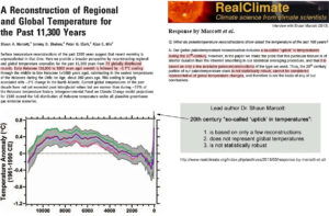
Despite this admitted lack of supporting evidence for the 20th century’s “uptick”, the Marcott et al. (2013) “hockey stick”-shaped graph has nonetheless been unskeptically cited by other authors nearly 700 times.
…
by Antony Watts, December 16, 2018 in WUWT
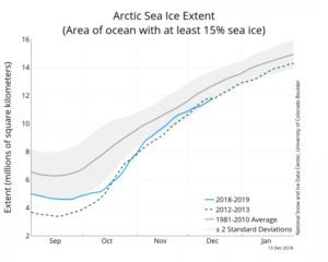
On December 14, 2008, former presidential candidate Al Gore predicted the North Polar Ice Cap would be completely ice free in five years. As reported on WUWT, Gore made the prediction to a German TV audience at the COP15 Climate Conference:
…
…
by Bob Tisdale, December 15, 2018 in WUWT
In this post, we’re going to present graphs that show the annual lowest TMIN and highest TMAX Near-Land Surface Air Temperatures (not in anomaly form) for ten (10) Countries in an effort to add some perspective to global warming. The list of countries, which follows, includes the countries with the highest populations.
And, as always with my posts, as part of the text, there are hyperlinks to the data that were used to prepare the graphs. Just click on the links if you’re looking for the data.
INITIAL NOTES
First of all, TMIN is described by Berkeley Earth as the “Mean of Daily Low Temperatures”, while TMAX is described as the “Mean of Daily High Temperatures”. Berkeley Earth provides monthly TMIN and TMAX data until partway through 2013. The start month for these individual-country datasets at Berkeley Earth depends on data availability from the individual country. Sometimes they start in the early 1800s, maybe even the mid-to-late 1700s for countries to be included in future posts (like the United Kingdom), and other times they start in the mid-to-late 1800s, so I’ve chosen 1900 as the start year for this post. The year 1900 is the end year of the IPCC’s new definition of “pre-industrial” times, so starting the graphs in 1900 is also appropriate in that respect.
…
La géologie, une science plus que passionnante … et diverse
