by T. Heller, Oct 20, 2020 in RealClimateScience
NOAA and NASA US temperature graphs have been massively altered over the past 20 years, to turn a 90 year cooling trend into a warming trend.
…
…
by T. Heller, Oct 20, 2020 in RealClimateScience
NOAA and NASA US temperature graphs have been massively altered over the past 20 years, to turn a 90 year cooling trend into a warming trend.
…
…
by American Geophysical Union, Oct 13, 2020 in WUWT
WASHINGTON–New research reveals temperatures in the deep sea fluctuate more than scientists previously thought and a warming trend is now detectable at the bottom of the ocean.
In a new study in AGU’s journal Geophysical Research Letters, researchers analyzed a decade of hourly temperature recordings from moorings anchored at four depths in the Atlantic Ocean’s Argentine Basin off the coast of Uruguay. The depths represent a range around the average ocean depth of 3,682 meters (12,080 feet), with the shallowest at 1,360 meters (4,460 feet) and the deepest at 4,757 meters (15,600 feet).
They found all sites exhibited a warming trend of 0.02 to 0.04 degrees Celsius per decade between 2009 and 2019 – a significant warming trend in the deep sea where temperature fluctuations are typically measured in thousandths of a degree. According to the study authors, this increase is consistent with warming trends in the shallow ocean associated with anthropogenic climate change, but more research is needed to understand what is driving rising temperatures in the deep ocean.
“In years past, everybody used to assume the deep ocean was quiescent. There was no motion. There were no changes,” said Chris Meinen, an oceanographer at the NOAA Atlantic Oceanographic and Meteorological Laboratory and lead author of the new study. “But each time we go look we find that the ocean is more complex than we thought.”The challenge of measuring the deep
Researchers today are monitoring the top 2,000 meters (6,560 feet) of the ocean more closely than ever before, in large part due to an international program called the Global Ocean Observing System. Devices called Argo floats that sink and rise in the upper ocean, bobbing along in ocean currents, provide a rich trove of continuous data on temperature and salinity.
…
…
by JoNova, Oct 8, 2020
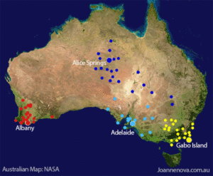
The Australian Bureau of Meteorology uses “surrounding” thermometers to adjust for odd shifts in data (caused by things like long grass, cracked screens, or new equipment, some of which is not listed in the site information). The Bureau fishes among many possible sites to find those that happen to match up or , err “correlate” during a particular five year period. Sometimes these are not the nearest site, but ones… further away. So the BOM will ignore the nearby stations, and use further ones to adjust the record.
These correlations, like quantum entanglements, are mysterious and fleeting. A station can be used once in the last hundred years to “correct” another, but for all the other years it doesn’t correlate well — which begs the question of why it had these special telediagnostic powers for a short while, but somehow lost them? Or why a thermometer 300km away might show more accurate trends than one 50km away.
One of the most extreme examples was when Cobar in NSW was used to adjust the records at Alice Springs –almost 1500km away (h/t Bill Johnston). That adjustment was 0.6°C down in 1932 (due to a site move, we’re told). This potentially matters to larger trends because Alice Springs is a long running remote station — the BOM itself says that Alice Springs alone contributes about 7-10 % of the national climate signal.[1] Curiously Cobar itself was adjusted in 1923 by a suite of ten stations including Bendigo Prison which is another 560 km farther south in a climate zone pretty close to Melbourne. In 1923 Cobar official temperatures were adjusted down by a significant 1.3 °C. No reason is given for this large shift — a shift larger than the entire (supposed) effect of CO2 in the last hundred years.
…
…
by Cap Allon, Oct 10, 2020 in Electroverse
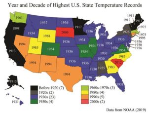
Below I’ve compiled a list of the hottest and coldest temperatures ever recorded in each U.S. state, according to NOAA data. Surely, if catastrophic global warming was actually a thing then it would show up in the temperature records. Spoiler: it doesn’t, and a discussion on why follows the list.
ALABAMA
– All-time highest temperature: 112° F (Centreville on Sept. 6, 1925)
– All-time lowest temperature: -27° F (New Market 2 on Jan. 30, 1966)
ALASKA
– All-time highest temperature: 100° F (Fort Yukon on June 27, 1915)
– All-time lowest temperature: -80° F (Prospect Creek on Jan. 23, 1971)
ARIZONA
– All-time highest temperature: 128° F (Lake Havasu City on June 29, 1994)
– All-time lowest temperature: -40° F (Hawley Lake on Jan. 7, 1971)
ARKANSAS
All-time highest temperature: 120° F (Ozark on Aug.10, 1936)
– All-time lowest temperature: -29° F (Gravette on Feb.13, 1905)
CALIFORNIA
– All-time highest temperature: 134° F (Greenland Ranch on July 10, 1913)
…
…
WISCONSIN
– All-time highest temperature: 114° F (Wisconsin Dells on July 13, 1936)
– All-time lowest temperature: -55° F (Couderay 7 W on Feb. 4, 1996)
WYOMING
– All-time highest temperature: 115° F (Basin on Aug. 8, 1983)
– All-time lowest temperature: -66° F (Riverside Ranger Station, Yellowstone National Park) on Feb. 9, 1933)
More than 210 degrees Fahrenheit separates the highest and the lowest temperatures on record in the United States, and it isn’t a coincidence that the majority of these temperatures records –for both hot and cold– occur during solar minimums.
This is because low solar activity weakens the jet stream, reverting its usual tight ZONAL flow to more of a wavy MERIDIONAL one. This violent “buckling” effect FULLY explains how regions can experience pockets of anomalous heat while others, even relatively nearby, can be dealing with blobs of record cold: basically, in the NH, Arctic cold is dragged anomalously far south and Tropical warmth is pushed unusually far north (for more see the two links below)
by P. Gosselin, Sep 26, 2020 in NoTricksZone
Today, according to government scientists, CO2 is supposed to be the dominant climate driver, overwhelming all the other power natural forces such as solar variability and oceanic cycles.
Map (right): JMA
Yet when we compare (untampered) datasets, we often find surprising parallels and underlying correlations with these now ignored natural factors, which tell us CO2 isn’t what the activists want us to believe it is and that things are really much messier than the simplistic CO2-temperature correlation.
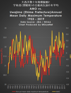
Today we look at a plot of the annual mean daily maximum temperature from Uwajima, Japan, together with the plot of the Atlantic Multidecadal Oscillation (AMO) going back almost 100 years.
Data: data.jma.go.jp/ / psl.noaa.gov/
Of course, nothing in a complex system like climate is going to show a perfect correlation, yet the above general fit is quite remarkable, which thus suggests regions are climatically interconnected in many yet to be understood ways. Such things aren’t accidental.
In summary: climate science is far from being understood, let alone settled. Anyone suggesting otherwise is likely just trying to sell you a bridge in Brooklyn – or they simply don’t know much about the subject and only parroting media sound bites.
by C. Rotter, Sep 20, 2020 in WUWT
Despite climate change being most obvious to people as unseasonably warm winter days or melting glaciers, as much as 95 percent of the extra heat trapped on Earth by greenhouse gases is held in the world’s oceans. For that reason, monitoring the temperature of ocean waters has been a priority for climate scientists, and now Caltech researchers have discovered that seismic rumblings on the seafloor can provide them with another tool for doing that.
In a new paper publishing in Science, the researchers show how they are able to make use of existing seismic monitoring equipment, as well as historic seismic data, to determine how much the temperature of the earth’s oceans has changed and continues changing, even at depths that are normally out of the reach of conventional tools.
They do this by listening for the sounds from the many earthquakes that regularly occur under the ocean, says Jörn Callies, assistant professor of environmental science and engineering at Caltech and study co-author. Callies says these earthquake sounds are powerful and travel long distances through the ocean without significantly weakening, which makes them easy to monitor.
Wenbo Wu, postdoctoral scholar in geophysics and lead author of the paper, explains that when an earthquake happens under the ocean, most of its energy travels through the earth, but a portion of that energy is transmitted into the water as sound. These sound waves propagate outward from the quake’s epicenter just like seismic waves that travel through the ground, but the sound waves move at a much slower speed. As a result, ground waves will arrive at a seismic monitoring station first, followed by the sound waves, which will appear as a secondary signal of the same event. The effect is roughly similar to how you can often see the flash from lightning seconds before you hear its thunder.
…
IMAGE: AN ARTIST’S RENDERING OF UNDERSEA EARTHQUAKE WAVES. view more CREDIT: CALTECH
by Cap Allon, Sep 20, 2020 in Electroverse
A nation-spanning mass of Arctic air has parked itself over the eastern half of North America of late, rewriting the record-books in many states, districts, and provinces, including in New York, Washington, and Ontario.
The city of Syracuse, NY tied an all-time record low of 34F (1.1C) on Saturday morning, just after 6AM, a feat originally achieved back in 1943–duringsolar minimum of cycle 17.
Buffalo also tied a low temperature record — the 38F (3.3C) registered on Saturday matched the record low for the day set back in 1995–solar minimum of cycle 22.
…
…
by P. Voosen, May 22, 2019 in AAAS/Science
When it opens next month, the revamped fossil hall of the Smithsonian Institution’s National Museum of Natural History in Washington, D.C., will be more than a vault of dinosaur bones. It will show how Earth’s climate has shifted over the eons, driving radical changes in life, and how, in the modern age, one form of life—humans—is, in turn, transforming the climate.
To tell that story, Scott Wing and Brian Huber, a paleobotanist and paleontologist, respectively, at the museum, wanted to chart swings in Earth’s average surface temperature over the past 500 million years or so. The two researchers also thought a temperature curve could counter climate contrarians’ claim that global warming is no concern because Earth was much hotter millions of years ago. Wing and Huber wanted to show the reality of ancient temperature extremes—and how rapid shifts between them have led to mass extinctions. Abrupt climate changes, Wing says, “have catastrophic side effects that are really hard to adapt to.”
But actually making the chart was unexpectedly challenging—and triggered a major effortto reconstruct the record. Although far from complete, the research is already showing that some ancient climates were even more extreme than was thought.
…
by Li X. et al., September 3, 2020 in Front.Earth.Sci.
Quantitative palaeotemperature reconstruction is crucial for understanding the evolution of Earth’s climate and reducing uncertainty in future climate predictions. Clarifying the temperature change over the Tibetan Plateau (TP) during the Common Era is critical because it plays a vital role in the prediction of cryosphere changes in such regions under a future warming climate. In this paper, we report a comprehensive synthesis of currently available quantitative temperature records to refine the temperature history of the TP during the Common Era. To date, Common Era quantitative temperature reconstructions are sparse and mainly concentrated in the northeastern TP. Considering seasonal bias of the available quantitative temperature reconstructions, three different composite temperature records for TP were derived, namely the “Standardization” composite, the “Mean annual air temperature anomaly” composite, and the “Mean summer temperature anomaly” composite individually. All the integrated temperature series reveal the Medieval Climate Anomaly and the Little Ice Age, but the start and end timings of these multi-centennial-scale periods and their temperature amplitudes differ. There is strong seasonality in temperature variations on this high plateau, and the 20th century warming was characterized by rapid winter temperature increases, while summer temperatures displayed weak variations. Spatial analysis suggests a relatively consistent signal marking a warm TP during 600–1400 CE and a cold plateau during 1400–1900 CE. Large-scale trends in temperature history for the TP resemble those for China and the Northern Hemisphere. Many factors, such as seasonality of temperature proxies, might lead to uncertainty in the reconstructed series. The results highlight that it is of crucial importance to develop more seasonal temperature reconstructions to improve the reliability of quantitative paleoclimatic reconstructions based on geological records across the TP.
…
by P. Homewood, September 3, 2020 in NotaLotofPeopleKnowThat
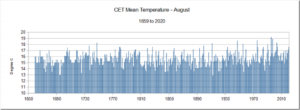
Despite a few warm days in early August, the month as a whole was not unusually hot, a full 1.6C cooler than August 1995, according to the Central England Temperature series. Other hotter Augusts include 1911, 1947 and 1975.
It was even colder than 1736 and 1899.
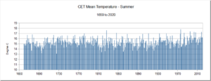
Summer as whole was even less remarkable, ranking 51st, tied with years such as 1701, 1731 and 1780.
The summers of 1976 and 1826 remain the two hottest on record, well above anything seen since.
https://www.metoffice.gov.uk/hadobs/hadcet/data/download.html
by A. Préat, 4 septembre 2020 in ScienceClimatEnergie
SCE a plusieurs fois rapporté que la période actuelle de réchauffement n’est pas exceptionnelle, qu’elle fait partie de cycles décennaux à pluriséculaires de refroidissement et réchauffement qui ont lieu dans des fourchettes de température fort modestes, de l’ordre de 0,15°C par 10 ans. SCE a aussi montré que le CO2 tant incriminé dans ces changements, et surtout l’actuel, n’avait pas de raison d’être, ce gaz venant après l’augmentation de température. Le ‘bouton CO2 ‘ à même d’expliquer ou de ‘justifier’ le battage médiatique quasi-quotidien est donc à ‘la remorque’ de la température et, l’hypothèse de l’effet de serre reste avant tout une hypothèse (exemple ici).
Enfin SCE a souvent rappelé (ici et ici) que la concentration atmosphérique de CO2 n’a jamais été aussi basse dans l’histoire géologique de notre planète, qui a connu la plupart du temps des concentrations jusqu’à 25 fois supérieures au cours du Phanérozoïque (à partir du Cambrien, il y a 541 millions d’années), et même encore bien plus élevées au cours du Précambrien. Nous partirons de ce dernier point, puisque les médias et scientifiques sont toujours à nous rappeler, de manière assez dramatique, que la teneur actuelle est plus élevée que celle des ‘derniers’ millions d’années (articles médiatiques presque quotidiens, exemple ici parmi une pléthore d’articles). Est-ce bien le cas? et si oui –et toujours pour ces ‘derniers’ millions d’années– quid de la température ?
…
by Tony Brown, August 28, 2020 in WUWT
“If Europeans truly mobilize around the delivery of the 2050 goal, every business decision, lifestyle choice, political swing, every hallmark of European culture — from annual ski trips, to Champions League Football matches, to French cheese — will need to be tested against its contribution to climate change.” European Commission ‘Green Deal’ March 2020
This is an article with a simple proposition. Science tells us that rapidly rising Co2 in turn causes rising temperatures, which has become a very serious problem for humanity.
The three questions I ask, in the expectation that the answer can be provided from main stream published science is;
“Assuming we reach zero carbon emissions by 2030-Extinction Rebellion (XR) requirement, or 2050 -the aim of most governments under the Paris Accord- 1) how long would it take for Co2 levels to naturally fall below the’ safe upper limits’ of 350ppm espoused by such as James Hansen; 2) for it to fall further to 280ppm -the previous pre industrial level -AND 3) when will temperatures start to fall in turn, to achieve pre industrial levels, said to be 1 to 2 degrees Centigrade below present, according to the IPCC.”
There are all sorts of caveats of course, with methane, water vapour, clouds, feedbacks, ocean response, natural variations etc but having scoured various ‘official’ web sites I can find no definitive estimate. An examination of the Extinction Rebellion web site demonstrates they are anarchists, rather than a serious green organisation. A couple of more reasoned attempts to track the consequences of zero carbon emissions are given in Note 3below the graphic-Figure 1 together with a variety of other useful background information.
Whether the reader personally believes excess Co2 to be a problem is not a matter this article is concerned with. Let’s take science at face value –our respective Governments have overwhelmingly agreed that humanity has added some 140ppm of Co2 to the pre industrial 280ppm and that, as a result, temperatures have risen substantially and are at a dangerous level and causing extremes of weather.
…
by K. Richard, August 13, 2020 in NoTricksZone
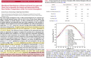
In the early 1900s, the globally-averaged distribution of calculated surface temperature estimates ranged between 14 and 15°C. For 1991-2018, HadCRUT, Berkeley, and NASA GISS also estimate today’s global temperature is about 14.5°C.
Scientists estimating Earth’s surface temperature has been an ongoing pursuit since the early 19th century.
A new study (Kramm et al., 2020) suggests the generally agreed-upon global temperature from 1877 to 1913 from dozens of calculated results was about 14.4°C.
Problematically, HadCRUT, Berkley, and NASA GISS also indicate the 1991-2018 had a global surface temperature of about 14.5°C.
This would suggest there has been “no change in the globally averaged near-surface temperature over the past 100 years”.
…
by Jean Van Vliet, 14 août 2020, in ScienceClimatEnergie
Introduction
Suite à la prise de conscience à la fin du 20ème siècle d’une hausse inhabituelle des températures terrestres, des chercheurs américains ont développé une théorie du réchauffement global basé sur l’effet de serre dû au CO2 [1], en soulignant la responsabilité possible de l’homme dans le réchauffement observé: la poursuite des émissions de CO2 conduirait à une éventuelle catastrophe planétaire. Ces chercheurs ont présenté leur théorie au Congrès américain [2] et aux médias. Le monde politique international a réagi rapidement à cet alarmisme [3] en permettant à Assemblée Générale de l’ONU de décembre 1988 d’approuver la mise en place du GIEC [4].
Depuis plus de trente ans et malgré le manque persistant de preuve formelle, la peur du réchauffement global anthropique causé par le CO2 est propagée sans relâche par l’ONU et ses satellites PNUE, GIEC et OMM relayés par les ONG environnementales et les médias, suivis plus récemment par une fraction du monde académique occidental. Une puissante industrie des énergies renouvelables a été créée via des subsides et des certificats verts quitte à doubler ou tripler le prix de l’électricité. Cette industrie est prête à exploiter les nouvelles aubaines financières annoncées par l’Accord de Paris et le Green Deal de l’UE. Dans un tel contexte, le but avoué est que l’humanité change radicalement son comportement, fût-ce au prix d’une dictature environnementale: l’alarmisme médiatique est maximal, et même les enfants sont embrigadés dans le débat pour soi-disant “sauver la planète”.
Cette tentative rampante de prise du pouvoir a cependant buté contre un obstacle imprévu depuis le début de 2020, à savoir la pandémie du Coronavirus: le lockdown sanitaire a montré que la société pouvait changer son comportement de manière spectaculaire, mais au prix de conséquences économiques et sociales majeures. A la première attaque de la pandémie succède aujourd’hui une deuxième vague et il semble impossible de prévoir quand nous serons délivrés du virus.
Les ressources des Etats n’étant pas infinies, la question brûlante se pose aujourd’hui de l’affectation des moyens humains et financiers disponibles en fonction nos priorités: devons-nous avoir davantage peur d’une pandémie et de ses conséquences sociales et économiques incontestables ou devons-nous supputer une explosion incontrôlable de la crise climatique amorcée au 20ème siècle et modifiant de manière drastique et irréversible notre environnement ?
Le but du présent article est d’apporter des éléments de réponse à cette question en examinant, dans une perspective scientifique large et basée sur les observations plutôt que sur les modèles, la “crise climatique” démarrée durant la seconde moitié du 20ème siècle en essayant de tirer des conclusions applicables au 21èmesiècle.
1/ La crise ‘climatique du 20ème siècle
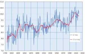
Il existe de nombreuses sources fournissant des historiques de température, mais il existe peu de séries chronologiques comparables à celle de l’Observatoire d’Armagh en Irlande du Nord pour la période 1796-2002 [5]; cette série est disponible sur le site web du Met Office britannique pour la période allant de 2002 à aujourd’hui [6].
Figure 1 : Evolution des températures moyennes annuelles de 1796 à 2019 (courbe bleue) ainsi qu’une courbe lissée correspondant à la moyenne glissante rétrospective sur une période de 11 ans (courbe rouge).
…
by K. Richard, August 10, 2020 in NoTricksZone
A new temperature reconstruction indicates today’s sea surface temperatures are colder than all but a few millennia out of the last 156,000 years.
A Southern Ocean site analyzed in a new study (Ghadi et al., 2020) has averaged 1-2°C during glacials and 4°C during interglacials. Today, with a 410 ppm CO2 concentration, this location has again plummeted to glacial/ice age levels (2°C).
The site was 2°C warmer than now when CO2 concentrations were 180 ppm about 20,000 years ago, or during the peak of the last ice age. During the Early Holocene (10,000 to 8,000 years ago), summer sea surface temperatures were also 2°C warmer than today.
There is no indication that CO2 concentration changes are in any way correlated with temperature changes throughout this entire 156,000-year epoch.
by Roy Spencer, August 4, 2020 in WUWT
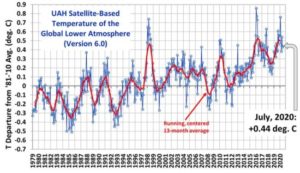
The Version 6.0 global average lower tropospheric temperature (LT) anomaly for July, 2020 was +0.44 deg. C, essentially unchanged from the June, 2020 value of +0.43 deg. C
The linear warming trend since January, 1979 remains at +0.14 C/decade (+0.12 C/decade over the global-averaged oceans, and +0.18 C/decade over global-averaged land).
by P. Homewood, July 31, 2020 in NotaLotofPeopleKnowThat
It’s marvellous what a bit of tarmac will do!
by P. Gosselin, July 29, 2020 in NoTricksZone
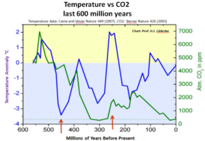
German climatologist Professor Dr. Horst-Joachim Lüdecke recently took data from two independent studies and superimposed them. The result shows the long claimed atmospheric CO2-global temperature correlation doesn’t exist.
The first data set was global temperature anomaly going back 600 million years, taken from the results of a paper by Came and Veizer, appearing in Nature (2007) and plotted below (blue):
The second data set was of atmospheric CO2 going back 600 million years, taken from a published study by Berner (2003), also appearing in Nature. These data are plotted in the above chart in blue.
No correlation
The plots were combined in the above chart to see how well they correlated, if at all. The result: no correlation.
For example, as the chart shows, 150 million years ago the atmospheric CO2 concentration was over 2000 ppm, which is 5 times today’s atmospheric concentration of 410 ppm – a level that some climate scientists say is already “dangerously high”. Yet, the global temperature 150 million years ago was more than 2°C below the long-term mean.
450 million years ago the relationship was even far more on its head: atmospheric CO2 concentrations were more than 10 times today’s level, yet the global temperature was a frigid 3.5°C below the mean!
“There’s no correlation between earth temperature and CO2,” Prof. Lüdecke concludes, observing recorded data.
by W. Eschenbach, July 24, 2020 in WUWT
OK, no need to torture me, I confess it—I’m a data junkie.
And when I see a new (to me at least) high-resolution dataset, my knees get weak. Case in point? The temperature dataset of the Colle Gnifetti ice core. It has a two-year resolution thanks to some new techniques. Better, it stretches clear back to the year 800. And best, it extends up to near the present, 2006. This lets us compare it to modern datasets. The analysis of the ice core dataset is described in Temperature and mineral dust variability recorded in two low-accumulation Alpine ice cores over the last millennium by Pascal Bohleber et al.
Let me start with where Colle Gnifetti is located. Unusual among ice core records, it’s from Europe, specifically in the Alps on the border of Switzerland and Italy.
Figure 1. Location of the ice cores in the study.
This is good because some of the longest thermometer-based temperature records are in Europe.
One interesting thing about the site is that usually, ice core drilling occurs at the literal ends of the earth, in Antarctica and Greenland and the like. But this site is not far from the foot of the Margherita Hut, which is at over 4500 metres elevation.
…
…
Further Reading: It’s instructive to compare the listed temperatures with the data in A Chronological Listing of Early Weather Events.
by Eric Worall, July 24, 2020 in WUWT
A new climate study has dismissed utterly implausible high end climate models. But the new study also seeks to raise the low end of the range of estimated climate sensitivity into the discomfort zone.
…
The treatment of cloud feedback is interesting. The study acknowledges large cloud feedback uncertainties, mentions the Lindzen et al. (2001) “iris effect”, and admits GCMs cannot be trusted to reproduce observed cloud response, yet still appears to attempt to derive a cloud feedback factor based on satellite observations, and mix this observational cloud factor with model predictions.
The treatment of clouds may turn out to be one of the most controversial assumptions in the study – as Pat Frank has pointed out on a number of occasions, the magnitude of model cloud response error is significantly greater than the CO2 driven warming which models attempt to project, which calls into question whether climate models have any predictive skill whatsoever.
To the author’s credit they have described their method in great detail, so I’m looking forward to detailed responses to this study.
by Margaritelli G. et al., June20, 2020 in Nature OPEN ACESS
Abstract
Reconstruction of last millennia Sea Surface Temperature (SST) evolution is challenging due to the difficulty retrieving good resolution marine records and to the several uncertainties in the available proxy tools. In this regard, the Roman Period (1 CE to 500 CE) was particularly relevant in the socio-cultural development of the Mediterranean region while its climatic characteristics remain uncertain. Here we present a new SST reconstruction from the Sicily Channel based in Mg/Ca ratios measured on the planktonic foraminifer Globigerinoides ruber. This new record is framed in the context of other previously published Mediterranean SST records from the Alboran Sea, Minorca Basin and Aegean Sea and also compared to a north Hemisphere temperature reconstruction. The most solid image that emerges of this trans-Mediterranean comparison is the persistent regional occurrence of a distinct warm phase during the Roman Period. This record comparison consistently shows the Roman as the warmest period of the last 2 kyr, about 2 °C warmer than average values for the late centuries for the Sicily and Western Mediterranean regions. After the Roman Period a general cooling trend developed in the region with several minor oscillations. We hypothesis the potential link between this Roman Climatic Optimum and the expansion and subsequent decline of the Roman Empire.
…
See also Roman Warm Period Was 3.6°F Warmer Than Today, New Study Shows
by Maher et al., May 12, 2020 in GWPF
A new study demonstrates how a prolonged warming pause or even global cooling may happen in coming years despite increasing levels of atmospheric greenhouse gases — caused by natural climatic variability.
Natural climatic variability has always been a topic that contains a lot of unknowns, but it has been rarely explicitly stated just how little we know about it. Such variability has been habitually underplayed as it was “obvious” that the major driver of global temperature was the accumulation of greenhouse gasses in the atmosphere, with natural variability a weaker effect.
But the global temperature data of this century demonstrate that natural variability has dominated in the form of El Ninos. ‘Doesn’t matter’, came the reply, ‘just wait and the signal of greenhouse warming will emerge out of the noise of natural climatic variability.’ How long will we have to wait for that signal? Quite a long time, according to some researchers as more papers acknowledge that natural climatic variability has a major, if not a dominant influence on global temperature trends.
With the usual proviso concerning climatic predictions there seems to be a growing number of research papers suggesting that the global average temperature of at least the next five years will remain largely unchanged. The reason: natural climatic variability.
Only last week the UK Met Office produced figures suggesting that there is only a 1 in 34 chance that the 1.5°C threshold will be exceeded for the next five year period. Now a new paper by climate modellers extends such predictions, suggesting that because of natural variability the average global temperature up to 2049 could remain relatively unchanged – even with the largest increase in greenhouse gas emissions.
Using two types of computer models in a first of its kind study, Nicola Maher of the Max Planck Institute for Meteorology, Hamburg, Germany, and colleagues writing in Environmental Research Letters looked at the 2019-2034 period concluding that,
…
by de la Vega et al., 2020 in Nature OPEN ACCESS
Abstract
The Piacenzian stage of the Pliocene (2.6 to 3.6 Ma) is the most recent past interval of sustained global warmth with mean global temperatures markedly higher (by ~2–3 °C) than today. Quantifying CO2 levels during the mid-Piacenzian Warm Period (mPWP) provides a means, therefore, to deepen our understanding of Earth System behaviour in a warm climate state. Here we present a new high-resolution record of atmospheric CO2 using the δ11B-pH proxy from 3.35 to 3.15 million years ago (Ma) at a temporal resolution of 1 sample per 3–6 thousand years (kyrs). Our study interval covers both the coolest marine isotope stage of the mPWP, M2 (~3.3 Ma) and the transition into its warmest phase including interglacial KM5c (centered on ~3.205 Ma) which has a similar orbital configuration to present. We find that CO2 ranged from 389+38−8389−8+38ppm to 331+13−11,331−11+13,ppm, with CO2 during the KM5c interglacial being 371+32−29371−29+32ppm (at 95% confidence). Our findings corroborate the idea that changes in atmospheric CO2 levels played a distinct role in climate variability during the mPWP. They also facilitate ongoing data-model comparisons and suggest that, at present rates of human emissions, there will be more CO2 in Earth’s atmosphere by 2025 than at any time in at least the last 3.3 million years.
…
by David Middleton, July 10, 2020 in WUWT
If the Earth was 3-4 °C warmer with a much higher sea level 3.3 million years ago, with about the same CO2 concentration, what does this say about the potency of it as a climate control knob?
The last time CO2 levels were this low, Earth was in the deepest ice age of the Phanerozoic Eon, the Pennsylvanian (Late Carboniferous)-Early Permian.
…
…
Figure 5. Phanerozoic temperatures (pH-corrected) and carbon dioxide. The Miocene is the first epoch of the Neogene Period (Berner et al, 2001 and Royer et al., 2004) (older is toward the left).
…
by Cap Allon, July 12, 2020 in Electroverse
Historical documentation destroys the man-made global warming theory.
While those in control of the temperature graphs are all too happy to fraudulently increase the running average, what they haven’t (yet) had the balls to do is rewrite the history books.
As Tony Heller uncovers on his site realclimatescience, NASA routinely cools the past and heats the present, so to give the illusion of a greater warming trend — and comparisons between old and new graphs instantly reveals this fraud:
In 1999, NASA’s James Hansen reported 0.5C US cooling since the 1930’s:
By 2016, the same NASA graph has eliminated that 1930-1999 cooling:
…