Archives par mot-clé : Temperature

Volcano In Scotland May Have Caused Prehistoric Global Warming prehistoric volcanic eruption

by S. Beech, January 25, 2019 in ClimateChangeDispatch


A massive volcanic eruption in Scotland on the same scale as the infamous Krakatoa blast may have contributed to prehistoric global warming.

Scientists say that global temperatures spiked around 56 million years ago.

And a new study suggests that a major explosive eruption from the Red Hills on the Isle of Skye may have been a contributing factor to the massive climate disturbance.

Large explosive volcanic eruptions can have lasting effects on climate and have been held responsible for severe climate effects in Earth’s history.

One such event occurred around 56 million years ago when global temperatures increased by up to 8 degrees Celcius (46 degrees Fahrenheit.)

The event has been named the Paleocene-Eocene Thermal Maximum (PETM).


Encore des observations n’allant pas dans le sens de la théorie!

by Jean, N. 25 janvier 2019 in ScienceClimatEnergie


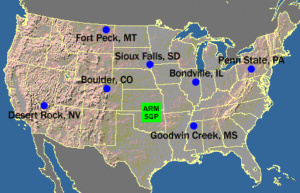
En octobre 2017 un article signé Carl Brehmer[1] et traitant de la théorie de l’effet de serre radiatif était publié sur le site web de l’association anglaise Principia Scientific International[2]. Dans cet article, l’auteur utilisait des données fournies par les stations météorologiques SURFRAD et démontrait que la théorie de l’effet de serre ne pouvait pas expliquer les observations. Si l’auteur a raison, il s’agit encore d’un sérieux problème pour la théorie. Dans le présent article nous allons suivre les pas de Carl Brehmer mais nous allons faire nos propres calculs en employant une autre méthodologie. Arriverons-nous aux mêmes conclusions?

.

Figure 1. Les stations SURFRAD de la NOAA aux Etats-Unis

Early 20th century global warming

by Judith Curry, January 25, 2019 in ClimateEtc.


A careful look at the early 20th century global warming, which is almost as large as the warming since 1950.  Until we can explain the early 20th century warming, I have little confidence IPCC and NCA4 attribution statements regarding the cause of the recent warming.

This is an issue that has long interested me.  Peter Webster wrote a previous post Mid 20th Century Global(?) Warming, which focused on the warm bump that culminated in the 1940’s.  My interest in this period was reignited while working on my report Sea Level and Climate Change.  Then, the recent paper by Zanna et al. discussed in Ocean Heat Content  Surprises further made the wheels turn.

In response to the Ocean Heat Content thread, David Appell posted a link to this paper on twitter:

The early 20th century warming: Anomalies, causes and consequences

New Paper: Modern Warming Was Driven By ‘Primarily Natural’ Factors. Global Cooling Has Now Begun.

by K. Richard, January 21, 2019 in NoTricksZone


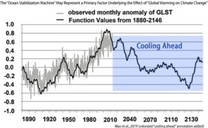
Four climate scientists assert (1) the last ~130 years of temperature changes fit “perfectly” into statistical indices of natural variation, and (2) a long-term deep cooling of the Earth system has recently commenced.

An analysis published in the journal Atmospheric and Climate Sciences by 4 climate scientists reveals the 1880-2013 temperature changes fit “perfectly” (0.9 correlation) into a calculation utilizing 15,295 periodic functions of natural variation.

The authors claim this affirms that the non-anthropogenic “major climate factors” (i.e., solar-cloud and ENSO forcing) can still be considered the “main reason” driving modern warming (Lakshmi and Tiari, 2015; Hassan et al., 2016; McLean, 2014Yeo and Kim, 2015;  Wielicki et al., 2002; Douglass and Knox, 2014; Sejrup et al., 2010Large and Yeager, 2012Irvine, 2015; Cess and Udelhofen, 2003; Clark, 2010Ogurtsov et al., 2017; Fleming, 2018Zherebtsov et al., 2019).


Image Source: Mao et al., 2019

See also here (numerous interesting comments)  here


Does The Climate-Science Industry Purposely Ignore A Simple Aspect of Strong El Niño Events That Causes Long-Term Global Warming?

by Bob Tisdale, January 20, 2019 in WUWT


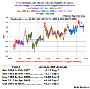
It was a little more than 10 years ago that I published my first blog posts on the obvious upward steps in the sea surface temperatures of a large portion of the global oceans…upward steps that are caused by El Niño events…upward steps that lead to sunlight-fueled, naturally occurring global warming.

There is a very simple explanation for those El Niño-caused upward shifts that also make themselves known in the sea surface temperature data for much larger portion of the global oceans than I first presented a decade ago…the upward steps that are blatantly obvious in the satellite-era (starts November 1981) of sea surface temperature data for the South Atlantic, Indian and West Pacific Oceans, as shown in Figure 1, which together cover about 52% of the surfaces of the global oceans.


Study Claiming Insect Decline Due To Global Warming Is Based On Faulty Temperature Data.

by P. Homewood, January 20, 2019 in NotaLotofPeople KnowThat


Clearly the whole study is worthless, and the paper should be withdrawn.

There are some alarming facts about all of this:

1) Why did the researchers not suspect that the temperature data looked hopelessly wrong at the outset?

2) Why did peer review not do the basic checks that I did?

3) The study carries out some mindbendingly complex statistical analysis, linking arthropod decline to rising temperatures. But how can this analysis have been robust, when the temperature data was hopelessly wrong?

The conclusion is that the faulty temperature data matched the researchers’ expectations of climate warming, and consequently they never bothered to crosscheck. It would after all have been extremely simple to have asked the people who maintain the data.

Whether or not arthropods are in decline I have no idea. But by blaming non existent climate warming, there is a very real danger that the true cause is being missed. Indeed, looking at those graphs, it may well be climate cooling that is responsible.

I plan to contact PNAS, who published the paper, to request that it be withdrawn.

NEW PAPER DOCUMENTS MAIN REASONS FOR INTERNATIONAL CONTROVERSY ABOUT THE IPCC’S SR1.5 REPORT

by  Press Release, GWPF, December 20, 2018


London, 20 December: One of Europe’s most eminent climate scientists has documented the main scientific reasons why the recent UN climate summit failed to welcome the IPCC’s report on global warming of 1.5°C.

In a paper published today by the Global Warming Policy Foundation Professor Ray Bates of University College Dublin explains the main reasons for the significant controversy about the latest IPCC report within the international community.

The IPCC’s Special Report on a Global Warming of 1.5°C (SR1.5) was released by the Intergovernmental Panel on Climate Change (IPCC) in advance of the recent COP24 meeting in Katowice, Poland, but was not adopted by the meeting due to objections by a number of governments.

Professor Bates examines some key aspects of the SR1.5 report. He assesses if the IPCC report exhibits a level of scientific rigour commensurate with the scale of its extremely costly and highly disruptive recommendation that carbon emissions be reduced to zero by mid-century.

The paper concludes that such a level of scientific rigour is not present in the report. Specifically, SR1.5 is deficient in scientific rigour in the following respects:


Media Reports of +40% Adjustment in Ocean Warming Were Greatly Exaggerated

by Roy W. Spencer, Ph. D., January 16, 2019


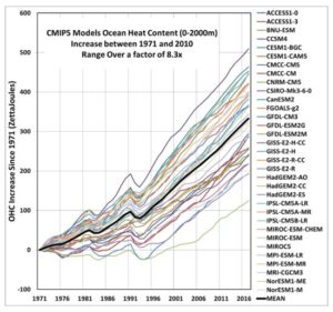
Summary:The recently reported upward adjustment in the 1971-2010 Ocean Heat Content (OHC) increase compared to the last official estimate from the IPCC is actually 11%, not 40%. The 40% increase turns out to be relative to the average of various OHC estimates the IPCC addressed in their 2013 report, most of which were rejected. Curiously, the new estimate is almost identical to the average of 33 CMIP climate models, yet the models themselves range over a factor of 8 in their rates of ocean warming. Also curious is the warmth-enhancing nature of temperature adjustments over the years from surface thermometers, radiosondes, satellites, and now ocean heat content, with virtually all data adjustments leading to more warming rather than less.

See also here

Regional Models: 3-10°C Warming In The Next 80 Years. Observations: No Warming In The Last 40-100 Years.

by K. Richard, January 14, 2019 in NoTricksZone


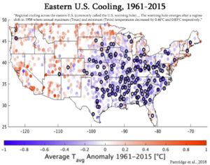
There are large regions of the globe where observations indicate there has been no warming (even cooling) during the last decades to century. Climate models rooted in the assumption that fossil fuel emissions drive dangerous warming dismiss these modeling failures and project temperature increases of 3° – 10°C by 2100 for these same regions anyway.

Image Source: Partridge et al., 2018

Pas de réchauffement pour les zones éloignées des océans

by Dr. Jean N., 16 janvier 2019 in ScienceClimatEnergie


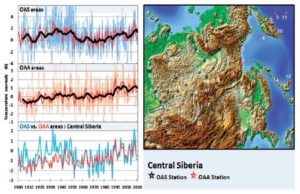
La théorie radiative de l’effet de serre prédit que la température de la basse atmosphère augmente lorsque le taux de CO2 croît. Si l’on prend par exemple une très vaste région, comme la Chine centrale ou le Midwest américain, qui couvrent tous deux des centaines de milliers de km2, on devrait donc observer un accroissement des températures moyennes de la basse atmosphère en fonction du temps. Effectivement, dans ces régions, et comme pour tout l’hémisphère Nord, le taux de CO2 n’a fait qu’augmenter depuis le début des mesures par spectrométrie infra-rouge en 1959. Cependant, une étude récente vient de montrer que la température moyenne n’aurait pas augmenté dans ces vastes régions, et ce malgré l’augmentation du taux de CO2 atmosphérique. L’étude en question a été publiée dans Energy & Environment en 2018 par deux chercheurs danois de la Danish Technical University, Frank Lansner et Jens Pedersen. Il faut rester prudent, mais si cette étude est confirmée, il s’agirait d’un sérieux problème pour la théorie radiative de l’effet de serre.


Figure 1. Anomalie de température pour la Sibérie centrale entre 1900 et 2010 (voir article)

The ‘Little Ice Age’ hundreds of years ago is STILL cooling the bottom of Pacific, researchers find

by Charles the moderator, January 9, 2019 in WUWT


  • The Little Ice Age brought colder-than-average temps around the 17th century

  • Researchers say temperatures in deep Pacific lag behind those at the surface

  • As a result, parts of the deep Pacific is now cooling from long ago Little Ice Age

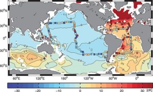
A Harvard study has found that parts of the deep Pacific may be getting cooler as the result of a climate phenomenon that occurred hundreds of years ago. The models suggest In the deep temperatures are dropping at a depth of around 2 kilometers (1.2 miles)

Greenland Is Way Cool

by Willis Eschenbach, January 8, 2019


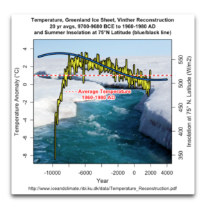
As a result of a tweet by Steve McIntyre, I was made aware of an interesting dataset. This is a look by Vinther et al. at the last ~12,000 years of temperatures on the Greenland ice cap. The dataset is available here.

Figure 1 shows the full length of the data, along with the change in summer insolation at 75°N, the general location of the ice cores used to create the temperature dataset.

Figure 1. Temperature anomalies of the Greenland ice sheet (left scale, yellow/black line), and the summer insolation in watts per square metre at 75°N (right scale, blue/black line). The red horizontal dashed line shows the average ice sheet temperature 1960-1980.

I’ll only say a few things about each of the graphs in this post. Regarding Figure 1, the insolation swing shown above is about fifty watts per square metre. Over the period in question, the temperature dropped about two and a half degrees from the peak in about 5800 BCE. That would mean the change is on the order of 0.05°C for each watt per square metre change in insolation …

Forget El Nino, StormFest is about to Hit the West Coast

by Charles the moderator, January 6, 2019 in WUWT


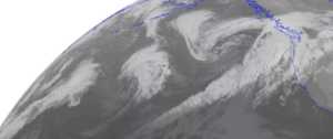
Things often calm down after January 1 during El Nino years….but not this year…with the U.S. West Coast from central California to Washington State about to be pummeled by a series of storms.   Rain, snow, wind?  Plenty for everyone.

A view of the latest infrared satellite imagery shows an amazing line-up of one storm after another stretching way into the Pacific.  A traffic jam of storms.


Let’s examine our stormy future, using a series of sea level pressure forecasts from the UW WRF weather forecast models (solid lines are sea level pressure, shading in lower atmosphere temperature).


UK Climate Trends – 2018

by P. Homewood, January 4, 2019 in NotaLotofPeopleKnowThat


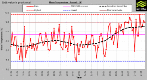
The Met Office has now published its data for 2018. We can expect plenty of claims about last year being the 7th warmest in the UK since records began (in 1910). Or that all of the ten warmest years have occurred this century.

The real significance of these latest numbers, however, is that they continue to confirm that UK temperatures stopped rising more than a decade ago, after a step up during the 1990s.


https://www.metoffice.gov.uk/climate/uk/summaries/actualmonthly…


Recently Dropping Global Temperatures Demonstrate IPCC Claims are Impossible

by Tim Ball, December 29, 2018 in WUWT


When you put the claims of the Intergovernmental Panel on Climate Change (IPCC) in perspective, you get a very different picture that defies logic. I decided to do this because of their recent hysterical claims in Special Report 15 (SR-15) designed to frighten and bully the world into completely unnecessary and enormously expensive environmental and energy policies. Charles Steele summarized their claims and proposed policies in his article, “Climate Doom Ahead? Think Twice,”

92 New Papers (2018) Link Solar Forcing To Climate . . . Some Predict Solar-Induced Global Cooling By 2030!

by K. Richard, December 27, 2018 in NoTricksZone


When it comes to the Sun’s influence on climate, one conclusion is certain: there is no widespread scientific agreement as to how and to what extent solar activity and its related parameters (i.e., galactic cosmic rays, geomagnetic activity, solar wind flux) impact changes in the Earth’s temperature and precipitation.

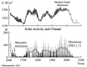
The disagreement is so chasmic and the mechanisms are so poorly understood that scientists’ estimates of the influence of direct solar irradiance forcing between the 17th century and today can range between a negligible +0.1 W m-2 to a very robust +6 W m-2 (Egorova et al., 2018Mazzarella and Scafetta, 2018).

There is no consensus on the amplitude of the historical solar forcing. The estimated magnitude of the total solar irradiance difference between Maunder minimum and present time ranges from 0.1 to 6 W/m2 making uncertain the simulation of the past and future climate.”  (Egorova et al., 2018)


Une autre hypothèse pour expliquer la hausse des températures

by Prof. dr. P. Berth, 26 décembre 2018 in ScienceClimatEnergie


Comme tout le monde le sait, pour expliquer la légère hausse des températures de l’atmosphère observée au 20e siècle, le GIEC invoque un seul responsable : le taux de CO2 atmosphérique, et donc l’activité humaine. Les médias, bien entendu, suivent le GIEC et le monde entier diabolise le CO2. Cependant, n’existe-t-il pas d’autres hypothèses? Les lecteurs attentifs de ce site (SCE) savent que l’hypothèse du GIEC est mise à mal par toute une série d’observations (voir par exemple ici, ici et ici) et que certains problèmes théoriques existent dans la théorie même de l’effet de serre (voir ici et ici). Quelle est donc l’explication pour le réchauffement si ce n’est pas le taux de CO2? Bien qu’il y ait probablement des causes multiples, nous allons voir qu’une équipe de chercheurs du CERN propose une hypothèse alternative en se basant sur les résultats du projet CLOUD. Une vidéo récente (octobre 2018) présentant les résultats de cette expérience sera d’ailleurs présentée en fin d’article. Avant de regarder cette vidéo, faisons d’abord le point.


Figure 1. Formation de nuages en présence de noyaux de condensation (CCN : Cloud Condensation Nuclei).


“…it is the change in temperature compared to what we’ve been used to that matters.” – Part 3

by Bob Tisdale, December 24, 2018 in WUWT


In this post, we’re going to present monthly mean TMIN and TMAX Near-Land Surface Air Temperatures (not in anomaly form) for a group of ten (10) Countries in an effort to add a little perspective to global warming. The list of countries, which follows, will, hopefully, reflect the home countries of recent visitors to WattsUpWithThat. The list is based on the number of visitors per country to my blog ClimateObservations during my peak year of 2014.

And, as always with my posts, as part of the text, there are hyperlinks to the data that were used to prepare the graphs. Just click on the links if you’re looking for the data.

This series of posts are logged under the Category of “Global Warming in Perspective” at WattsUpWithThat, with the link to that category here. The category link at my blog ClimateObservations is here.

The Discovery Of Tree Trunks Under Glaciers 600 Meters Atop Today’s Treeline Date To The Last ICE AGE

by K. Richard, December 24, 2018 in NoTricksZone


Between 60 and 40 thousand years ago, during the middle of the last glacial, atmospheric CO2 levels hovered around 200 ppm – half of today’s concentration.

Tree remains dated to this period have been discovered 600-700 meters atop the modern treeline in the Russian Altai mountains.  This suggests surface air temperatures were between 2°C and 3°C warmer than today during this glacial period.

Tree trunks dating to the Early Holocene (between 10.6 and 6.2 thousand years ago) have been found about 350 meters higher than the modern treeline edge.  This suggests summer temperatures were between 2°C and 2.5°C warmer than today during the Early Holocene, when CO2 concentrations ranged between about 250 and 270 ppm.

None of this paleoclimate treeline or temperature evidence correlates with a CO2-driven climate.


The Climate Sciences Use Of The Urban Heat Island Effect Is Pathetic And Misleading

by Geoffrey Sherrington, December 20, 2018 in WUWT


ABSTRACT.

The ‘urban heat island’ arises because air temperatures measured in urban cities can be different to those of the rural city surroundings. Thermometers were and still are more often found in cities than surroundings. City temperatures have a synthetic, man-made component that needs to be subtracted to match the surrounding rural temperatures, which are the items of interest for climate studies.

Failure to subtract the UHI effect will lead to false results for temperature trends such as those used to claim global warming. The question arises whether rural and urban temperatures have adequate accuracy to provide reasonable results after the subtraction. This essay argues that historic Australian rural temperature records are unfit for this purpose; that global temperature records are likely to be similarly inadequate; and that as a consequence, all past estimates of UHI derived from land surface temperatures by thermometry are invalid or questionable.

In short, all past estimates of UHI magnitude before the satellite era are incorrect for reasons given. The actual rates of global temperature changes over the past century are likely to be wrong by a significant amount, of similar magnitude to the global warming claimed at about 1°C per century.

More recent estimates are being made with temperatures from instruments on satellites, which help the future path to better understanding.

Obsessing Over Global Temperatures

by Ron Clutz, December 18, 2018 in ScienceMatters


Over the last 40 years global-mean surface air temperature – ‘global temperature’ for short – has gained an extraordinary role in the science, politics and public discourse of climate change. What was once a number crudely calculated through averaging together a few dozen reasonably well-spaced meteorological time series, has become reified as an objective entitythat simultaneously measures Earth System behaviour, reveals the future, regulates geopolitical negotiations and disciplines the human imagination. Apart perhaps from GDP rarely can so constructed an abstract entity have gained such power over the human world.

Modern Climate Wavelet Patterns

by Renee Hannon, December 17, 2018 in WUWT


Wavelet analyses of modern global temperature anomalies provides an excellent visualization tool of temperature signal characteristics and patterns over the past 150 years. Scafetta recognized key temperature oscillations of about 9, 20 and 60-years using power spectra of global surface temperature anomalies. There has been much discussion about the 60-year quasi-oscillation both in WUWT and publications.

Detrending the temperature time series and removing the 60-year underlying trend enables insights into the interplay of interannual and decadal scales. Wavelet analyses reveals these periodic signals have distinguished patterns and characteristics that repeat over time suggesting natural external and internal influences. Interannual wavelet patterns that consist of 9-year and 3 to 5-year quasi-oscillations are repeated and dominate over 70% of the instrumental record. The 3 to 5-year discontinuous breakouts are coincident to El Niño and La Niña events of the El Niño-Southern Oscillation (ENSO). A period of quiescence from 1925 to 1960 is devoid of most wavelet signals suggesting different or transitional climate processes.

A Fabricated ‘Uptick’? Marcott’s 2013 Hockey Stick Graph Debunked By Marcott’s Own 2011 Ph.D Thesis

by K. Richard, December 13, 2018 in NoTricksZone


Almost immediately after it was introduced to the public, the lead author of Marcott et al. (2013) squelched the narrative that said the hockey-stick-shaped reconstruction he and his colleagues produced is a robust representation of modern global-scale temperature changes.

In an interview with Marcott published by RealClimate.org, it was acknowledged that the “uptick” does not represent a global-scale reconstruction, as it is based on only a few proxy records and lacks statistical significance. 

Despite this admitted lack of supporting evidence for the 20th century’s “uptick”, the Marcott et al. (2013) “hockey stick”-shaped graph has nonetheless been unskeptically cited by other authors nearly 700 times.

“…it is the change in temperature compared to what we’ve been used to that matters.” – Part 2

by Bob Tisdale, December 15, 2018 in WUWT


In this post, we’re going to present graphs that show the annual lowest TMIN and highest TMAX Near-Land Surface Air Temperatures (not in anomaly form) for ten (10) Countries in an effort to add some perspective to global warming. The list of countries, which follows, includes the countries with the highest populations.

And, as always with my posts, as part of the text, there are hyperlinks to the data that were used to prepare the graphs. Just click on the links if you’re looking for the data. 

INITIAL NOTES

First of all, TMIN is described by Berkeley Earth as the “Mean of Daily Low Temperatures”, while TMAX is described as the “Mean of Daily High Temperatures”. Berkeley Earth provides monthly TMIN and TMAX data until partway through 2013. The start month for these individual-country datasets at Berkeley Earth depends on data availability from the individual country. Sometimes they start in the early 1800s, maybe even the mid-to-late 1700s for countries to be included in future posts (like the United Kingdom), and other times they start in the mid-to-late 1800s, so I’ve chosen 1900 as the start year for this post. The year 1900 is the end year of the IPCC’s new definition of “pre-industrial” times, so starting the graphs in 1900 is also appropriate in that respect.