Archives par mot-clé : Temperature

Why Climate Change Wasn’t Behind Paris’s Record-High Temperature

by Chris Martz, July 27, 019 in ClimateChangeDispatch


It’s summer, temperatures are hot - sometimes record hot - and as usual, climate alarmism reaches record highs as climate activists have a field day with fearmongering rather than with facts and data.

Every week, various weather events end up getting caught in the spokes of the wheel of climate; it’s an endless cycle. Rinse, wash, repeat.

This time, it’s the [second] European heatwave this summer.

A Bit of Historical Perspective

While countries like the Netherlands, Germany, and Belgium have recorded their hottest temperatures on record this week, Paris’s record high of 108.7°F (42.6°C) on Thursday, July 25, made international headlines and consequently sparked climate insanity.¹

The graph below (Figure 1) shows the maximum temperature in Paris, France for each year since 1900.² As indicated by the red trendline, there has been a noticeable increase in the annual maximum temperature in Paris over the long run, however, the trend is not alarming.

Paris’s previous hottest temperature record stood for nearly 72 years.³

On July 28, 1947, the city reached 104.7°F (40.4°C).³ Paris’s high of 108.7°F (42.6°C) on Thursday broke the old record by 4°F (2.2°C), an incredible feat by any stretch of the imagination.

To break an all-time temperature record by 4°F in summer, let alone tie it, is extremely difficult to do, even with global warming.

GLOBAL TEMPERATURE FALLING AGAIN

by Clive Best, July 27, 2019 in GWPF


The global averaged surface temperature for June 2019 was 0.62C, back down to where it was before the 2015/16 El Nino.

The global averaged surface temperature for June 2019 was 0.62C using my spherical triangulation method merging GHCNV3 with HadSST3. This is a further drop of 0.04C from May 2018. The discrepancy with GHCNV4 is however growing. V4C calculated in exactly the same way gives a June temperature of 0.75C, a rise of 0.03C,  and 0.13C warmer than V3. This difference is statistically significant.

CO2 Is So Powerful It Can Cause Global Warming To Pause For Decades

by Joanna Nova, July 24, 2019 in ClimateChangeDispatch


It’s all so obvious. If researchers start with models that don’t work, they can find anything they look for — even abject nonsense which is the complete opposite of what the models predicted.

Holy Simulation! Let’s take this reasoning and run with it  — in the unlikely event, we actually get relentless rising temperatures, that will imply that the climate sensitivity of CO2 is lower. Can’t see that press release coming…

Nature has sunk so low these days it’s competing with The Onion.

The big problem bugging believers was that global warming paused, which no model predicted, and which remains unexplained still, despite moving goalposts, searching in data that doesn’t exist, and using error bars 17 times larger than the signal.

The immutable problem is that energy shalt not be created nor destroyed, so The Pause still matters even years after it stopped pausing.

The empty space still shows the models don’t understand the climate — CO2 was supposed to be heating the world, all day, every day.

Quadrillions of Joules have to go somewhere, they can’t just vanish, but models don’t know where they went. If we can’t explain the pause, we can’t explain the cause, and the models can’t predict anything.

In studies like these, the broken model is not a bug, it’s a mandatory requirement — if these models actually worked, it wouldn’t be as easy to produce any and every conclusion that an unskeptical scientist could hope to “be surprised” by.

The true value of this study, if any, is in 100 years time when some psychology Ph.D. student will be able to complete an extra paragraph on the 6th-dimensional flexibility of human rationalization and confirmation bias.

Busted climate models can literally prove anything. The more busted they are, the better.

RUSSIA BREAKS MORE ALL-TIME LOW TEMPERATURE RECORDS, INCLUDING ONE FROM 1893

by Cap Allon, July 19, 2019 in Electroverse


On the back of Russia’s horde of new record low temperatures set on July 12, a bucket-load more were set over the following few days, busting records that had previously stood for well over 100 years.

The mercury across the majority of Europe has remained well-below average during the month of July as a string of Arctic blasts continue to delay the start of the continent’s summer. Large regions are seeing temperature departures of up to 20C below average, sending all-time cold records tumbling.

 …

And now Russia has 7 more daily records to add to the ever-expanding list (data courtesy of www.hmn.ru):

  • Sortavala recorded 3.8C (38.8F) — busting the previous record of 4.2C (39.6F) set in 1971.
  • Vytegra’s 0C (32F) beat the previous record of 1.5C (34.7F) from way back in 1893.
  • Vyborg observed 6.7C (44F) surpassing the 7C (44.6F) set in 1978 (solar minimum of cycle 20).
  • Roslavl’s 7C (44.6F) beat out the 7.9C (46.2F) from 1935 (solar minimum of cycle 15).
  • Cherepovets4.1C (39.4F) busted the 4.8C (40.6F) set in 1995 (solar minimum of cycle 22)
  • Rybinsk registered 7.2C (45F) smashing the previous record low of 9.9C (49.8F) from 1977 (solar minimum of cycle 20).

While Kostroma’s 5.7C (42.3F) beat 1948’s record of 6.9C (44.4F).

NO EXPERIMENTAL EVIDENCE FOR THE SIGNIFICANT ANTHROPOGENIC CLIMATE CHANGE

by J. Kauppinen and P. Malmi, July 13, 2019 in Physics.gen-ph


Abstract. In this paper we wil lprove that GCM-models used inI IPCC report AR5 fail to calculate the influences of the low cloud cover changes on the global temperature. That is why those models give a very small natural temperature change leaving a very large change for the contribution of the green house gases in the observed temperature. This is the reason why IPCC has to use a very large sensitivity to compensate a too small natural component. Further they have to leave out the strong negative feedback due to the clouds in order to magnify the sensitivity. In addition, this paper proves that the changes in the low cloud cover fraction practically control the global temperature.

1. Introduction

The climate sensitivity has an extremely large uncertainty in the scientific lit- erature. The smallest values estimated are very close to zero while the highest ones are even 9 degrees Celsius for a doubling of CO2. The majority of the papers are using theoretical general circulation models (GCM) for the estimation. These models give very big sensitivities with a very large uncertainty range. Typically sensitivity values are between 2–5 degrees. IPCC uses these papers to estimate the global temperature anomalies and the climate sensitivity. However, there are a lot of papers, where sensitivities lower than one degree are estimated without using GCM. The basic problem is still a missing experimental evidence of the cli- mate sensitivity. One of the authors (JK) worked as an expert reviewer of IPCC AR5 report. One of his comments concerned the missing experimental evidence for the very large sensitivity presented in the report [1]. As a response to the com- ment IPCC claims that an observational evidence exists for example in Technical Summary of the report. In this paper we will study the case carefully.

2. Low cloud cover controls practically the global temperature

Antarctica was warmer one thousand years ago — and life was OK

JoNova, July 11, 2019


Remember when polar amplification was the rage? So much for that theory

Antarctica is twice the size of the US or Australia. Buried 2 km deep under domes of snow, it holds 58 meters of global sea level to ransom. The IPCC have been predicting its demise-by-climate-change for a decade or two.

A new paper looks at 60 sites across Antarctica, considering everything from ice, lake and marine cores to peat and seal skins. They were particularly interested in the Medieval Warm Period, and researched back to 600AD.  During medieval times (1000-1200 AD) they estimate Antarctica as a whole was hotter than it is today.  Antarctica was even warmer still  — during the dark ages circa 700AD.

Credit to the paper authors: Sebastian Lüning, Mariusz Gałka, and Fritz Vahrenholt

Feast your eyes on the decidedly not unprecedented modern tiny spike:

The little jaggy down after 2000 AD is real. While there was rapid warming across Antarctica from 1950-2000, in the last twenty years, that warming has stalled. Just another 14 million square kilometers that the models didn’t predict.

We already knew the Medieval Warm Period was a global phenomenon, thanks to hundreds of proxies, and 6,000 boreholes. But this new paper is a great addition.

With an awesome dedication to detail, the team put all the big oceanic and other factors into one big graph. It is nice to see them side by side so we can see the connections between them.

Red Sea Temperature Record Shows It Follows The AMO, Not CO2 … “Natural Climate Oscillations”

by P. Gosselin, July 7, 2019 in NoTricksZone


AMO cycle on the downward side: Red Sea to cool in the coming decades

By Die kalte Sonne
(German text translated by P Gosselin)

Seven years ago, in our book “The Forgotten Sun”, we proposed using ocean cycles for medium-term forecasts. At the time, the climate establishment was strictly opposed to this. Today fortunately times have changed.

On March 15, 2019, a team led by George Krokos analyzed the temperature development of the Red Sea in Geophysical Research Letters, which has become noticeably warmer in recent decades. The researchers put this into a long-term context and found a strong correlation with the 70-year ocean cycle of the AMO (Atlantic Multidecade Oscillation).

Now that AMO has reached its peak, Krokos and colleagues expect the Red Sea to cool in the next three decades.

Abstract:

Natural Climate Oscillations may Counteract Red Sea Warming Over the Coming Decades
Recent reports of warming trends in the Red Sea raise concerns about the response of the basin’s fragile ecosystem under an increasingly warming climate. Using a variety of available Sea Surface Temperature (SST) data sets, we investigate the evolution of Red Sea SST in relation to natural climate variability. Analysis of long‐term SST data sets reveals a sequence of alternating positive and negative trends, with similar amplitudes and a periodicity of nearly 70 years associated with the Atlantic Multidecadal Oscillation. High warming rates reported recently appear to be a combined effect of global warming and a positive phase of natural SST oscillations. Over the next decades, the SST trend in the Red Sea purely related to global warming is expected to be counteracted by the cooling Atlantic Multidecadal Oscillation phase. Regardless of the current positive trends, projections incorporating long‐term natural oscillations suggest a possible decreasing effect on SST in the near future.

Anchorage “Record” Was Not Actually A Record!

by P. Homewood, July 14, 2019 in NotaLotofPeopleKnowThat


The US state of Alaska, part of which lies inside the Arctic Circle, is sweltering under a heatwave, with record temperatures recorded in several areas, including its largest city.

Temperatures reached 90F (32C) in Anchorage on Thursday, shattering the city’s previous record of 85F.

https://www.bbc.co.uk/news/world-us-canada-48890556

The report clearly implied global warming as the cause, with several references to climate change links throughout the article.

As I pointed out at the time, the all-time record temperature for Alaska was set as long ago as 1915, when an incredible 100F was measured at Fort Yukon.

This story follows the usual BBC recipe for Arctic heatwaves:

  • Record temperatures = global warming
  • Hot weather is unprecedented in the Arctic. Most people would believe that temperatures of 90F simply never used to occur in the Arctic, it just sounds so unimaginable.

Unfortunately for the BBC, it turns out that the Anchorage temperature is not even a record!

I have now had time to check through the NOAA data files, and have discovered that back in June 1931, the temperature actually reached 92C at Anchorage:

Land’s complex role in climate change

by  Pielke et al., 2016 in PhysicsToday


To date, most reporting on climate has focused on the possibility of catastrophic warming due to carbon dioxide and other greenhouse gases released into the atmosphere. The assessment of climate change risk has essentially been distilled to a single metric: the global average surface temperature. That reality was evident at the 2015 United Nations Climate Change Conference in Paris, where the central negotiating point was whether the global temperature rise should be limited to 1.5 °C or 2 °C. Indeed, a 2016 opinion piece by Simon Lewis (University College London and the University of Leeds, UK) states that, “by endorsing a limit of 1.5 °C, the [Paris] climate negotiations have effectively defined what society considers dangerous.”

But the reality of humans’ impact on climate is exceedingly complex.2 Even if greenhouse gas emissions could be elimi- nated completely, other harmful anthropogenic sources of cli- mate change would remain. And even if global average tem- peratures were contained, human impacts on climate would manifest in other potentially dangerous ways.

One often overlooked human factor is land use. Deforestation, dry land farming, irrigated agriculture, overgrazing, and other alterations to the natural landscape can disrupt Earth’s natural balances and change weather patterns. As with the addition of CO2into the atmosphere, the effects can last for decades or longer and affect regions distant from the original offense. Given continued rapid population growth, they threaten to be irreversible.

Ice Box July: Unusual Cold, Surface Frost Sweep Across Central Europe!

by P. Homewood, July 10, 2019 in NotALotOfPeopleKnowThat


No Tricks Zone has the latest on the coldwave gripping much of Northern Europe. Following a new record low for July set in Lower Saxony last week, there are unconfirmed reports of a new record July low for the whole of the Netherlands:
.
.

From No Tricks Zone:

Where have all the globe-trotting climate ambulance chasers gone? Well, they’re nowhere to be found in Europe nowadays.

The reason is the unusual cold that has swept across a large swath of the continent and which has sent temperatures plummeting to near freezing.

Icebox July: Parts of Central Europe saw ground surface frost yesterday morning. Source: Wetteronline.de

Yesterday morning ground frost hit parts of Belgium, Holland, Germany and the Czech Republic, as the above chart shows. Unsurprisingly, the media have been curiously silent about it.

Record Dutch July low


Climate scientists fiddling the data again and again and again and again

by Paul Matthews, June 30, 2019 in ClimateScepticism


The history of climate scientists adjusting data to try to make recent warming look greater than it really is goes back quite a long way – it’s a regular topic at Paul Homewood’s blogfor example. But climate scientists continue to do it, giving the sceptics plenty of ammunition. Here are three recent blog posts discussing how climate scientists continue to adjust data to exaggerate warming.

At Pierre Gosselin’s blog there’s a guest post by Kirje from Japan, on NASA GISS temperature adjustments. In the latest GISS version, V4, the supposedly “unadjusted” data sets are different from the unadjusted data in the previous version V3.

Tony Heller has a graph of the 2000, 2017 and 2019 version of NASA GISTEMP, showing that Gavin Schmidt and his team have managed to crank up  warming, particularly in the era of the inconvenient pause. You can also see this effect in fig 2 and fig 4 of the GISS history page.

Here in the UK, the HadCRUT4 team are doing the same thing. Clive Best asks Whatever happened to the Global Warming Hiatus? The answer is that they have demolished it with a sequence of adjustments to the data. HadCRUT3, as published in 2014, shows a clear pause, with no warming from about 2001-2013, but the latest new improved data set HadCRUT4.6 cranks recent temperatures upwards. Clive thought that night be due to including different measurement stations, but checked and found that was not the case. The numbers have simply been adjusted.

….

Here the red diamond is the raw data, the green diamond is HadSST3, and the new HadSST4 is shown as the black line, with grey shading representing uncertainty. In the early years of the 20th century, there was global warming that doesn’t fit with the carbon-dioxide-controlled theory of climate scientists, so that is adjusted downwards. But look at the trend over the pause era, since 2000. The raw data shows literally no trend at all. HadSST3 adjusted the trend upwards to create warming, and HadSST4 adjusts things upwards again, roughly doubling the previous adjustment. And this is in an era when the data quality should be excellent, thanks to the introduction of the ARGO float system.

La fraction anthropique de + 0,3°C depuis 1880 est “noyée” dans la variabilité naturelle

by François Gervais, 6 juillet 2019 in LaSynthèse.OnLine


Conférence de M.François GERVAIS, Lauréat du Prix Yvan Peyches de l’Académie des Sciences, (6 Juillet 2019)

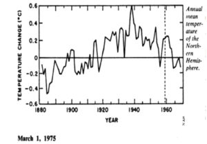
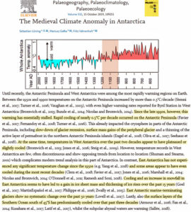
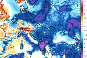
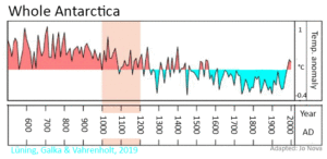
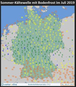
La vague de chaleur ayant traversé la France lors de la dernière semaine de Juin 2019 a donné lieu à une prolifération d’âneries proférées par certains médias, ainsi que, malheureusement, par certains hommes politiques. Les mêmes qui refusaient de prendre en compte les records de froid de l’hiver 2018-2019 dans l’hémisphère Nord, le record de surface de la banquise dans l’Antarctique du 21 septembre 2014 et le record de froid près du Pôle Sud (-98°6 C en 2018), en disant « Ne mélangez pas météo et climat » se sont mis frénétiquement à brandir des records de chaleur comme des scalps, oubliant au passage le bon conseil qu’ils donnaient eux-mêmes il y a 6 mois… Cette augmentation de la variabilité des températures, qui revient régulièrement dans l’histoire du climat de la Planète Terre, est un phénomène naturel où l’Homme, monté sur ses ergots, joue un rôle bien plus faible que clamé urbi et orbi par ceux qui s’enrichissent, au sens propre, du « climat de peur » qu’ils génèrent.

Pour nourrir le débat de faits scientifiques, recensés par des études menées par des scientifiques renommés, dont les références sont citées sur chaque slide, nous avons demandé à M. François Gervais, ancien Directeur de l’UMR 6157 du CNRS, et expert reviewer du rapport AR5 du GIEC, l’autorisation de reproduire sur La Synthèse les 52 slides projetées lors d’une Conférence qui eut lieu le 13 décembre 2018 (NDLR).


  1. Pour accéder aux 52 slides, résumant les enjeux de la transition énergétique, merci de cliquer sur le premier lien en bas de page.

  2. Pour accéder à la biographie de M. François Gervais, auteur de plus de 230 publications dans des revues scientifiques à comité de lecture, cliquer sur le deuxième lien en bas de page.

  3. Pour assister à la Conférence du 13 décembre 2018, cliquer sur le lien ci-dessous (durée : 59 minutes) :

Medieval Climate Anomaly Now Confirmed In Southern Hemisphere On All Four Continents

by Lüning et al., July  6, 2019 in NoTricksZone


For a long time it has been said that the Medieval Warm Period was a purely North Atlantic phenomenon. This has proved to be wrong.

On 29 June 2019, a paper by Lüning et al. 2019 on the Medieval Warm Period in Antarctica appeared in the trade journal Palaeogeography, Palaeoclimatology, Palaeoecology. Here is the abstract:

With the publication of this paper, the Medieval Climate Anomaly (MCA) has now been confirmed on all four continents of the southern hemisphere.

While the largest part of the southern hemisphere apparently experienced a warm phase during the MCA, there were also isolated areas that cooled down. To the latter regions belong, for example, coasts, where cold water from the depth rose increasingly. In other areas so-called climate seesaws or dipoles were active, as we know them from today’s climate. One end of the “seesaw” heats up, the other end cools down.

Another result of the studies is that the medieval climate history of huge areas in the southern hemisphere is simply unknown. A task force urgently needs to be set up to fill in this climatic “empty space” with information on pre-industrial temperature development. This information is urgently needed to calibrate the climate models on the basis of which far-reaching socio-political planning is currently taking place.

What follows are publications on the Medieval Period climate of the southern hemisphere as an overview:

Lüning, S., M. Gałka, F. Vahrenholt (2019): The Medieval Climate Anomaly in Antarctica. Palaeogeogr., Palaeoclimatol., Palaeoecol., doi: 10.1016/j.palaeo.2019.109251

SCE INFO : 45,9°C un record en France ?

by SCE-INFO, 3 juillet 2019 in ScienceClimatEnergie


De nombreux médias l’ont annoncé, tout comme le site MétéoFrance : la barre des 45 °C aurait été franchie pour la première fois en France vendredi 28 juin 2019. On a atteint 45,9 °C à Gallargues-le-Montueux, à l’ouest du Gard, à 16 h 20. Ce serait une première en France depuis que l’on fait des mesures de températures. Température exceptionnelle? Sans remettre en cause le réchauffement global de la basse troposphère, ni l’augmentation de la fréquence des vagues de chaleur constatée par le GIEC, certaines remarques doivent être faites concernant ce record de température.

Avant de sombrer dans le catastrophisme, il est important de “garder la tête froide” et de considérer les quelques points suivants :

1. Une telle température a peut-être déjà été atteinte dans le passé proche, mais n’a tout simplement pas été mesurée. N’oubliez pas qu’il n’y avait pas autant de thermomètres il y a cent ans. Par exemple, en 1865, il n’y avait en France que deux observatoires astronomiques effectuant des observations météorologiques quotidiennes (voir ici). Aujourd’hui, les stations météorologiques professionnelles du réseau de Météo-France, appelé réseau Radome, ne sont que de 554 pour le France métropolitaine. Il faudrait évidemment plus de stations pour monitorer les 643 801 km² de territoire. Aujourd’hui, cela fait une station pour 1162 km2.

2. Pendant l’été 1930, une vague de chaleur a traversé la France, comme l’atteste le petit article de journal ci-dessous (Figure 1) retrouvé dans “The Telegraph” (Brisbane). Les températures sont données en Fahrenheit et 122 Fahrenheit correspondent à 50°C. Bien que l’article ne donne pas les détails de la mesure (il faut donc rester prudent) nous voyons que de telles vagues de chaleurs se sont déjà produites dans le passé. Voyez également ce qui s’est passé en 1900, 1911, 1921 et 1934  ici.

Record High Temperatures in France: 3 Facts the Media Don’t Tell You

by Roy Spencer, July 2, 2019 in GlobalWarming


News reporting of the recent heat wave in France and other European countries was accompanied with the usual blame on humans for causing the event. For example, here’s the CBS News headline: Record-breaking heat is scorching France. Experts say climate change is to blame.

While it is possible that the human component of recent warming might have made the heat wave slightly worse, there are three facts the media routinely ignore when reporting on such “record hot” events. If these facts were to be mentioned, few people with the ability to think for themselves would conclude that our greenhouse gas emissions had much of an impact.

1. Record High Temperatures Occur Even Without Global Warming

Adjusted “Unadjusted” Data: NASA Uses The “Magic Wand Of Fudging”, Produces Warming Where There Never Was

by P. Gosselin, June 25, 2019 in NoTricksZone


By Kirye
and Pierre Gosselin

It’s been long known that NASA GISS has been going through its historical temperature data archives and erasing old temperature measurements and replacing them with new, made up figures without any real legitimate reason.

This practice has led to the formation of new datasets called “adjusted” data, with the old datasets being called “V3 unadjusted”. The problem for global warming activists, however, was that when anyone looks at the old “V3 unadjusted” – i.e. untampered data – they often found a downward linear temperature trend. Such negative trends of course are an embarrassment for global warming alarmists, who have been claiming the planet is warming up rapidly.

The adjusted “unadjusted” data

So what to do? Well, it seems that NASA has decided to adjust its “V3 unadjusted datasets” and rename them as “V4 unadjusted”. That’s right, the adjusted data has become the new V4 “unadjusted” data.

And what kind of trend does the new “V4 unadjusted” data show?

You guessed it. The new V4 unadjusted data are now yielding warmed up trends, even at places where a cooling trend once existed.

This is how NASA uses its magic wand of fudging to turn past cooling into (fake) warming.

6 examples of scandalous mischief by NASA

What follows are 6 examples, scattered across the globe and going back decades, which demonstrate this scandalous mischief taking place at NASA.

No. 1

Punta Arenas, Chile. Here we see how a clear cooling trend has been warmed up by NASA to produce a slight cooling trend:


giss.nasa.gov/cgi-bin/gistemp/stdata_show_v3

giss.nasa.gov/cgi-bin/gistemp/stdata_show_v4

Dry Hot North German Summers Were More Common 1000 Years Ago, Scientists Report

by P. Gosselin, June 19, 2019 in NoTricksZone


Dry Summers Like 2018 Were Common in the Middle Ages

CO2, GLOBAL WARMING, CLIMATE AND ENERGY

by Allan M.R. MacRae, B.A.Sc., M.Eng., P.Eng., June 2019 in WUWT


ABSTRACT

Global warming alarmism, which falsely assumes that increasing atmospheric CO2 causes catastrophic global warming, is disproved – essentially, it assumes that the future is causing the past. In reality, atmospheric CO2 changes lag global temperature changes at all measured time scales.

Nino34 Area Sea Surface Temperature changes, then tropical humidity changes, then atmospheric temperature changes, then CO2 changes.

The velocity dCO2/dt changes ~contemporaneously with global temperature changes and CO2 changes occur ~9 months later (MacRae 2008).

The process that causes the ~9-month average lag of CO2 changes after temperature changes is hypothesized and supported by observations.

The ~9-month lag, +/- several months, averages 1/4 of the full-period duration of the variable global temperature cycle, which averages ~3 years.

Based on the above observations, global temperatures drive atmospheric CO2 concentrations much more than CO2 drives temperature.

Climate sensitivity to increasing atmospheric CO2 must be very low, less than ~1C/(2*CO2) and probably much less.

There will be no catastrophic warming and no significant increase in chaotic weather due to increasing CO2 concentrations.

Increasing atmospheric CO2 clearly causes significantly improved crop yields, and may cause minor, beneficial global warming.

Atmospheric CO2 is not alarmingly high, it is too low for optimal plant growth and alarmingly low for the survival of carbon-based terrestrial life.

Other factors such as fossil fuel combustion, deforestation, etc may also increase atmospheric CO2. The increase of CO2 is clearly beneficial.

“Green energy” schemes are not green and produce little useful (dispatchable) energy, primarily because of the fatal flaw of intermittency.

There is no widely-available, cost-effective means of solving the flaw of intermittency in grid-connected wind and solar power generation.

Electric grids have been destabilized, electricity costs have soared and Excess Winter Deaths have increased due to green energy schemes.

HYPOTHESIS AND CONCLUSIONS

Fig.1a – The very close relationship of dCO2/dt (red) vs global temperature (blue) is clearly apparent. Major volcanoes disrupt the relationship.

A Second Look At Radiation Versus Temperature

by Willis Eschenbach, June 14, 2019 in WUWT


I kept going back and looking at the graphic from my previous post on radiation and temperature. It kept niggling at me. It shows the change in surface temperature compared to the contemporaneous change in how much energy the surface is absorbing. Here’s that graphic again:


Figure 1. From my previous post. It is a scatterplot showing the dependence of temperature on the total downwelling radiation (longwave plus shortwave) absorbed by the surface.

What I found botheracious were the outliers at the top of the diagram. I knew what they were from, which was the El Nino/La Nina of 2015-2016.

After thinking about that, I realized I’d left one factor out of the calculations above. What the El Nino phenomenon does is to periodically pump billions of cubic meters of the warmest Pacific equatorial water towards the poles. And I’d left that advected energy transfer out of the equation in Figure 1. (Horizontal transfer of energy from one place on earth to another is called “advection”).

And it’s not just advection of energy caused by El Nino. In general, heat is advected from the tropics towards the poles by the action of the ocean and the atmosphere. Figure 2 shows the average amount of energy exported (plus) or imported (minus) around the globe.

Central Europe temperature constrained by speleothem fluid inclusion water isotopes over the past 14,000 years

by Affolter et al., June 5, 2019 in ScienceAdvance


Abstract

The reasons for the early Holocene temperature discrepancy between northern hemispheric model simulations and paleoclimate reconstructions—known as the Holocene temperature conundrum—remain unclear. Using hydrogen isotopes of fluid inclusion water extracted from stalagmites from the Milandre Cave in Switzerland, we established a mid-latitude European mean annual temperature reconstruction for the past 14,000 years. Our Milandre Cave fluid inclusion temperature record (MC-FIT) resembles Greenland and Mediterranean sea surface temperature trends but differs from recent reconstructions obtained from biogenic proxies and climate models. The water isotopes are further synchronized with tropical precipitation records, stressing the Northern Hemisphere signature. Our results support the existence of a European Holocene Thermal Maximum and data-model temperature discrepancies. Moreover, data-data comparison reveals a significant latitudinal temperature gradient within Europe. Last, the MC-FIT record suggests that seasonal biases in the proxies are not the primary cause of the Holocene temperature conundrum.

Radiation versus Temperature

by Willis Eschenbach, June 8, 2019 in WUWT


Due to the recent posts by Lord Monkton and Nick Stokes, I’ve been thinking about the relationship between radiation and temperature. So I turned to the CERES dataset. Here is a scatterplot of the monthly global average surface temperature versus the monthly global average downwelling total radiation absorbed by the surface. The total radiation is the sum of the net solar radiation at the surface and the downwelling longwave radiation at the surface. I’ve removed the seasonal variations from the data.

Note that 3.7 W/m2 is the increase in downwelling longwave radiation expected from a doubling of CO2 …

When I saw that, I thought well, maybe the increase is small because there’s a lag between the absorption of the radiation and the warming. To see if that was the case, I did a cross-correlation analysis of the relationship.

Latest Global Temp. Anomaly (May ’19: +0.32°C) A Simple “No Greenhouse Effect” Model of Day/Night Temperatures at Different Latitudes

by Dr. Roy Spencer, June 7, 2019 in WUWT


Abstract: A simple time-dependent model of Earth surface temperatures over the 24 hr day/night cycle at different latitudes is presented. The model reaches energy equilibrium after 1.5 months no matter what temperature it is initialized at. It is shown that even with 1,370 W/m2 of solar flux (reduced by an assumed albedo of 0.3), temperatures at all latitudes remain very cold, even in the afternoon and in the deep tropics. Variation of the model input parameters over reasonable ranges do not change this fact. This demonstrates the importance of the atmospheric “greenhouse” effect, which increases surface temperatures well above what can be achieved with only solar heating and surface infrared loss to outer space.