by Allan M.R. MacRae, B.A.Sc., M.Eng., P.Eng., June 2019 in WUWT
ABSTRACT
Global warming alarmism, which falsely assumes that increasing atmospheric CO2 causes catastrophic global warming, is disproved – essentially, it assumes that the future is causing the past. In reality, atmospheric CO2 changes lag global temperature changes at all measured time scales.
Nino34 Area Sea Surface Temperature changes, then tropical humidity changes, then atmospheric temperature changes, then CO2 changes.
The velocity dCO2/dt changes ~contemporaneously with global temperature changes and CO2 changes occur ~9 months later (MacRae 2008).
The process that causes the ~9-month average lag of CO2 changes after temperature changes is hypothesized and supported by observations.
The ~9-month lag, +/- several months, averages 1/4 of the full-period duration of the variable global temperature cycle, which averages ~3 years.
Based on the above observations, global temperatures drive atmospheric CO2 concentrations much more than CO2 drives temperature.
Climate sensitivity to increasing atmospheric CO2 must be very low, less than ~1C/(2*CO2) and probably much less.
There will be no catastrophic warming and no significant increase in chaotic weather due to increasing CO2 concentrations.
Increasing atmospheric CO2 clearly causes significantly improved crop yields, and may cause minor, beneficial global warming.
Atmospheric CO2 is not alarmingly high, it is too low for optimal plant growth and alarmingly low for the survival of carbon-based terrestrial life.
Other factors such as fossil fuel combustion, deforestation, etc may also increase atmospheric CO2. The increase of CO2 is clearly beneficial.
“Green energy” schemes are not green and produce little useful (dispatchable) energy, primarily because of the fatal flaw of intermittency.
There is no widely-available, cost-effective means of solving the flaw of intermittency in grid-connected wind and solar power generation.
Electric grids have been destabilized, electricity costs have soared and Excess Winter Deaths have increased due to green energy schemes.
HYPOTHESIS AND CONCLUSIONS
…
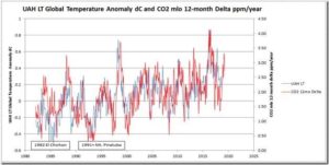
Fig.1a – The very close relationship of dCO2/dt (red) vs global temperature (blue) is clearly apparent. Major volcanoes disrupt the relationship.