
by A. MacRae, September 1, 2019 in WUWT
CATASTROPHIC GLOBAL WARMING IS A FALSE CRISIS – THE NEXT GREAT EXTINCTION WILL BE GLOBAL COOLING
Forget all those falsehoods about scary global warming, deceptions contrived by wolves to stampede the sheep. The next great extinction event will not be global warming, it will be global cooling. Future extinction events are preponderantly cold: a glacial period, medium-size asteroid strike or supervolcano. Humanity barely survived the last glacial period that ended only 11,500 years ago, the blink-of–an-eye in geologic time.
Cold, not heat, is by far the greater killer of humanity. Today, cool and cold weather kills about 20 times as many people as warm and hot weather. Excess Winter Deaths, defined as more deaths in the four winter months than equivalent non-winter months, total over two million souls per year, in both cold and warm climates. Earth is colder-than-optimum for humanity, and currently-observed moderate global warming increases life spans.
“Cold Weather Kills 20 Times As Many People As Hot Weather”
By Joseph D’Aleo and Allan MacRae, September 4, 2015
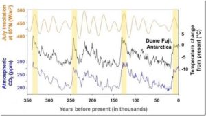
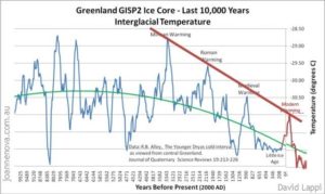
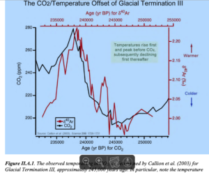
However, Excess Winter Deaths are not the worst threats to humanity. The glacial cycle averages about 100,000 years, consisting of about 90,000 years of the glacial period, when mile-thick continental glaciers blanketed much of the Northern and Southern Hemispheres including Canada, Russia, Northern Europe and Northern USA, and about 10,000 years of interglacial, the warm period of the present. Earth is now 11,500 years into the current warm interglacial, and our planet may re-enter the glacial period at any time.
“Glacial-Interglacial Cycles”
https://www.ncdc.noaa.gov/abrupt-climate-change/Glacial-Interglacial%20Cycles
…
