by P. Homewood, March 21, 2020 in NotaLotofPeopleKnowThat
Bullet Point Summary:
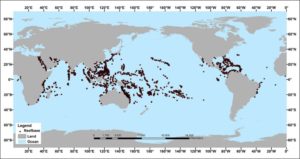
Coral thrive in warm water, not cold water.
Recent warming has allowed coral to expand their range poleward, while still thriving near the equator.
Coral has existed continuously for the past 40 million years, surviving temperatures and carbon dioxide levels significantly higher than what is occurring today.
The primary causes of coral bleaching includeoxybenzone (a chemical found in sunscreen), sediment runoff from nearby coastal lands, and cold temperatures like those recorded in 2010 off the Florida coast.
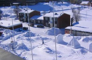
The first flakes of the season in Kiruna, Sweden fell back on Sept 30 and from then on have continued relentlessly, with accumulations now comfortably surpassing the region’s all-time snowfall record.
NASA has recently revealed this upcoming solar cycle (25) will be “the weakest of the past 200 years,” with the agency correlating previous solar shutdowns to prolonged periods of global cooling here.
by P. Homewood, March 19, in NotaLotofPeopleKnowThat
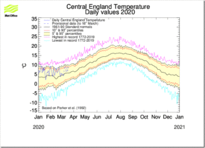
If you had not noticed (!), it has been a mild and wet start to the year here in the UK, and also across in NW Europe.
No doubt this will be linked to global warming in due course, but in fact it is simply weather, as the CET chart below proves:
Since the year started, temperatures have consistently been within the normal band. In other the sort of temperatures commonly seen at this time of year.
However, they have also been consistently in the top half of that band, rather than being spread between cold and warm, as would happen most years.
The reason for the weather we have had is, of course, the jet stream, or more precisely the North Atlantic Oscillation (NAO), which has been strongly and stubbornly positive all winter.
The Norwegian Centre for Climate Research CICERO spotted this mild weather coming back in December, and commented on 6th January:
The unusual warm temperatures this winter and forecasts indicating milder winter conditions for January, February and March in Europe are partly due to an atmospheric circulation pattern called the North Atlantic Oscillation, or NAO. This atmospheric circulation pattern explains well the weather we get in Europe, especially in winter.
They want to ban coal, oil and gas. Exactly how will they replace them? Who wins? Who loses?
Berkeley, CA, Takoma Park, MD and other cities; California, Connecticut, New York, Virginiaand other states; Germany, England and other countries; the European Union – all plan to banish oil, natural gas and coal within 10, 20 or 30 years. A number of US states have joined Regional Greenhouse Gas Initiatives and proudly say We Are Still In … the Paris climate treaty, no matter what President Trump says or does.
Forget the headlines and models, and look at hurricane, tornado, sea level and other historic records. There is no crisis, no unprecedented warming or weather events, certainly nothing that proves humans have replaced the powerful natural forces that have always driven climate changes and weather events.
But for now, let’s just examine their zero-carbon plans. How exactly will they make this happen? Where do they plan to get the turbines, panels and batteries? the raw materials to manufacture them? How do they plan to function as modern societies with pricey, erratic energy and frequent power disruptions?
Diminishing sea ice translates to warmer ocean, more rain, and stronger trade winds.
University of California – San Diego
Arctic and Antarctic ice loss will account for about one-fifth of the warming that is projected to happen in the tropics, according to a new study led by Mark England, a polar climate scientist at Scripps Institution of Oceanography at the University of California San Diego, and Lorenzo Polvani, the Maurice Ewing and J. Lamar Worzel Professor of Geophysics at Columbia Engineering, England’s doctoral supervisor.
While there is a growing body of research showing how the loss of Arctic sea ice affects other parts of the planet, this study is the first to also consider the long-range effect of Antarctic sea ice melt, the research team said.
“We think this is a game-changer as it shows that ice loss at both poles is crucial to understanding future tropical climate change,” England said of the study funded by NASA and the National Science Foundation. “Our study will open a hitherto unexplored direction and motivate the science community to study the large effects that Antarctic sea ice loss will have on the climate system.”
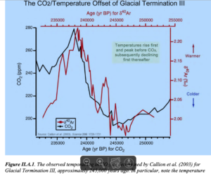
by Dr A. Ollila, March 16, 2020 in ClimateChange Dispatch
During the years 2000-2014, the global temperature hardly increased, and that period has been called the temperature pause or hiatus.
The debate among the climate community has resulted in more than 200 research studies in some cases with opposite results about the reasons.
This amount of papers can be compared to the research studies of Earth’s energy balance and the greenhouse effect. I have found about 10 publications for both subjects.
During the years 2000-2014, the emissions of carbon dioxide were 126 gigatons carbon (GtC) being 31% of the total emission after 1750, but the greenhouse (GH) gases were not able to increase the temperature.
According to the IPCC, the temperature increase should have been 0.4°C from 2000 to 2014 (Ref. 1).
It looks like that the pause ended to the super El Nino 2015-2016 because the temperature has been thereafter about 0.2 °C above-the-pause average.
Research study about the pause and the ENSO
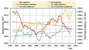
The impulse for my research study came from a story figure on WUWT that showed shortwave (SW) radiation variations during the pause.
A curve showed increased values around El Nino 2015-16 and thereafter. I decided to find out what could be the impact of this finding on the temperatures.
In Fig. 1, I have depicted the total solar irradiance (TSI), SW radiation and LW radiation from 2000 onward. This data is available from the CERES databank maintained by NASA.
Fig.1. TSI, SW radiation and LW radiation trends normalized to the altitude of 20 kilometers.
Within the last few years, over 50 papers have been added to our compilation of scientific studies that find the climate’s sensitivity to doubled CO2 (280 ppm to 560 ppm) ranges from <0 to 1°C. When no quantification is provided, words like “negligible” are used to describe CO2’s effect on the climate. The list has now reached 106 scientific papers.
“The greenhouse phenomenon in the atmosphere that results from emission of its molecules and particles in the infrared spectrum range is determined by atmospheric water in the form of molecules and microdrops and by carbon dioxide molecules for the Earth atmosphere and by carbon dioxide molecules and dust for the Venus atmosphere. The line-by-line method used the frequency dependent radiative temperature for atmospheric air with a large optical thickness in the infrared spectral range, allows one to separate emission of various components in atmospheric emission. This method demonstrates that the removal of carbon dioxide from the Earth’s atmosphere leads to a decrease of the average temperature of the Earth’s surface by 4 K; however, doubling of the carbon dioxide amount causes an increase of the Earth’s temperature by 0.4 K from the total 2 K at CO2 doubling in the real atmosphere, as it follows from the NASA measurements. The contribution to this temperature change due to injections of carbon dioxide in the atmosphere due to combustion of fossil fuel, and it is 0.02 K. The infrared radiative flux to the Venus surface due to CO2 is about 30% of the total flux, and the other part is determined by a dust.”
II. Scientific observations reveal rising greenhouse gases present no imminent threat to human health and welfare . 5
A. There is nothing unusual or unnatural about Earth’s current warmth or rate of warming. Historic and modern records of atmospheric CO2 and temperature violate established principles of causation. Model-based temperature projections since 1979 artificially inflate warming (compered to observations) by a factor of three, invalidating the models and all their ancillary claims associated with greenhouse gas-induced warming5
B. Observations reveal key adverse effects of greenhouse gas-induced warming are not occurring despite EPA predictions they should be worsening16
How to Properly Test for a CO2-induced Influence on Extreme Weather 17
Extreme Weather Observations and Trends 24 (i)Hurricanes 24 (ii)
III. CO2 emissions and fossil energy use initiated, and continue to sustain, the industrial revolution and the many human and environmental benefits that have emerged therefrom, which benefits have enhanced human health and welfare 56
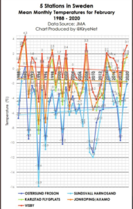
It’s been a particularly mild winter in Europe this year. But that hasn’t changed the long-term trend over the past 30 years.
Now that the February 2020 data have been coming in, we plot the mean February temperatures for some countries in Europe.
Sweden
Three of 5 stations show February mean temperature in Greta Thunberg’s Sweden have had a cooling trend since 1988! The real data will probably make the climate alarmists upset.
Several new studies use evidence from temperature-sensitive plant species and megafauna remains to reconstruct an Arctic climate that was 6°C to 22°C warmer than today when CO2 concentrations lingered near 300 ppm.
by J. Moseley, March 9, 2020 in ClimateChangeDispatch
Is planet Earth warming, cooling, or staying the same? I often challenge advocates for climate alarmism: what is the temperature of the planet today?
Or we can use any specific day in recent years for which data are available. We cannot know the temperature of the planet thousands or millions of years ago if we cannot even measure it today.
Yes, the question is one single temperature of the entire planet. Not the temperature in Nome, Alaska, or Dallas, Texas, or Sydney, Australia, or in your hometown.
One single temperature reading for the entire globe. To put it that way immediately sounds strange.
But if we don’t have a single temperature reading for the entire planet for today, how can we say if the planet is getting warmer or cooler or not changing at all?
We cannot talk about the temperature in, say, Geneva or London or New York City only. The question is whether the entire planet is getting warmer, not isolated cities.
Some of us have forgotten basic statistics. Some avoided it in school. But most of us are vaguely familiar with the random sampling process used in public opinion surveys.
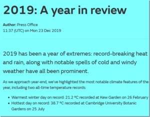
According to the Met Office, 2019 was a year of weather extremes in the UK. There is actually very little evidence to back this claim up, but this does not stop them ludicrously claiming one mild day in February as “extreme”!
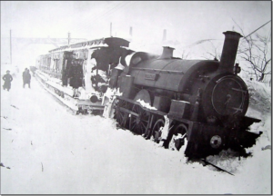
To most people, extreme weather would be the sort of stuff our ancestors experienced in this very week in 1891:
I [Harry Hardrada] recently unearthed an intriguing piece of literature from a 19th century periodical named ‘Ho! Forthe Pole!’ in Littell’s Living Age, Volume 66 (1860).
The paper highlights various voyages to the North Pole throughout the 17th-18th centuries with meticulous detail. It appears, according to the article, that many wooden ships penetrated as far north as the 89th latitude in ‘open iceless seas’ during this time — as in 1665 and 1675.
A bit far-fetched?
Perhaps, on the face of it… but there is some good evidence out there which may suggest otherwise.
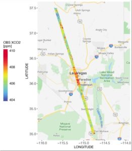
CO2 measurements from OCO-2 in parts per million over Las Vegas on Feb. 8, 2018. Credit: Dien Wu/University of Utah
A new NASA/university study of carbon dioxide emissions for 20 major cities around the world provides the first direct, satellite-based evidence that as a city’s population density increases, the carbon dioxide it emits per person declines, with some notable exceptions. The study also demonstrates how satellite measurements of this powerful greenhouse gas can give fast-growing cities new tools to track carbon dioxide emissions and assess the impact of policy changes and infrastructure improvements on their energy efficiency.
Cities account for more than 70% of global carbon dioxide emissions associated with energy production, and rapid, ongoing urbanization is increasing their number and size. But some densely populated cities emit more carbon dioxide per capita than others.
To better understand why, atmospheric scientists Dien Wu and John Lin of the University of Utah in Salt Lake City teamed with colleagues at NASA’s Goddard Space Flight Center in Greenbelt, Maryland and the University of Michigan in Ann Arbor. They calculated per capita carbon dioxide emissions for 20 urban areas on several continents using recently available carbon dioxide estimates from NASA’s Orbiting Carbon Observatory-2 (OCO-2) satellite, managed by the agency’s Jet Propulsion Laboratory in Pasadena, California. Cities spanning a range of population densities were selected based on the quality and quantity of OCO-2 data available for them. Cities with minimal vegetation were preferred because plants can absorb and emit carbon dioxide, complicating the interpretation of the measurements. Two U.S. cities were included–Las Vegas and Phoenix.
by P. Homewood, March 3, 2020 in NotaLotofPeopleKnowThat
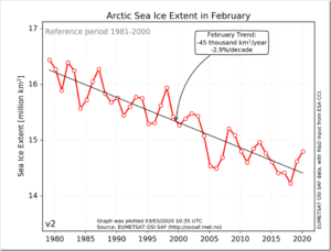
Arctic sea ice extent continues to run well ahead of the last few years, as it has done for most of this year so far, and continues to grow at a time of year when it normally begins to stabilise and recede.
Average extent in February was the highest since 2013, and stands greater than 2005 and 2006:
by Mark Simone, March 5, 2020 in ClimateChangeDispatch
For more than 50 years, climate alarmists in the scientific community and environmental movement have not gotten even one prediction correct, but they do have a perfect record of getting 41 predictions wrong.
List Of Doomsday Predictions That Climate Alarmist Got Wrong:
Here is the source for numbers 1-27. As you will see, the individual sources are not crackpots, but scientific studies and media reports on “expert” predictions.
The sources for numbers 28 to 41 are linked individually.
1967: Dire Famine Forecast By 1975
1969: Everyone Will Disappear In a Cloud Of Blue Steam By 1989 (1969)
1970: Ice Age By 2000
1970: America Subject to Water Rationing By 1974 and Food Rationing By 1980
1971: New Ice Age Coming By 2020 or 2030
1972: New Ice Age By 2070
1974: Space Satellites Show New Ice Age Coming Fast
Depuis le début des mesures satellitaires en 1967, la couverture neigeuse de l’hémisphère nord a augmentée en automne et en hiver. Ce phénomène incontestable a par exemple été illustré en graphiques par un laboratoire spécialisé dans les chutes de neige à la Rutgers University aux Etats Unis, le Global Snow Lab, mais également par l’Organisation Météorologique Mondiale.
Pour l’automne, on est ainsi passé de 18,4 106 km2 de neige en 1967 à environ 20,2 106 km2pour 2019 (Figure 1). Pour l’hiver, la situation est plutôt stable ou en légère augmentation : on est ainsi passé de 45,3 à 46,0 106 km2 de neige dans l’hémisphère nord (Figure 2). Par contre, pour le printemps on constate une diminution de 31,5 à 28,7 106 km2, une chute d’environ 9% (Figure 3).
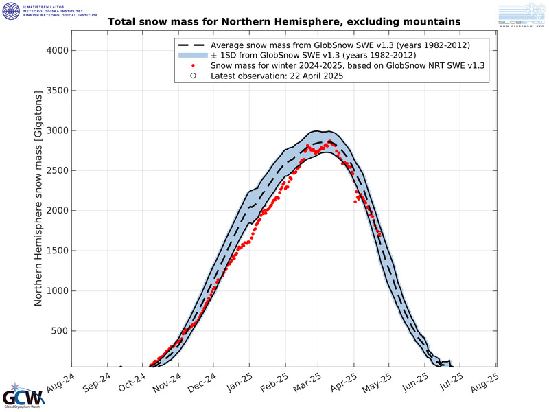
Les données de l’Institut météorologique finlandais (FMI), présentées sur le site internet d’un organe de l’Organisation Météorologique Mondiale (Global Cryosphere Watch), révèlent également que la masse totale de neige pour l’hémisphère Nord a été constamment supérieure à la moyenne de 30 ans pendant la majeure partie de la saison 2020 et que son taux de croissance est en augmentation (Figure 4).
Conclusion : dire que la neige disparait en automne ou en hiver à cause du réchauffement global est donc une contre-vérité. Cela peut être vrai au niveau local, mais pas pour l’ensemble de l’hémisphère nord. Concernant cet hémisphère, une diminution n’est visible que pour le printemps.
Pour un rappel des épisodes neigeux remarquables en Belgique cliquez ici
….
Figure 4. Masse de neige totale (gigatonnes) pour l’hémisphère nord (montagnes exclues) entre octobre 2019 et mars 2020 (points rouges). La moyenne sur 30 ans est indiquée par le trait pointillé noir (± 1 écart-type). Source : ici.
Data from the Finnish Meteorological Institute (FMI) reveals that the Total Snow Mass for the Northern Hemisphere has been consistently above the 30 year average for the majority of the season, and is now actually increasing its rate of growth.
Feel free to shovel this chart down the throats of those still insisting the world is burning up and that snowfall is a thing of the past.
Looking at the chart, the light blue indicates the 30-year average (1982 to 2012):
It’s clear for all to see, and for all climate alarmists to ignore, Total Snow Mass for the Northern Hemisphere is currently running well-above the 30-year norm, according to the latest observation point; plotted March 02, 2020 — by some 300 gigatons at that!
by Tony Heller, March 5, 2020 in RealClimateScience
Over the past 30 years, NOAA has been rapidly losing US thermometers. In 1989, 1,205 stations reported some daily temperatures, but last year only 871 stations reported some daily temperatures.
Thirty-five percent (424) of the stations in 2019 were zombie stations, meaning that NOAA estimated data for all twelve months. This is done even for some of the thermometers which reported at least a little data in 2019.
Using NASA’s MERRA-2 radiation data, scientists find shortwave radiation (SW) has been rising since the 1980s. The SW increase has been larger and faster than longwave radiation (LW) changes during this same timespan. Cloud variability has been the “main driver” of these trends.
In a new Nature journal paper (Delgado-Bonal et al, 2020) published in Scientific Reports, scientists use radiation records from NASA to conclude shortwave (SW) changes are “mainly determined” by cloud modulation.
Clouds are “showing a declining trend” from 1984-2014. Fewer clouds means less SW radiation is reflected to space and more is absorbed by the Earth’s surface.
by Clive Best, August 30, 2019 in ClimateChangeDispatch
Climate change may well turn out to be a benign problem rather than the severe problem or “emergency” it is claimed to be.
This will eventually depend on just how much the Earth’s climate is warming due to our transient but relatively large increase in atmospheric CO2 levels.
This is why it is so important to accurately and impartially measure the Earth’s average temperature rise since 1850. It turns out that such a measurement is neither straightforward, independent, nor easy.
For some climate scientists, there sometimes appears to be a slight temptation to exaggerate recent warming, perhaps because their careers and status improve the higher temperatures rise.
They are human like the rest of us. Similarly, the green energy lobby welcomes each scarier temperature increase to push ever more funding for their unproven solutions, without ever really explaining how they could possibly work better than a rapid expansion in nuclear energy instead.
Despite over 30 years of strident warnings and the fairly successful efforts of G7 countries to actually reduce emissions, CO2 levels in the atmosphere are still stubbornly accelerating upwards.
This is because simultaneously the developing world has strived to raise the wellbeing and living standards of their large populations through the use of ever more coal and oil, exactly as we did.
This is our current dilemma. Should they somehow be stopped from burning fossil fuels, or maybe compensated financially to ‘transition’ to so-called renewable energy instead?
All this again depends on the speed of climate change, which simply translates to the slope of the temperature record.
By Jerry Powlas, March 2, 2020 in ClimateChangeDispatch
“The temperature of the Earth” is an ambiguous term that cannot mean anything.
At any given time, it is possible to measure the temperature of some very small part of the Earth, such as, perhaps, a shot glass of water.
At that same moment, other temperatures of the Earth that could be measured will show a variation from the temperature of molten rock (1,300 to 2,200°F) to polar ice (32 to -76°F).
Daily variation of the same place on Earth can be 50 to 60°F. Seasonal variation can be well over 100°F in high latitudes.
Conceptually, we could imagine, but not actually measure, every possible place and thing, at every possible time through all the seasons, and then average these data.
To detect “global warming,” we would have to modify these data to include the specific heat of everything measured, as well as the latent heat of all the things that change phase such as water, which appears as a liquid, vapor, and ice.
Conceptually, yes; actually, no. Not possible.
Atmospheric science is presumably the scientific study of the atmosphere. (I am proudly not an atmospheric scientist.) If you use the scientific method to study something, you might presume to call yourself a scientist.
Calling yourself a scientist does not give you the privilege of using bad data to reach fuzzy conclusions and then scare people with the latter.
These folks are looking for about a 1°C change in “the temperature of the Earth” over the course of 100 years.
Australia’s “Grand Solar Minimum” summer –which brought record cold/heat, drought/floods, fires, and dust storms– had one final sting in the tail: another flurry of rare summer snow.
While summer down-under officially ended on Saturday, Feb 29, another blast of heavy, unexpected snow began burying parts of Tasmania on Wednesday, Feb 26.
Mountainous areas of the isolated island state reported large accumulations to close out the week, with local meteorologists warning yet more snow could settle above 1,000 m (3,280 ft) –including at Mount Field and Wellington– over the coming days.
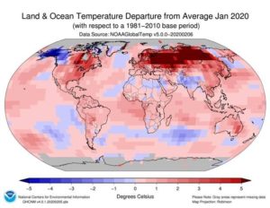
In a report generating substantial media attention this month, the National Oceanic and Atmospheric Administration (NOAA) claimed January 2020 was the hottest January on record. In reality, the claim relies on substantial speculation, dubious reporting methods, and a large, very suspicious, extremely warm reported heat patch covering most of Russia.
The January 2020 Climate Assessment Report, released by NOAA’s National Center for Environmental Information (NCEI), was accompanied by a map showing a giant red menace of extraordinary asserted warmth extending from the Russian border with Poland well into Siberia. Yet, the asserted hot spot appears nowhere else.
Figure 1: Map of temperature departure provided by NOAA/NCEII. Note the huge red spot over Russia.


