Archives par mot-clé : Temperature

RECORDS CONTINUE TO FALL ACROSS THE NW + MORE HISTORIC COLD SET TO ENGULF ALL OF NORTH AMERICA BY OCT 10

by Cap Allon, October 3, 2019 in Electroverse


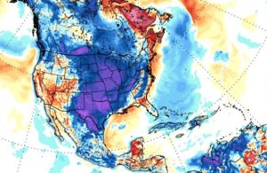
This weekend will mark the final phase of a major winter storm that ravaged the NW U.S. bringing whipping winds to the Flathead Valley, feet of snow along the Continental Divide and record-breaking/challenging temps for all.

A new all-time daily record low temperature was set in Kalispell, Montana on Wednesday, October 02 as the mercury plunged into the teens across the region.

The weather station at Glacier Park International Airport recorded a low of 19F (-7.2C) at 5 AM which busted the dates previous record low of 21F (-6.1C) set back in 1999.

Great Falls, Montana registered a record-smashing 9F (-12.8C) on Tue, Oct 01, according to the NWS, which annihilated the previous daily low of 22F (-5.6C) set back in 1959.

Additionally, areas to the northwest also saw record low daily temperatures on Tuesday as both Cut Bank and Browning comfortably surpassed their previous cold records from 1950.

And further south, crossing a few state lines into California, temperatures at Sacramento Executive Airport dropped to 42F (5.6C) early Wednesday morning, surpassing the old record of 43F (6.1C) set in 1971. Meaning that in less than a week, Sacramento has now set multiple all-time record lows; on Sunday, both downtown Sacramento and the airport set record lows of 45F (7.2C) and 46F (7.8C) respectively.

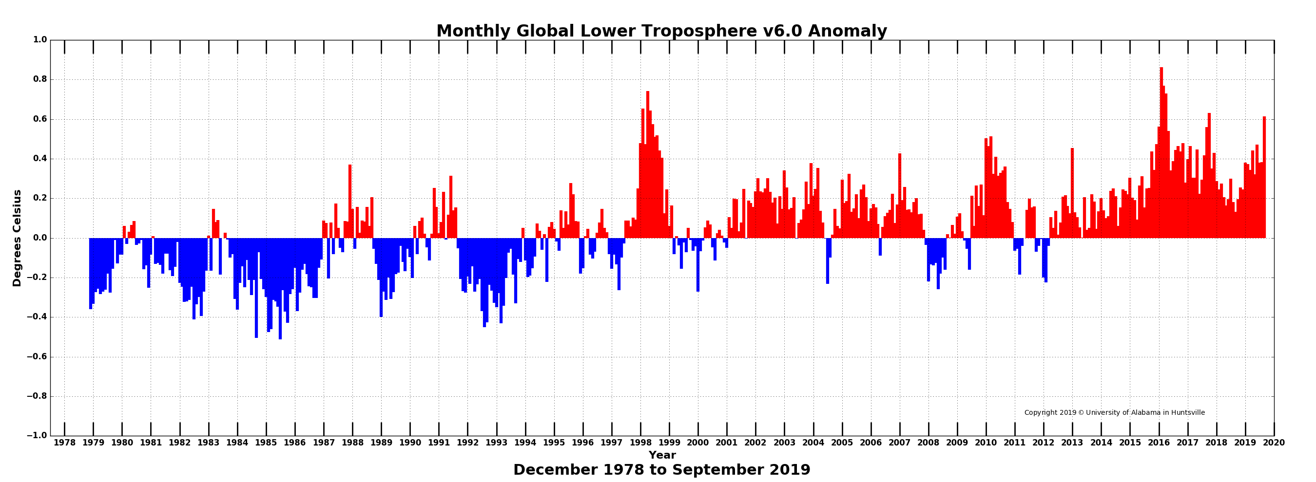
Global Temperature Report: September 2019

by Anthony Watts, October 3, 2019 in WUWT


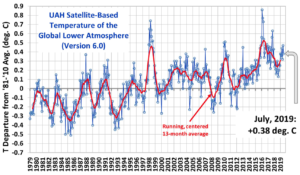
Global climate trend since Dec. 1 1978: +0.13 C per decade

September Temperatures (preliminary)

Global composite temp.: +0.61 C (+1.10 °F) above seasonal average

Northern Hemisphere.: +0.64 C (+1.15 °F) above seasonal average

Southern Hemisphere.: +0.58 C (+1.00°F) above seasonal average

Tropics.: +0.60 C (+1.08°F) above seasonal average

August Temperatures (final)

Global composite temp.: +0.38 C (+0.68 °F) above seasonal average

Northern Hemisphere.: +0.33 C (+0.59 °F) above seasonal average

Southern Hemisphere.: +0.44 C (+0.79°F) above seasonal average

Tropics.: +0.45 C (+0.81 °F) above seasonal average

Notes on data released October 3, 2019 (v6.0)

September’s globally-averaged, bulk-layer atmospheric temperature anomaly of +0.61°C (+1.10°F) represented the warmest September reading of the past 41 Septembers in our satellite record. The jump from August was substantial (+0.23°C) and ranks among the largest month-to-month changes. (Several previous jumps were greater than 0.3°C however.) The warmth was global in extent with warmest September temperatures posted for both hemispheres and the tropical belt. This month-to-month heating is possibly related, at least in part, to the tropical Pacific Ocean’s loss of heat energy to the atmosphere in the recent months as El Niño conditions declined.

Protesting Warmth? Greta’s Home, Sweden, Is 3°C COLDER Today Than Nearly All Of The Last 9000 Years

by K. Richard, September 26, 2019 in NoTricksZone


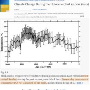
Greta Thunberg lives in Sweden. According to peer-reviewed science, Sweden was at least 3°C warmer than it is today about 6000 to 9000 years ago, when CO2 concentrations lingered around 265 ppm. At 410 ppm CO2, 21st century Sweden is colder now than almost any time in the last 9000 years.

A Much Warmer Northern Hemisphere

During the Medieval Warm Period, wine vineyards flourished in Scandinavia and Russia at the same latitude (55°N) where polar bears roam today.

UK Climate Trends: Plus Ça Change: Climate hysteria is unjustified

by P. Homewood, September 27, 2019 in GWPF


London, 27 September: The UK’s key climate indicators have barely changed for 20 years. That’s according to a new paper from the Global Warming Policy Foundation, which rebuts claims that the weather is getting worse.
According to author Paul Homewood, the Met Office’s Central England Temperature Record shows that temperatures have barely changed in 20 years and that there has been no increase in extremely hot days either:
“The summer of 2018 had just one day over 30 degrees, while 1976 had six. The Met Office’s data show that hot days are just not becoming more common.”
And there seems to be little to worry about on bad weather front either. There has been a gentle decline in storminess, and in most of the UK, there has been no change in either average rainfall or rainfall extremes:
“Only in Scotland has there been a noticeable increase”, says Homewood. “Climate hysteria is entirely overdone.”
Paul Homewood: Plus Ça Change: The UK Climate in 2018 (pdf)

UK: New “Beast from the East” could cause one of the coldest winters in three decades

by Charles the moderator, Sep. 9, 2019 in WUWT


The UK could be set to experience one of the coldest winters in three decades, scientists have warned.

Meteorologists say an even more extreme version of the “Beast from the East” could see parts of the country hit with blizzard-like conditions throughout much of January and February next year.

Using ground-breaking analysis of sea temperatures and air pressures, scientists have been able to predict one of the longest-range UK weather forecasts ever recorded – according to The Sunday Times.

Mark Saunders, professor of climate prediction at University College London (UCL), said: “This would rank the 2020 January-February central England temperature as the coldest winter since 2013.”

What Greenland Heatwave?

by P. Homewood, September 1, 2019 in NotaLotofPeopleKnowThat


Let’s start with Qaanaaq (Thule), which the Mirror reporter visited during w/e 25th August. She wrote:


A heatwave is gripping The Arctic, melting away Greenland’s ice sheet on an unprecedented scale and threatening a global rise in sea levels – an urgent reminder of the climate crisis we are now all facing.

Kids splashing each other in the sea and locals wearing t-shirts were unheard of here in August 10 years ago.

But now, alongside teenage girls wearing skirts to school and increasing mosquitoes, it is a common occurrence for the residents of Qaanaaq, in north-west Greenland, one of the world’s most northerly cities situated 700 miles north of the Arctic Circle.

This is the frontline of climate change…..

The country is also experiencing record-breaking temperatures. In mid-June, along the eastern coast it was 9C warmer than the 1981-2010 average.

Just as western Europe has baked in a heatwave with record temperatures at the end of July, the hot air moved as far north as Greenland with the gauge hitting 22C on August 1. The average high is around 7C….


According to Weather Underground, however, daily maximum temperatures at Qaanaaq never got above 47F that week. The highest temperature of the month was 63F on the 1st.

KNMI confirm that the record temperature at Qaanaaq is 67F, and that a temperature of 63F was also recorded way back in 1959.

A Skeptic’s Guide To Global Temperatures

by Clive Best, August 30, 2019 in ClimateChangeDispatch


Climate change may well turn out to be a benign problem rather than the severe problem or “emergency” it is claimed to be.

This will eventually depend on just how much the Earth’s climate is warming due to our transient but relatively large increase in atmospheric CO2 levels.

This is why it is so important to accurately and impartially measure the Earth’s average temperature rise since 1850. It turns out that such a measurement is neither straightforward, independent, nor easy.

For some climate scientists, there sometimes appears to be a slight temptation to exaggerate recent warming,  perhaps because their careers and status improve the higher temperatures rise.

Listen to the Trees!

by Jim Steele, August 22, 2019 in WUWT


What’s Natural?

Published in Pacifica. Tribune August 20,2019

This summer I taught a class on the Natural History of the Sierra Nevada for San Francisco State University’s Sierra Nevada Field Campus. The first day we taught students how to identify the trees. Once students know their trees, they can easily see how tree species vary with elevation, temperature, moisture, and snow pack. They can see which species colonize open sunny areas and which trees need shade before they can invade. Old time naturalists used trees to identify “life-zones” where different species of mammals, birds, insects and other plants can be found. Furthermore, when you listen to the trees, you can see change.


Tree rings indicate the warmest decades of the 20th century were the 1930s and 40s, and temperatures have yet to surpass those decades. This divergence between thermometers and trees is best explained by the fact that instrumental temperatures are biased upwards when taken at hot airports or in areas recently suffering from growing urban heat island effects. In contrast, trees measure temperatures in natural habitat.

Why CO2 is Not the Control Knob of Global Temperature and Observational Proof it is Not Causing Dangerous Warming

by Institute for the Human Environment,   August 2019


There is no debate as to whether or not atmospheric carbon dioxide, or CO2, is a so-called greenhouse gas. When present in the atmosphere, this one-carbon and two-oxygen molecule indeed has the capacity to absorb infrared radiation and warm the planet. There is also no debate as to whether or not the concentration of atmospheric CO2 is rising; over the past two centuries it has increased from a meager 0.028% of the atmosphere by volume to a still-meager 0.041% today. Furthermore, there is no argument that global temperatures are warmer today than they were 50, 100 or even 200 years ago. However, there is much debate on whether or not the modern increase in atmospheric CO2 has caused, or is presently causing, dangerous global warming, warming so severe that it is threatening life all across the planet.

But how accurate is this narrative?

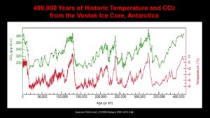
In answering this question, one need only examine the historic temperature and CO2 records illustrated in Figure 1 more critically. Certainly, these two variables experience a fairly high degree of correlation over the time period shown. However, it doesn’t take a Ph.D. scientist to recognize and understand the fact that correlation among two variables does not prove causation. Every textbook on statistics teaches as much, and they also teach that a hypothesis of causation among two variables can be rejected if there is no statistically significant correlation between them, or if the correlation fails to be maintained in a consistent and expected manner across time.

By applying such principles to the case being considered here, it can confidently be argued that if carbon dioxide is indeed the all-important control knob of temperature that climate alarmists claim it to be, then changes in atmospheric CO2 should always precede changes in temperature. And, because CO2 is a greenhouse gas, to prove causation those changes must always be such that a rise in CO2 induces a corresponding rise in temperature, whereas a decline in CO2 must always induce a corresponding drop in temperature. Consistent observations to the contrary, if present in the historic record, would therefore serve to invalidate a causation claim, as well as demonstrate that atmospheric CO2 is nothing more than a bit player among the many factors that drive climate change.

Figure 1. 400,000 years of historic temperature and CO2 from the Vostok Ice Core, Antarctica. Source: Petit et al. (1999) Nature 399: 429-436.

Northern Europe July Temperature Sees NO WARMING Over Past Decades. Global July Not A Record High!

by P. Gosselin, August 20, 2019 in NoTricksZone


Parts of Europe have seen a couple of brief but intense heat waves this summer, and so some of the public got brainwashed by the media into thinking the continent’s summer climate is rapidly getting hotter and that all this is the new normal.

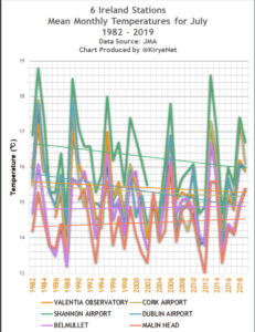
Yet, when we examine the unaltered data from the Japan Meteorology Agency (JMA) for locations in northern Europe that have long-term datasets available, we see there has been no July warming trend over the past decades. Media reports suggesting otherwise are nonsense.

Ireland

Looking at 6 stations in Ireland, we have the following for July:


Data source: JMA.

Overall, Ireland’s mean July temperatures have been cooling off modestly over the past 3 decades and more, even though three stations are located at airports.

Sweden

Ten Causes of Warming: The Layperson’s Checklist

by Jim Steele, August 8, 2019 in WUWT


All temperatures are not created equally. Rising temperatures have many causes. Good science demands we explore alternative hypotheses before reaching any conclusions. Below is a list of common causes of warming trends and heat events that everyone should consider in addition to any possible increased greenhouse effect.

1. Heat trapping surfaces: Asphalt and cement not only heat up much faster than natural habitat during the day, those materials hold the heat longer, increasing temperatures at weather stations situated near buildings and near asphalt. More asphalt, more warming, more record temperatures.

2. Loss of Vegetation: During the summer the temperature of a dry dirt road can be 60°F higher at noon, than ground shaded by trees. That’s why our pets instinctively seek the shade. Plants also bring moisture from below the ground that cools the air by evaporative cooling. Increasing deforestation or lost vegetation due to landscape changes cause regional warming trends.

3. Transport of heat: Natural climate oscillations alter air and ocean circulation patterns that can drive more heat from the tropics towards the poles. Europe’s recent heat wave was largely caused by air heated over the baking Sahara Desert and then driven into Europe. Similarly, the latest research finds variations in Arctic sea ice has been dominated by transport of warm Atlantic water heated in the tropics and transported northward via the Gulf Stream.

4. Less cloud cover: Recent research suggests a trend of less cloud cover resulted in increased solar heating of land and oceans. The added solar energy normally reflected by clouds was 2 times greater than what’s believed to be added by increasing carbon dioxide. Two decades of declining cloud cover was similarly shown to cause Greenland’s rapid ice melt between 1995 and 2012.

5. Less Cooling: Windy conditions cool the oceans. The unusually warm ocean conditions that occurred in the northwestern Pacific Ocean, known as the Blob, were caused by decreased winds that reduced normal cooling.

6-10: ….

….

AccuWeather Founder/CEO: No Evidence Heatwaves More Common From ‘Climate Change’

by Dr. J. N. Myers, Auhsut 8, 2019 in ClimateChangeDispatch


First, and most importantly, we warn people all the time in plain language on our apps and on AccuWeather.com about the dangers of extreme heat, as well as all hazards.

Furthermore, that is the reason we developed and patented the AccuWeather RealFeel® Temperature and our recently expanded AccuWeather RealFeel® Temperature Guide, to help people maximize their health, safety and comfort when outdoors and prepare and protect themselves from weather extremes.

The AccuWeather RealFeel Temperature Guide is the only tool that properly takes into account all atmospheric conditions and translates them into actionable behavior choices for people.

Second, although average temperatures have been higher in recent years, there is no evidence so far that extreme heatwaves are becoming more common because of climate change, especially when you consider how many heatwaves occurred historically compared to recent history.

New York City has not had a daily high temperature above 100 degrees since 2012, and it has had only five such days since 2002.

However, in a previous 18-year span from 1984 through 2001, New York City had nine days at 100 degrees or higher.

Evidence that ERA5-based Global Temperatures Have Spurious Warming

by Dr. Roy Spencer, August 6, 2019 in GlobalWarming


“Reading, we have a problem.”

As a followup to my post about whether July 2019 was the warmest July on record (globally-averaged), I’ve been comparing reanalysis datasets since 1979. It appears that the ERA5 reanalysis upon which WMO record temperature pronouncements are made might have a problem, with spurious warmth in recent years.

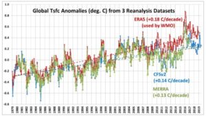
Here’s a comparison of the global-average surface air temperature variations from three reanalysis datasets: ERA5 (ECMWF), CFSv2 (NOAA/NCEP), and MERRA (NASA/GSFC). Note that only CFSv2 covers the full period, January 1979 to July 2019:

ERA5 has a substantially warmer trend than the other two. By differencing ERA5 with the other datasets we can see that there are some systematic changes that occur in ERA5, especially around 2009-2010, as well as after 1998:

Why You Shouldn’t Draw Trend Lines on Graphs

by Kip Hansen,  August 6, 2019 in WUWT


What we call a graph is more properly referred to as “a graphical representation of data.”  One very common form of graphical representation is “a diagram showing the relation between variable quantities, typically of two variables, each measured along one of a pair of axes at right angles.”

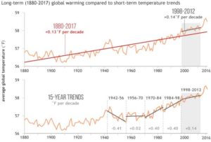
Here at WUWT we see a lot of graphs —  all sorts of graphs of a lot of different data sets.  Here is a commonly shown graph offered by NOAA taken from a piece at Climate.gov called “Did global warming stop in 1998?” by Rebecca Lindsey published on September 4, 2018.


I am not interested in the details of this graphic representation — the whole thing qualifies as “silliness”.  The vertical scale is in degrees Fahrenheit and the entire range change over 140 years shown is on the scale 2.5 °F or about a degree and a half C.   The interesting thing about the graph is the effort of drawing of “trend lines” on top of the data to convey to the reader something about the data that the author of the graphic representation wants to communicate.  This “something” is an opinion — it is always an opinion — it is not part of the data.

The data is the data.  Turning the data into a graphical representation (all right, I’ll just use “graph” from here on….), making the data into a graph has already  injected opinion and personal judgement into the data through choice of start and end dates, vertical and horizontal scales and, in this case, the shading of a 15-year period at one end.  Sometimes the decisions as to vertical and horizontal scale are made by software — not rational humans —  causing even further confusion and sometimes gross misrepresentation.

Anyone who cannot see the data clearly in the top graph without the aid of the red trend lineshould find another field of study (or see their optometrist).  The bottom graph has been turned into a propaganda statement by the addition of five opinions in the form of mini-trend lines.

La localisation temporelle et géographique des stations de mesure de la température pose des problèmes

by Carl-Stéphane Huot, 30 juillet 2019 in ScienceClimatEnergie


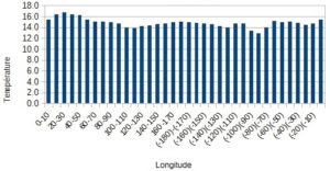
La notion de réchauffement climatique préoccupe bon nombre de gens depuis des années. Cependant, ce réchauffement apparent pourrait être influencé par le déplacement de stations météorologiques vers les zones plus chaudes de la planète, soit plus  près de l’équateur, soit à des altitudes plus basses.  La modélisation du climat est aussi influencée par l’existence de régions sans, ou avec très peu, de stations météorologiques.

Graphique 1 : Température moyenne selon la classe de longitude.

Conclusion

La variation extrêmement élevée du nombre de stations météorologiques servant au calcul de la température mondiale a contribué depuis le début des années 1950 à une partie au moins de l’élévation de  température. La dérive de celles-ci d’une place à l’autre fausse la précision des données que l’on peut en tirer, et contribue à augmenter l’inquiétude de la population. L’emplacement et le nombre de stations à installer posent un certain nombre de problèmes autant scientifiques que techniques et  politiques, et rend, avec d’autres éléments, (par exemple l’effet d’urbanisation, non abordé ici) extrêmement difficile de parler de réchauffement climatique.

Temps far, far below normal across almost the entire territory of European Russia

by Robert, August 4, 2019 in IceAgeNow


We’re talking about record-breaking cold across an area almost half as big as the entire contiguous United States.

2 Aug 2019 – In a number of points in the north-east of the territory, the temperature dropped to record lows. In the capital of the Komi Republic, in Syktyvkar, it dropped to 2.7 degrees, which is 0.3 degrees lower than the previous record held since 1944.

Not only in the northern areas, the temperature also dropped to critical levels. In Voronezh the thermometers showed +7 degrees, leaving behind the previous record of +7.1 degrees in 1971.

Further south, in Saratov, the minimum temperature on the first day of August was 9.6, beating the previous record of 10.4 degrees set in 1948.

The cold also hit Azov. In Tsimlyansk, Rostov Region, on August 1 the temperature fell to 13.3 degrees. The previous record, 13.6, was noted in 1975.

On the first day of August, the average temperature across almost the entire territory of European Russia was 4-6 degrees below normal, and in the Volga region it did not reach the average long-term values ​​of 8 degrees.

Cold weather throughout the territory from the White to the Black Sea will continue for at least another week.

European Russia covers nearly 4,000,000 km2 (1,500,000 sq mi).
Together, the 48 contiguous states and Washington, D.C. occupy a combined area of 8,080,464.3 km2 (3,119,884.69 sq miles).

http://www.hmn.ru/index.php?index=2&nn=62368

July 2019 Was Not the Warmest on Record

by Roy Spencer, August 2, 2019 in GlobalWarming


July 2019 was probably the 4th warmest of the last 41 years. Global “reanalysis” datasets need to start being used for monitoring of global surface temperatures. [NOTE: It turns out that the WMO, which announced July 2019 as a near-record, relies upon the ERA5 reanalysis which apparently departs substantially from the CFSv2 reanalysis, making my proposed reliance on only reanalysis data for surface temperature monitoring also subject to considerable uncertainty].


See also here

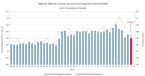
Relation entre l’ activité sismique dans les océans et le réchauffement global (août 2019)

c/o Luc Trullemans,  août 2019 in PublicMétéo


Introduction

Une forte relation à été observée ces dernières années entre de l’activité sismique dans les océans et le récent réchauffement climatique  (CSARGW ,Correlation of Seismic Activity and Recent Global Warming) .

Cette corrélation entre de l’activité sismique océanique et le réchauffement climatique avait déjà été remarquée de 1979 à 2016 (CSARGW16) et vient d’être confirmée jusqu’en 2018.

Dans cette note, on démontre que  l’activité sismique dans les océans ( =>tremblements de terre de magnitude 4-6) provoque des flux géothermiques sous-marins et ont une relation importante avec les fluctuations de la température globale des océans (SST) et de la température globale de l’air (GT).

Ceci avance une nouvelle l’hypothèse selon laquelle l’activité sismique océanique pourrait être  un des paramètres  les plus importants dans la variation de la température globale.


Hockey Stick Groundhog Day

by P. Homewood, August, 1, 2019 in NotaLotofPeopleKnowThat


Some ancient history

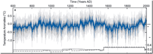
Fifteen to twenty years ago, Michael Mann and colleagues wrote a few papers claiming that current warming was unprecedented over the last 600 to 2000 years.  Other climate scientists described Mann’s work variously as crap, pathetic, sloppy, and crap.  These papers caught the interest of Stephen McIntyre and this led to the creation of his Climate Audit blog and the publication of paperspointing out the flaws in these hockey stick reconstructions. In particular, Mcintyre and his co-author Ross McKitrick showed that the method used by Mann and colleagues shifted the data in such a way that any data sets that showed an upward trend in the 20th century would receive a stronger weighting in the final reconstruction.  With this method, generation of a hockey-stick shape in the temperature reconstruction was virtually guaranteed, which M&M demonstrated by feeding in random numbers to the method.

‘Hidden’ NOAA temperature data reveals that 6 of the last 9 months were below normal in the USA – and NOAA can’t even get June right

by Anthony Watts, July 30, 2019 in WUWT


A review of state-of-the-art climate data tells a different story than what NOAA tells the public.

While media outlets scream “hottest ever” for the world in June and July (it’s summer) and opportunistic climate crusaders use those headlines to push the idea of a “climate crisis” the reality is for USA is that so far most of 2019 has been below normal, temperature-wise.

Little known data from the state of the art U.S. Climate Reference Network (which never seems to make it into NOAA’s monthly “state of the climate” reports) show that for the past nine months, six of them were below normal, shown in bold below.

201810 -0.18°F
201811 -2.56°F
201812 2.39°F
201901 0.63°F
201902 -3.15°F
201903 -2.81°F
201904 1.55°F
201905 -1.13°F
201906 -0.14°F

Above: Table 1, U.S. average temperature anomaly from October 2018 to June 2019. Full data file here

New Attempts To Erase The MWP & LIA

by P. Homewood, July 29, 2019 in NotaLotofPeopleKnowThat


There have been many attempts to get rid of the Medieval Warming Period and Little Ice Age, and here’s another one:

The science teams reconstructed the climate conditions that existed over the past 2,000 years using 700 proxy records of temperature changes, including tree rings, corals and lake sediments. They determined that none of these climate events occurred on a global scale.

https://www.bbc.co.uk/news/science-environment-49086783

As with the other failed attempts, this latest one claims that the MWP and LIA were only localised phenomena. But nothing could be further from the truth.

These three new studies rely on proxies, but time and again hockey stick studies based on proxies are proven to be fake, based on cherry picked proxies and dodgy statistics.

In fact, we have no need to rely on proxies, because the actual evidence of warm and cold periods is very real and substantial across the world.

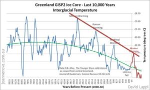
We are all familiar with the evidence from Greenland ice cores, which clearly show both the MWP and LIA:

http://www.kaltesonne.de/temperatures-over-the-past-10000-years/


Anti science L. A. Times hypes propaganda denying global wide Medieval Warm Period and Little Ice Age

by Larry Hamlin, July 28, 2019 in WUWT


The Los Angeles Times is at it again hyping anti science climate alarmist propaganda trying to conceal the global wide Medieval Warm Period and the Little Ice Age that are supported and justified by hundreds of scientific studies.

This climate alarmist propaganda Times article cites a new “study” that ridiculously attempts to deny these clearly established warm and cool periods in our past.

This alarmist hyped new “study” is addressed in a superb article at the JoNova website demonstrating the complete lack of scientific veracity of this studies claims.

There is nothing I can add to show how politically contrived and inane the claims are from this new “study” beyond the excellent presentation in the JoNova article.

Provided below are excerpts from this excellent article which demonstrate the lack of scientific credibility of the new “study” as well as the politically driven anti science climate alarmism bias of the Times.


‘Hidden’ NOAA temperature data reveals that 6 of the last 9 months were below normal in the USA – and NOAA can’t even get June right

by Anthony Watts, July 30 2019 in WUWT


A review of state-of-the-art climate data tells a different story than what NOAA tells the public.

While media outlets scream “hottest ever” for the world in June and July (it’s summer) and opportunistic climate crusaders use those headlines to push the idea of a “climate crisis” the reality is for USA is that so far most of 2019 has been below normal, temperature-wise.

Little known data from the state of the art U.S. Climate Reference Network (which never seems to make it into NOAA’s monthly “state of the climate” reports) show that for the past nine months, six of them were below normal, shown in bold below.


201810 -0.18°F
201811 -2.56°F
201812 2.39°F
201901 0.63°F
201902 -3.15°F
201903 -2.81°F
201904 1.55°F
201905 -1.13°F
201906 -0.14°F

Above: Table 1, U.S. average temperature anomaly from October 2018 to June 2019. Full data file here

Note the below average value for June, 2019 at -0.14°F

Figure 1, U.S. average temperature anomaly from January 2005 to June 2019. Source of graph, NOAA, available here

China is warming fastest where the cities are, not where the models predicted – classic UHI

by JoNova, July 24, 2019


The biggest changes in temperature (“divergence” in dark red brown Fig 6) occurred where the most people lived (blue dots). In the 60 years to 2010 China was reported to have warmed by 0.79 ± 0.10 °C. However Scafetta et al calculate at most, China could have experienced a real warming of only 0.46 ± 0.13 °C.

Somehow the combined might and supercomputers at NOAA, NASA, Hadley and the Bureau of Met experts all missed this.

It’s another third of a degree gone from the Glorious CO2 Narrative. Just like that.


Is there a  more perfect nation to study the Urban Heat Island effect than China?

The worlds most populous nation has made a blistering transformation in two decades. As recently as 1995 the population was 75% rural. Now it’s approaching 60% urban. Shenzhen, which is near Hong Kong, grew from 3000 people in 1950 to more than 10 million in 2010. Around Beijing, thousands of towns have been built in a networked carpet, each a mere 2km apart (zoom in on Google satellite view). The stations in these areas are effectively not rural anymore.

See also here

1970s: Earth Warmed 0.6°C From 1880-1940 And Cooled -0.3°C From 1940-1970. Now It’s 0.1°C And -0.05°C.

by K. Richard, July 25, 2019 in NoTricksZone


About 45 years ago, the “consensus” in climate science (as summarized by Williamson, 1975) was quite different than today’s version.

1. The Medieval Warm Period was about 1°C warmer than present overall while the “largely ice-free” Arctic was 4°C warmer, allowing the Vikings to navigate through open waters because there was “no or very little ice” at that time.
2. The island of Spitsbergen, 1237 km from the North Pole and home to over 2000 people, “benefited” because it warmed by 8°C between 1900 and 1940, resulting in 7 months of sea-ice free regional waters. This was up from just 3 months in the 1800s.
3. Central England temperatures dropped -0.5°C between the 1930s to the 1950s.
4. Pack-ice off northern and eastern iceland returned to its 1880s extent between 1958 and 1975.
5. In the 1960s, polar bears were able to walk across the sea (ice) from Greenland to Iceland for the first time since the early 1900s. (They had somehow survived the 7 months per year of sea-ice-free waters during the 1920s-1940s).


Image Source: National Academy of Sciences,  Understanding Climatic Change