Archives de catégorie : climate-debate

Less Ice In Arctic Ocean 6000-7000 Years Ago

by Geological Survey of Norway, October 20, 2008 in ScienceDaily


Recent mapping of a number of raised beach ridges on the north coast of Greenland suggests that the ice cover in the Arctic Ocean was greatly reduced some 6000-7000 years ago. The Arctic Ocean may have been periodically ice free.

”The climate in the northern regions has never been milder since the last Ice Age than it was about 6000-7000 years ago. We still don’t know whether the Arctic Ocean was completely ice free, but there was more open water in the area north of Greenland than there is today,” says Astrid Lyså, a geologist and researcher at the Geological Survey of Norway (NGU).

Scientists Document No Clear Warming Role For CO2 During The Last Deglaciation – Or The Last 10,000 Years

by K. Richard, April 4, 2019 in NoTricksZone


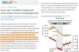
A new paper indicates the rise in CO2 concentration occurred well after the Northern Hemisphere’s ocean circulation changes drove the abrupt warming (~11,700 years ago) that ended the last ice age – a lag that effectively leaves no causal role for CO2 during deglaciation.


Australia Surface Temperatures Compared to UAH Satellite Data Over the Last 40 Years

by Roy Spencer, April 3, 2019 in GlobalWarming


Summary: The monthly anomalies in Australia-average surface versus satellite deep-layer lower-tropospheric temperatures correlate at 0.70 (with a 0.57 deg. C standard deviation of their difference), increasing to 0.80 correlation (with a 0.48 deg. C standard deviation of their difference) after accounting for precipitation effects on the relationship. The 40-year trends (1979-2019) are similar for the raw anomalies (+0.21 C/decade for Tsfc, +0.18 deg. C for satellite), but if the satellite and rainfall data are used to estimate Tsfc through a regression relationship, the adjusted satellite data then has a reduced trend of +0.15 C/decade. Thus, those who compare the UAH monthly anomalies to the BOM surface temperature anomalies should expect routine disagreements of 0.5 deg. C or more, due to the inherently different nature of surface versus tropospheric temperature measurements.

Conclusions

The UAH tropospheric temperatures and BOM surface temperatures in Australia are correlated, with similar variability (0.70 correlation).
Accounting for anomalous rainfall conditions increases the correlation to 0.80. The Tsfc trends have a slightly greater warming trend than the tropospheric temperatures, but the reasons for this are unclear. Users of the UAH data should expect monthly differences between the UAH and BOM data of 0.6 deg. C or so on a rather routine basis (after correcting for their different 30-year baselines used for anomalies: BOM uses 1961-1990 and UAH uses 1981-2010).

Higher energy demand drove up global CO2 emissions in 2018

by IEA, April 7, 2019


Higher energy demand drove up global CO2 emissions in 2018
We released our second annual report on global energy trends last week, highlighting that energy demand worldwide grew by 2.3% in 2018, its fastest pace this decade, thanks to a strong global economy and higher demand for heating and cooling.
Natural gas emerged as the fuel of choice, posting the biggest gains and accounting for 45% of the rise in energy consumption. Solar and wind generation grew at double-digit pace, with solar alone increasing by 31%. Still, that was not fast enough to meet higher electricity demand around the world that also drove up coal use.

As a result, global energy-related CO2 emissions rose by 1.7% to 33 Gigatonnes (Gt) with coal use in power generation alone surpassing 10 Gt and accounting for a third of total emissions. The majority of that was from coal-fired generation capacity in Asia, with a fleet of young power plants that are decades short of average lifetimes of around 50 years.

CO2 Emissions Up As Europeans Switch From Diesel To Gasoline Cars

by K. Oroschakoff, April 6, 2019 in WUWT


The aftermath of the Dieselgate scandal is pushing drivers to switch from diesel to gasoline cars, undermining efforts to cut carbon dioxide emissions from road transport.

Average CO2 emissions from new cars rose in 2017 for the first time since 2010 — largely due to the fuel change, according to final data released by the European Environment Agency (EEA) on Thursday.

That’s bad news for the EU’s efforts to cut emissions by at least 40 percent by 2030. Cars are responsible for around 12 percent of total EU CO2 emissions, according to the European Commission.

The EEA said that average CO2 emissions from new cars sold in 2017 increased by 0.4 grams of CO2 per kilometer to 118.5 grams, up from 118.1 grams in 2016. Under EU rules, carmakers need to meet a fleet-wide target of 95 grams by 2021.

Since 2010, emissions from new cars have fallen by 15.5 percent, or almost 22 grams of CO2 per kilometer; but emission reductions slowed between 2015 and 2016.

The rise in car pollution in 2017 is “stark confirmation that car makers need to achieve further and faster improvements in manufacturing and promoting more efficient cars,” the EEA said.

What’s the worst case? Climate sensitivity

by Judith Curry, April 1, 2019 in WUWT


Are values of equilibrium climate sensitivity > 4.5 C plausible?

For background, see these previous posts on climate sensitivity [link]

Here are some possibilistic arguments related to climate sensitivity.  I don’t think the ECS example is the best one to illustrate these ideas [see previous post], and I probably won’t include this example in anything I try to publish on this topic (my draft paper is getting too long anyways).  But possibilistic thinking does point you in some different directions when pondering the upper bound of plausible ECS values.

5. Climate sensitivity

Equilibrium climate sensitivity (ECS) is defined as the amount of temperature change in response to a doubling of atmospheric CO2 concentrations, after the climate system has reached equilibrium. The issue with regards to ECS is not scenario discovery; rather, the challenge is to clarify the upper bounds of possible and plausible worst cases.

The IPCC assessments of ECS have focused on a ‘likely’ (> 66% probability) range, which has mostly been unchanged since Charney et al. (1979), to be between 1.5 and 4.5 oC. The IPCC AR4 (2007) did not provide any insight into a worst-case value of ECS, stating that values substantially higher than 4.5 oC cannot be excluded, with tail values in Figure 9.20 exceeding 10 oC. The IPCC AR5 (2013) more clearly defined the upper range, with a 10% probability of exceeding 6 oC.

Since the IPCC AR5, there has been considerable debate as to whether ECS is on the lower end of the likely range (e.g., < 3 oC) or the higher end of the likely range (for a summary, see Lewis and Curry, 2018). The analysis here bypasses that particular debate and focuses on the upper extreme values of ECS.

The Little Ice Age – Back to the Future

by Jim Steele, April 4, 2019 in WUWT


Extreme scientists and politicians warn we will suffer catastrophic climate change if the earth’s average temperature rises 2.7°F above the Little Ice Age average. They claim we are in a climate crisis because average temperature has already warmed by 1.5°F since 1850 AD. Guided by climate fear, politicians fund whacky engineering schemes to shade the earth with mirrors or aerosols to lower temperatures. But the cooler Little Ice Age endured a much more disastrous climate.

The Little Ice Age coincides with the pre-industrial period. The Little Ice Age spanned a period from 1300 AD to 1850 AD, but the exact timing varies. It was a time of great droughts, retreating tree lines, and agricultural failures leading to massive global famines and rampant epidemics. Meanwhile advancing glaciers demolished European villages and farms and extensive sea ice blocked harbors and prevented trade.

2019 Hurricane season forecast: below average

by Anthony Watts, April 4, 2019 in WUWT


Dr. Philip Klotzbach of Colorado State University writes on Twitter:

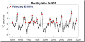
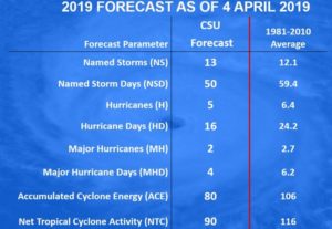
Seasonal #hurricane forecast from @ColoradoStateU predicts slightly below-average season: 13 named storms, 5 hurricanes & 2 major (Cat 3+, >=111 mph) hurricanes. Primary reason for slightly below-avg forecast is anticipated continuation of weak #ElNino.

We anticipate that the 2019 Atlantic basin hurricane season will have slightly belownormal activity. The current weak El Niño event appears likely to persist and perhaps even strengthen this summer/fall. Sea surface temperatures averaged across the tropical Atlantic are slightly below normal, and the far North Atlantic is anomalously cool.

Our Atlantic Multi-decadal Oscillation index is below its long-term average. We anticipate a slightly below-average probability for major hurricanes making landfall along the continental United States coastline and in the Caribbean. As is the case with all hurricane seasons, coastal residents are reminded that it only takes one hurricane making landfall to make it an active season for them. They should prepare the same for every season, regardless of how much activity is predicted.

PROBABILITIES FOR AT LEAST ONE MAJOR (CATEGORY 3-4-5) HURRICANE LANDFALL ON EACH OF THE FOLLOWING COASTAL AREAS:

1) Entire continental U.S. coastline – 48% (average for last century is 52%)

2) U.S. East Coast Including Peninsula Florida – 28% (average for last century is 31%)

3) Gulf Coast from the Florida Panhandle westward to Brownsville – 28% (average for last century is 30%)

PROBABILITY FOR AT LEAST ONE MAJOR (CATEGORY 3-4-5) HURRICANE TRACKING INTO THE CARIBBEAN

(10-20°N, 88-60°W) 1) 39% (average for last century is 42%)

CBC Claims Canada Warming Twice As Fast As Globe, Yet Data Tell A Different Story: No Warming In 25 Years!

by P. Gosselin, April 3, 2019 in NoTricksZone


Canada’s CBC here recently cited “a leaked report” which claimed Canada is “warming at twice the global rate.”

According to the “leaked report”, Canada’s annual average temperature over land has warmed 1.7 C when looking at the data since 1948. But that claim is misleading when recent data is considered.

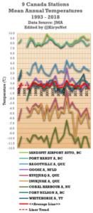
Over the past 25 years, since scientists began to warn that the planet was warming in earnest, there has not been any warming when one looks at the untampered data provided by the Japan meteorology Agency (JMA) that were measured by 9 different stations across Canada. These 9 stations have the data dating back to around 1983 or 1986, so I used their datasats.

Looking at the JMA database and plotting the stations with longer term recording, we have the following chart:

Another New Study Supports Early 21st Century Warming Hiatus Was Real

by P. Gosselin, April 2, 2019 in NoTricksZone


A number of scientists from the alarmist camp like to insist that there had never been such a hiatus. The latest paper contradicts that claim.

The new study states that many published analyses show that lightning activity is responsive to temperature on time scales ranging from the diurnal to the decadal and that the hiatus in global warming earlier this century can be seen in several global datasets.

Scientists found that the statistically flat behavior of the global lightning record from the NASA Lightning Imaging Sensor over the same decadal period is consistent with this hiatus in global warming.

What follows is the paper’s abstract:

Multiple records of global temperature contain periods of decadal length with flat or declining temperature trend, often termed a ‘hiatus’. Towards assessing the physical reality of two such periods (1940–1972 and 1998–2014), lightning data are examined. Lightning activity is of particular interest because on many different time scales it has been shown to be non-linearly dependent on temperature. During the earlier hiatus, declining trends in regional thunder days have been documented. During the more recent hiatus, lightning observations from the Lightning Imaging Sensor in space show no trend in flash rate. Surface-based, radiosonde-based and satellite-based estimates of global temperature have all been examined to support the veracity of the hiatus in global warming over the time interval of the satellite-based lightning record. Future measurements are needed to capture the total global lightning activity on a continuous basis.”

Sizzling March?

by P. Homewood, April 3, 2019 in NotaLotofPeopleKnowThat


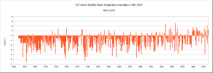
According to CET, March 2019 was the 17th warmest on record since 1659, 1.2C higher than the 1981-2010 average.

Sound impressed? No, thought not!

The month as a whole actually seemed to be pretty unremarkable. There was some mild weather at the start of the month, accompanied by very wet weather. The last few days were also pleasant and sunny.

But unusually warm?

The graph at the top gives a bit of perspective.

First of all it is obvious that last month was pretty typical of Marchs during the last 30 years or so.

The fact that it is 1.2C above the 30-year average means little, as natural variability means some years are warmer and others cooler, such as last year. That’s what an average is.

Indeed, in the last 30 years, eleven had March anomalies of 1C or more. Six of these years were warmer than this March.

By far the warmest Marchs were in 1957 and 1938, again suggesting that there was nothing unusual about last month.


The other thing which stands out is that most Marchs used to be much colder than normal until the 1980s.

https://www.metoffice.gov.uk/hadobs/hadcet/cetmaxdly1878on_urbadj4.dat

see also here (WUWT)

State of the Climate 2018

by Prof. Ole Humlum, April 2 , 2019 in GWPF


That’s according to Norwegian Professor Ole Humlum whose annual review of the world’s climate is published today by the Global Warming Policy Foundation.
 
Last week, the WMO issued its own review of the climate, which insinuated that global warming was worsening. However, Professor Humlum points out that the data tells a very different story:
 
“Reading the WMO report, you would think that global warming was getting worse. But in fact it is carefully worded to give a false impression. The data are far more suggestive of an improvement than a deterioration.”
 
And the lack of anything to be alarmed about is clear across a range of measures, says Professor Humlum:
 
“After the warm year of 2016, temperatures last year continued to fall back to levels of the so-called warming “pause” of 2000-2015. There is no sign of any acceleration in global temperature, hurricanes or sea-level rise. These empirical observations show no sign of acceleration whatsoever.”


Professor Humlum’s key findings:
 

  • In 2018, the average global surface temperature continued a gradual descent towards the level characterising the years before the strong 2015–16 El Niño episode. 
  • Since 2004, when the Argo floats came into operation, the global oceans above 1900m depth have on average warmed somewhat. The maximum warming (between the surface and 120 m depth) mainly affects oceans near the equator, where the incoming solar radiation is at a maximum. In contrast, net cooling has been pronounced for the North Atlantic since 2004.
  • Data from tide gauges all over the world suggest an average global sea-level rise of 1– 1.5 mm/year, while the satellite record suggests a rise of about 3.2 mm/year. The large difference between the two data sets still has no broadly accepted explanation.
  • The Northern Hemisphere snow cover extent has undergone important local and regional variations from year to year. The overall global tendency since 1972, however, is for overall stable snow extent.
  • Tropical storm and hurricane accumulated cyclone energy (ACE) values since 1970 have displayed large variations from year to year, but no overall trend towards either lower or higher activity. The same applies for the number of hurricane landfalls in the continental United States, for which the record begins in 1851.

see also here

Fabricating A Warming: NASA Now Altering ‘Unadjusted” Data To Create New, Warmer ‘Unadjusted’ Data

by P. Gosselin, March 31, 2019 in NoTricksZone


By Kirye

and Pierre Gosselin

One fellow climate blogger recently wrote on how he’s been been looking at GHCN ‘unadjusted’ data and noticed that scientists at NASA appear to have been altering them: “This is a fairly disturbing development,” he wrote.

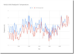
Heating up Reykjavik and Nuuk

Cited as an example is Reykyavik, Iceland. According to Tony Heller here, “The current version V4 has massively cooled the past, to make it look like Iceland is warming.”

Heller then posted a chart showing the difference between v2 unadjusted and the new v4 ‘unadjusted’ for the Reykjavik station.


Spreadsheet

Heller also found here that the same appears to be the case for Nuuk, Greenland as well.

Scientists: The CO2 Greenhouse Effect Was Cancelled Out By Clouds During 1992-2014

by K. Richard, March 28, 2019 in NoTricksZone


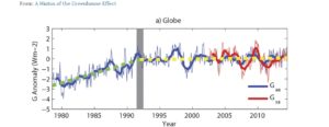
An unheralded but significant 2016 scientific paper – “A Hiatus of the Greenhouse Effect” – is now publicly available.

Scientists have found the greenhouse effect’s (GHE) influence on planetary temperatures went on “hiatus” during 1992-2014.

The estimated GHE radiative influence for these 22 years was a slightly negative -0.04 Wm-2 per year.

The reason why the GHE influence went on hiatus in recent decades is that (a) decadal-scale changes in cloud cover exert dominant radiative control in longwave forcing (GHE) efficacy, and (b) the shortwave effects of cloud cover changes override the radiative longwave effects, meaning that a decrease in cloud cover will allow more direct shortwave radiation to be absorbed by the Earth system, eliciting a net positive imbalance in the energy budget.


New paper: Urbanization has increased minimum temperatures 1.7K in the UK

by Ian L.M. Goddard & S. Bett, Marcy 21, 2019 in WUWT


Abstract

This study aims to estimate the affect of urbanisation on daily maximum and minimum temperatures in the United Kingdom. Urban fractions were calculated for 10 km × 10 km areas surrounding meteorological weather stations. Using robust regression a linear relationship between urban fraction and temperature difference between station measurements and ERA‐Interim reanalysis temperatures was estimated.

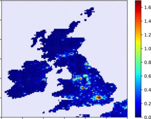
For an urban fraction of 1.0, the daily minimum 2‐m temperature was estimated to increase by 1.90 ± 0.88 K while the daily maximum temperature was not significantly affected by urbanisation. This result was then applied to the whole United Kingdom with a maximum T min urban heat island intensity (UHII) of about 1.7K in London and with many UK cities having T min UHIIs above one degree.

This paper finds through the method of observation minus reanalysis that urbanisation has significantly increased the daily minimum 2‐m temperature in the United Kingdom by up to 1.70 K.

Figure 5 Map showing the change in T min due to the urbanisation at the 10 km × 10 km scale over the United Kingdom and Ireland. The colour bar shows the magnitude of the temperature change in K

Methane warming exaggerated by 400%

by Barry Brill, March 30, 2019 in WUWT


The IPCC’s AR5 estimated the global warming caused by a tonne of livestock methane would be 28 times that of a tonne of carbon dioxide. New research destroys that estimate.

The war on meat has been gathering pace amongst our Western elites. The Economist makes a detailed case for “plant-based food” in the interests of quelling climate change –

The FAO calculates that cattle generate up to two-thirds of the greenhouse gases from livestock, and are the world’s fifth largest source of methane. If cows were a country, the United Herds of Earth would be the planet’s third largest greenhouse-gas emitter.

These calculations are based on figures supplied by the IPCC’s AR5, which contends that the global warming potential (GWP) of methane over 100 years is no less than 28 times the global warming it expects to be caused by an equivalent weight of carbon dioxide. This estimate is up from the GWP of 21 put forward in the IPCC’s previous report.

All this is now challenged by a new and authoritative research paper, Allen et al (2017): “A solution to the misrepresentations of CO2-equivalent emissions of short-lived climate pollutants, under ambitious mitigation”. This paper finds that conventional GWPs misrepresent the impact of short-lived gases (such as methane) on global temperature – and recommends the adoption of a new metric, denoted as GWP*.

Deep-water circulation changes lead North Atlantic climate during deglaciation

by F. Muschitiello et al., March 20, 2019 in Nature


Abstract

Constraining the response time of the climate system to changes in North Atlantic Deep Water (NADW) formation is fundamental to improving climate and Atlantic Meridional Overturning Circulation predictability. Here we report a new synchronization of terrestrial, marine, and ice-core records, which allows the first quantitative determination of the response time of North Atlantic climate to changes in high-latitude NADW formation rate during the last deglaciation. Using a continuous record of deep water ventilation from the Nordic Seas, we identify a 400-year lead of changes in high-latitude NADW formation ahead of abrupt climate changes recorded in Greenland ice cores at the onset and end of the Younger Dryas stadial, which likely occurred in response to gradual changes in temperature- and wind-driven freshwater transport. We suggest that variations in Nordic Seas deep-water circulation are precursors to abrupt climate changes and that future model studies should address this phasing.

Indications Point To Upcoming Solar Cycle 25 Being Among The Weakest In 200 Years

by F. Bosse and F. Vahrenholt, March 29, 2019 in NoTricksZone


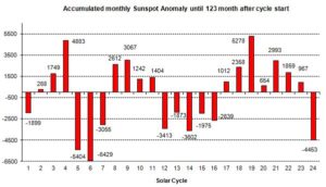
The sun was also very sub-normally active in February. Although we are in the middle of the minimum, the sunspot number of 0.8 for the 123rd month into the cycle is very low. On 26 days of the month no spots were visible, only on 2 days was there a little, symmetrically distributed over both solar hemispheres.The only exciting question currently: When will the minimum be finished and will solar cycle 25 begin? Although 6 spots of the new cycle were already visible in February with a significantly higher resolution, estimates are difficult.March again was dominated by some spots of the “old” SC24.  The rule: “weaker cycles often last longer than stronger cycles” could hold.

Figure 2: The strength of the sunspot activity of each cycle in comparison. The numbers in the diagram are obtained by adding up the monthly deviations between the observed values and the mean value (blue in Fig.1) up to the current 123rd cycle month.

Figure 2 shows that five cycles (No. 8, 15, 16, 18, 22) did not have a month 123 at all. Instead the following cycle started. In this respect, the picture is now somewhat distorted towards the end of the cycle.

See also here in GWPF

EU consumption results in high carbon emissions from tropical deforestation, studies show

by Charles the moderator, March 29, 2019 in WUWT


Chalmers University of Technology

A sixth of all emissions resulting from the typical diet of an EU citizen can be directly linked to deforestation of tropical forests. Two new studies, from Chalmers University of Technology, Sweden, shed new light on this impact, by combining satellite imagery of the rainforest, global land use statistics and data of international trade patterns.

“In effect, you could say that the EU imports large amounts of deforestation every year. If the EU really wants to achieve its climate goals, it must set harder environmental demands on those who export food to the EU,” says Martin Persson from Chalmers, one of the researchers behind the studies.

The link between production of certain foods and deforestation has been known before. But what Martin Persson and Chalmers colleague Florence Pendrill have now investigated is the extent to which deforestation in the tropics is linked to food production, and then where those foods are eventually consumed. In the first study, they focused on how the expansion of cropland, pastures, and forestry plantations has taken place at the expense of the rainforest.

196595_web

Emissions sources for deforestation-related carbon dioxide emissions are diverse and vary by region. Emissions embodied in production are shown for each commodity group within each region. A region’s width on the x-axis corresponds to the embodied emissions produced in that region, while the y-axis shows the share of emission attributed to each commodity group within each region, implying that the rectangles within the plot are scaled according to the emissions embodied in each region-commodity combination. The percentages within the rectangles indicate the share of the total embodied emissions; 2.6?gigatonnes of carbon dioxide due to tropical deforestation during the period 2010-2014.
Credit: Florence Pendrill, Chalmers University of Technology


Wildfires Declining In Southern Europe

by P. Homewood, March 28, 2019 in NotaLotofPeopleKnowThat


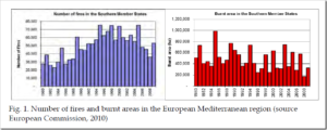
1. Introduction Fires are an integral component of ecosystem dynamics in European landscapes. However, uncontrolled fires cause large environmental and economic damages, especially in the Mediterranean region. On average, about 65000 fires occur in Europe every year, burning approximately half a million ha of wildland and forest areas; most of the burnt area, over 85%, is in the European Mediterranean region. Trends in number of fires and burnt areas in the Mediterranean region are presented in Fig. 1. Recent analyses of the available data in the European Forest Fire Information System (EFFIS) show that over 95% of the fires in Europe are human-induced. The split of causes shows that most of them are due to misuse of traditional practices of straw burning of shrub-burning to recover areas for cattle feeding. Although European countries have collected information on forest fires since 1970s, the lack of harmonized information at the European level has prevented a holistic approach for forest fire prevention in the Region. The European Forest Fire Information System (EFFIS) has been developed jointly by the European Commission (EC) services (Directorate General Environment and the Joint Research Centre) and the relevant fires services in the countries (forest fires and civil protection services) in response to the needs of European bodies such as the Monitoring and Information Centre of Civil Protection, the European Commission Services and the European Parliament. EFFIS is a comprehensive system covering the full cycle of forest fire management, from forest fire prevention and preparedness to post-fire damage analysis (see Fig. 2). The system is providing information to over 30 countries in the European and Mediterranean regions, and receives detailed information of forest fire events from 22 European countries. It supports forest fire prevention and forest fire fighting in Europe through the provision of timely and reliable information on forest fires.

Again Reality Goes In Opposite Direction Of Climate Models…”Confidence In Models Correspondingly Low”

by P. Gosselin, March 27, 2019 in NoTricksZone


Real vegetation development in southern Africa takes a very different course than claimed by climate models

By Die kalte Sonne
(German translated by P Gosselin)

Climate models provide answers to all conceivable questions about the future. Political decision-makers are grateful for this information because they can make their plans accordingly.

But are the forecasts derived from models correct at all?

A research team led by Timm Hoffman has now compared the model projections with real vegetation development in southern Africa using historical photos. The sobering result: Nature has mostly developed quite differently than assumed by the models. In contrast to the model assumptions, no significant long-term trend in precipitation could be observed. Vegetation belts, which were supposed to shrink, ended up expanding. Confidence in the models is correspondingly low.

Political planning or even CO2 damage calculations based on the simulations are not possible. Here is the abstract of the work published in the journal Anthropocene in March 2019:

Southern Africa vegetation expanding, images show. Source: here.

INFO-SCE: 5% d’augmentation de production d’électricité en Chine : cela fait quoi?

by Science,  Climat et Energie, 27 mars 2019


Selon le dernier rapport de l’IEA, la consommation d’énergie mondiale a augmenté de 2,3% en 2018 ce qui représente la plus forte augmentation des dix dernières années. Le gaz naturel fut le plus consommé et représente 45% de l’augmentation de la consommation totale d’énergie.

Suite à cette augmentation de consommation d’énergie les émissions de CO2 se sont accrues de 1,7% pour atteindre 33,1 Gt en 2018. Près d’un tiers de ces émissions provient des centrales de charbon, surtout celles de la Chine.

Il faut noter que les émissions de CO2 en Chine ont augmenté de 2,5%, ou 230 Mt, pour atteindre 9,5 Gt. Un bond de plus de 5% de la production d’électricité à partir de centrales au charbon a entraîné une augmentation des émissions de 250 Mt, ce qui a plus que compensé l’impact de la baisse de l’utilisation du charbon en dehors du secteur de l’énergie.

Pour comparer…la Belgique émet 115 Mt de CO2.

DONC…l’augmentation des émissions en Chine dues au charbon en 2018 représente plus du double de toutes les émissions de CO2 de la Belgique.

Report : The “New Energy Economy”: An Exercise in Magical Thinking

by Mark P. Mills, March 26, 2019 in ManhattanInstitute


EXECUTIVE SUMMARY

A movement has been growing for decades to replace hydrocarbons, which collectively supply 84% of the world’s energy. It began with the fear that we were running out of oil. That fear has since migrated to the belief that, because of climate change and other environmental concerns, society can no longer tolerate burning oil, natural gas, and coal—all of which have turned out to be abundant.

So far, wind, solar, and batteries—the favored alternatives to hydrocarbons—provide about 2% of the world’s energy and 3% of America’s. Nonetheless, a bold new claim has gained popularity: that we’re on the cusp of a tech-driven energy revolution that not only can, but inevitably will, rapidly replace all hydrocarbons.

This “new energy economy” rests on the belief—a centerpiece of the Green New Deal and other similar proposals both here and in Europe—that the technologies of wind and solar power and battery storage are undergoing the kind of disruption experienced in computing and communications, dramatically lowering costs and increasing efficiency. But this core analogy glosses over profound differences, grounded in physics, between systems that produce energy and those that produce information.

In the world of people, cars, planes, and factories, increases in consumption, speed, or carrying capacity cause hardware to expand, not shrink. The energy needed to move a ton of people, heat a ton of steel or silicon, or grow a ton of food is determined by properties of nature whose boundaries are set by laws of gravity, inertia, friction, mass, and thermodynamics—not clever software.

This paper highlights the physics of energy to illustrate why there is no possibility that the world is undergoing—or can undergo—a near-term transition to a “new energy economy.”

Among the reasons: